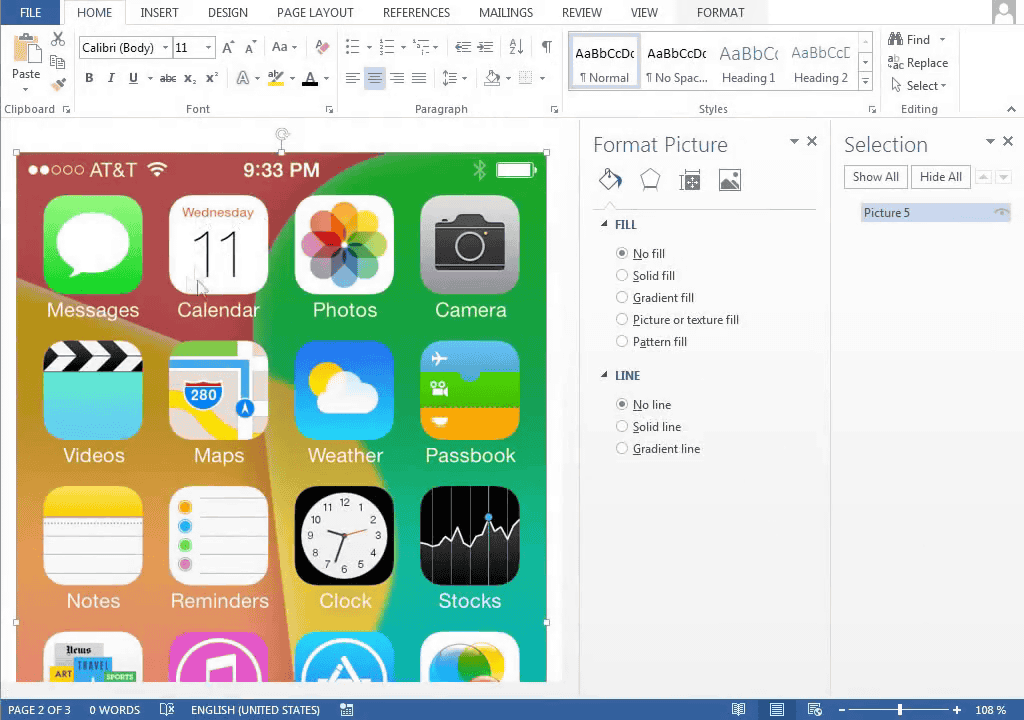
When iOS 7 flat design is made only with Microsoft Word, it becomes like this
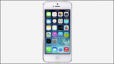
On the latest OS "iOS 7" installed on iPhone and iPadSimple two-dimensional "flat design" without shadows and depthHas been adopted. Vaclav Krejci has tried to see if it can reproduce its home screen using only Microsoft's Word, and has released a movie on YouTube.
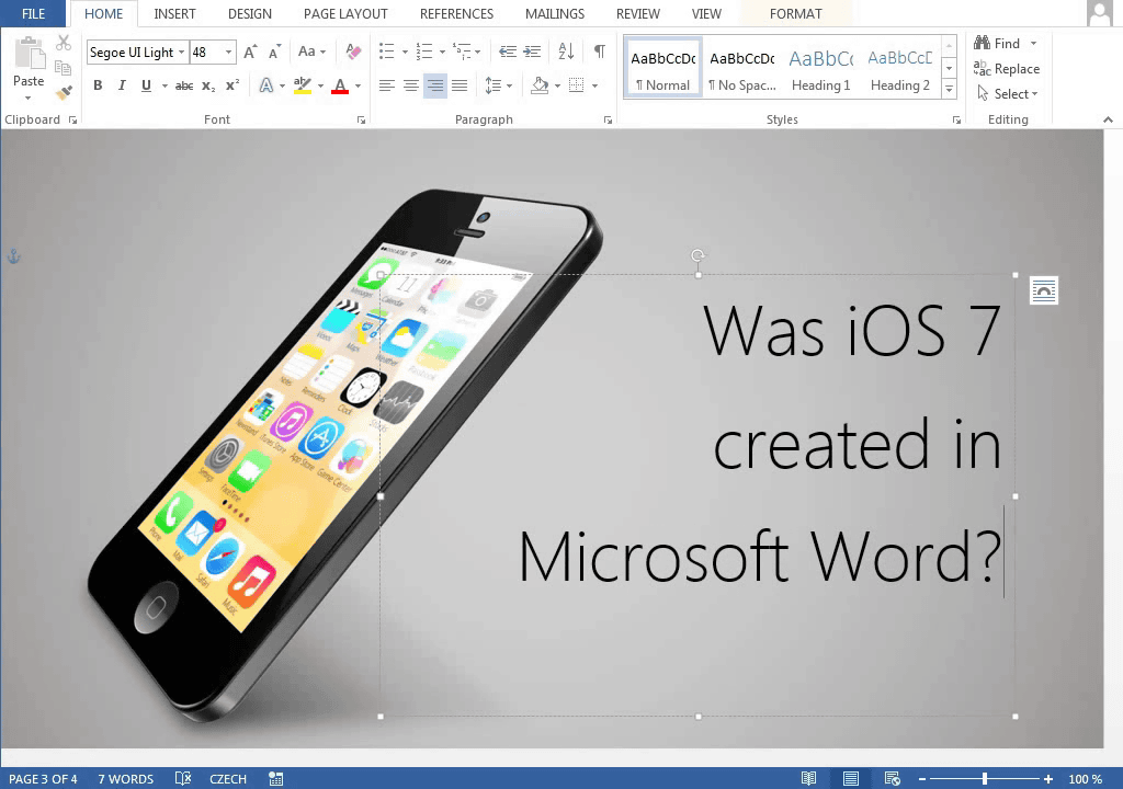
Was iOS 7 created in Microsoft Word? - YouTube
In the comment field, "No!" "Using Photoshop because the title is" Was iOS 7 created in Microsoft Word? "(IOS 7 was created with Microsoft Word?)" Although I am receiving Tsukkomi such as "It is easy," in short, I challenged how far I could reproduce the home screen of the iPhone I made into iOS 7 by Word alone.
IOS 7 screen is characterized by flat design
This time, I will reproduce this home screen with only Microsoft Word.
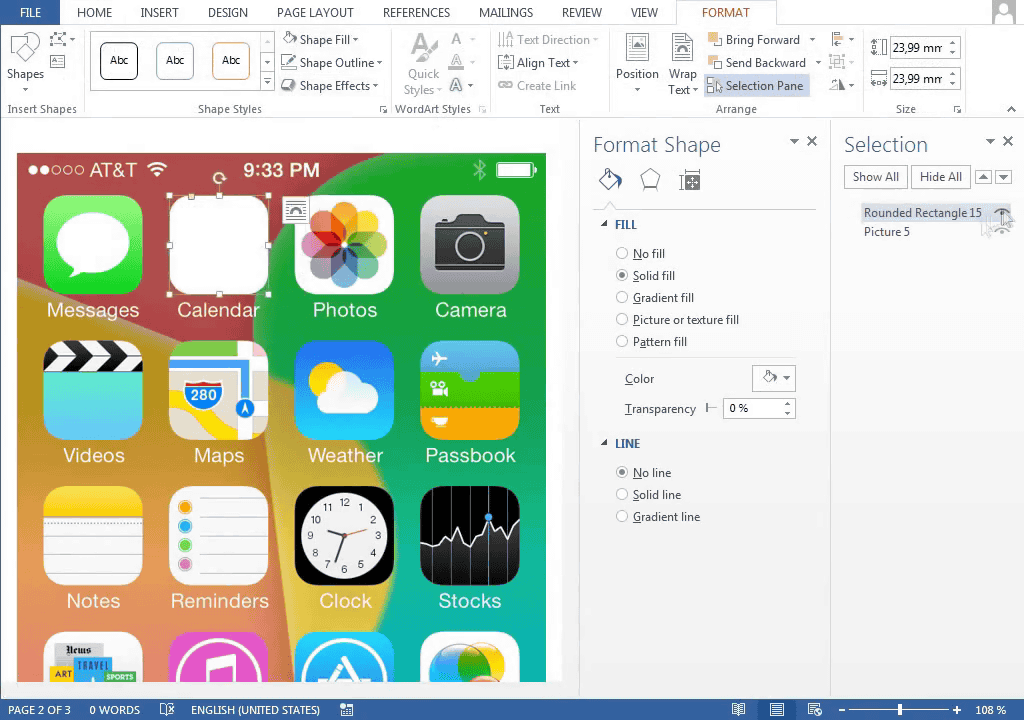
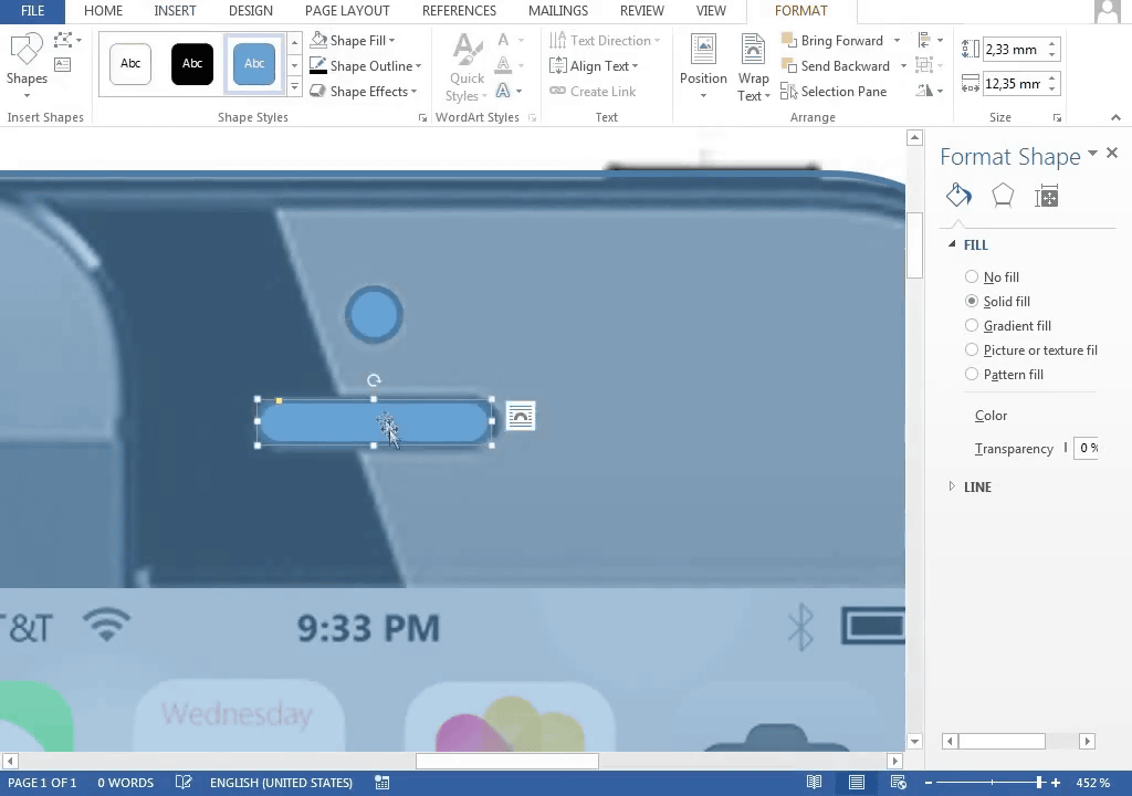
Firstly from creating icons. Round the corners of the square and adjust the size.
This is the foundation of all icons

Although I will design the design here ... ...
Firstly from the calendar icon.
Make the color of the base white ......
Put in letters.
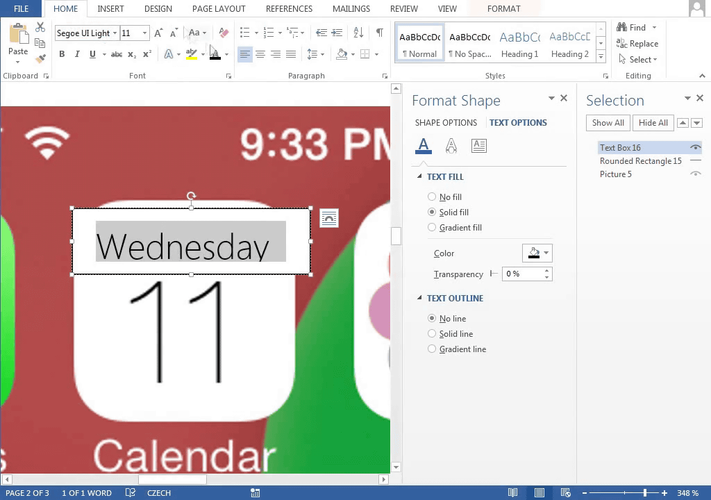
Mimic fonts and colors as much as possible ......
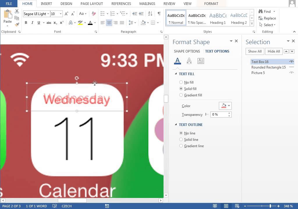
Then the numbers ......

Completion should be done as much as possible.

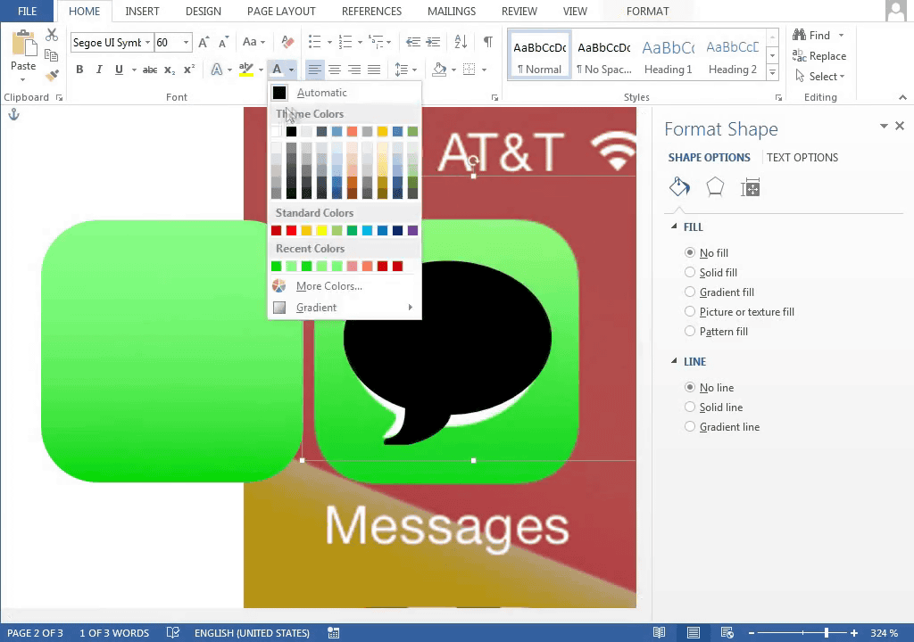
Next, a message icon
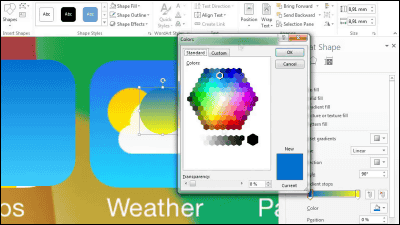
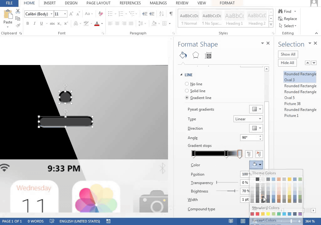
After aligning the colors, select what is similar to the balloon displayed in the center of the icon from the Word shape.

Although it is not the same shape indeed, it will look like it if you arrange the colors.
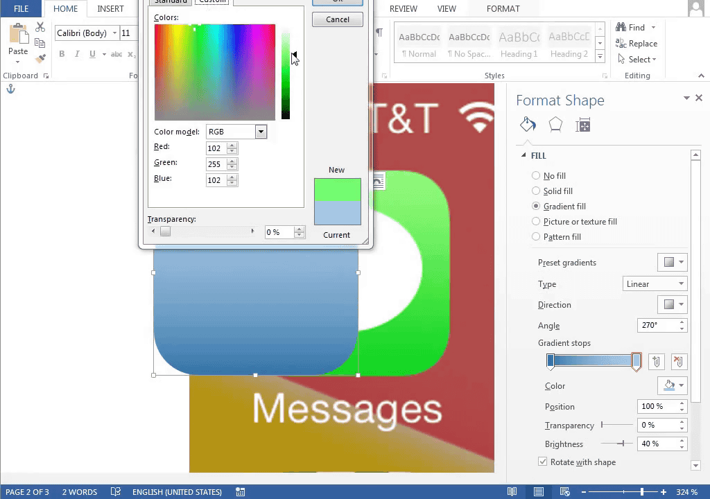
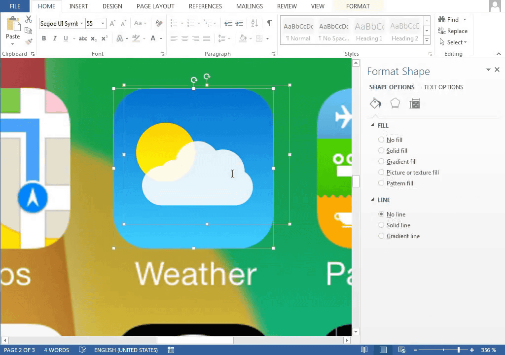
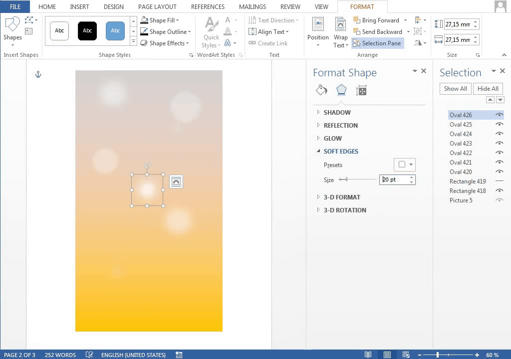
The background of the weather icon is subtly a gradation, so from that adjustment.
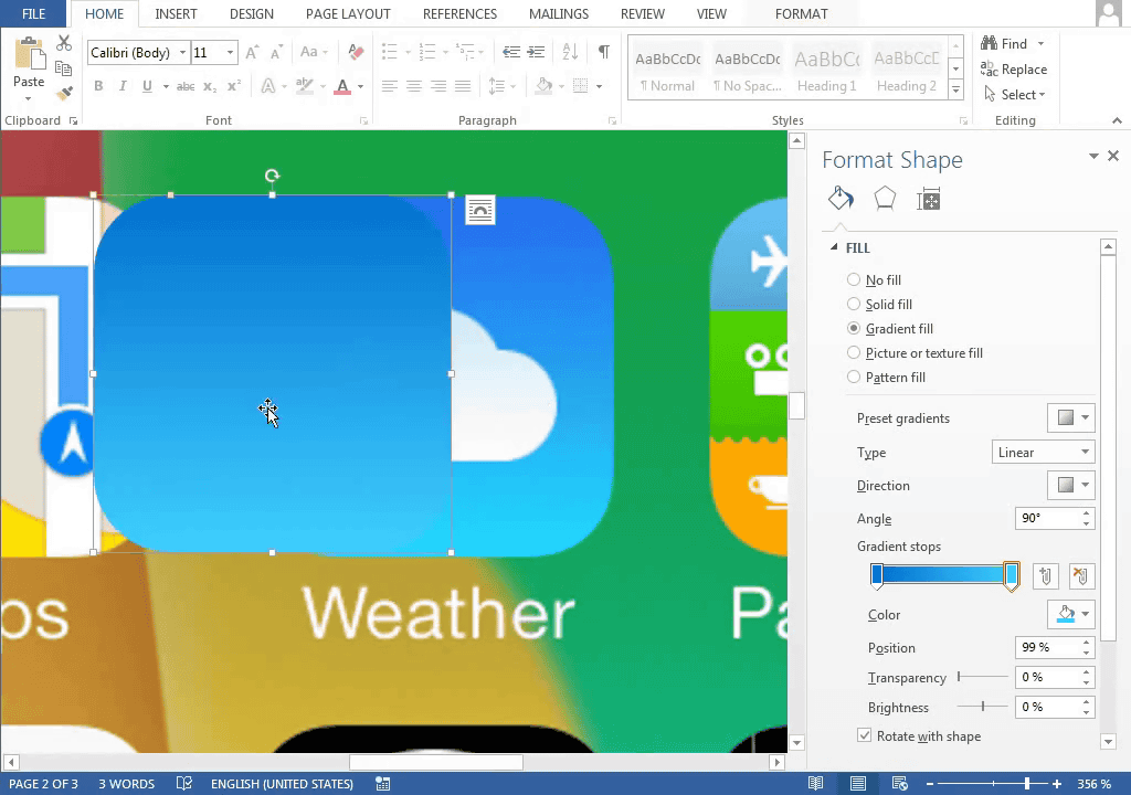
The color of the sun ... ....
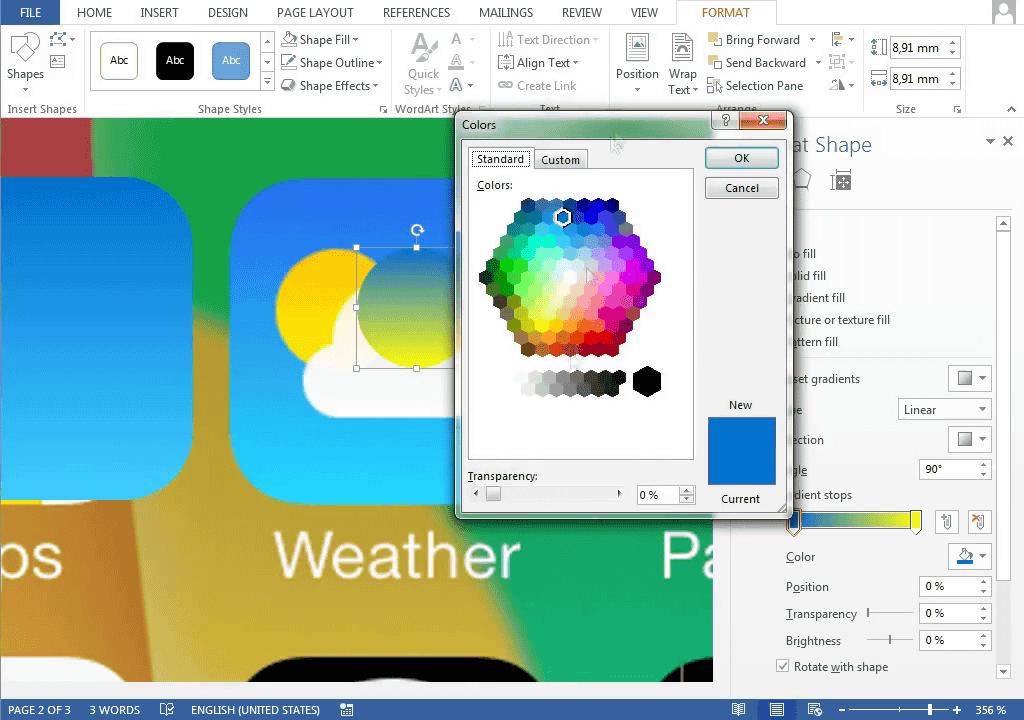
Change to yellow
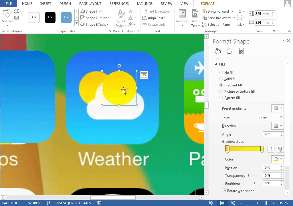
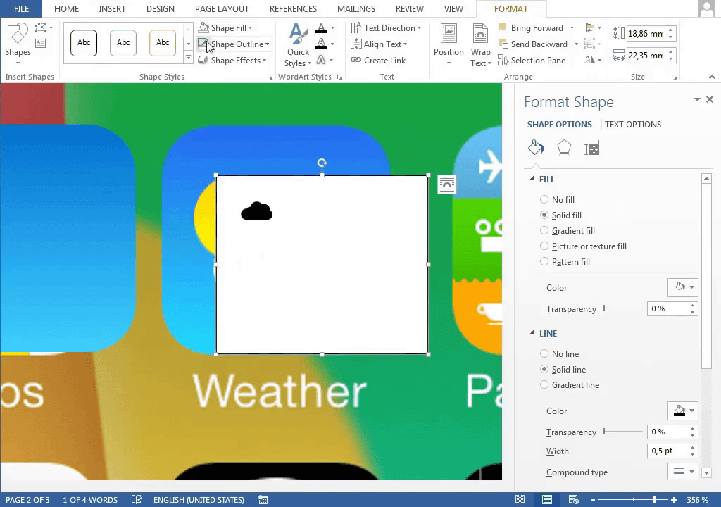
Like the message, clouds look for similar shapes and bring them.
Although it is slightly different in shape when piled up ... ...
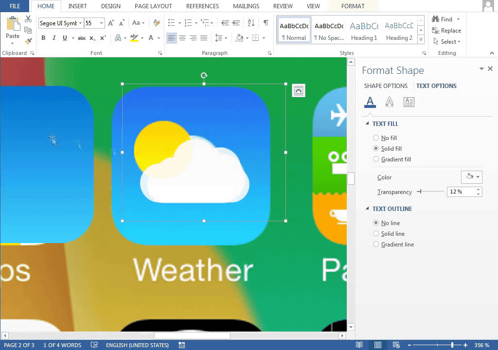
Background · Together with the sun, this icon looks like a correct answer.
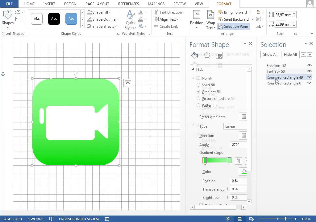
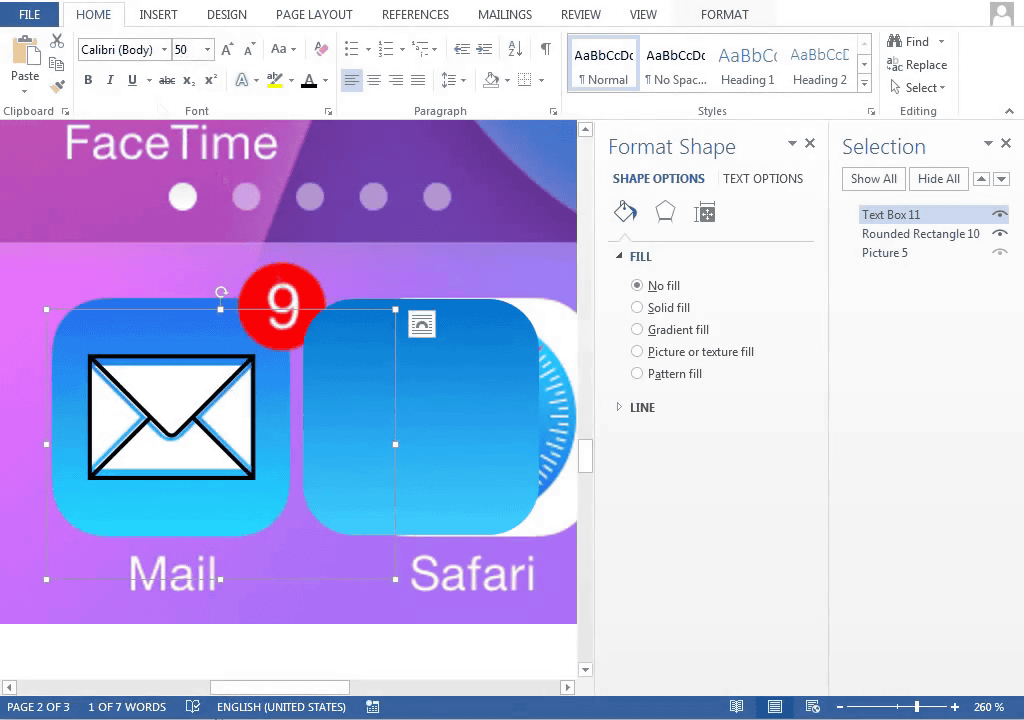
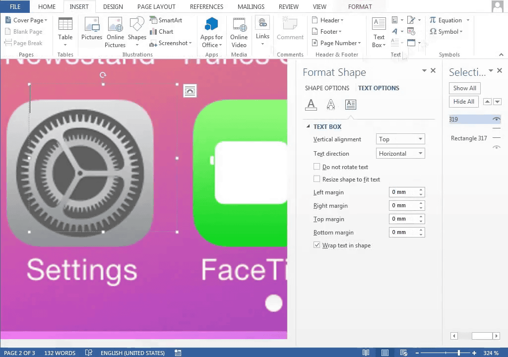
I brought the shape of the projector to make a FaceTime icon. Above the "Settings" character is the FaceTime icon being created in Word.
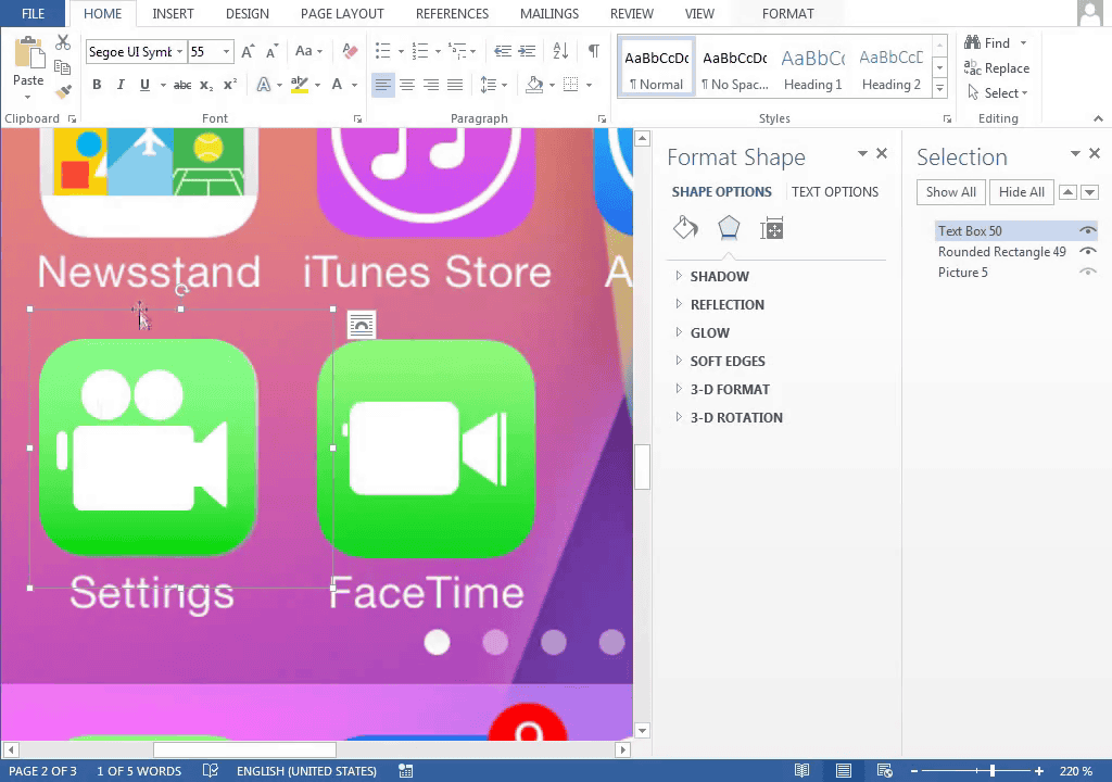
Delete unnecessary reel parts sticking to figure
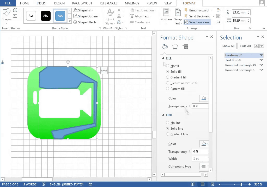
It seemed like it at once
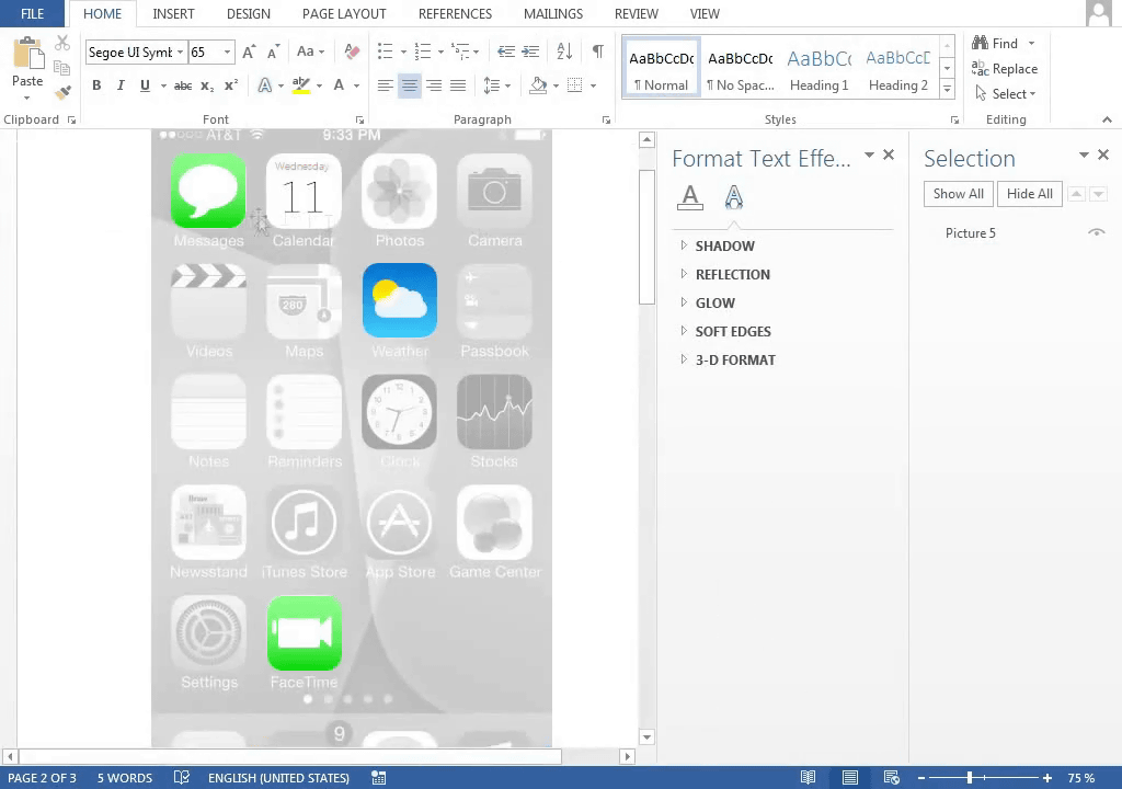
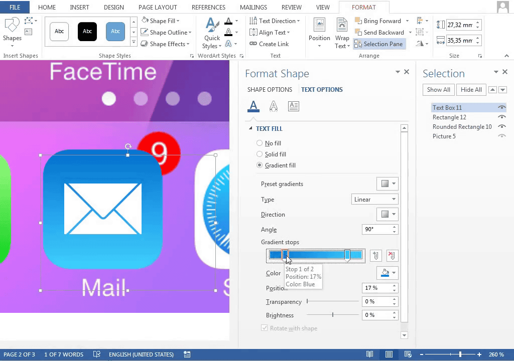
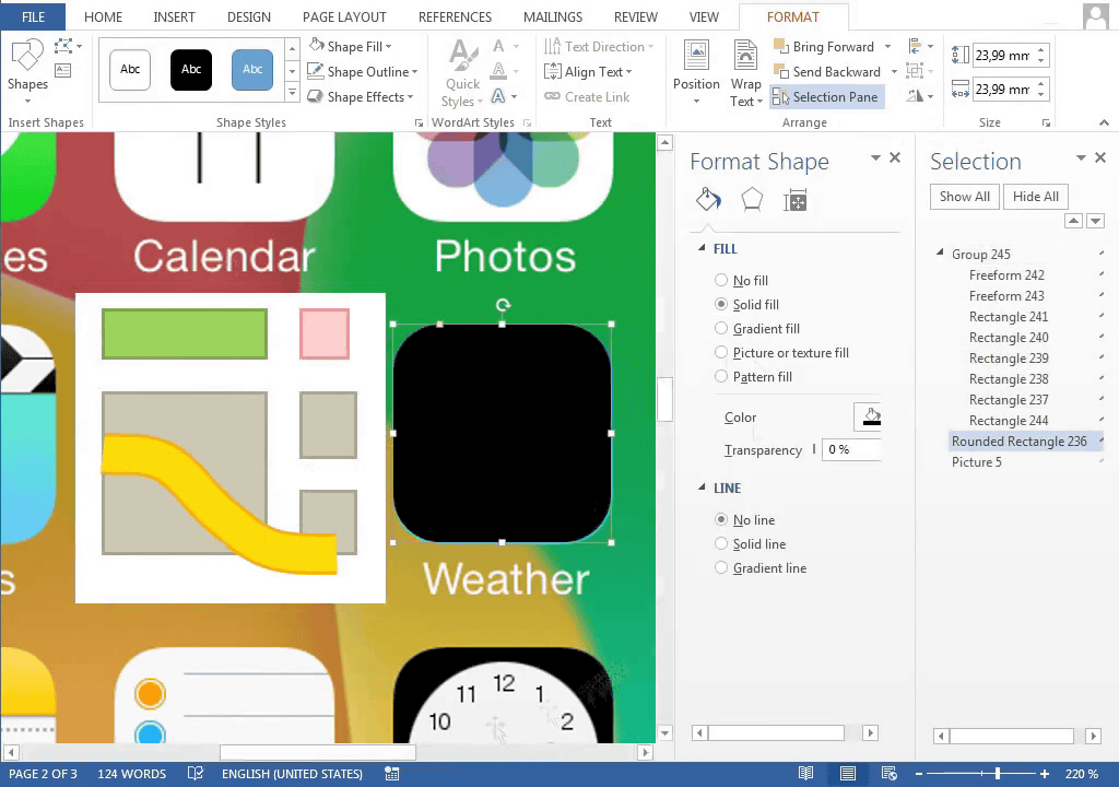
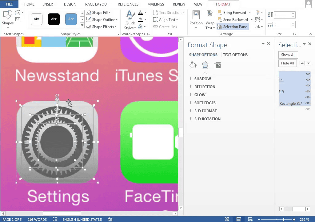
This completes the creation of 4 icons. Further work will continue.
The telephone icon is easy because there is a figure of the receiver.
Completing it by adjusting the angle
Since the mail icon also has a closed stationery figure, just adjust the size.
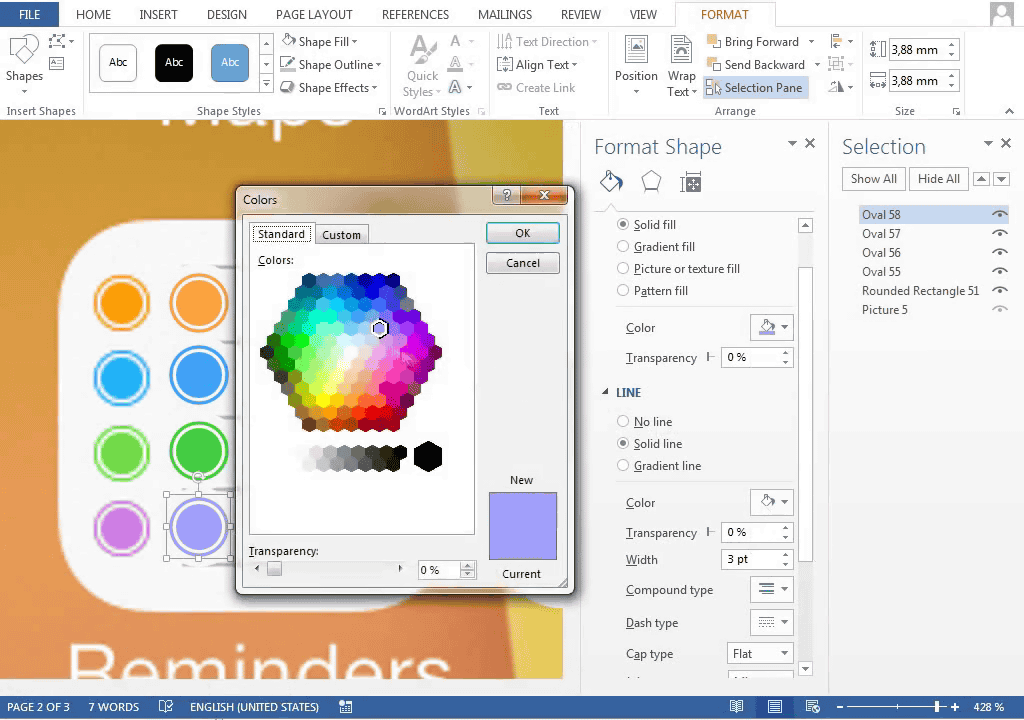
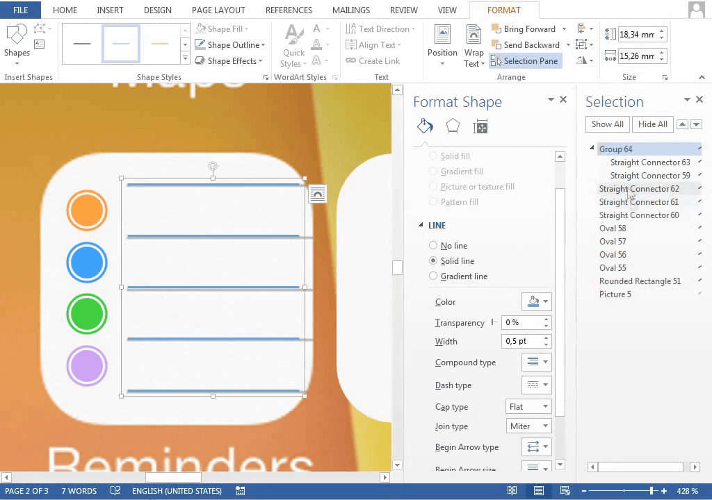
In the case of a reminder icon, it does not have any graphics of four colors, so I make it. However, once you make one, you can copy it and change the color OK.
Ruled lines are created by pulling lines and creating spaces at equal intervals.
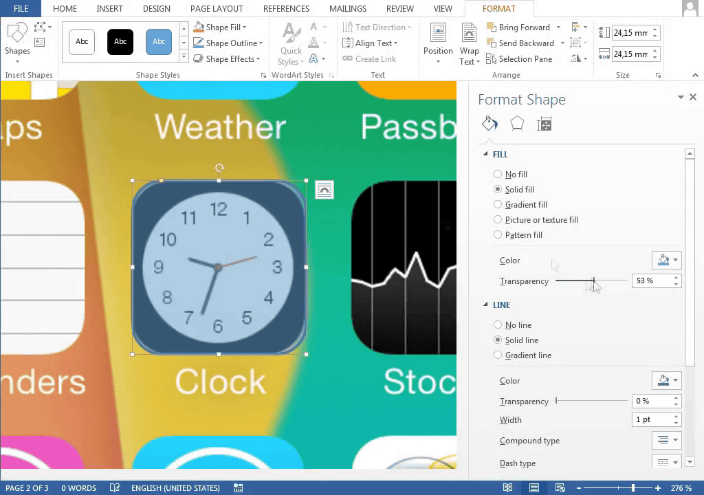
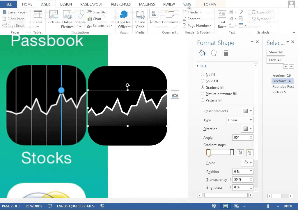
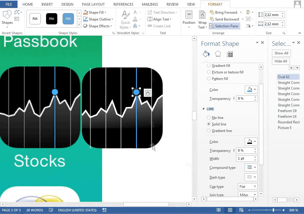
A stock price icon with a slight difficulty level, the shape of a polygonal line traced the original icon.
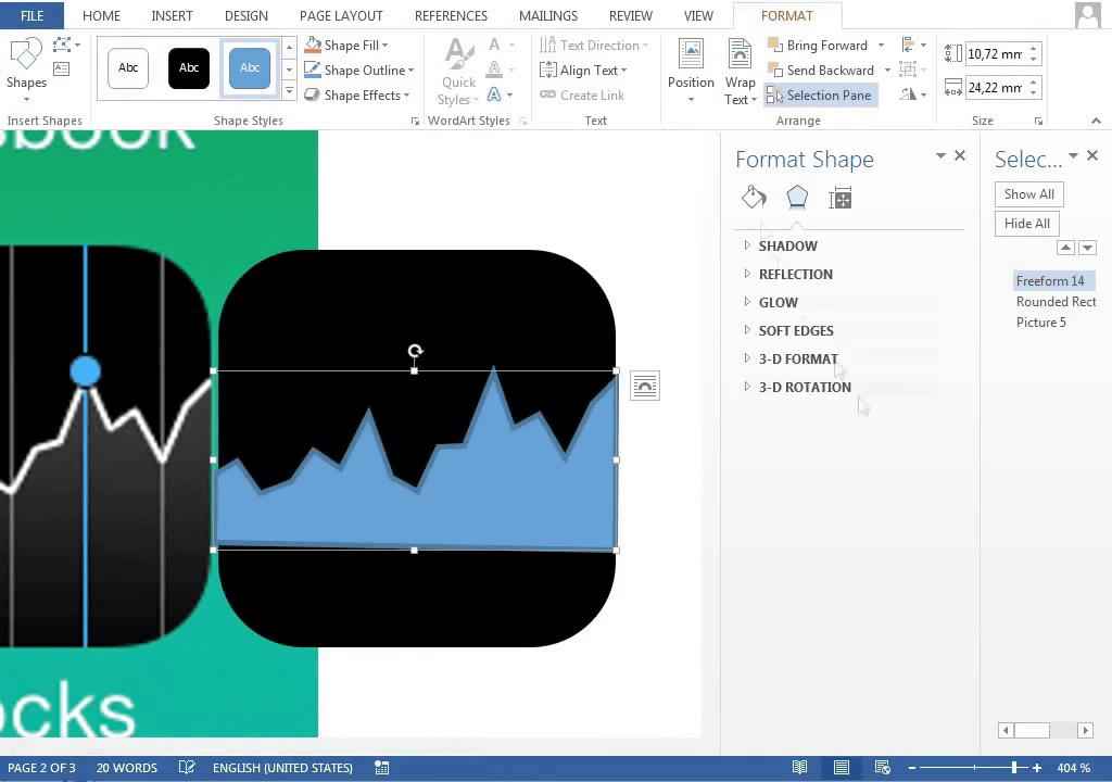
Put a white line ......
Writing a vertical line ......
Arrange at even intervals. It is lovely that the position where the line is broken and the position of the vertical axis are slightly misaligned.
Add a blue dot and finish.
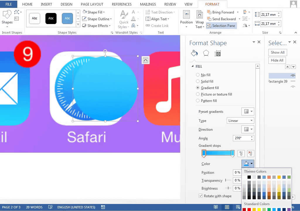
Next, the Safari icon.
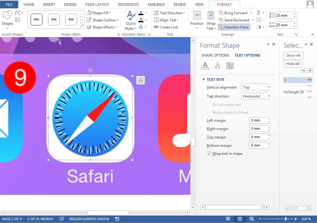
I want to make a scale around the compass. If it's just horizontal writing it will be like this ... ...

By changing the follow path letters can be arranged in a circle
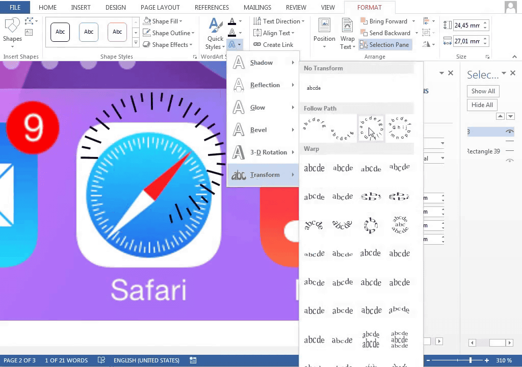
Because the length of the scale was not enough, increase the number ......

This street
Afterwards if you create a compass needle from a triangle figure it is completed.

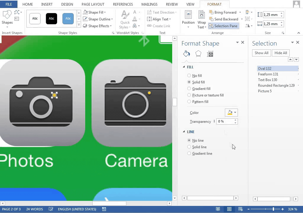
Since the shapes of the cameras are not very similar, it is necessary to add a little effort.
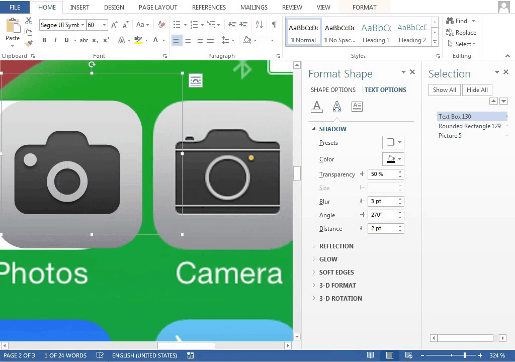
Put the line with rectangle selection ...
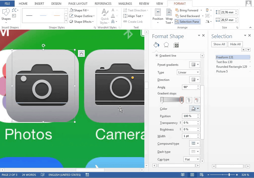
Added a yellow dot (autofocus auxiliary light). As expected, the release button etc. are small, so they are omitted.
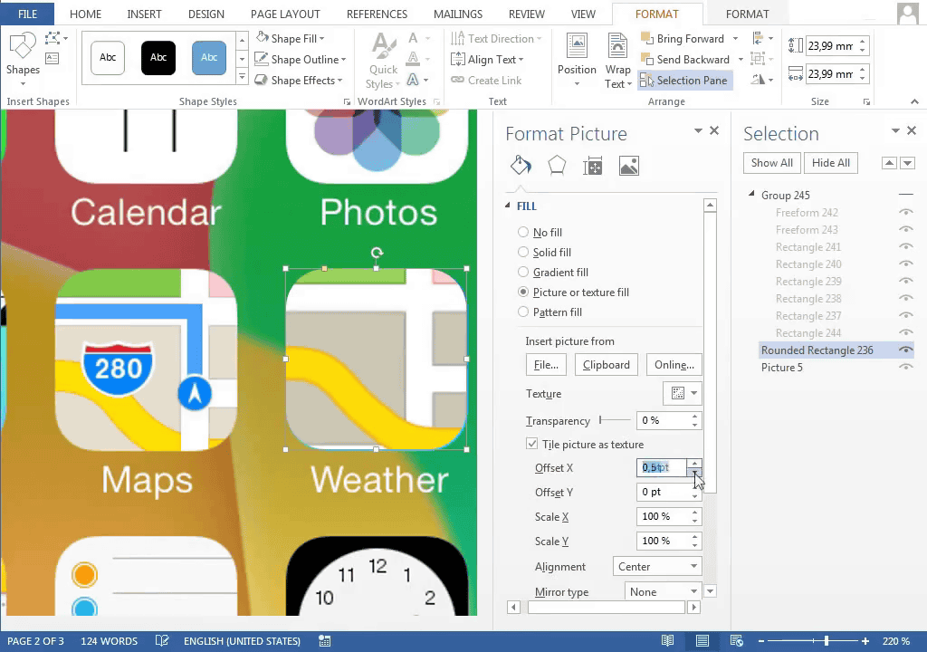
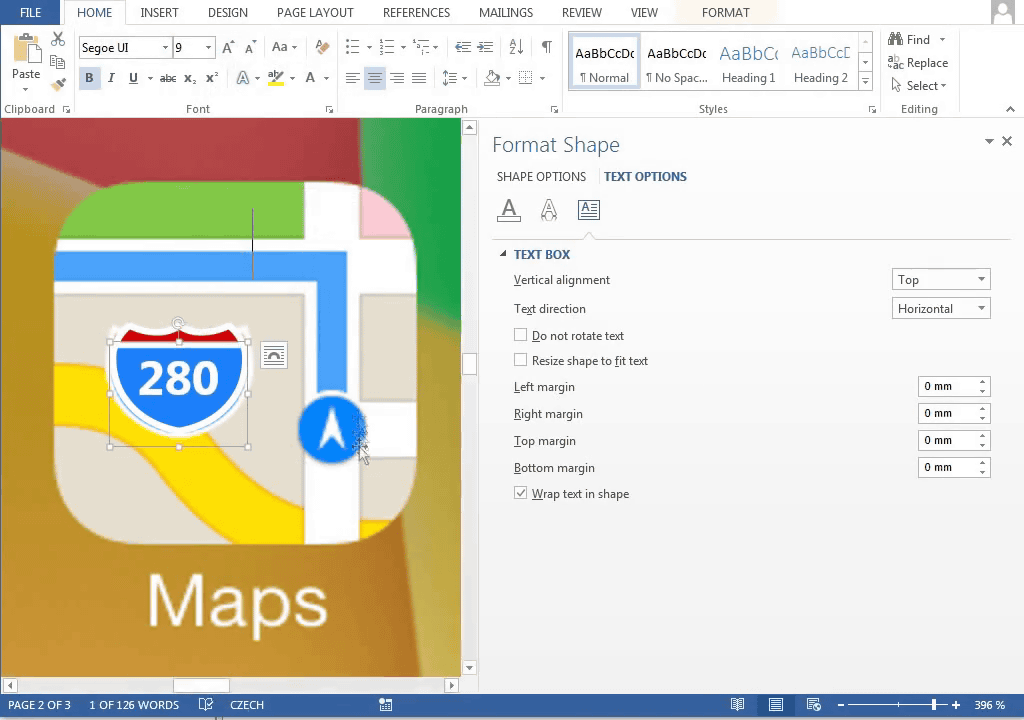
The work that required detailed work is the map icon
First, select parts other than the road to match the colors
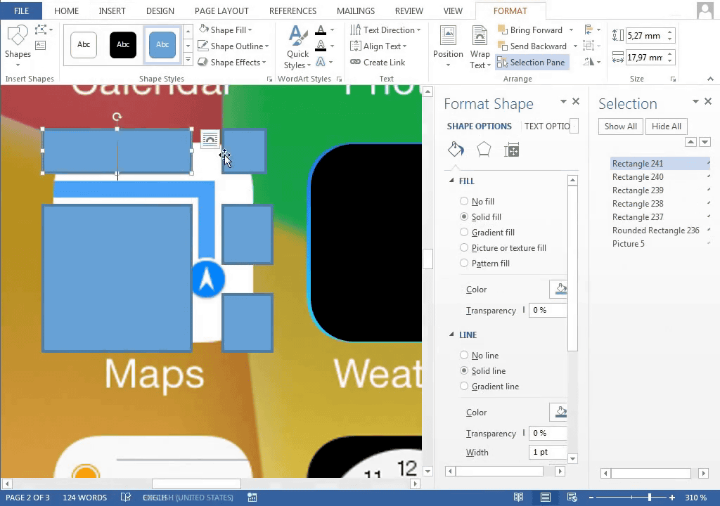
Next, copy the shape of the highway (yellow road) ... ...
Create underlay
About half of the processes are completed
Mimicking the shape ......
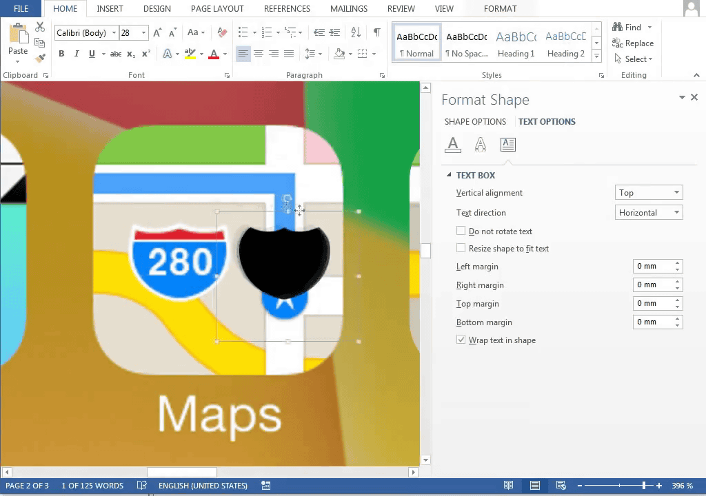
Color matching ......
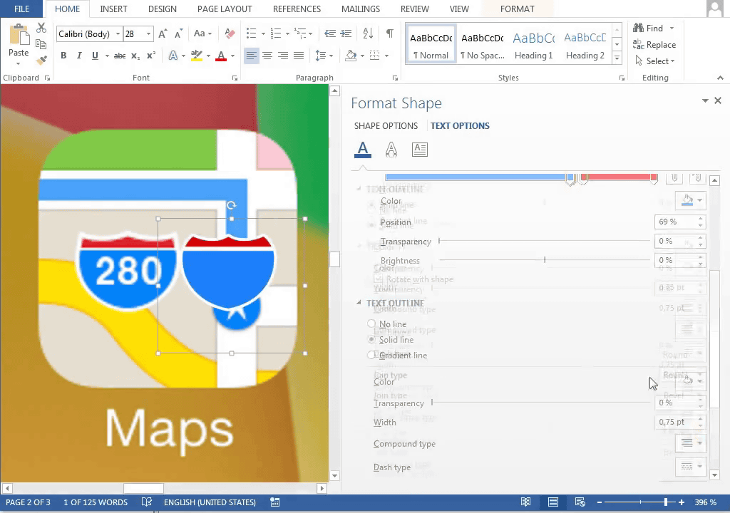
A road sign is completed if you enter a number
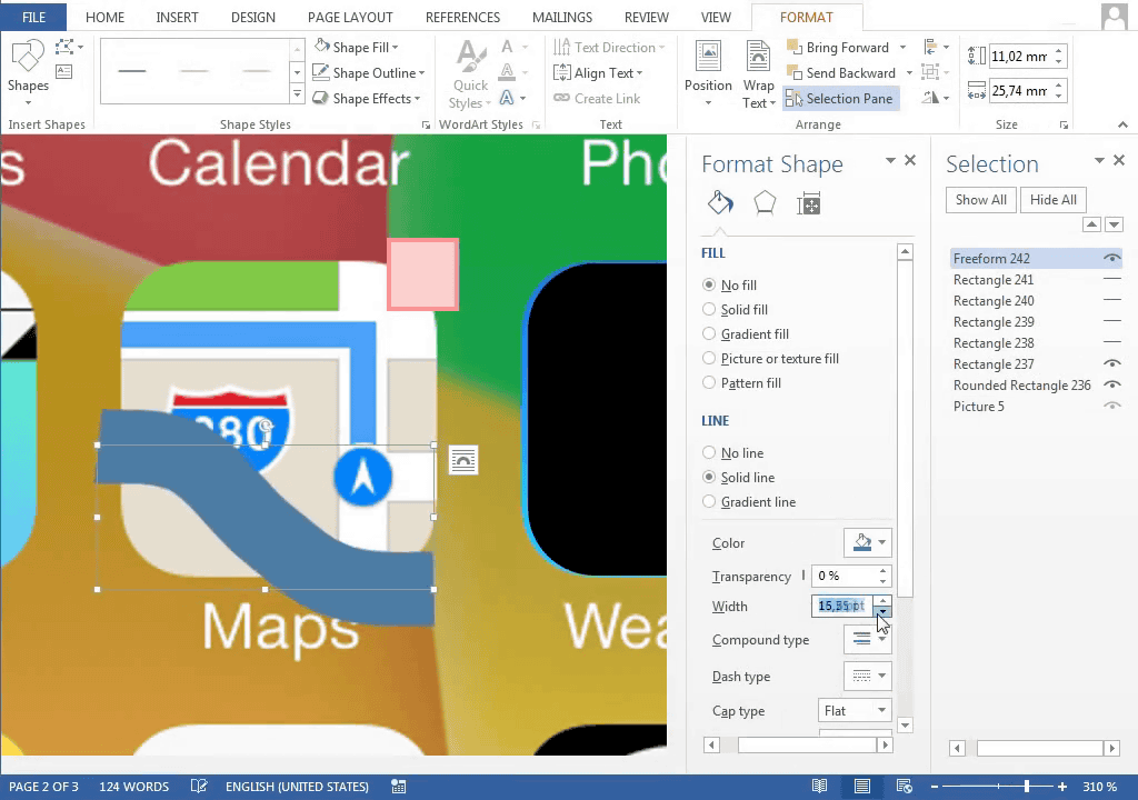
Next, if you make a road part in Navi ... ...
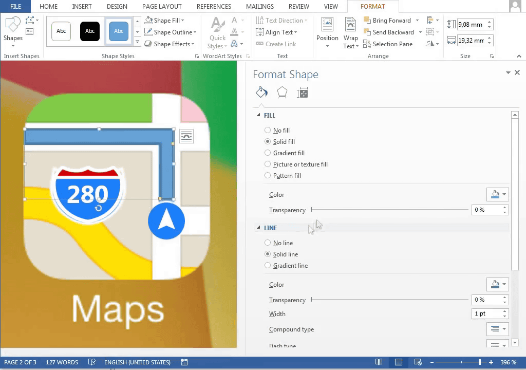
The map icon is complete.
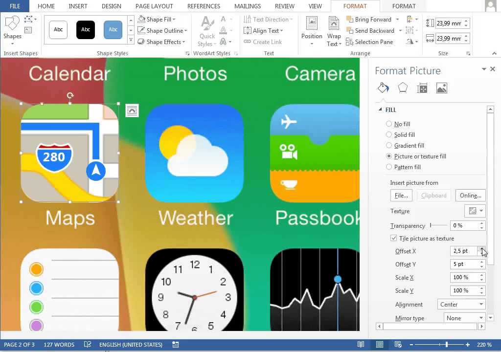
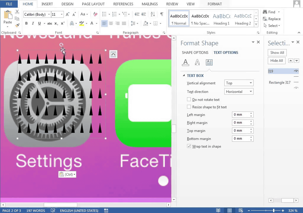
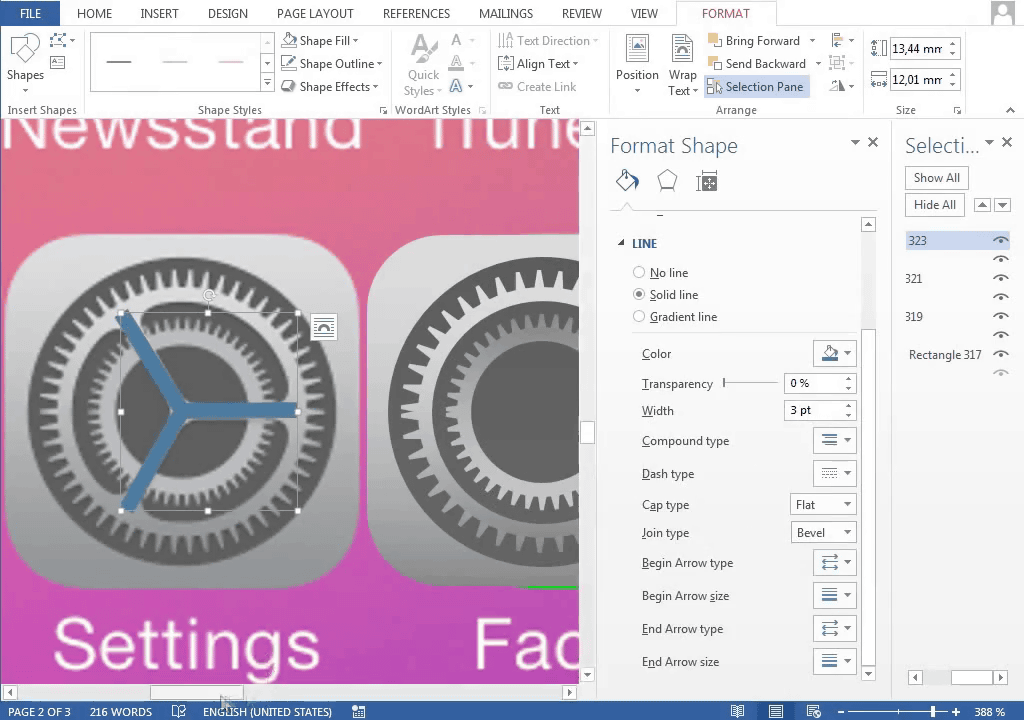
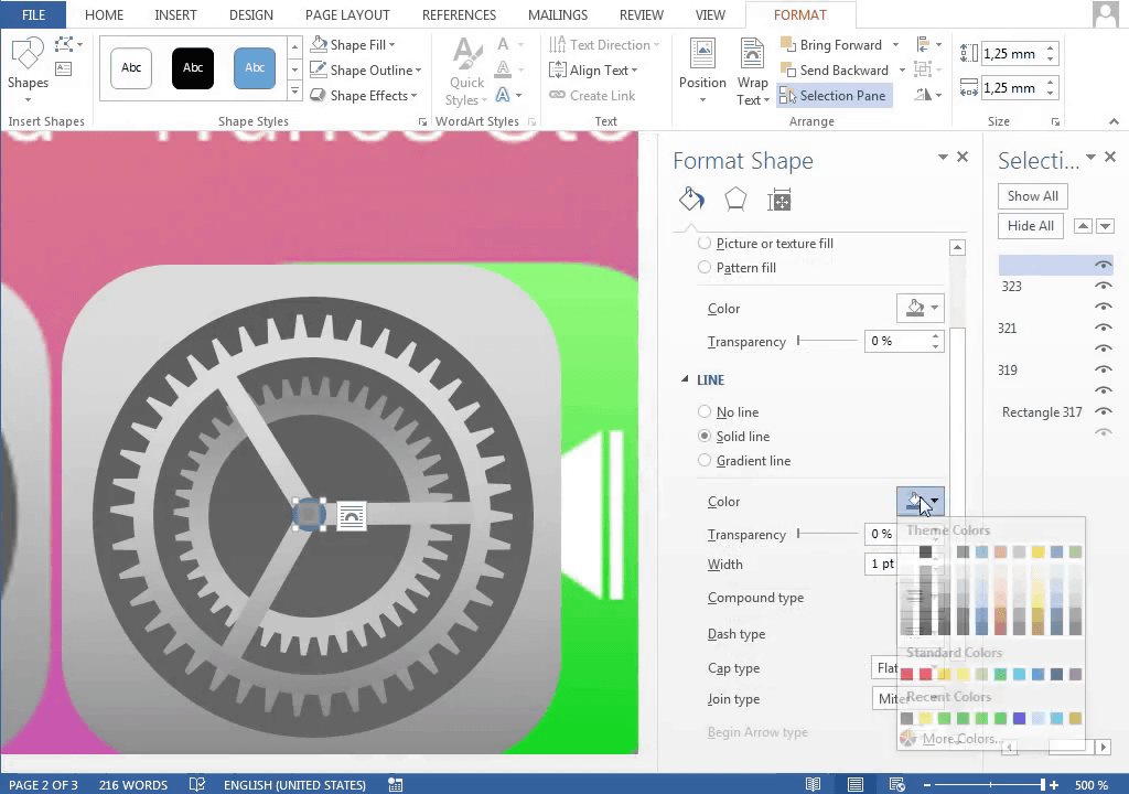
The setting icon is designed to have two gears overlapped
I will make it using a triangle
Just like Safari's compass, arrange it circularly ...
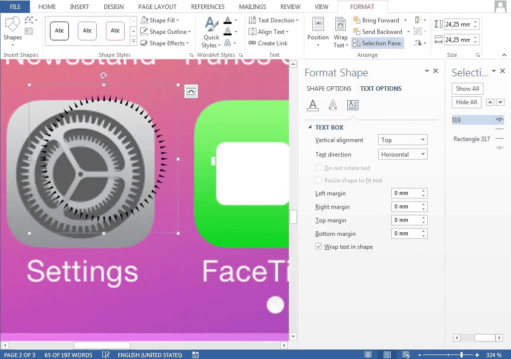
Create gear
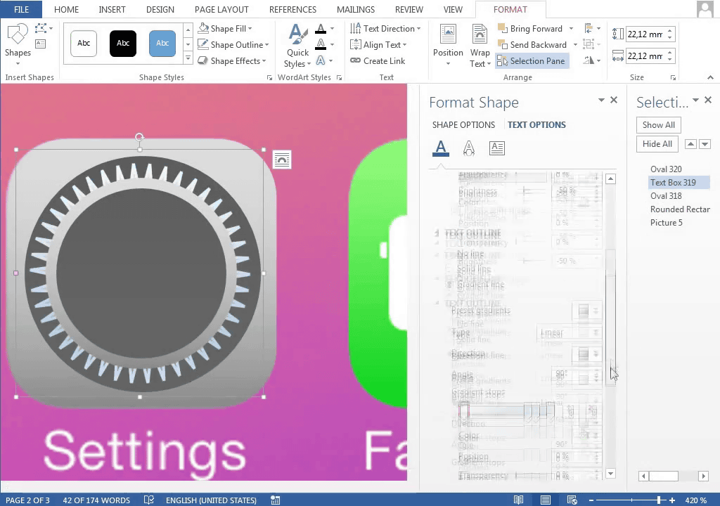
Duplicate ... ...
Match the shapes of the spokes ......
Coalescence.
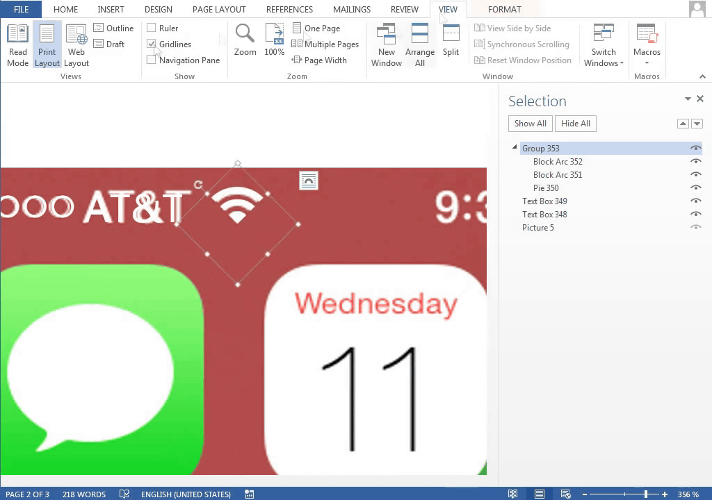
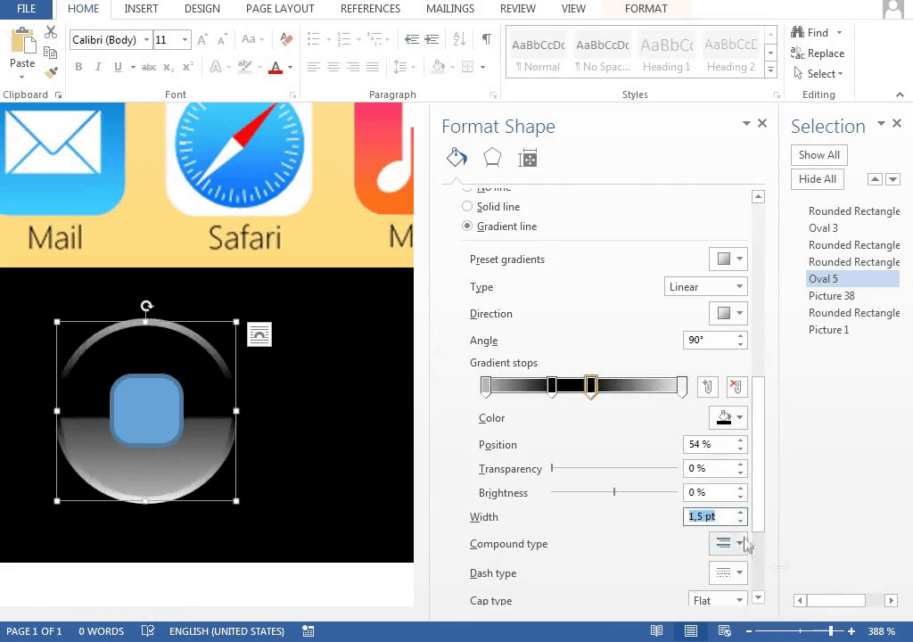
There are things other than icons on the home screen, so we must also make it. For example, display of radio field intensity at the upper left of the screen ... ...
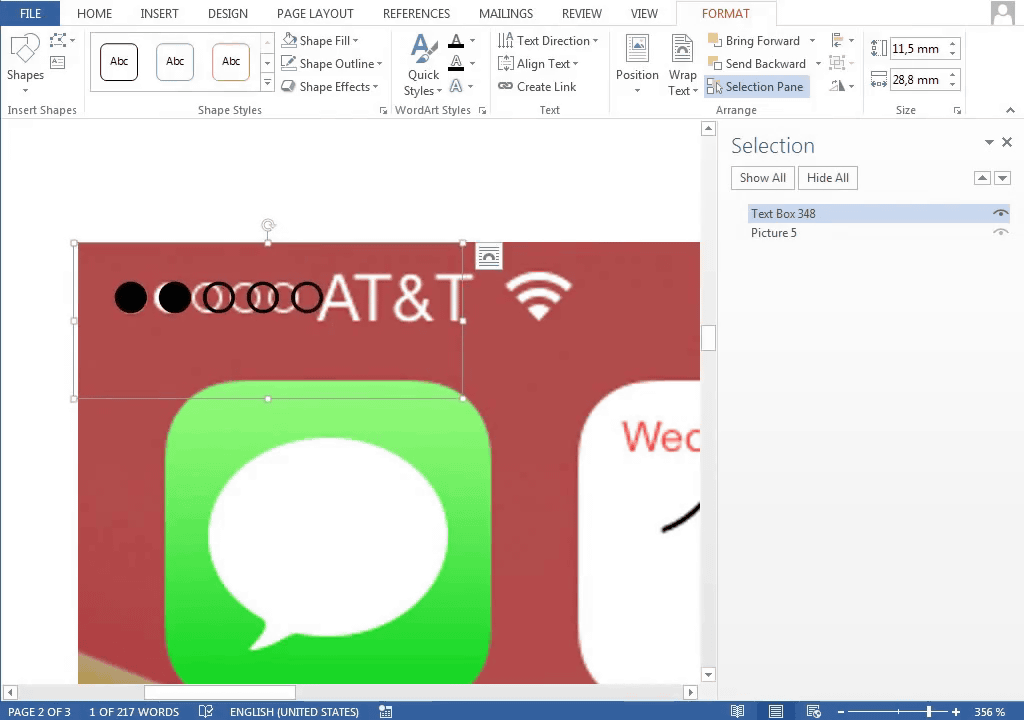
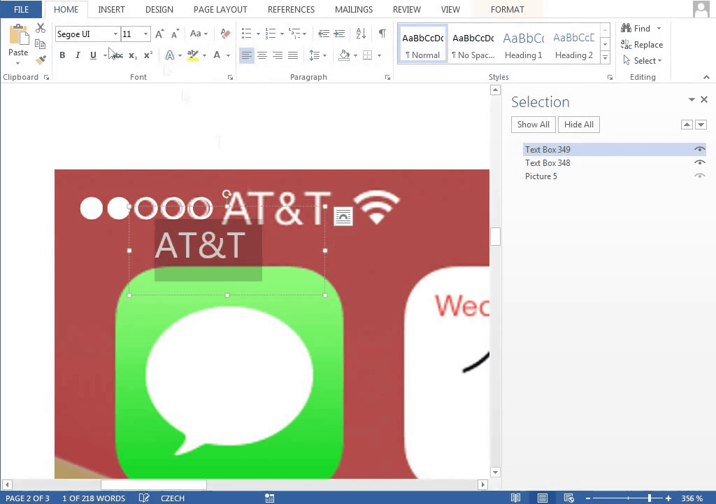
Display of carrier name.
Make a fan shape ......
If three overlapping ......
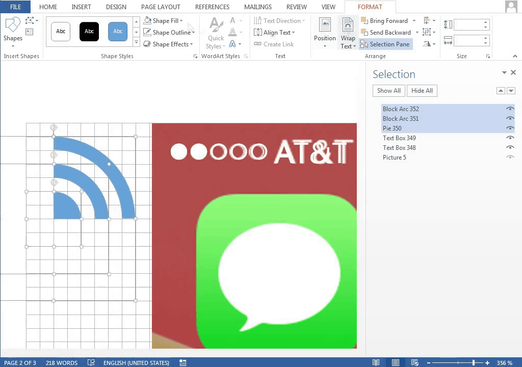
Wi-Fi icon.
I will create a Bluetooth icon from a hexagon.

In addition, if you make a background ...
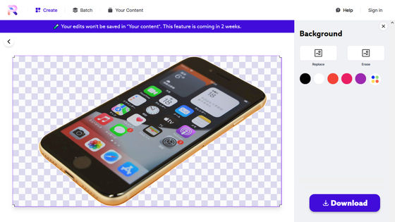
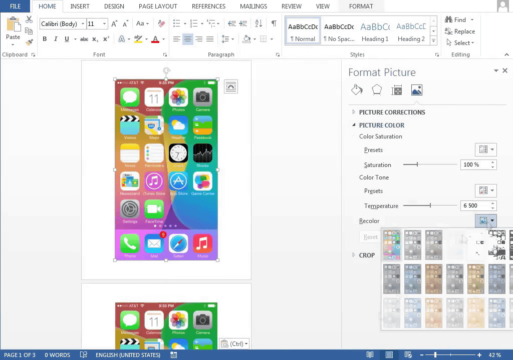
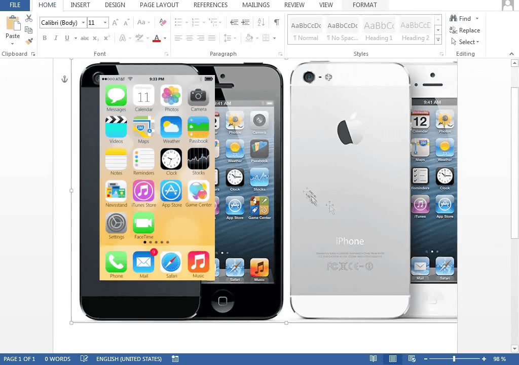
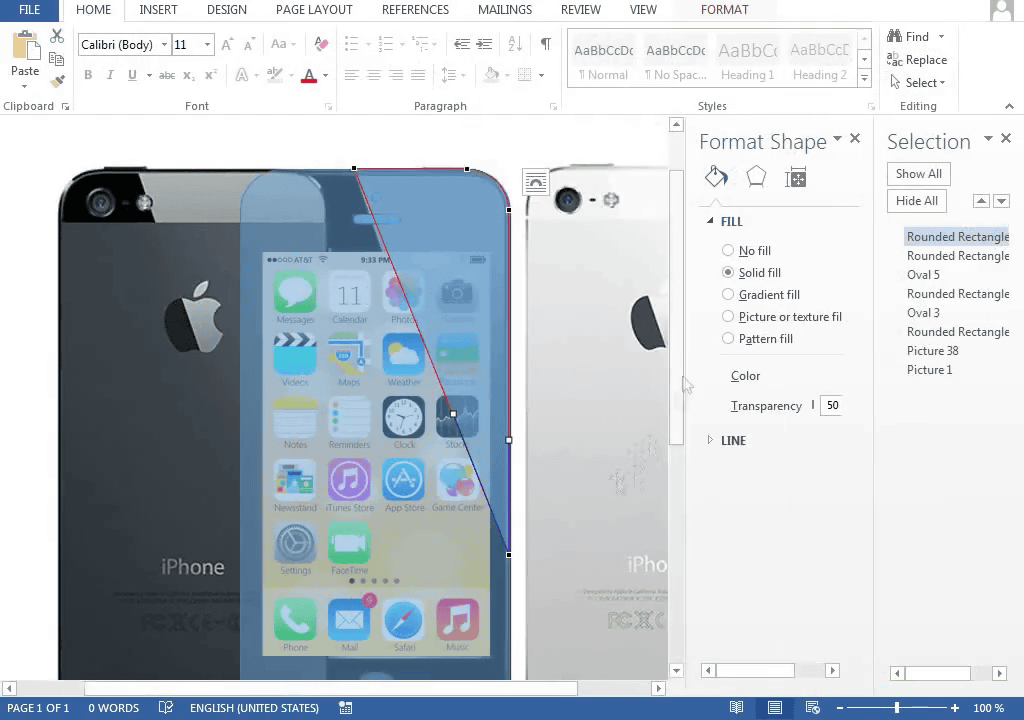
Screen is completed. If you synthesize this into iPhone photos it looks like that ... ...
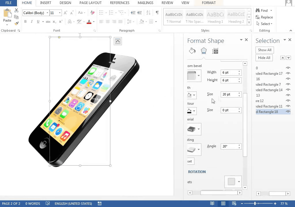
After checking the size of the iPhone, I started checking the size of the camera.
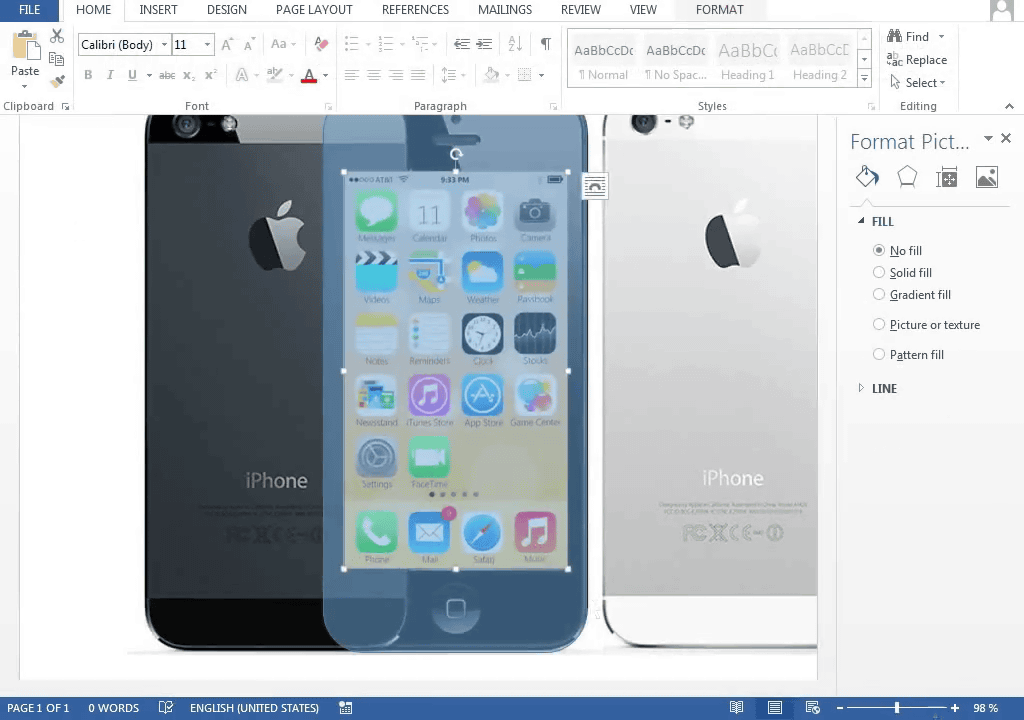
It is a line of reflection of light that is cut obliquely.
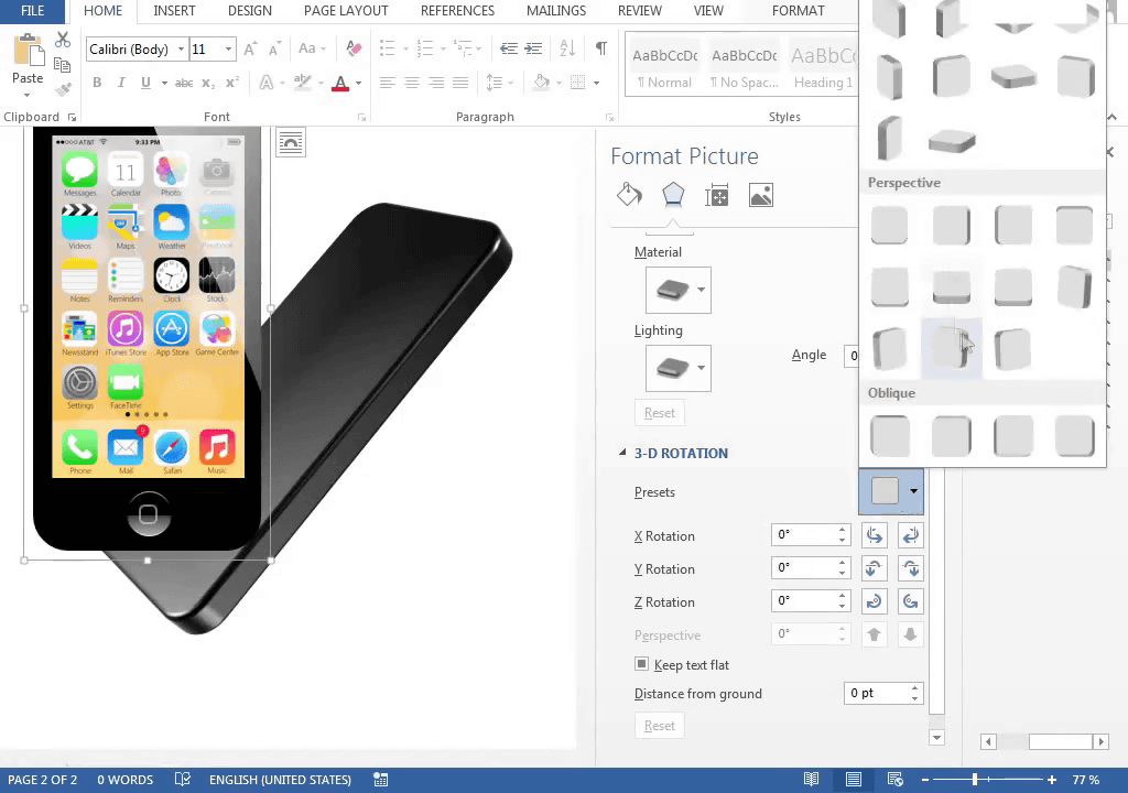
Krejci was trying to make it on Word even iPhone.
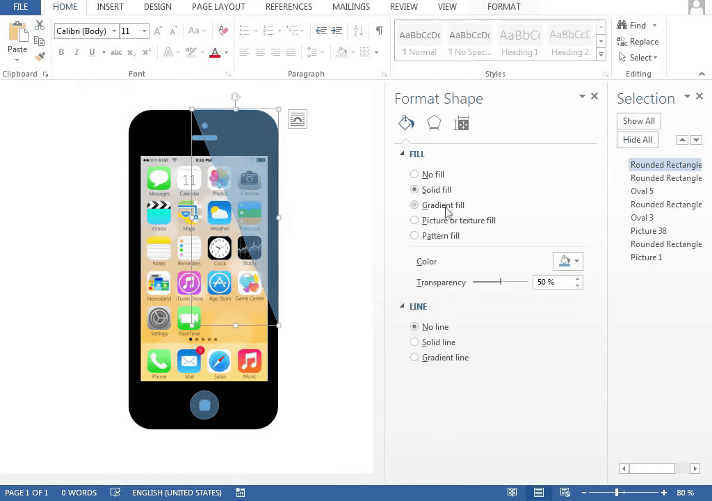
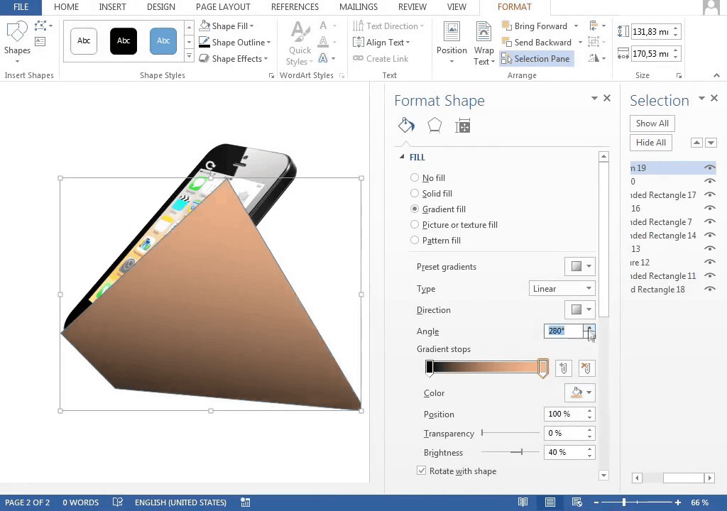
Put the reflection of light on the right shoulder part ...
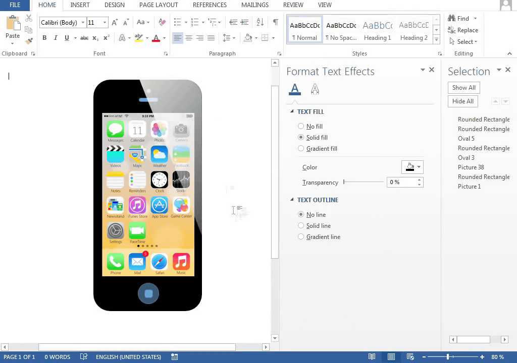
We will make details.
A square mark on the home button. It is like iPhone 5, not iPhone 5s.
Tilt diagonally ......
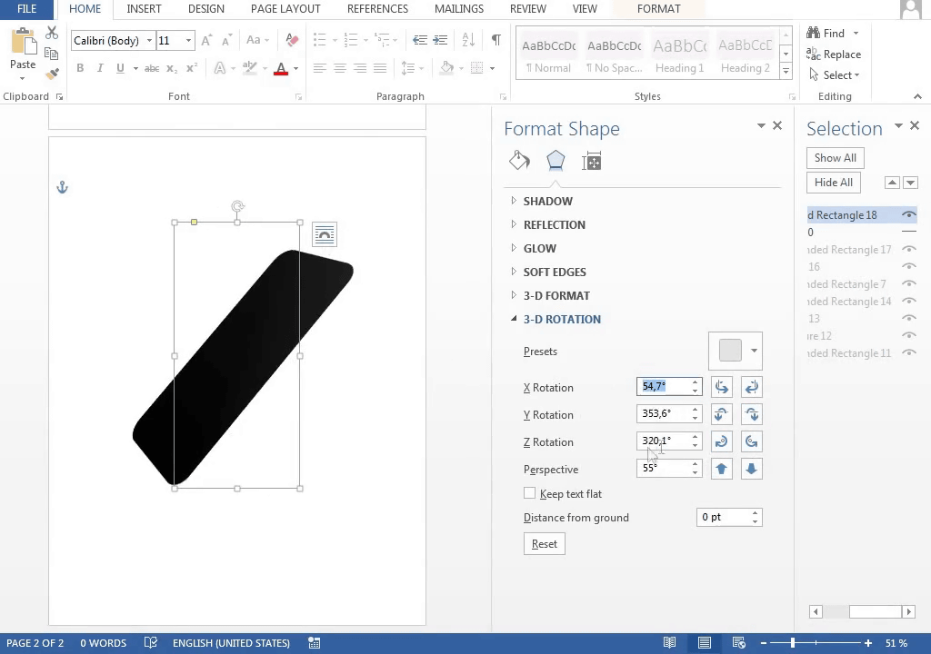
Make Gawa ......
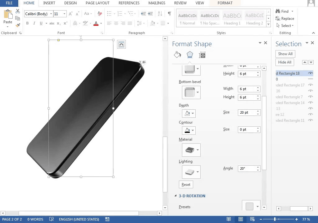
I will bring up the home screen I made earlier.
Pett pasted together ......
Shade on ... ....
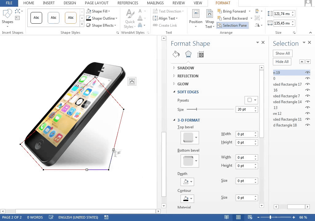
Completion

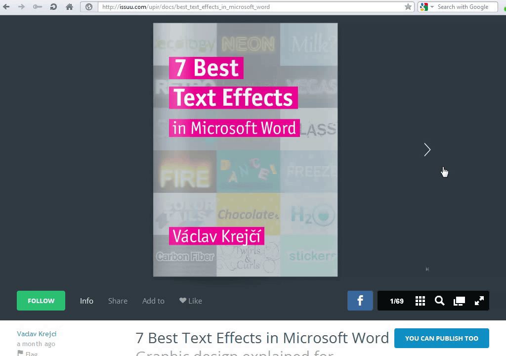
Vaclav Krejci is an author of a book introducing Word's technique "7 Best Text Effect in Microsoft Word", which actually published a movie to show that this technique can do so much is. By the way this bookIt is possible to read online for free.
If you want to make this image just like Tsukkomi street in the YouTube comment section, you can use Photoshop faster, but it is a mistake that you can understand that "Word alone can do this" There is none. However, how long will it take to reach Krejci's level ...?
Related Posts: