Examples of web design that remain impressive using large images effectively 20
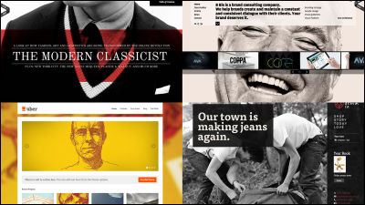
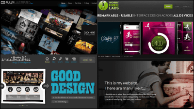
When designing a website, using a large photo will unify the atmosphere of the site or push the image of the brand all the way, but if it fails due to its size it will be a big deal. Therefore, "20 Inspiring Examples of Big Backgrounds in Web Design" gathered reference sites that actually use large background images. How to use main content and photos are various, but none are finished in an impressive website.
20 Inspiring Examples of Big Backgrounds in Web Design | Inspiration
http://webdesignledger.com/inspiration/20-inspiring-examples-of-big-backgrounds-in-web-design
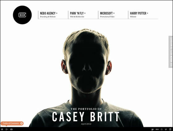
◆ 01:Casey Britt
Casey Britt of the design office has a man with no face.
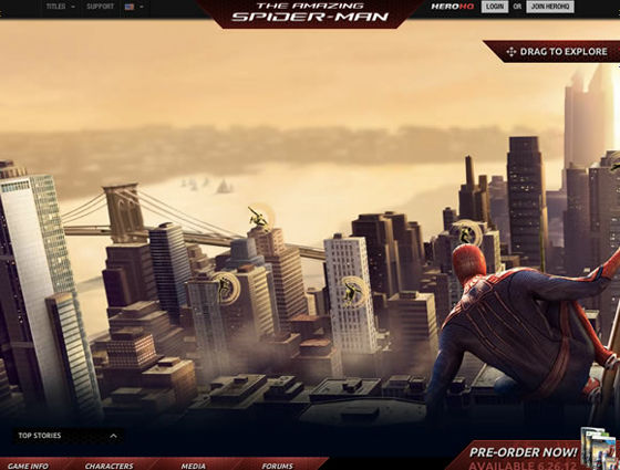
◆ 02:The Amazing Spider-Man
It is the official page of the movie Amazing Spider-Man.
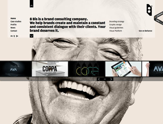
◆ 03:8 Bis Agency
At the brand consultancy company 8 Bis Agency the up photo of a smiling male was used.
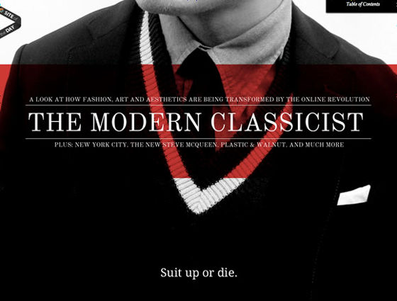
◆ 04:Suit Up or Die Magazine # 1
Web magazine Suit Up or Die is an impressive finish with red placed in black and white photos.
◆ 05:Uber
A site selling images and animations of freelance photographers and designers.

◆ 06:Whitmans
Burger shop Whitmans is a design that hamburgers can see through the back of the blue background.

◆ 07:Studio Octopi
The center of the simple site design has the photos set up largely at the architectural studio Octopi's website.

◆ 08:VonDutch
The fashion brand for riders Von Dutch's site has foundersKenny HowardThe amount of the upwards.

◆ 09:Hiut Denim
The British jeans brand Hiut Denim uses rustic pictures that convey the atmosphere that is an organic product.

◆ 10:Range Rover Evoque Special Edition With Victoria Beckham
Land RoverWhenVictoria BeckhamHas collaborated "Evok" site top.

◆ 11:H-ART
H-ART, a company that produces Madrid's digital content, uses pictures that are heartwarming.

◆ 12:Individuelle Singlespeeds und Fixies. Bikes aus Düsseldorf
Design that you can see at a glance that it is a bicycle website.

◆ 13:Tim Roussilhe Portfolio
Tim Roussilhe 's Web design, graphic design, etc, has photos of elderly men. I have a portrait on the blackboard next door.

◆ 14:TAG Interativa
Production company TAG's website has a landscape at work. By clicking on the mark above each employee, it leads to each employee's Twitter.

◆ 15:Stéphan Rizon
This is the singer's website of Stéphan Rizon.

◆ 16:Jalbert Productions International
Jalbert Productions site making pictures about sports photos of the top brand of lacrosse productsMaverik LacrosseFrom CM.

◆ 17:Actualités
Mécénat Musical, which distributes content on music, pushes out the pictures of those who are featured at the time.

◆ 18:Marcus Thomas
On the site top of the agency Marcus Thomas's site is a letter of Marcus Thomas greatly across the screen.

◆ 19:MENDO
Below is MENDO's website of book sales site.

◆ 20:BIRDMAN Project
And the website of the advertising company BIRDMAN was the American style.

Related Posts:
in Design, Posted by darkhorse_log
