Movie summarized by seeing all the latest features of Windows 8 in one shot
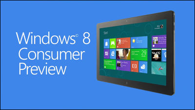
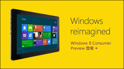
Waiting for the place where you searched by chatting with messenger while using the new type of task manager, picture password, charm, "People" application that was also included in Windows Phone, sharing with hasty while viewing images and pages, using the new map application "Map" For example, "Windows 8 Consumer PreviewWhat kind of things will be possible when a number of the functions clarified by "cooperate?" Microsoft publishes a movie summarizing and showing that it is on YouTube.
First of all, the first movie.
Meet Windows 8 - YouTube
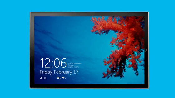
The screen before login is renewed and it looks something like this.
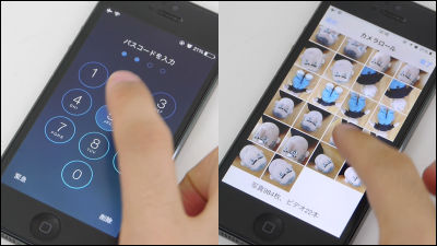
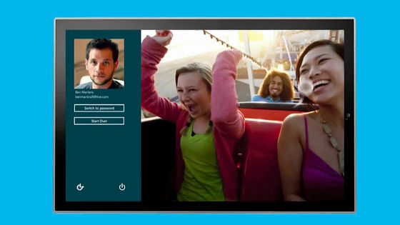
An image linked with your user name is visible on the upper left, and a picture password function is visible on the left. Although you can use the password function by the character string like so far, you do not remember the long password, but to say where you touched your favorite picture and what kind of gesture you want to make it a password It is a terrible feature.
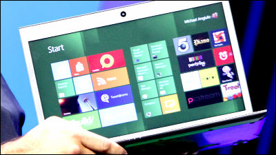
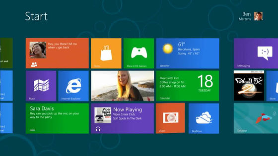
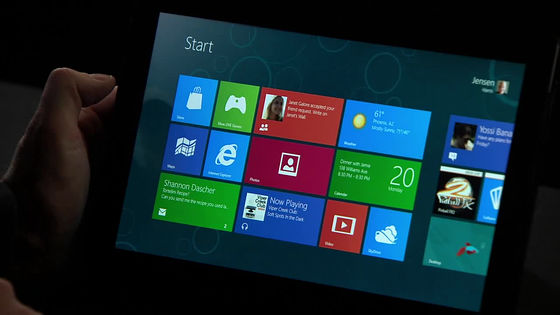
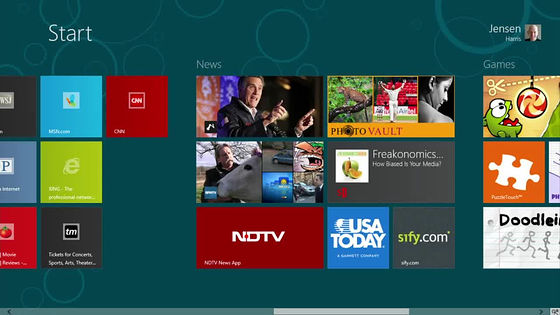
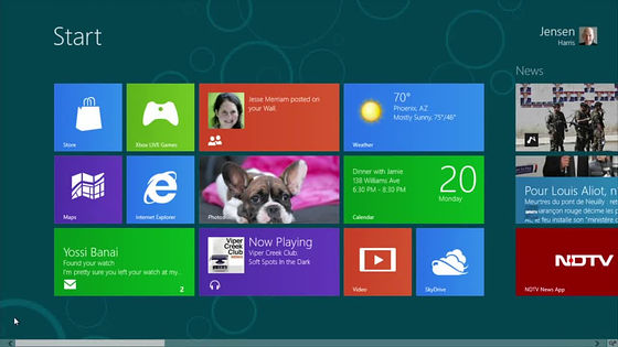
This is the start menu that is not the start menu. It further strengthens the screen adopted also in Windows Phone.
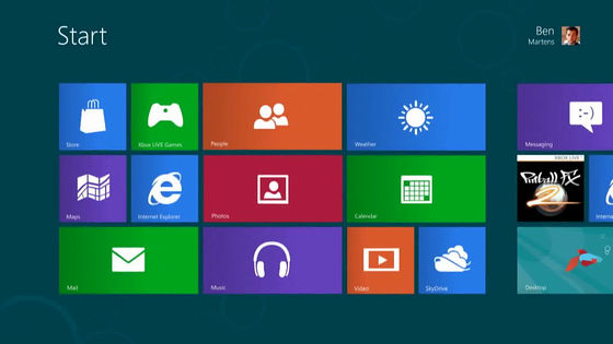
In this way you can customize the combination of tiles as much as you want
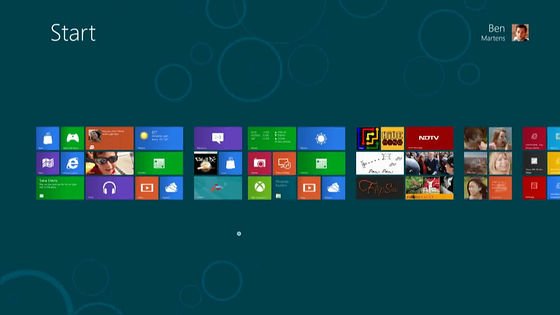
This is a scene to zoom out and customize the start screen itself
Movie full screen playback mode

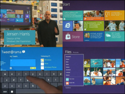
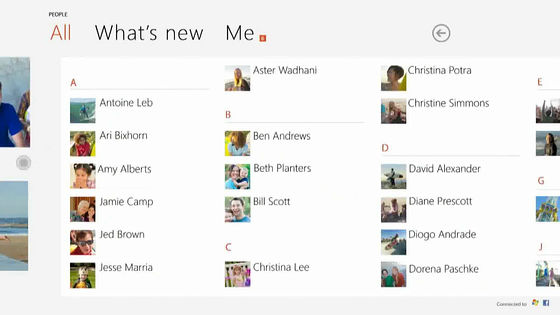
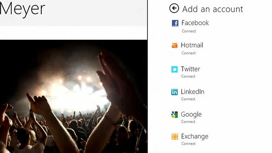
"People" application that works with Facebook, Google, LinkedIn, etc.
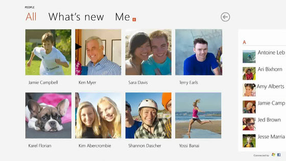
List your own social network
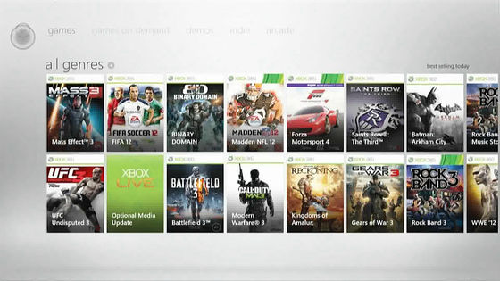
Xbox games
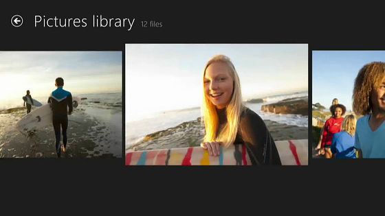
Saved photo list
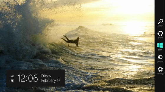
In the bar at the far right is "Charm"
For example, while watching a photo, you can quickly select the person you want to share the picture with by haste, send it by e-mail, send it to Twitter, send it to Facebook, and so on.
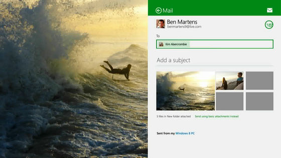
Furthermore, if there is a message arrival via messenger while browsing the picture, a balloon will appear at the top right and notice
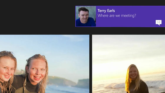
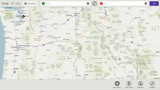
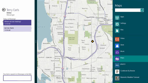
While launching the Map application ... ....
Swipe from the left and pull out the messenger
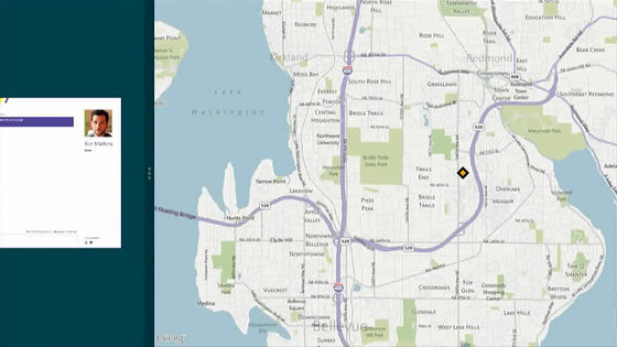
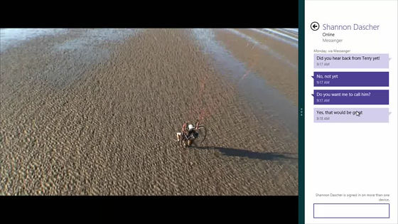
It docks as it is and fuses with the chat screen. It is a function that God did for people who are using chatting with messenger.
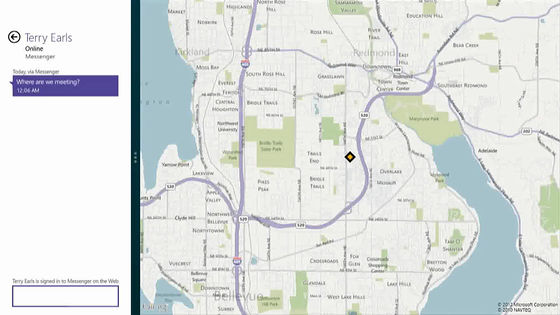
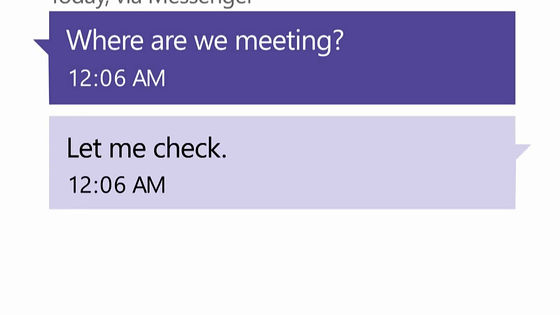
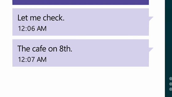
For example, when searching for a meeting place, saying "Where to meet?" "I will check it for a while".
A map is already visible on the right side of chatting and further search from the search window at the right end in the map
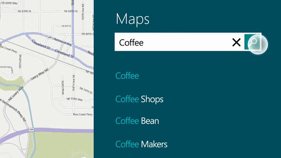
Enter "coffee" and tap
Designate a cafe in the map
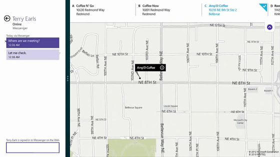
Chat by saying "Let's make this cafe"
Of course it is also possible to issue an existing Windows desktop
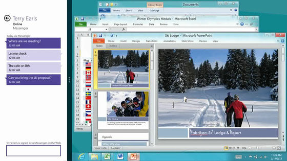
So the first one is a rough preview, the second one from here is the actual one. Here you can see clearly a part of the real power of Windows 8.
Windows 8 Consumer Preview: Product Demo - YouTube
Touch the screen and swipe (from the right to the left while touching the screen with the fingertip) ......
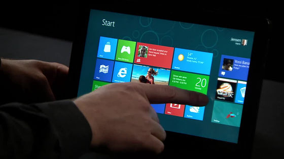
Moving like this to a combination of tiles of different start screens, the movement is extremely smooth
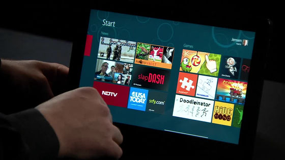
Of course, it can operate without trouble even with mouse and keyboard of the notebook PC which are not compatible with the touch screen up to now
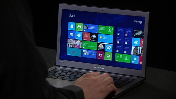
This is the screen before login. What is visible in the lower left corner is the current time, plus today's schedule (where and where you meet and where), wireless LAN status, battery status, number of incoming messages, number of unread messages, etc. It is displayed.

Picture password that I saw in the upper left is yourself, the one you see right is the picture password that came out. It is also possible to switch to the password as before.

For details on Picture Password, see the following page to explain in detail how its principle and how robust it is.
Sign in with Picture Password - Building Windows 8 - Site Home - MSDN Blogs
http://blogs.msdn.com/b/b8_ja/archive/2011/12/22/signing-picture-password.aspx
Optimize Picture Password Security - Building Windows 8 - Site Home - MSDN Blogs
http://blogs.msdn.com/b/b8_ja/archive/2011/12/24/optimizing-picture-password-security.aspx
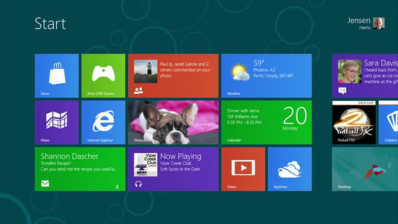
Start screen immediately after login
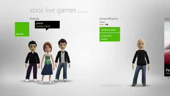
Can also work with Xbox avatar
This is a state that shows your friend on the start screen.
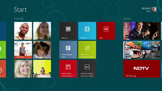
In particular, it is possible to share photos, movies and pages immediately with the latest activity history of friends of good friends and their opponents. We will automatically pull out the detailed profile of the other person from Facebook etc., so there is no need to rewrite each time.
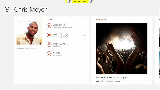
This is where you are looking at the photo history you are uploading
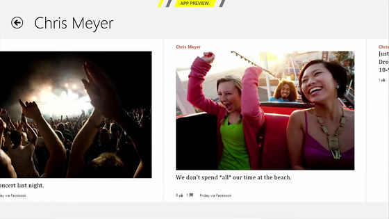
If you feel that it is quite a nice picture, you can share it immediately using Facebook, Hotmail, Twitter, LinkedIn, Google etc.
Switching applications that are running are also compatible with touch screens and can be switched with a touch of pulling out one after another by simply swiping from the left end
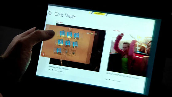
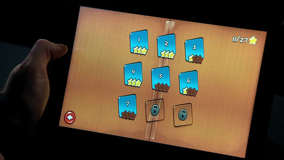
Call Internet Explorer 10 while switching game
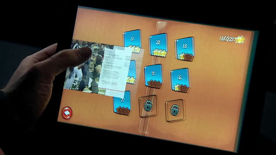
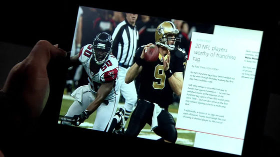
Switching to weather while watching the stock price.
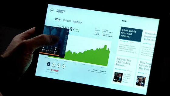
The weather application of this time Windows 8 is cool.
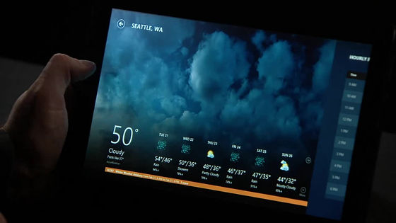
It is also possible to arrange vertically laid applications in this way and list them in thumbnail images
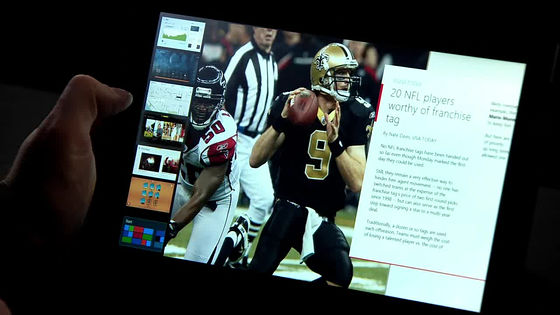
Touch the thumbnail image of the application you want to switch ... ...
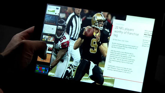
Switching to Popo

Swipe down from the top to end the application
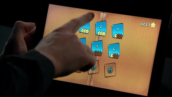
Apps that are visible become smaller ... ...
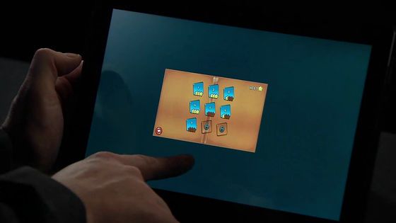
I will fall down to the lower side, it will fade away
Then I feel like returning to the start screen
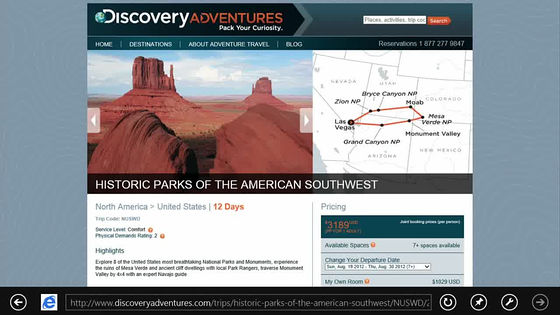
This is the latest Internet Explorer 10. The address bar etc. are moving to the bottom of the screen.
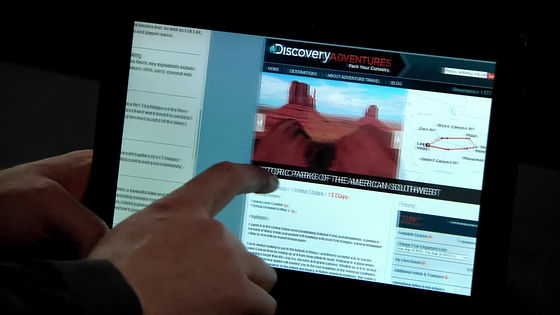
Swipe to the left of the screen to return to the site you saw just before
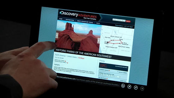
The site that I saw before the scroll will come out
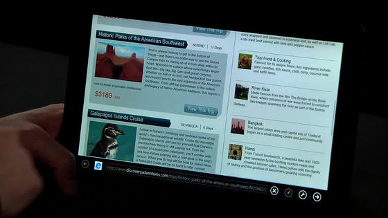
If you swipe the top of the screen further, the history of the site you saw in the past can be roughly listed as a thumbnail image.
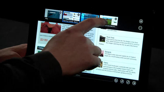
This way you can switch the page you are watching with the same operation as the application switching, the same feeling, with one shot
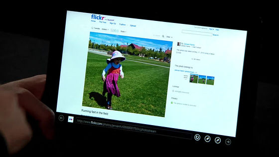
If you want to share the photos of the page you are watching, swipe right of the screen this time
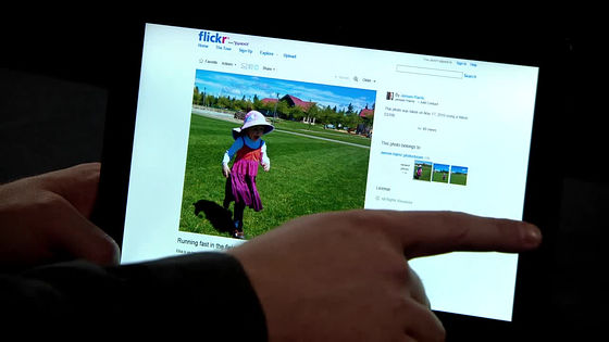
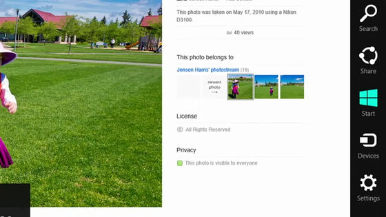
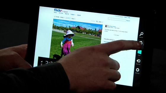
Various charms such as "search" "sharing" "start" "device" "setting" appear
Tap "Share" this time
The things that are visible to the right are the contents of the sharing, the top three photo icons are mailed to your friends and shared, below which icons to share with "Mail" "Renren" "SkyDrive" "WordPress.com" There is.
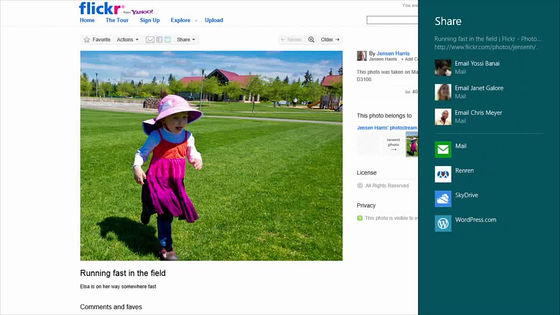
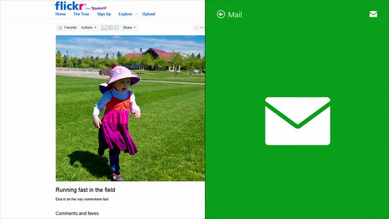
Tap email this time
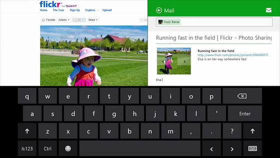
The on-screen keyboard is activated, and you can enter it casually
Next is the customization of the start screen. Pay attention to the lower right corner of the image below, and tap the magnifying glass icon
Then you zoom out and zoom into the Customize screen
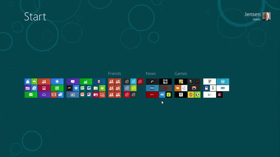
Easy to replace or move by group by drag & drop
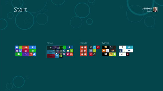
Of course you can easily zoom in and switch various tiles in the same way and move them
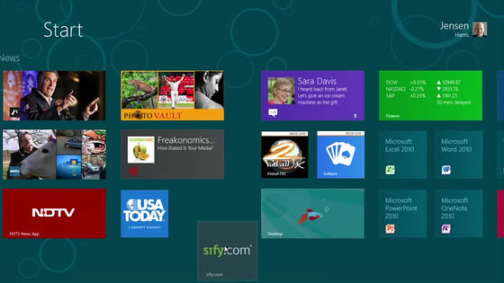
I can not find the start button which was always left in the lower left in Windows, but if you move the mouse to the lower left corner of the screen, the thumbnail image of the start screen jumps out in this way
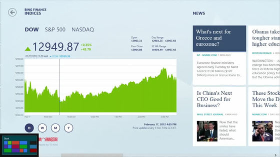
And in this way it is possible to switch to the start screen immediately
If you move the mouse to the upper left corner to return to the previous app, the thumbnail image of the application that was running up to the point pops up a little
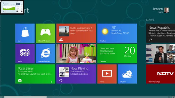
If you place the mouse in the upper left corner, you can switch back and forth one after another
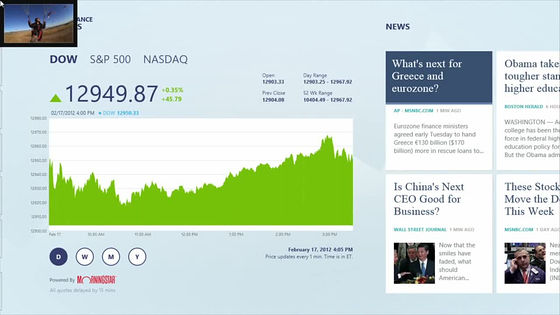
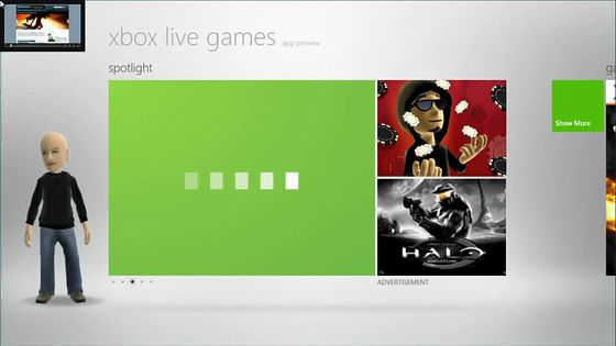
If you move it further downward as it is, the thumbnail image of the app that is running is displayed in a struggle
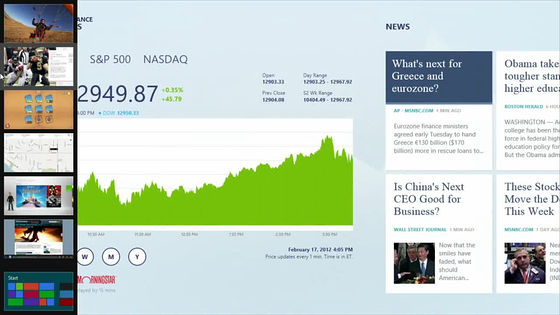
It is really flexible and freely to arrange windows of each application. While looking at photos, pulling out the messenger application and pulling it out ... ...
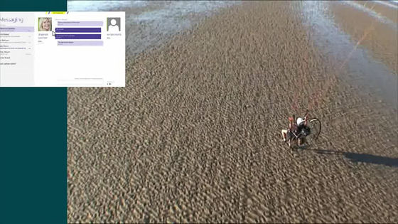
Continue to the right of the screen
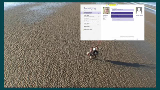
Pointing and throwing, you can browse images while docking and chatting
Now switch the application while displaying the conventional desktop
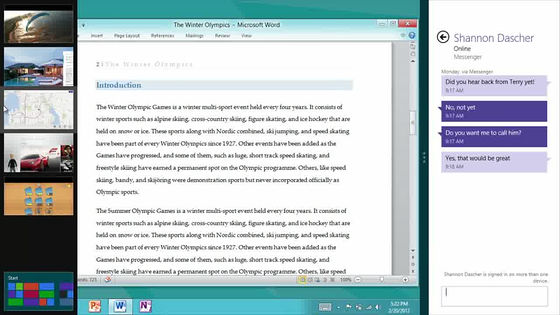
Pull out the page I was watching from the thumbnail of the switch and poip to the right end.
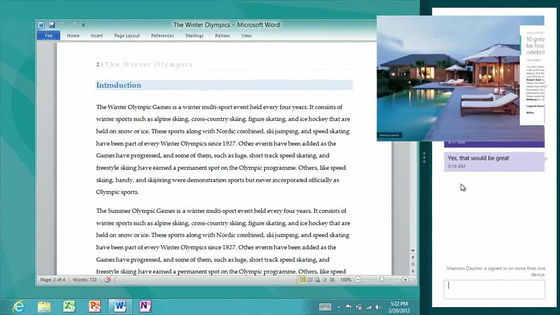
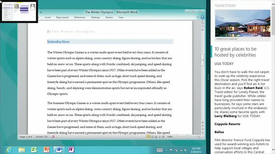
By displaying the page you saw in this way, you can easily create sentences like Word, in Word while referring to the contents of that page
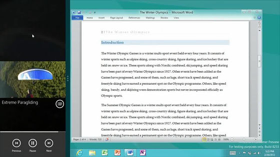
Docking on the right edge while playing the movie
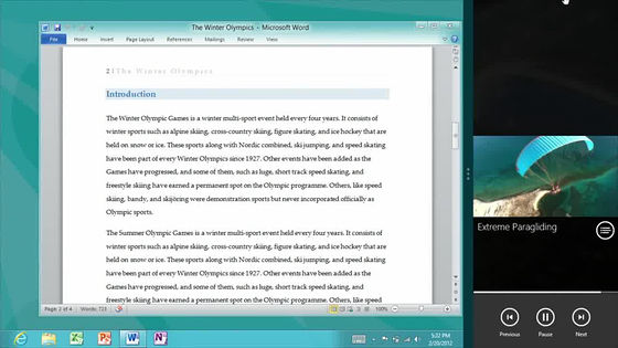
Drag as it is to the left
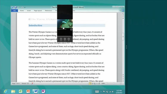
Dock to the left. In other words, you can move it to a place you like, whether right or left.
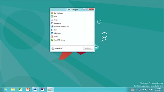
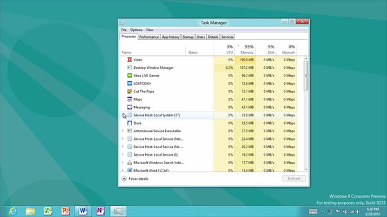
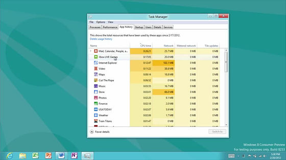
And this is a new task manager
CPU · Memory usage · Disk access · Can be sorted by network bandwidth being consumed
It is also possible to graphically see the total CPU utilization rate, memory usage rate, disk access speed, network usage transfer amount, etc. from startup to the present
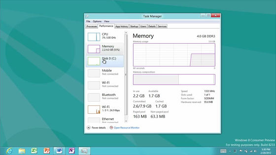
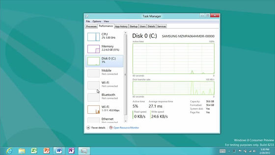
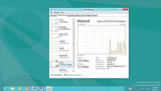
You can also see the total total CPU time and network transfer volume used by the application for each application launched in the past
Next is a copy of the file
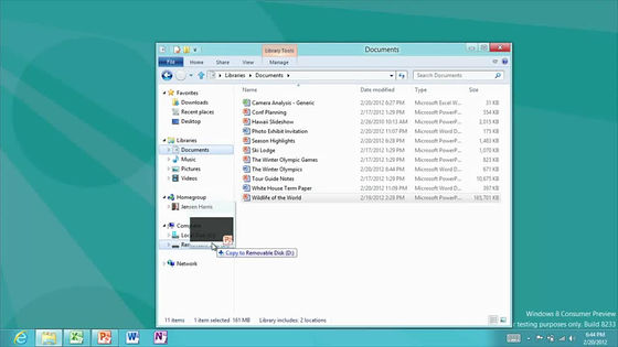
You can see how much bandwidth you are consuming in this way, and how many MBs you are copying per second by a graph display.
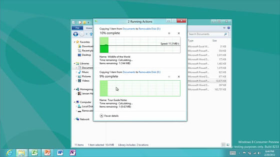
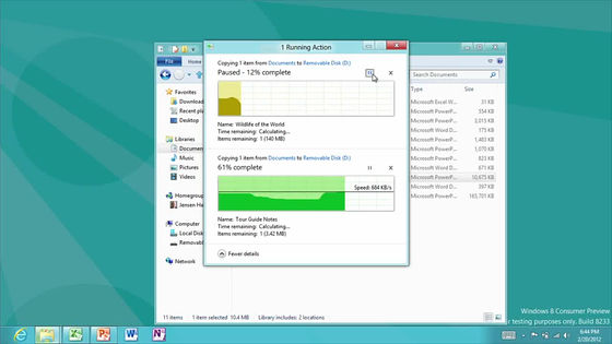
It is also easy to pause, so it's easy to copy the files and move them first before moving them
Now start mail from the start screen
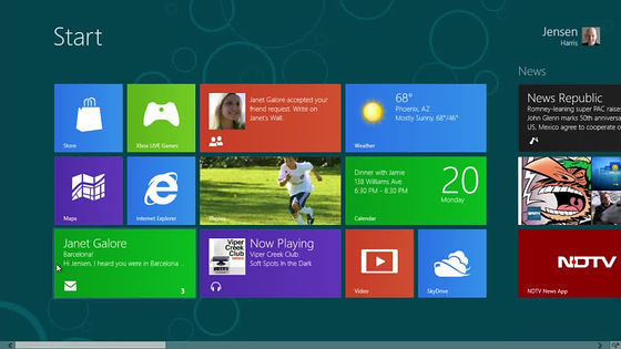
This is a mail application

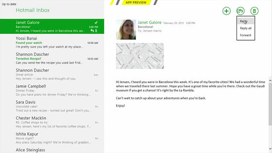
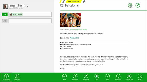
Search Hotmail's received mail from the list on the left and display it on the right. Since there is a reply button at the top right, tap it.
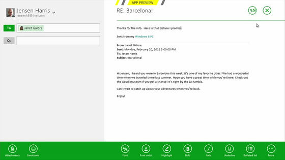
The left side is the mail address, the right side is the text etc. Since you can edit the place where you tapped anywhere immediately, it is intuitive for both reply and e-mail creation.
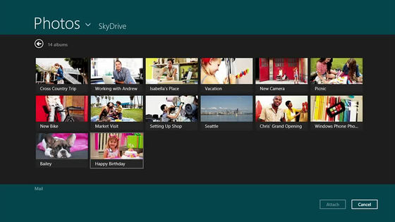
To attach a photo to an email, the photo application launches
"Picture library" saved in your computer, and you can specify "SkyDrive" "Facebook" "Flickr" on the network
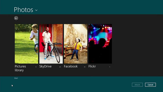
What is in SkyDrive. Thumbnail images are also displayed casually.
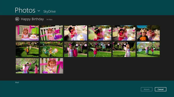
This is a picture on Facebook, which is also casually displayed.
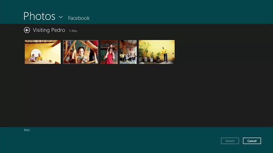
Tap the image you want to attach and select it, tap the attached button
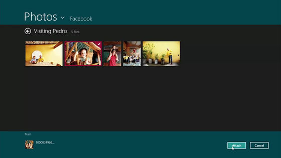
Then, the mechanism that the image is attached in this way
Cooperation with the page you are seeing is also quite powerful. Pull out the charm from the right end.
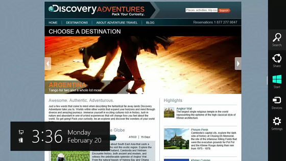
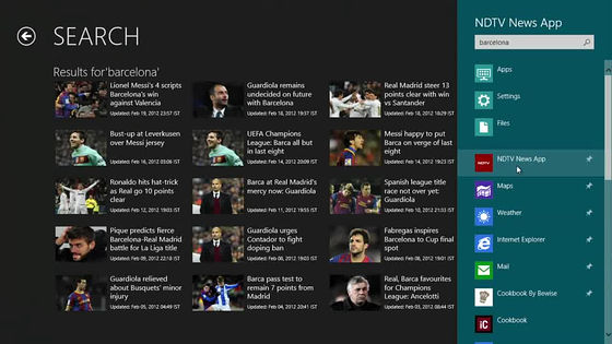
Search
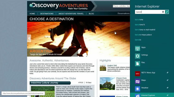
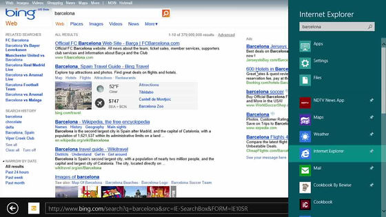
Switch to IE with haste
news list
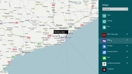
map
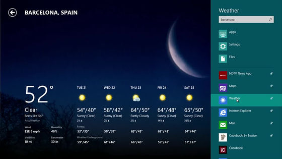
weather
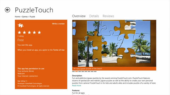
And this is the new Windows Store, you can buy apps from here, install and update is possible with haste.
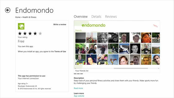
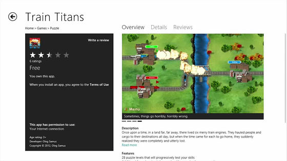
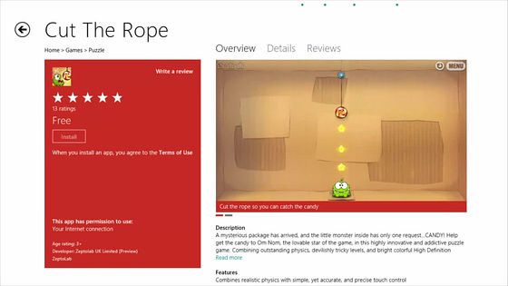
As far as I see the state so far, it has a structure that further strengthened the smartphone, it is designed to be able to be used almost without discomfort if a person using an existing smartphone is afraid of using the strength of Windows itself Because many of the cooperative functions are implemented, it is especially important for users who place great importance on communicating with various people online, and for most users who value human relationships in real life. It is likely to be Windows to keep it strong.
Also, there is only the current Windows 7 core, all the operation feeling and the desktop as it is still inherited as it is, it is not to be unusable if you do not get used to the new screen, just to say it is old It does not leave the screen as it is, and it is felt that it is finished in Windows which has not been so far by switching well or blending with Windows-like place and new place.
In addition, it is probably not a lie, it seems that it seems that smooth switching or crisp feeling presented in this movie is not a lie, and it will be moving like this in the end, it should be understandable if only a few Windows Phone 7 users is. The Windows Phone 7 now is almost, it really moves like this. No doubt the day will come when we make smartphones the interface of Windows itself, I feel the flow of the times.
Related Posts:
