Adidas (adidas) new headquarters building stuck to functional design excelled
In the 1920 's, he first started making sports shoes in a small rural town in Germany as a shoe store named Dusler brothers' shop, but in 1948 he broke up and broke up, brother Adolf Dassler who was in charge of manufacturing and manufacturing Shrink the name and last name of "AdidasBrother · Rudolph · Dassler who was in charge of selling to "the company" became "Ruda" company, the following year a further light "PumaWe renamed to the company, and it reaches the present.
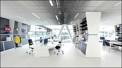
That's why adidas and puma have headquarters in a very close place (common name:Adipu Village), Adidas has completed a new headquarter building of quite excellent design this year. Not only the exterior but also the office design in the middle are stiff, and the desk in the office has its own functional design.
WORKOUT - Interior by KINZO >> Yanko Design
Kadawittfeldarchitektur
Adidas WORKOUT | KINZO Berlin
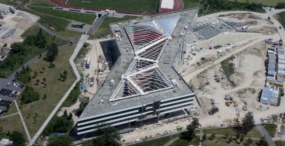
This is an appearance
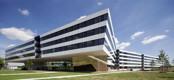
Pretty sharp design
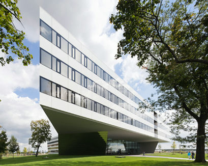
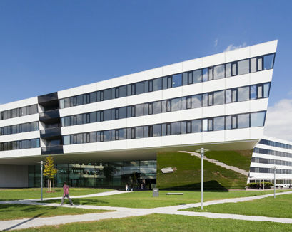
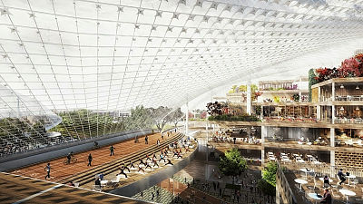
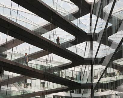
The inside is like this. It is a feeling that outside light is plunged into the plenty, and the concept around here is similar to Google head office.
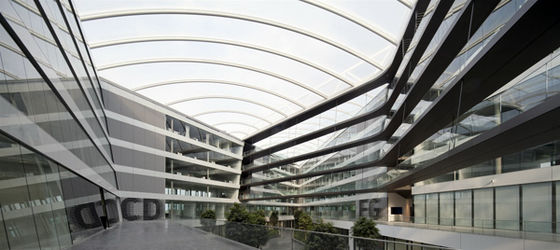
Bridges
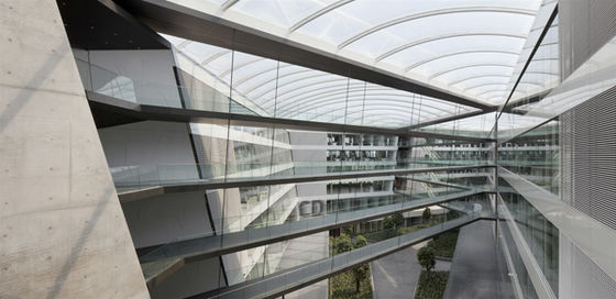
It connects with each side part
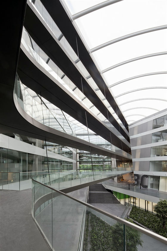
Void of a tremendous height
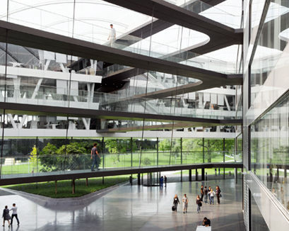
Futuristic
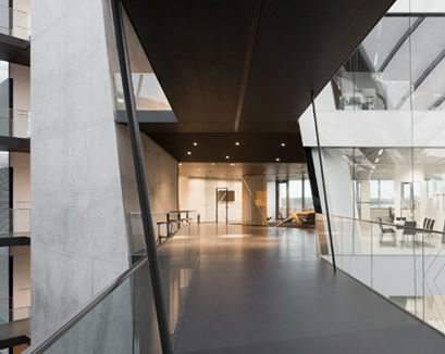
The corridor is like this
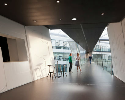
Oblique space
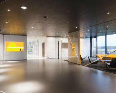
Lobby of the atmosphere which is absolutely a sports maker
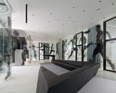
There is also such a floor
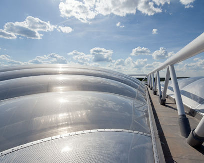
The roof is like this
In the office
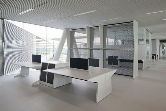
It looks like a concept design somehow, but it is a real mono
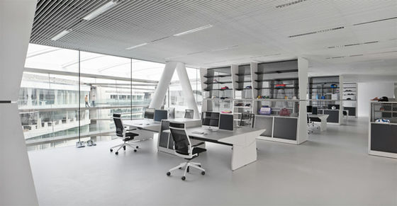
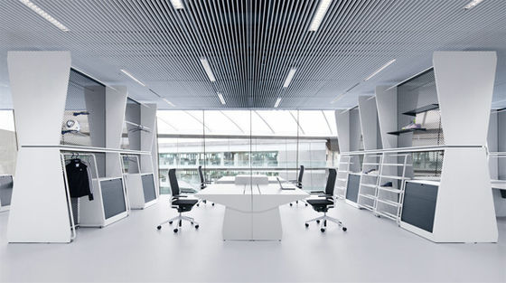
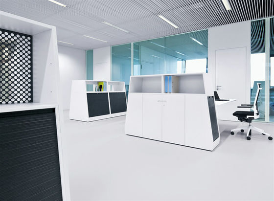
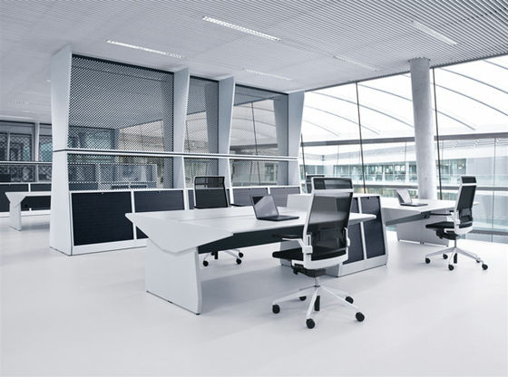
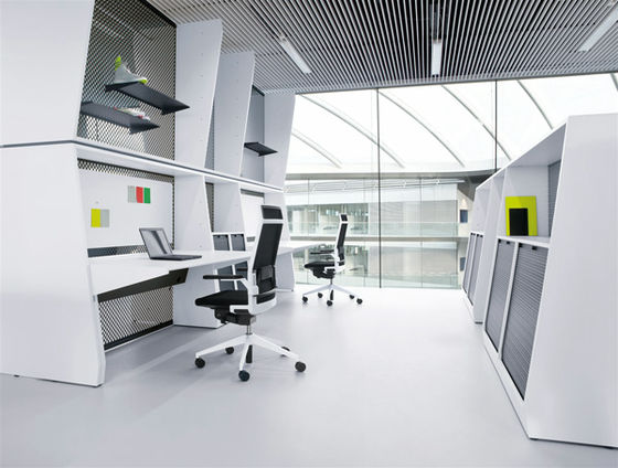
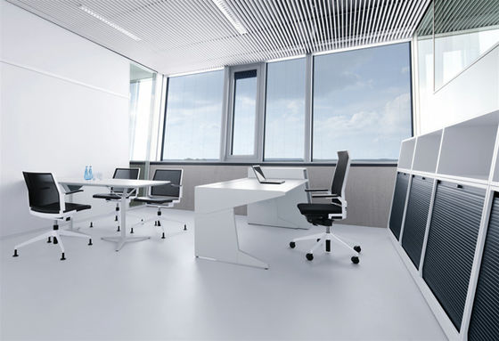
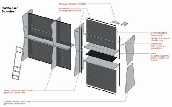
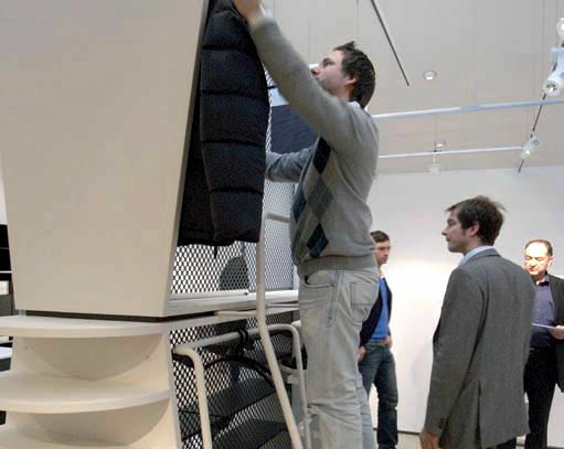
The size and shape of this shelf is not a strange design
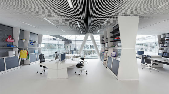
It is based on such ergonomics
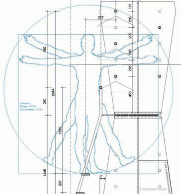
Therefore, it is easy to take out stored items
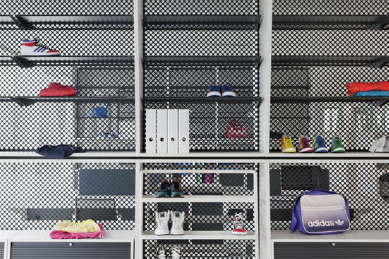
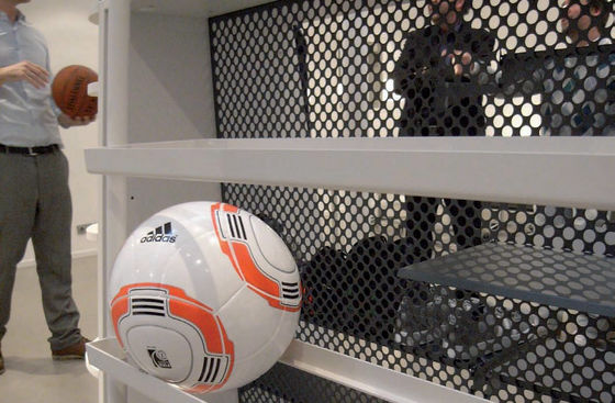
It is also possible to display prototyped balls
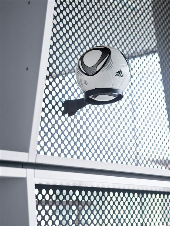
It is designed with ease of use as the main theme, and you can see the attention as a sports goods maker
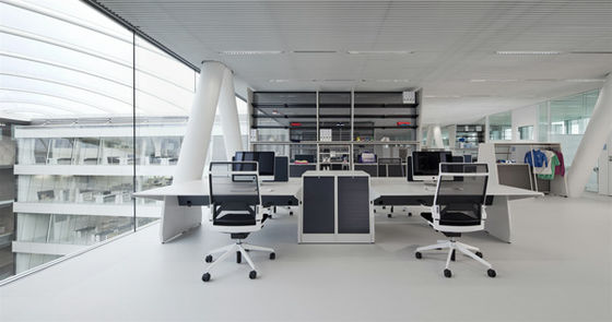
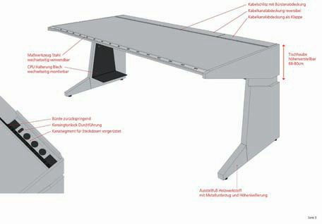
The desk can adjust the height is also a point, it is possible to up and down according to the sitting height and body shape
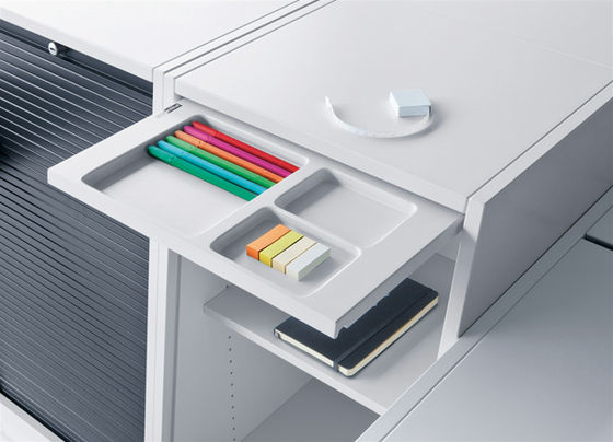
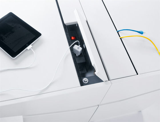
Desk drawer
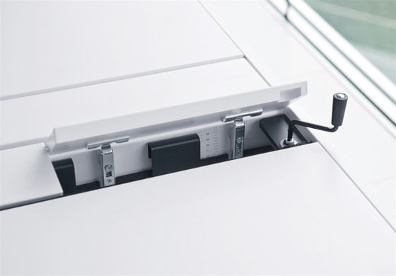
Power supply from here
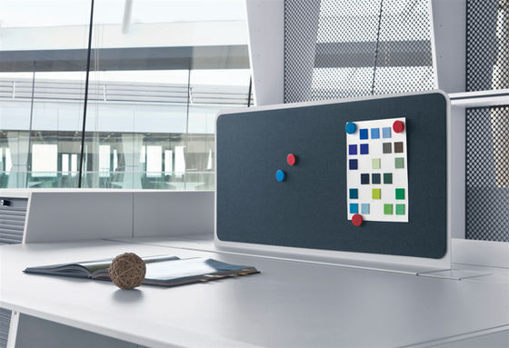
Effectively utilize the partition with the desk opposite
This goal net like thing also works as a partition
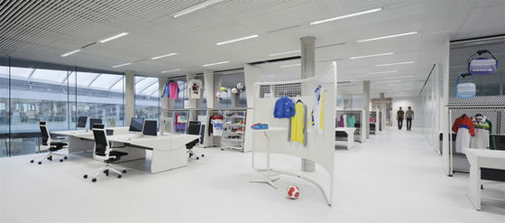
It becomes like this
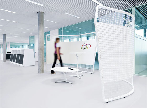
Looking at how it actually works from outside
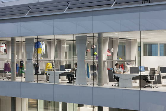
As headquarters are engaged in designing and developing a variety of main products, "white" seems to be the color tone so that it is easier to examine their designs and colors
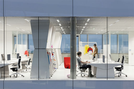
It will be like this at night.
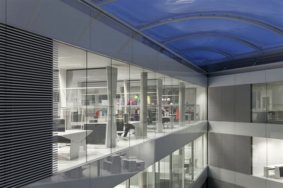
You can see which department works well
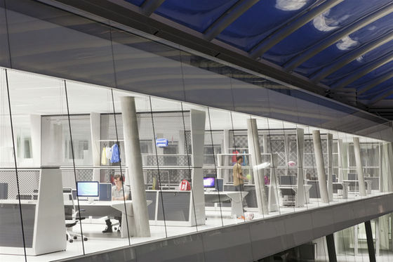
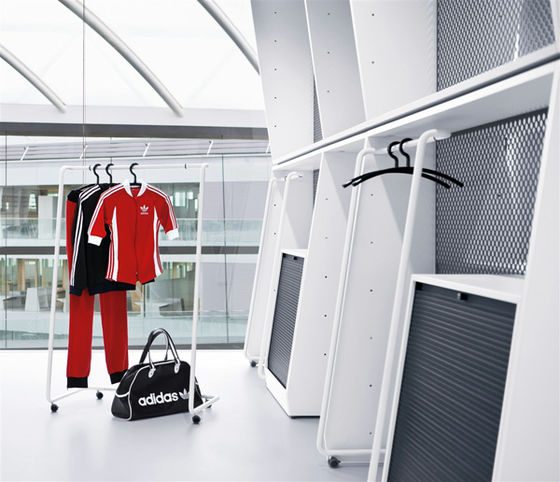
Hanger and container type locker
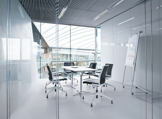
This is a meeting room. Especially the desk for this meeting is a tremendous amount of stuff, there are only things that are focused on planning and development, and ingenuity to smoothly advance the main meeting is actually hidden.
Power cable can be stored compactly
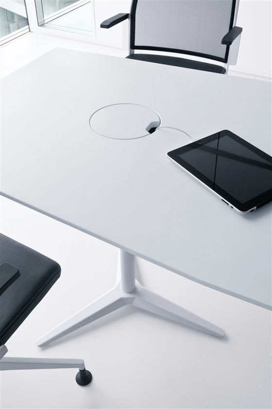
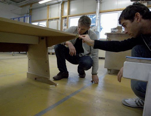
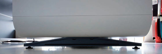
And this leg part is commitment. Actually, I think that it is understood to the person who examined the table and the desk of this size actually, but if you use chair with casters "legs" will be in the way anyway, how to make the leg part compact There is a point. However, the strength is lost or the load limit on the desk is not reduced, but it does not mean that even if the installation area with the floor is increased, it will not stabilize, even if the floor is damaged, it is not good It is difficult, but I clear it well.
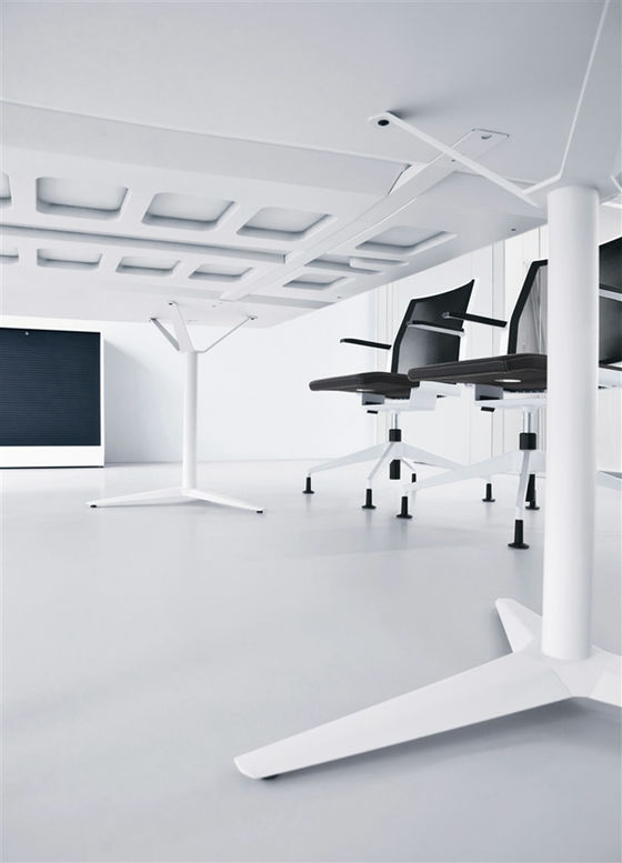
Careful checks and trial and error have been done in this way so far
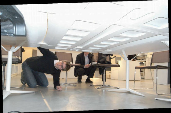
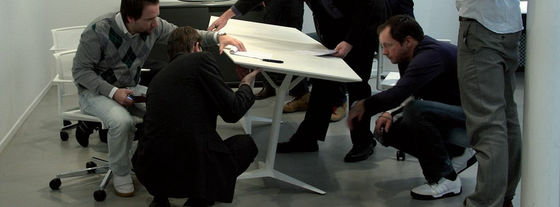
Model of leg part
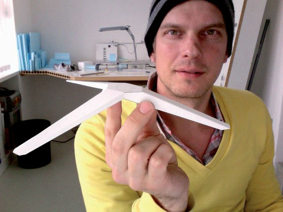
Finished product, this sticking commitment
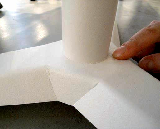
You can see that the building itself is made easy to move
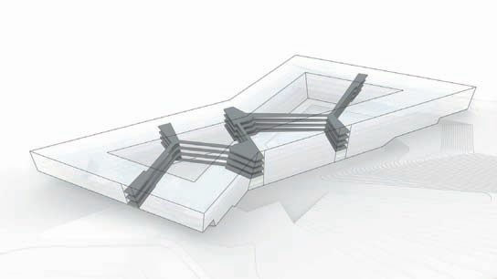
Looking from the top like this
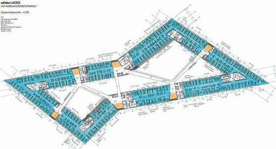
The interior is like this layout
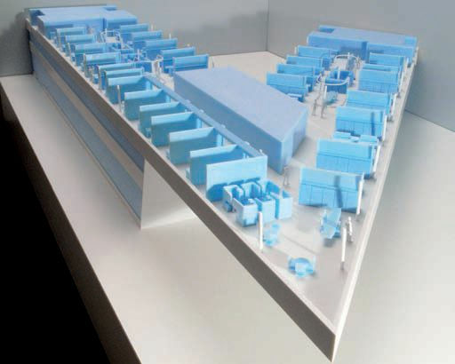
Sample model at the first point
When you look at the first conceptual design, you can see well that the open images and various designs are not blurred to the end
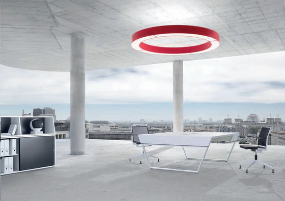
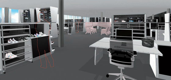
This is also the initial rendering image, almost the same as now
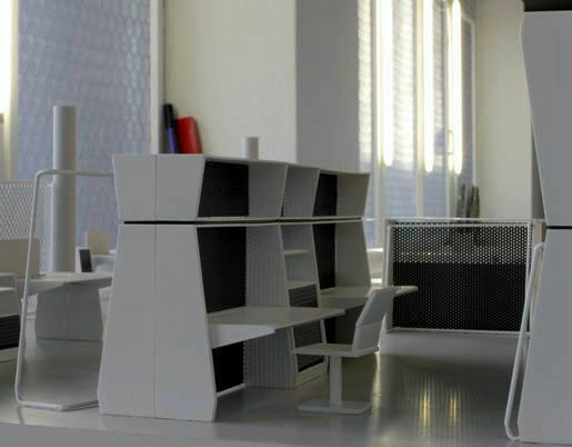
model
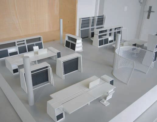
Model of 1/20 size
Even if it is one shelf used by the design team, it is authentic like this
Prototype
Office desk to do daily work
It is strictly designed in this way
Shelves arranging trial shoes, what is necessary because this area is Adidas
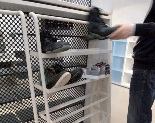
Final prototype
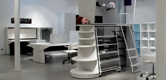
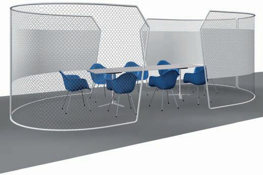
Multipurpose office that can be used for meetings
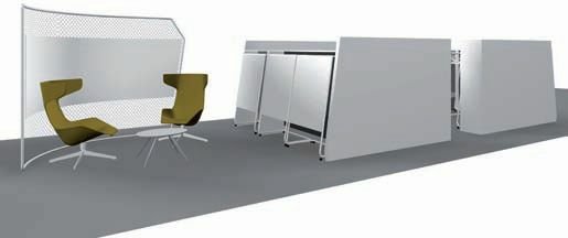
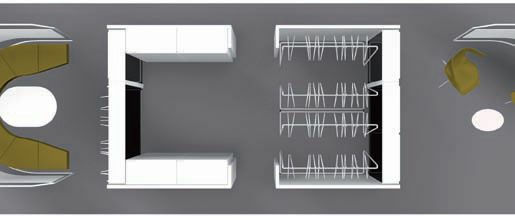
The partition is a goal-net style
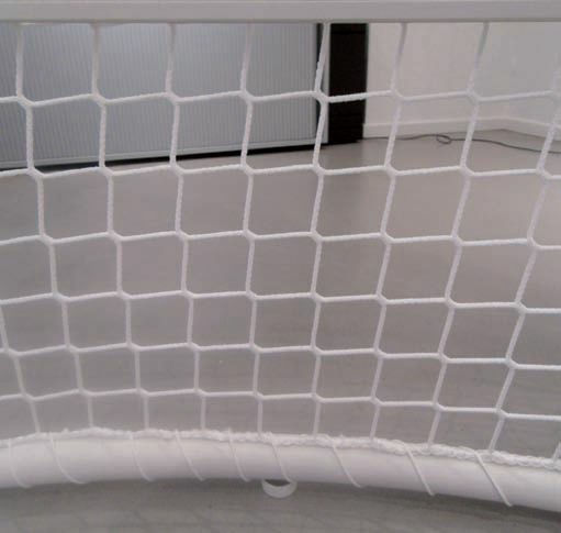
Or assuming to use it like this
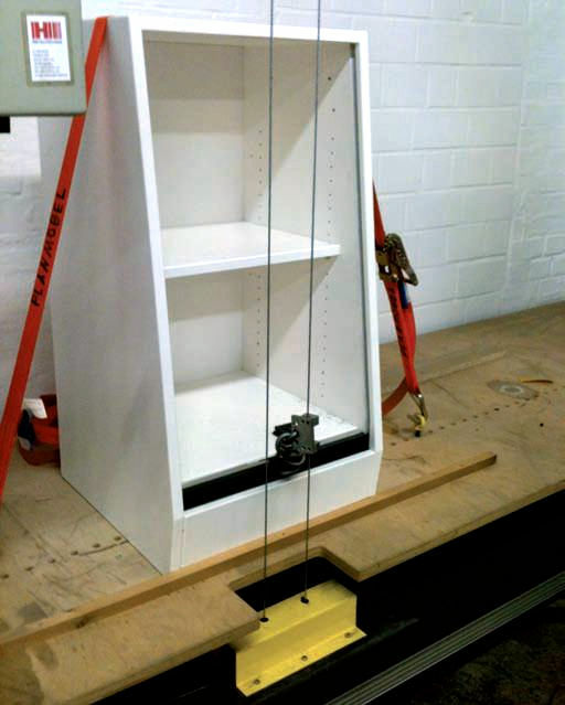
Locker shelf prototype
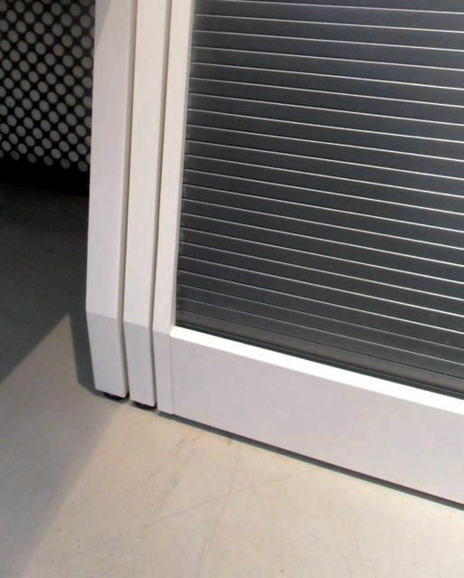
Private is also kept as it closes properly
A shelf for placing the prototype in this way and seeing it
Development team floor where various materials can be arranged side by side
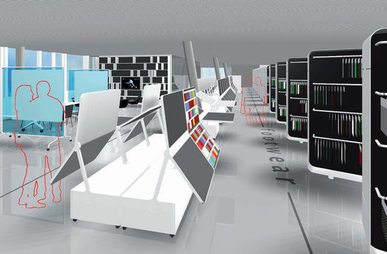
Actually it will be
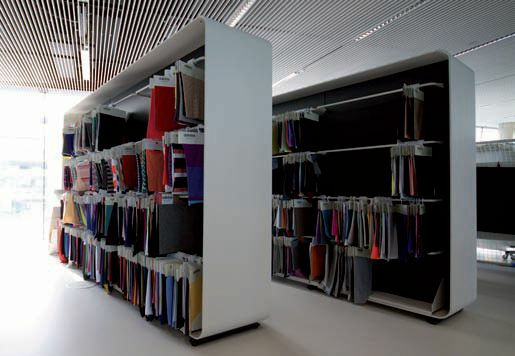
Place to place materials and place prototypes
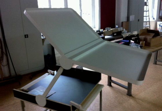
I will stick to the edge of the edge
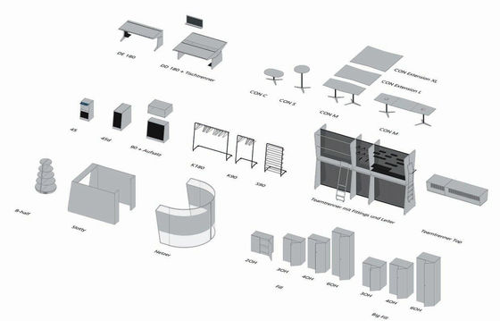
As a result, a lot of newly designed office furniture in the end. We combine these to create a comfortable and functional office.
Related Posts:
in Design, Posted by darkhorse
