GIGAZINE's site design has been renewed
CMS currently in use at GIGAZINE "ExpressionEngine 2.1.3In addition to the update of "GIGAZINE" top page of site design has been renewed.
Basically, every time a new personal computer is released, the screen resolution of GIGAZINE readers is rising, and since it is often unnecessary to look at the current layout as it is, the original taste that was fixed (yellow headline It is up to now that I changed my design daringly.
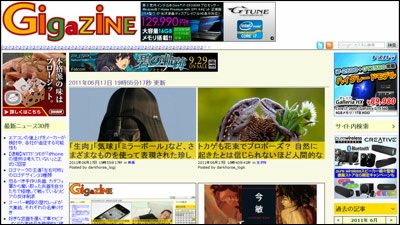
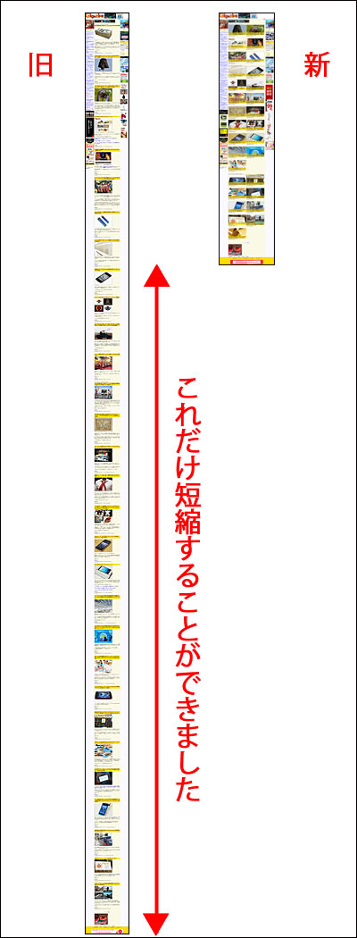
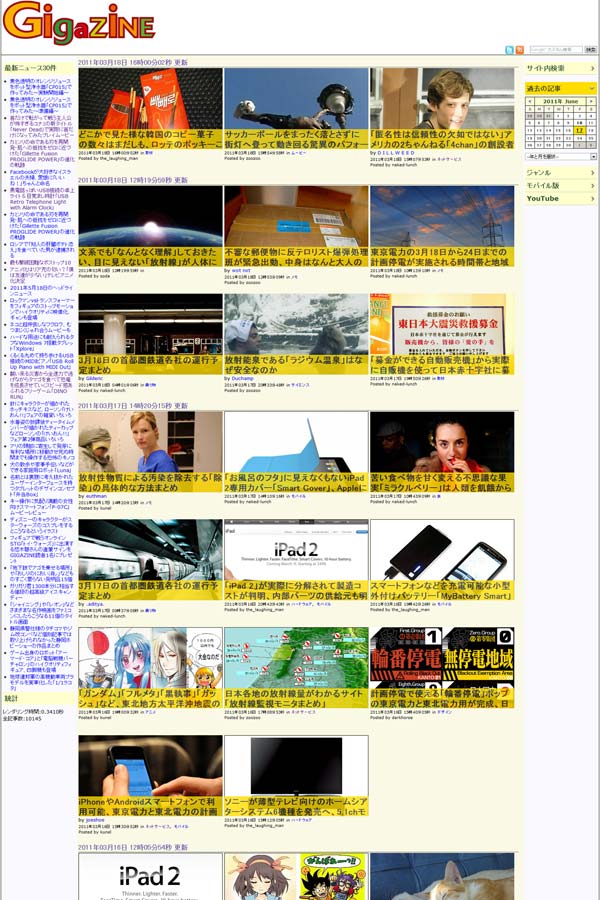
Here is the layout before renewal. In the case of a screen with a horizontal width of 1024 pixels, it looked like this.
However, from around last year the number of users with a width of about 1280 pixels began to increase, and it is now the number one user in the horizontal 1920 x 1080 vertical.
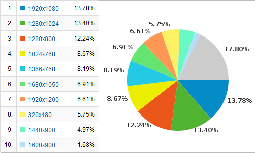
As for the percentage of the total in more detail, the top ten is like this (The breadth of 1280 pixels wide is bold).
First place: Width 1280 pixels: 27.21%
Second place: Width 1920 pixels: 20.41%
3rd place: width of 1024 pixels: 9.79%
4th place: width of 1366 pixels: 8.19%
5th place: width 1680 pixels: 6.92%
6th: Width 320 pixels: 5.99%
7th place: width 1440 pixels: 5.01%
8th: Width 1600 pixels: 3.47%
9th: Width 2560 pixels: 1.13%
10th: Width 800 pixels: 0.47%
Originally it was laid out on a narrow screen based on a width of 800 pixels to 1024 pixels in the first place, but already more than 70% of the total already exceeded the width assumed here.
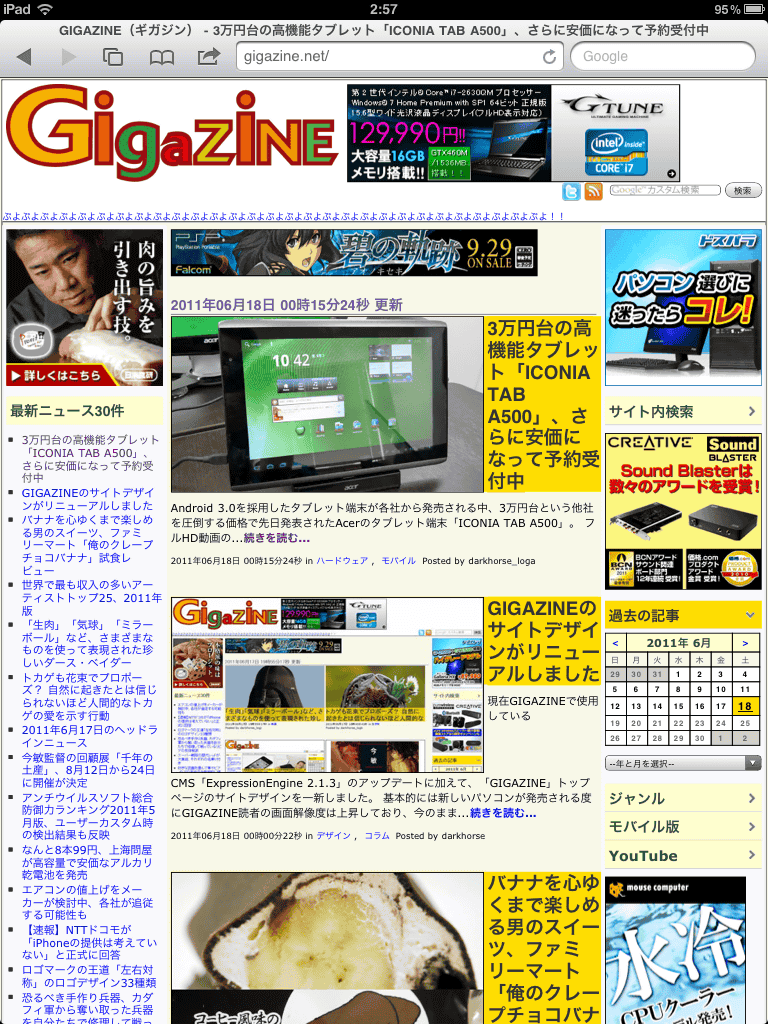
In addition to increasing the number of article display on the top page one after another, it became too long in the vertical direction and the scroll bar on the right was also small. If you capture by full-screen scrolling with a width of 1024 pixels, it becomes like this. It is too long.

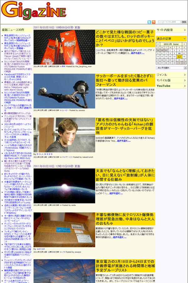
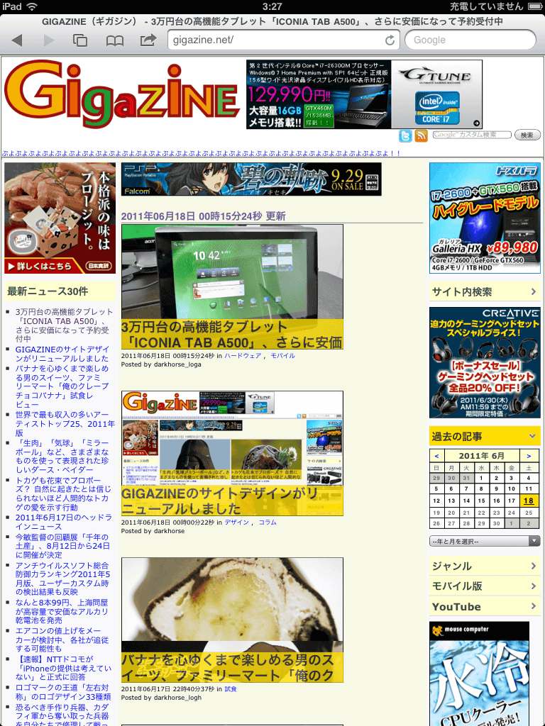
Therefore, when the width is 1280 pixels or more, it is made to display like this. This is the case when the screen resolution is 1280 × 1024, and the browser display is done on the full screen.
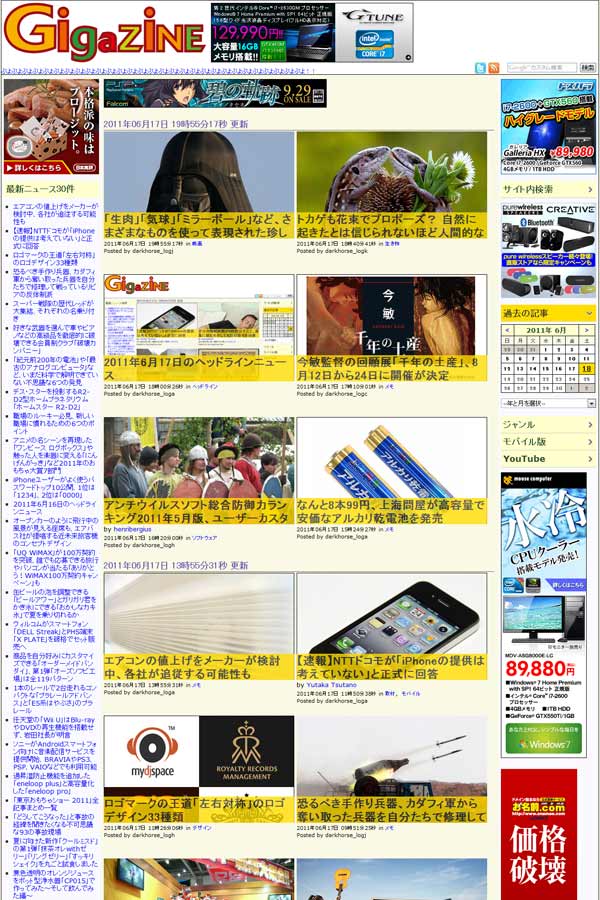
By keeping the left and right menus as it is, by setting the middle content part to 2 or more columns, it is possible to increase the number of articles when displaying the page at the beginning by one from two to more page scrolls We have made it possible to eliminate the trouble of even a little, and improving list quality.
When browsing with full HD resolution, that is, 1920 × 1080, the middle content will change from 2 columns to 3 columns, and the listing will rise.
This time, we lay out with a width of 1280 pixels or more, but in an environment less than 1024 pixels you can see with a different layout of one column. The following images are displayed when browsing with 1024 × 768 pixels.
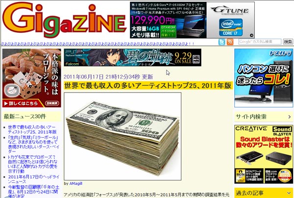
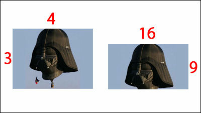
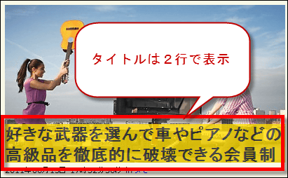
There are also some changes in the new layout for the article, and the top image was a ratio of 4: 3 until now, but it is 16: 9 to match the layout of the landscape standard.
For the top image of each article, the title is displayed over two lines at the bottom.
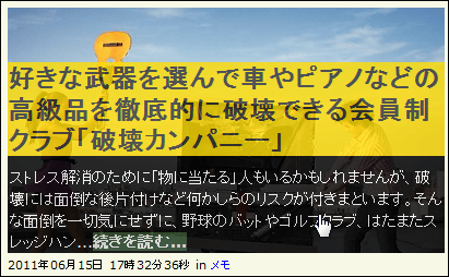
When the mouse cursor moves upward, the continuation of the title and the first part of the body are displayed in this way. At first, I also thought to display animation with Nyuran, but I consider it to be displayed quickly, considering viewing every day. Linked so that you can read articles by clicking from anywhere on this thumbnail image.
As the major update of "ExpressionEngine" itself lost the mechanism of trackback, we decided to terminate the mechanism for accepting and displaying trackbacks. Instead, I try to display what I was retweeted about each article of GIGAZINE on Twitter.
Well then, thank you very much for your continued support.
2011/06/18 0:27 Addendum
Please wait for GIGAZINE for smartphone version a little more until the start of operation.
Also, although the design of the top screen is now changed, we are also considering changing the layout of the content of each article. Because it seems to be missing mainly when it is wide, it will do it as soon as possible.
2011/06/18 3:32 Addendum
If the horizontal resolution of the screen resolution is too low, the layout looked something like this and it was terrible. This is the case of "iPad 2".
Therefore, I changed the layout earlier. Basically, it seems that it applied the same display mechanism as it was when the width is 1280 or more, but it should have become much easier to see.
2011/06/20 9:36 Addendum
As a result of consolidating and examining what we gave you ideas in concrete opinions and suggestions, we decided to apply them sequentially.
2011/06/20 16:08
Based on the opinions received, I changed it as follows.
◆ 1: Do not over the mouse over, put a title under the image, show all the images. The title is fixed by the size of two lines.
◆ 2: Set the lower limit of the top page width so that the middle column will not collapse if the screen is small
◆ 3: The gap between the left menu and the body image and the gap between the thumbnails are the same width and are aligned. This makes it easier to distinguish between side by side articles
◆ 4: Delete all the dates, times, categories, etc. that were under the top image
◆ 5: The date and time will be placed on top of the top images of all articles
◆ 6: Make it possible to distinguish articles that have already been read, make the date part put on top of the article clickable so that the color there changes
◆ 7: Change the link to 30 previous GIGAZINE top page to "button to see previous article >>" to expand the range that can be clicked
I am still doing fine adjustments elsewhere, but I think that this level of change is perhaps conscious. We appreciate the many readers who sent concrete and constructive opinions, Thank you very much!
Related Posts: