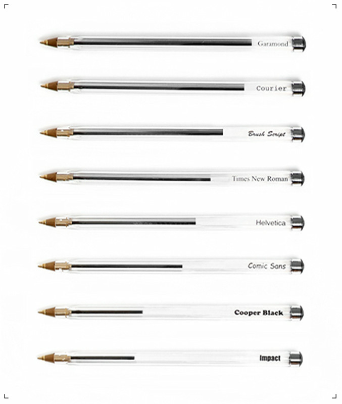
When you examine it by drawing with the hand actually which font consumes the most ink, it becomes like this
Previously, at GIGAZINEInk for printers is more expensive than bloodI told you that. In order to save even a little of this expensive ink, the fiercest who tried to examine the character by actually using a ballpoint pen appeared as to which font does not consume the most ink.
Details are below.
Measuring Type: Tom Wrigglesworth
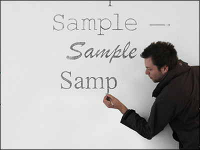
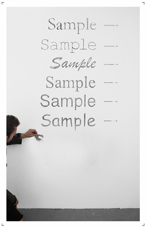
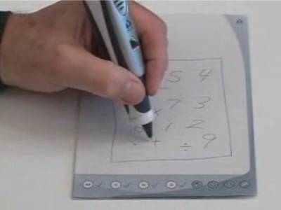
With freehand handwriting I began to draw "Sample" characters.
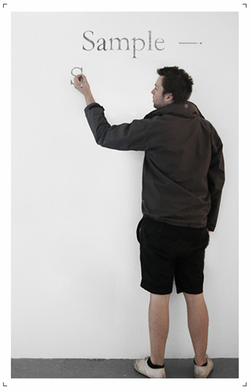
Do not use rulers or patterns at all, straight straight lines, curves smoothly.
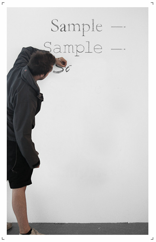
Of course, I feel that I have properly drawn the features of each font.
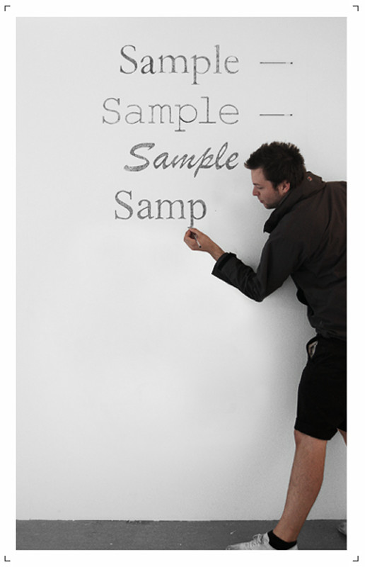
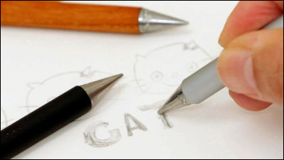
We will also paint the "Black" type font whose line width gets thick with guts.
It is completed in a little more.
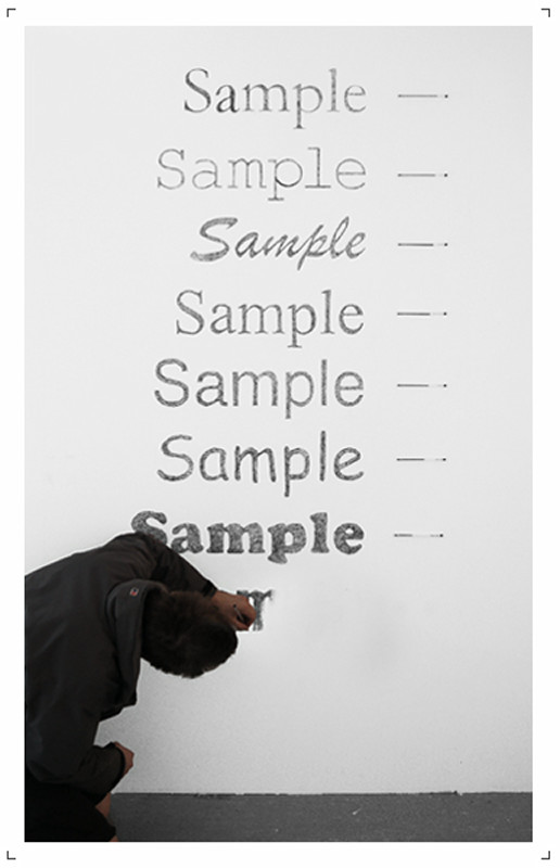
I would like to doubt whether this person is really a human being if it is drawn so far.
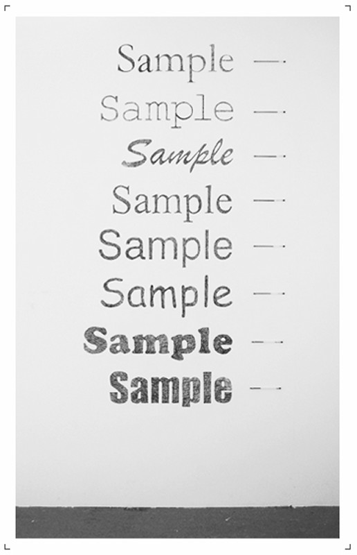
That's why ink consumption comparison. However, it is familiar with Apple's logo that we do not consume inkGaramonIt seems to be.Cooper BlackIt is natural that there is a lot of ink consumption of bold fonts such as, but with a clear designHelveticaIt is unexpected that the ink consumption of (the fifth row from the top) is relatively large.
I feel that it is surprising that techniques that allow you to precisely draw fonts are more surprising than the results of experiments.
Related Posts:


in Note, Posted by darkhorse_log