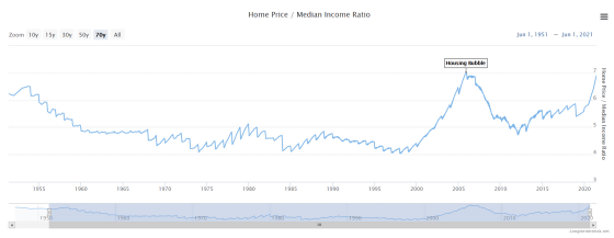
A graph of the relationship between house prices and annual household income over 70 years looks like this

Home Price to Income Ratio (US & UK) --73 Year Chart | Longtermtrends
https://www.longtermtrends.net/home-price-median-annual-income-ratio/
First, a graph of the ratio calculated from the 'median house price / annual household income' in the United States looks like this. The values from 1955 to 2020 are graphed, but the graph has been declining since World War II, and from 1960 to 2000, the house price was 4 to 5 of the median annual household income. It was double, but the graph has skyrocketed since 2000. In 2005, just before the Lehman shock, house prices rose to seven times the median annual household income. After that, when the bubble burst, the graph plummeted, and until 2019 it was around 5 to 6 times, but after 2020 it is nearly 7 times again.
According to investor Mike Maloney, the above ratio is greatly affected by interest rates.
On the other hand, in response to the recent rise in house prices, isn't something like the Lehman shock happening again? There is a concern. For this reason, the S & P Case-Shiller Home Price Index, which has been widely used as a home price index since the Lehman Shock, has been attracting attention.
The S & P Case-Shiller Home Price Index was developed in the 1980s by economists Professor Karl Case and Professor Robert Shiller to show trends in home prices in the United States. The S & P Case-Shiller Home Price Index is calculated based on past home sales case data, with the January 2000 price as 100, using a method called the 'repeat sales pricing method.'
The repeat sales pricing method is a method of examining the difference in transaction prices for properties that have been bought and sold multiple times, and has variables that correct 'price decline due to significant aging' and 'price increase due to expansion and renovation'. Because it is built in, it is said to indicate a pure home price quote. The S & P Case-Shiller Home Price Index also has an aspect as an American economic index, and if the S & P Case-Shiller Home Price Index rises, stocks and dollars will rise as economic recovery can be expected, and vice versa. And that .
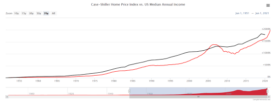
The graph below shows the S & P Case-Shiller Home Price Index (red) and the median annual household income (black). Basically, the two graphs are on the rise as well, but since 2005, the S & P Case-Shiller Home Price Index has risen above the median annual household income. On the other hand, the S & P Case-Shiller Home Price Index does not appear to exceed the median annual household income rise in 2020.
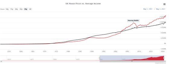
This time, the graph of 'household price / median annual household income' in the United Kingdom. In the UK, home prices have been around 4 to 7.5 times the median annual household income since 1950. The graph has been on an upward trend since 2000, and since 2020, house prices have risen to more than eight times the median annual household income.
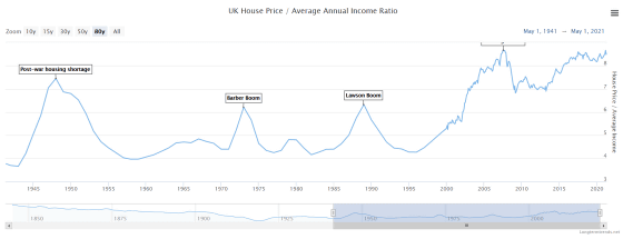
A graph of UK home prices and average annual income looks like this: In the pre-2000 economic boom and financial bubble, home prices never exceeded average annual income. However, since 2000, we can see that house prices have risen at a rate that exceeds the increase in average annual income.
Related Posts:
in Note, Posted by darkhorse_log

