Design that induces user's behavior using a psychological mechanism What is "dark pattern"?

ByJohn T
Especially, I do not remember applying, but spam mails are sent before I realize that I can not find a way to stop that spam mail .... There are things like .... It is probably "Dark patternBecause it caught on the trick of design called so. A movie that explains what the "dark pattern" is, which guides actions in the direction intended by the company without being noticed by users is uploaded to YouTube.
How Dark Patterns Trick You Online - YouTube
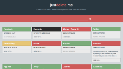
Suppose, for example, "I want to delete an Amazon account".

The address and credit card information associated with the account is collected in "Account Service" in "Account & List", so it seems that it can be deleted here ...

Actually, there is nothing concerning "account deletion (withdrawal)" in this menu.

The correct answer is to select "Help" from among the many menus at the bottom of the page ... ...

Click "Contact customer service" on "If problem is not resolved" tab in "Search by topic".

There are four menus, but select "Other" at the right end.

Select "Login and security". On the Japanese version of Amazon.co.jp "Account confirmation, change, closure" and it became somewhat easier to understand.

You will be able to select "Close account" in the details content column.

And you can not withdraw from yourself, and lastly you have to ask customer service to do a withdrawal process by chat.

In this way, it is an example of a dark pattern that makes it as difficult as possible for operations that you do not want as much as possible, such as "withdrawal".

As mentioned above, the model "Easy to enter but difficult to get out" is classified as a "cockroach Hui Hui" model by UX Specialist Harry Brinnul.

Such patterns are now commonplace and you can find the same pattern just by looking at the mail receiving folder a bit. Looking at the notice mail of a sale like the one below, for example ......

The link to stop the subscription is placed in the end part of the messed up part, making it very hard to find.

Because the character color of the text and the character color of the link are intentionally resembled because it is difficult to see the link.

Let's see an example of a smartphone application. Below is the screen of "TWO DOTS" game. "Play", the button to press to advance the game is displayed in green.

This is unified in other screens, and it is designed to "move forward if you press the green button" in most scenes.

However, only when you can not go forward without solving the puzzle, it becomes a UI "Push the green button to buy the item". In this case, you need to tap white x to go ahead.

During the game, because the action "push when the green button is displayed" is repeated, it pushes the green item purchase button as it is by Pavlov conditionalization.

When you register on LinkedIn, you may get an email invited to LinkedIn to your contact.

It is because I pressed the "Send invitation email to contact" button when registering to LinkedIn ... ...

When registering, it is supposed to push the same blue button many times and go on the page, so you just click on it.

LinkedIn 's spam email has evolved into a lawsuit and is paying a settlement of $ 13 million (about 1.4 billion yen).

However, cases like LinkedIn evolving into litigation are rare, and many of the dark patterns are legal. Where to draw illegal lines of psychological tricks is a difficult problem.

In the movie "It is best to condemn the company that notices the existence of the dark pattern and uses it to counter the dark pattern".

Related Posts:
in Video, Note, Web Service, Posted by log1d_ts


