What is different about Google's redesigned logo, sticking to attention?
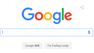
Google products and functions, screen design has been changing so far, but on September 2, 2015 Japan time, the logo will be changed again. In addition to changing the four-color logo of blue, red, yellow and green, new ideas have been added to voice search screens, and so on, the Google Japan Blog and Google Design blog says " "What was changed?" "What kind of design is it?" The secret of the logo design is released.
Google Japan Blog: Google's logo is new
http://googlejapan.blogspot.jp/2015/09/google-update.html
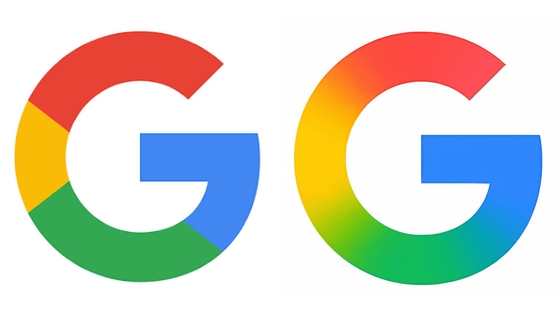
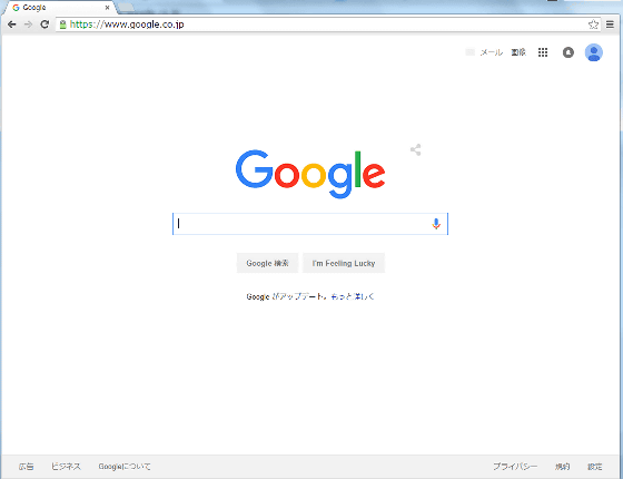
So, when you check the top page of Google, the logo mark is changed, the microphone mark of voice search becomes colorful, the favicon displayed at the top of the tab is blue, red, yellow, green It was changed to the letter "G" represented by the four colors.
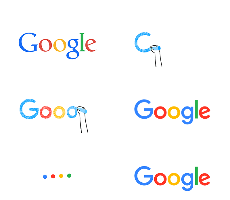
Animation is also delivered on September 1st local time only, and the old logo mark has been erased as a kyukyu and has been rewritten as a new logo.
I think that "why now at this timing?", But until now Google has changed logo mark designs many times along with the change of the times. This change was added in response to diversified changes in the user environment, "In order to let you know that Google's" magic "is working there, no matter what small screen it is working on."
The transition of Google's past logo and the transition of the screen design can be confirmed from the following movie.
Google, evolved - YouTube
The initial Google search screen looks something like this. It is characterized by three-dimensional characters with various angles, from this time I use blue, red, yellow and green color.
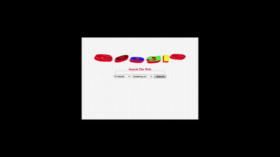
It approaches the design of the current logo mark for a moment. However, the acronym "G" was green, unlike now.
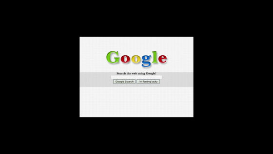
Surprised Marked.

Although the logo mark has a slightly black shadow, the initial letter "G" is blue, and it came closer to the Google logo that we knew from time to time.

And to the Google logo before change.

In the articles published by Google Design, the features of the new logo and the background to the development of the logo are released, and at first glance the simplicity is a logo design, but thoughtful ideas and prejudices are condensed I understand.
Evolving the Google Identity - Articles - Google Design
https://design.google.com/articles/evolving-the-google-identity/

The characteristics of the new logo areSans serifWhat has changed. With a flat design without a shadow, etc., push the colors blue, red, yellow and green to the front, the letter "e" is spinning a bit. Also, in addition to the logo, Google also appeals that Google moves "in motion" even in moving four color dots. Furthermore, the favicon displayed on the tab etc. is changed from "G" which was expressed in one blue color to multicolor, so that you can see that Google is used even for small screen.

The way we looked at the logo so far depends on the terminal you use ... ...

The new logo mark has the same appearance on any terminal.

The logo of each service was changed little by little. For example, in "Google Maps" the form of M and a has changed.

In M, the groove in the middle is shallow, a can clearly see the difference from 'o' etc even from a distance.

These are named "Google Product Sans".

In addition, the colorful G mark is the same shadow-free sans serif as Google's new logo, but it is finely calculated so that the space and balance in the character do not become unnatural. The feeling I looked at is circular, but as you look closely it is shaped little by little so that it does not become a "perfect circle".

There was also some designs in which the upper left quarter was all yellow, but the completed logo has less yellow distribution.

Dots are active when using voice search. Showing that it is Google by color, and attaching a movement will indicate "What kind of state is Google search now?" For example, when four dots are waving gently, it is time to say "You can listen to the story."

When the user is speaking, the dot extends vertically.

When I am thinking, I turn around with Kurukuru.

When we are doing the confirmation work we will wave it wildly and let you know.

All dots and spaces are arranged to be 1: 1.

When it moves round and round it becomes a beautiful double circle as follows.
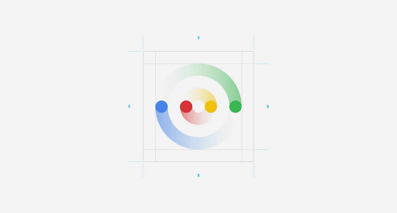
In addition, the color used is also a little brighter than the front logo.

When these design changes are implemented on a smartphone it looks like this. A new logo and a microphone mark are displayed in the search field at the top of the home screen.

When I started voice search, Google's logo was displayed large.

By saying "Please tell me", the logo mark changes to a dot, and it gently waves.

When asking, "What is the weather like in New York?", The dot stretches and shrinks.

Turning out the result while informing that it is "thinking" with rotating dots ......

The dot returns to the original Google logo.

Related Posts:
in Video, Web Service, Design, Posted by darkhorse_log
