"The shape of love" understood by big data on Facebook such as year difference, post count, catastrophe etc.

ByMaricruz suarez
It is no exaggeration to say that Facebook has the most data on "affair" in the world, Facebook creates and publishes various love indicators from the enormous big data possessed. What kind of thing is "the shape of love" that you can see from there?
We are running a series of blog posts this week on love. - Facebook Data Science
https://www.facebook.com/data/posts/10152217010993415
◆Year difference
This is a graph showing the correlation between couple 's year difference and the age of the couple. The numerical value on the left of the graph represents the age difference of the couple, and the numerical values under the graph represent the average age of the couple.
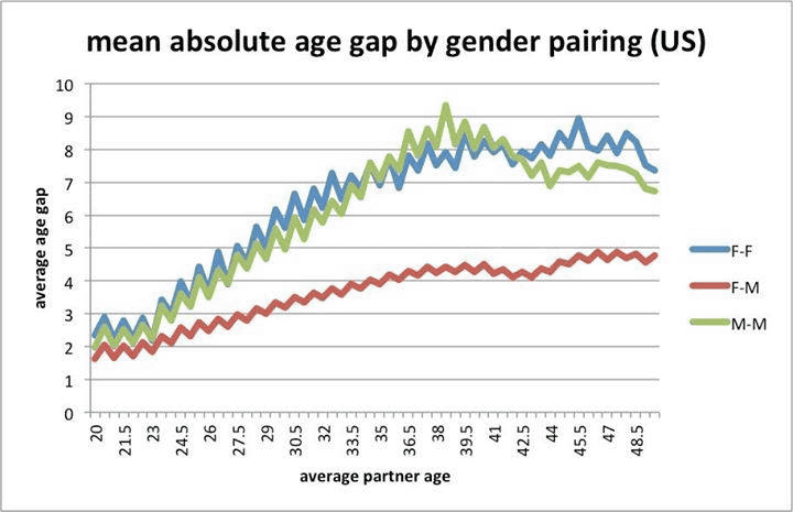
It is understood that the difference between years is big for couples of the same sex (females are blue, men are green), and the age difference tends to open as age goes up.
This is a graph showing the difference in the years of couples around the world along with the number of people. The lower figure shows age difference, and the couple to the right of "0" shows that men are older.
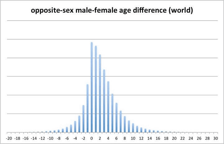
Statistically, the couple of the same age is the most,Median"Men are two years seniors older."
This represents an imbalance between males and femalesGender Gap IndexAnd age difference by country. Indicates that gender equality is about equal as the numerical value under the graph approaches 1 (the graph goes to the right).
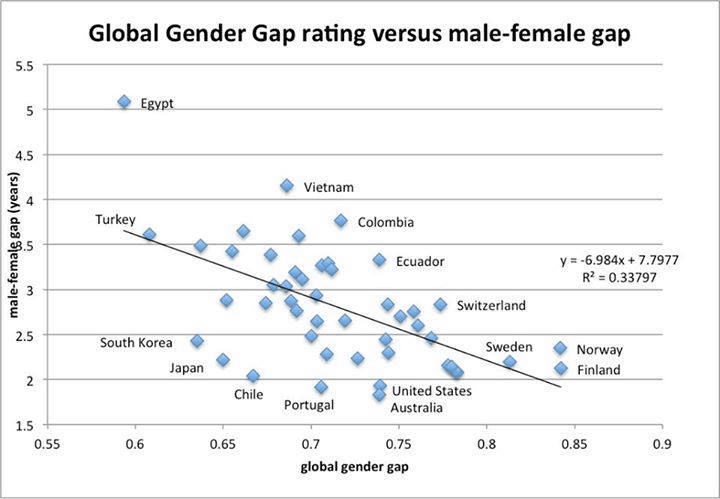
The graph shows that there is little inequality between men and women in Norway, Sweden, Finland, etc. Nordic countries such as Finland and the Nordic countries have a small age difference, and on the contrary, age differences are large in Muslim countries such as Egypt and Turkey. The numerical value on the left of the graph is the age of male - (minus) the age of the woman. In any country, the male has a higher age than the female in the couple.
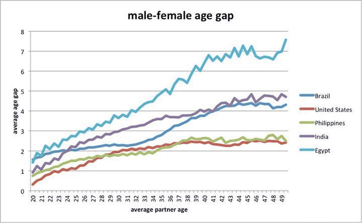
The graph below shows the yearly difference and the average age of the couple about the United States (red), Brazil (green), India (purple), Philippines (ocher) and Egypt (light blue). In any country, it can be confirmed that as the average age of the couple increases, the difference in years tends to widen (men are older than females).
◆Love and religion
The graph below shows distribution of the proportion of couples with the same faith by country. The numerical value on the left of the graph represents the rate at which the actual couple believes in the same religion, and the higher the number means the same for religion. On the other hand, the figures below the graph show the percentage of people in the country who meet the same religion, and how much different religions are popular.
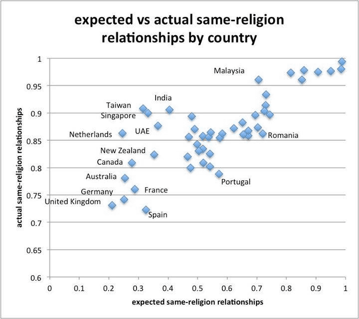
The graph shows that although many religions are prevalent in Taiwan and Singapore, couples often believe in the same religion, but in contrast, in Malaysia and Romania there are relatively many pagans It turns out that a couple is established.
The following graph shows the proportion of couples with the same faith in the United States by age, a graph showing married couple (red) and unmarried couples (blue) respectively.
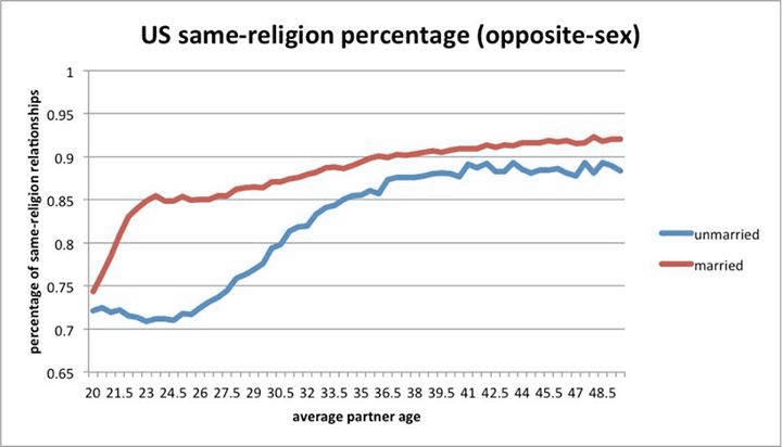
The graph shows that married couples believe in the same religion compared to unmarried couples, but we can confirm that couples between heathens are easier to establish as couples have younger age.
◆Dating relationship and number of posts
Facebook has a function that can display "relationship relationship", and you can see at a glance that married, single person, or partner is available.
The graph below shows how many postings to Facebook have changed before and after the couple's formation. The numerical value on the left of the graph represents the number of posts per day, the numerical value under the graph represents the day on which the middle "0" appeared, the left represents before association, the right represents after association Numeric values were separated from the day of association It shows the number of days.
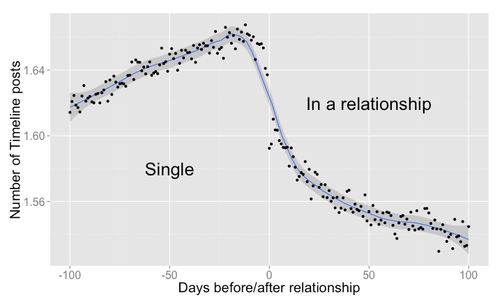
From the graph, it is understood that the number of postings increases until the couple is established, and the number of postings decreases as the relationship begins. Does it mean that you will not be in the face of Facebook when you start dating?
There is also data that the contents of posts on Facebook will change before and after the couple is formed. In the figure below, the numerical value on the left of the graph shows the degree to which positive expressions such as "likes", "nice" and "nice" are included in the contribution content, indicating that the content is exciting as the number is higher, It expresses how much the condition is changed before and after.
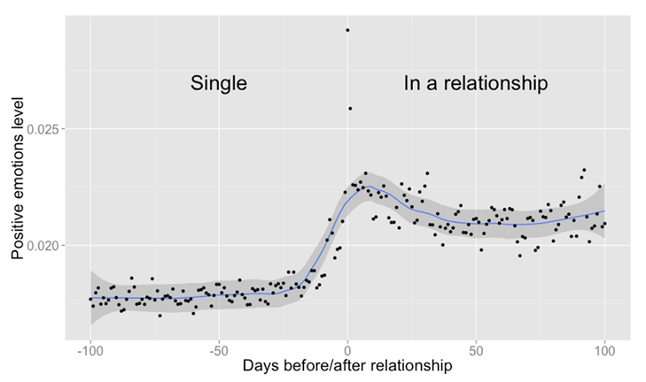
It is obvious from this graph that posts with floating contents increase after couple formation. The number of submissions decreases, and it turns into sweet content that it can be said that it is a sign of rearing.
◆catastrophe
This is a graph showing the change in the number of messages appearing on the timeline before and after the catastrophe.
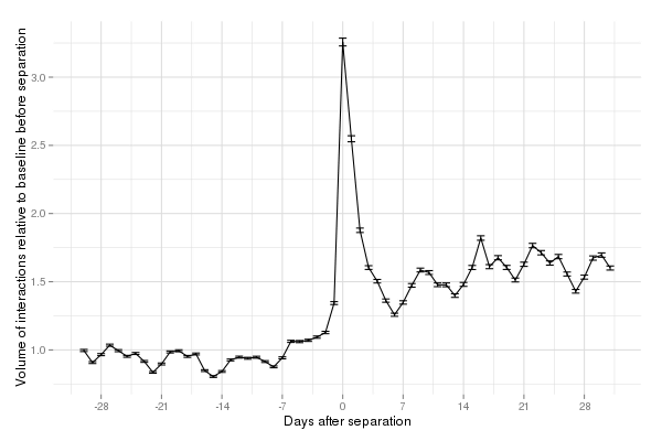
On the graph "0", on the day of catastrophe, more than three times the message of the day before appears in the timeline, and after the catastrophe it is clear that the number of messages gets larger overall than before the catastrophe. Apparently, eliminating relationships seems to be the most important concern for many people.
Related Posts:


in Note, Web Service, Posted by darkhorse_log