Website design based on red, 35 patterns remaining in the impression of the viewer

It is a website design 35 pattern that is based on "red" which is likely to remain in the impression of the viewer simply by looking at it. Red tends to be noisy if you do not use it well enough for an impressive amount, but you can create an attractive web site design by putting it together nicely.
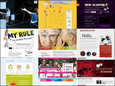
A Round up of Red-Colored Websites Design
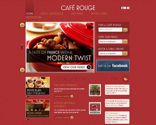
1:Cafe Rouge
The red pot and the background match well.
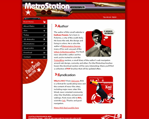
2:MetroStation
Website design that is gathered closely.
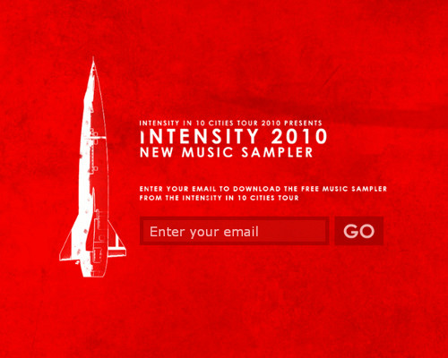
3:Intensity in Ten Cities
The rocket is impressive.
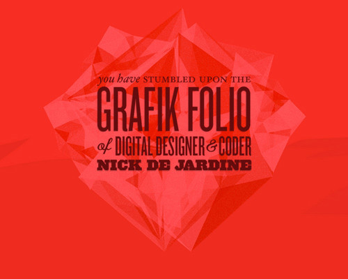
Four:Grafik
Various densities of red are used.
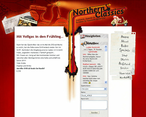
Five:Northern Classics
Red with a dark background.
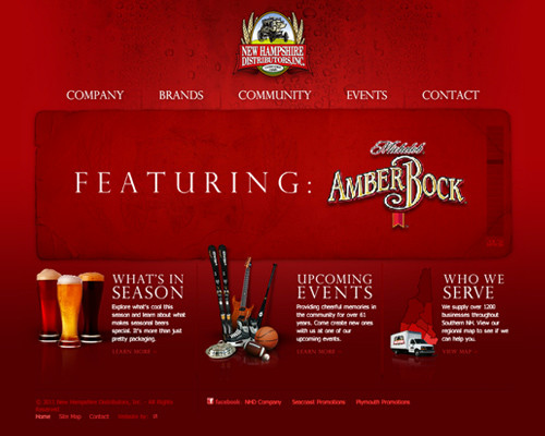
6:New Hampshire Distributors, Inc.
To the atmosphere with a sense of luxury calm somewhere due to the astringent red.
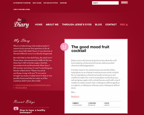
7:The CP Diary
Tint like red wine.
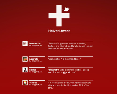
8:Helveti-Tweet
White letters match well with the background color.
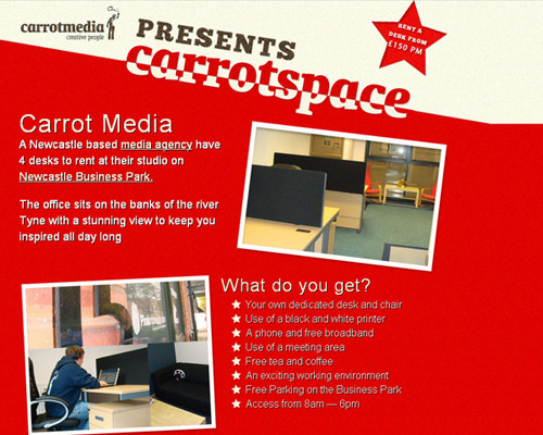
9:CarrotSpace from Carrot Media
It is a website that uses "diagonal" well.
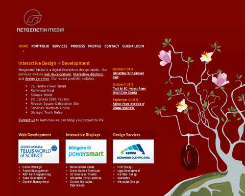
Ten:Netgenetix Media
It seems that the dark red background also matches the plant's picture.
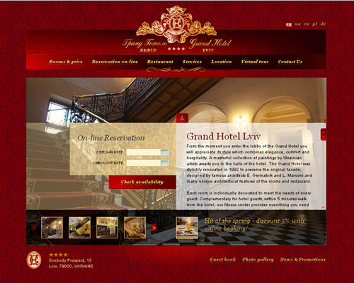
11:Grand Hotel
There is a feeling of luxury.
12:Godmother
The feeling that the yellow character stands out by the red background.

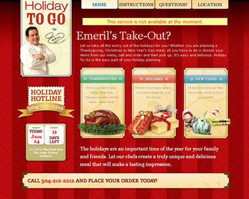
13:Holiday To Go
I used a red with different density and it seems to be a pattern.
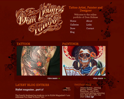
14:Dom Holmes Tattoo
Tattoo studio site.
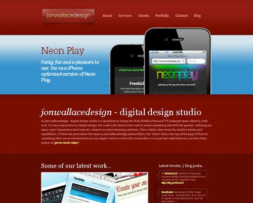
15:Jonwallacedesign
Here, red is a supporting role that complements blue.
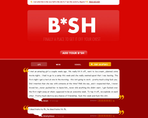
16:B * SH
Different red in the upside and downside.
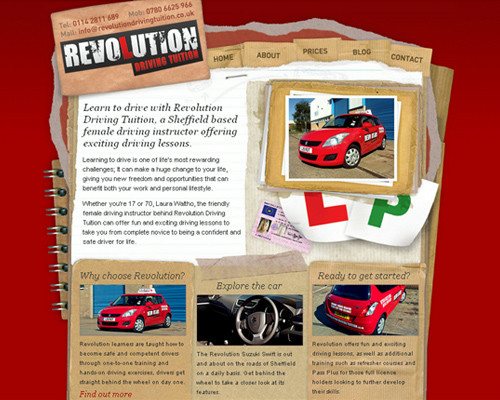
17:Revolution Driving Tuition
The red car and the natural background are familiar.
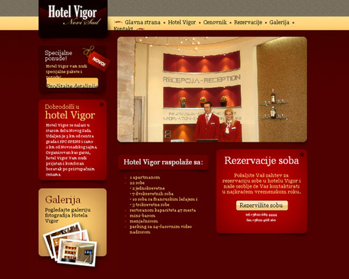
18:Hotel Vigor
Website design of a color tailored to the hotel reception and employee's clothing.
19:Tuesday Creative
The emphasis stands out by the contrast between red and white.

20:Impulse Development
A website with a pretty chic impression.

twenty one:FinerHome
The character is impressive.

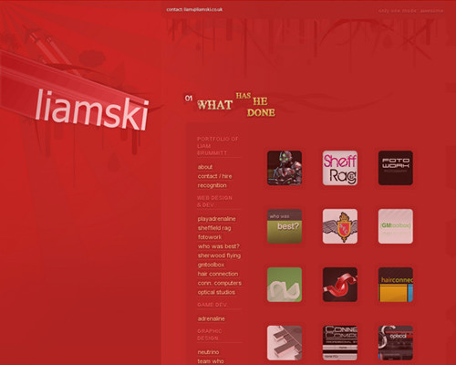
twenty two:Liamski
A thin pattern is drawn.
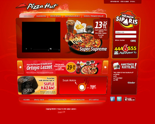
twenty three:Pizza Hut
The Pizza Hut logo is red so it feels very natural.
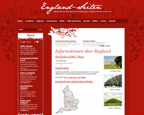
twenty four:England-Seiten
A pattern like a petal is treated.
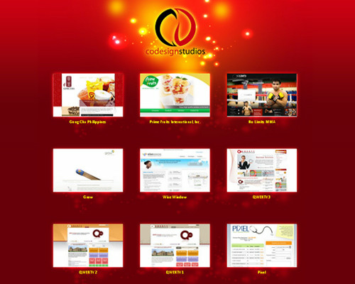
twenty five:Codesign Studios
Design that the central photo often gets to see.
26:Westmoore Church
A pattern is drawn in black on a red background.

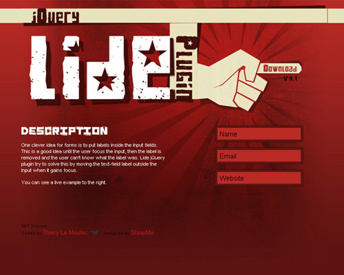
27:Lide jQuery Plugin
A concentrated line is drawn with blackened red on the left hand.
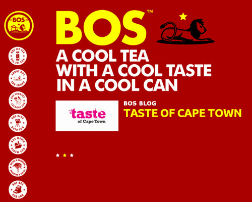
28:Bos Brands
Impression that the yellow letters are complemented by the background red.
29:Konil Media
Red background treated with patterns.

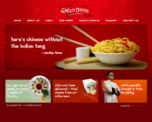
30:Green Onion
The Chinese restaurant's website seems to convey the heat and hotness of cooking by using red.
31:Pixeldeath
The color is gradually dark from top to bottom.
![]()
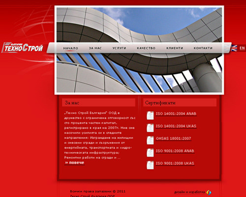
32:TechnoStroy
A feeling that the picture in the center is noticeable.
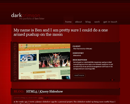
33:Dark Crimson
Overall there is a dark and calm atmosphere.
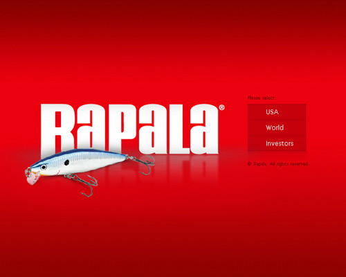
34:Rapala
Impression that central letters and lures are well complemented by red.
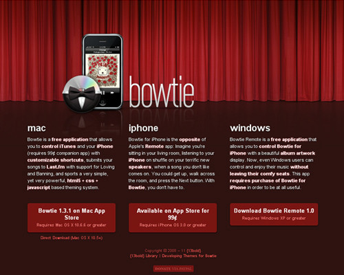
35:Bowtie
I am using the curtain well.
Related Posts:

in Design, Posted by darkhorse_log