A map showing the unemployment rate in various countries of the world
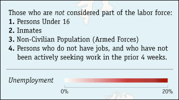
There seems to be a map that shows how much unemployment rate each country in the world has become. It seems that you gave up on finding a job on this map "People who are not working for jobs for more than 4 weeks" are not included in the unemployed, but which country is in a bad economy It may become an indicator to judge.
Details are from the following.
Unemployment Rates Around The World |

It means that the unemployment rate is getting higher as you get red in the map. In addition, it seems that the unemployed person does not include people under 16 years old, non-civilians such as military persons, dependents, people who do not work seeking work for more than 4 weeks on this map.
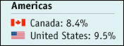
Let's look at each individually. You can see that the unemployment rate is higher for Americans than for Canada.
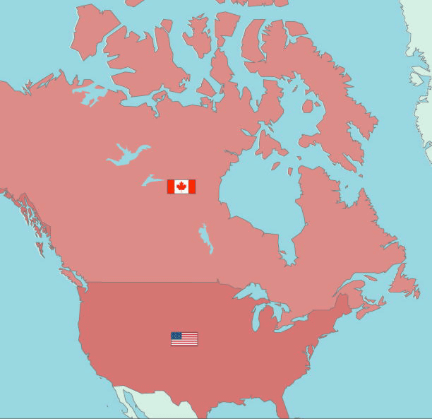
Specifically, America is 9.5% and Canada is 8.4%.
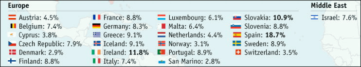
Followed by European countries. You can see that the unemployment rate in Spain is high.
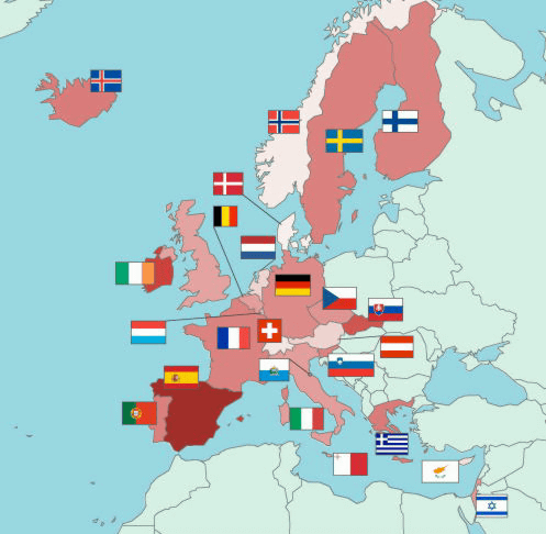
Specific unemployment rate figures are as follows. The unemployment rate of Spain, Ireland and Slovakia exceeds 10%.
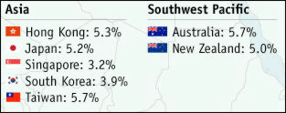
Then Australia and New Zealand. The unemployment rate is lower than in the US and European countries.

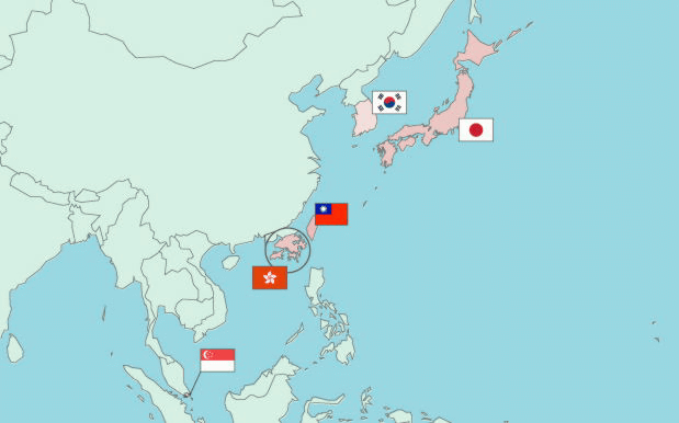
Finally Asian countries. It seems that the unemployment rate is low as compared with the European countries.
The unemployment figures for Asian countries, Australia and New Zealand are as follows.
Related Posts:


in Note, Posted by darkhorse_log