The new logo of the British Bureau of Commerce (OGC) looks 'comforting me'
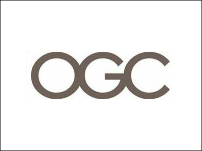
The new logo of the British Bureau of Commerce (OGC) . At first glance, it looks like a normal logo, but if you rotate it 90 degrees to the right, it will look a little strange. In particular, I am worried that things such as pencils that are printed by rotating them 90 degrees to the right may be difficult to use in public places.
Details are as below.
According to an OGC spokesman, 'a few staff members laughed when they saw this new logo, but it's not inappropriate.'
To those who can see it, it should look very strange.
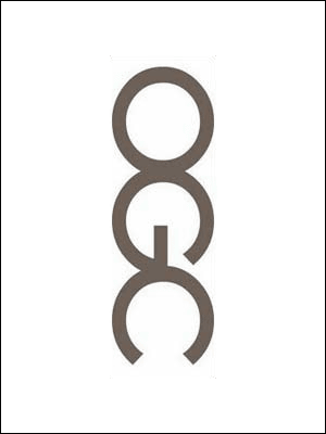
If you don't understand the meaning or don't come to the point, please refer to this moving GIF image.
ogclogo.gif (GIF image, 122x357 px)
OGC unveils new logo to red faces --Telegraph
Related Posts:


in Note, Posted by darkhorse_log