Yahoo! Is displaying a new type of blue bar in the search result
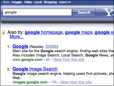
Even though it is a blue bar, it is not a thing to be integrated with a browser such as Google Toolbar, but only Yahoo! On the search result screen of the search, the input field when searching again is a blue bar. Apparently some of the users seem to see such a screen.
It seems that it is being tested as to whether the usability improves because not only the appearance changes but also the feeling of operation is changing only a little.
Yahoo! in Japan Do not you plan to make such a change?
Details are as follows.
Yahoo Testing New Blue Bar Search Results Format
This is the current search result

So this is the result of the new test

If you look closely it's Yahoo! Various links have been moved directly above the input field so that linkage with the service can be made immediately, or the part which was previously "Advanced Search" is "Options" with big button. It seems that it seems that such a detailed change affects usability.
By the way, on June 12, 22 o'clock broadcast a while agoDawn of Gaia"so"There is a business opportunity at midnight"It touched on Monday night's 24-hour McDonald's, which took up orders at 0:00 am, but in the middle of that we also mentioned McDonald's," If the operation is reduced by 10 seconds, the sales will be 0.6 A comment from McDonald's saying "It's going up" was broadcasted. Yahoo! Perhaps it is also aiming to raise such profits through such fine adjustment of layout.
Related Posts:
in Web Service, Posted by darkhorse
