Poster stick of AIDS prevention / eradication campaign Human being stupid
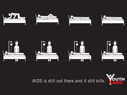
There is a campaign to spread the knowledge of AIDS "Youth AIDS" and eradicate AIDS, but the poster has changed slightly. I am expressing the state of a stick man with 35 illustrations, but the second half is satisfactory but I can not help entering the first half 20 without thinking unintentionally.
Details are as follows.
2 WENTY 4 OUR: AIDS on the street!
The poster of the problem is this. The first half depicts the way to infection, but it is quite a cheerful stick man. Is there a need to draw various things so far ...?
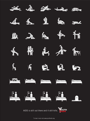
It's pretty surprising if the top was really overhanging .... Currently it seems to be appealing with posters using artists popular among young people.


The site of Youth AIDS is below.
ALDO fight AIDS - YouthAIDS
POPULATION SERVICES INTERNATIONAL:
Related Posts:
in Design, Posted by logc_nt
