Where Does My Tweet Go "tool that visually understands how the tweets are diffusing
On Twitter, the total number of retweets is displayed at the bottom of the tweet, but the web service that visualizes how the retwees spread and how many users read tweets in total is "Where Does My Tweet Go (WDMTG)"is.
WDMTG - Where Does My Tweet Go
https://wdmtg.com/
To use WDMTG, click "LAUNCH APP" on the top page.

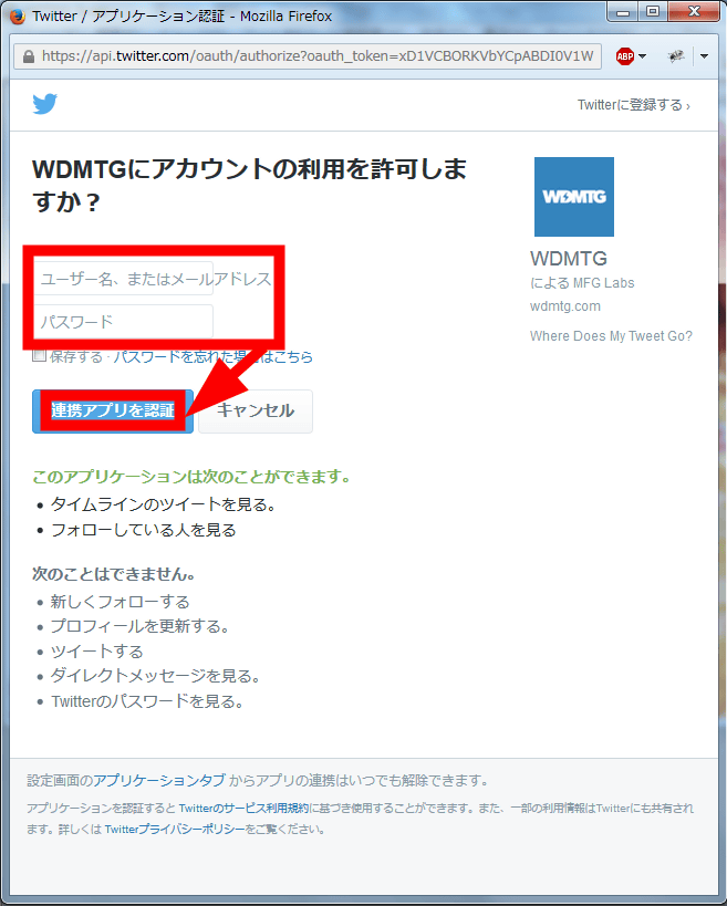
Since the Twitter authentication screen is displayed, enter account information and click "Authenticate linked applications".
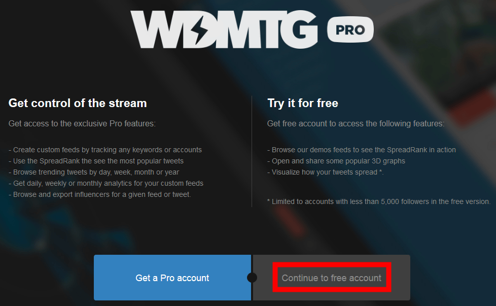
"Pro account" plan which can register RT and can register multiple keywords and accounts is set from 40 dollars a month (about 4800 yen), but this time we choose "free account" which can be used free of charge. Please note that free accounts are limited to Twitter accounts with followers less than 5000 people.
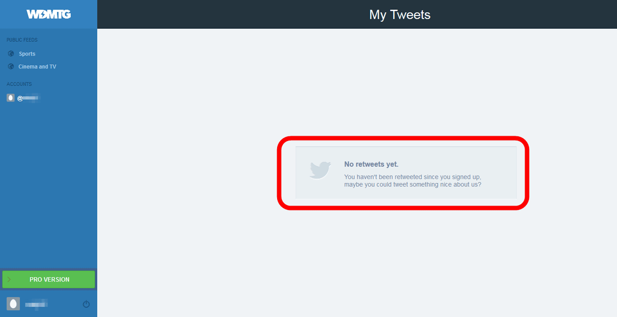
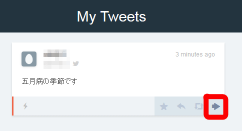
The WDMTG user page looks something like this. Since tweets after registering with WDMTG are subject to tracking, "No retweets yet." Is displayed.
When my tweet is retweeted by another person, tweets are displayed under "My Tweets". Click the bold arrow at the bottom right to see the graph.
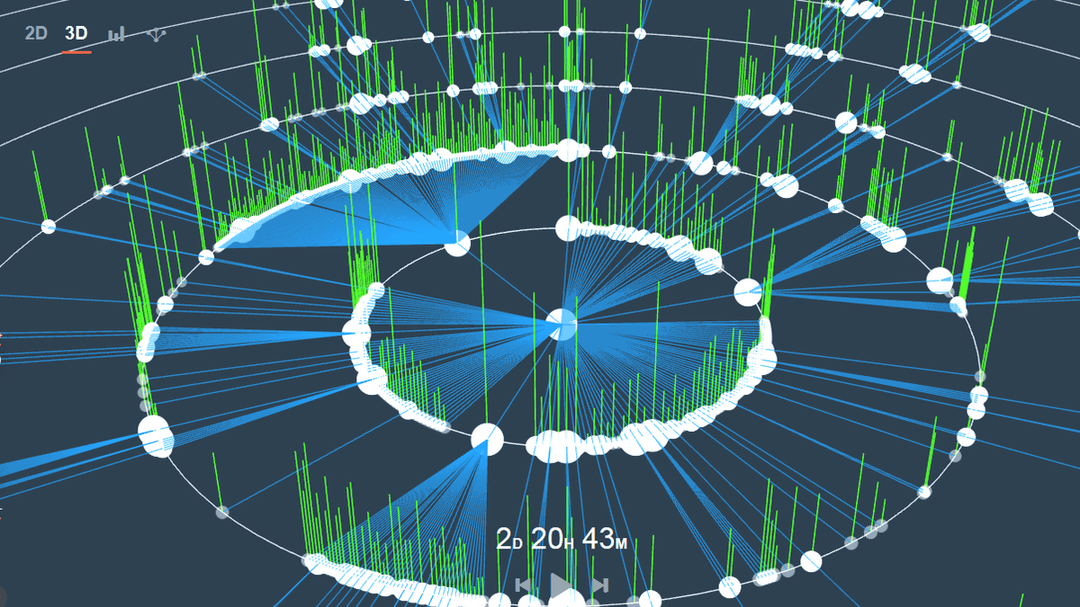
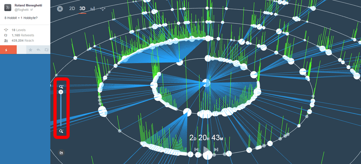
A large circular graph will then be displayed. My account is in the center of the circle, the line extends from the center towards the outer periphery of the circle, and on the outer periphery the account of the retweet person is displayed.
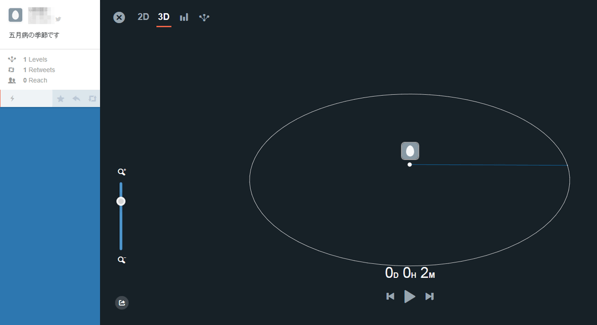
As the retweet became too little,Demographs provided by WDMTGI will look at one of them.
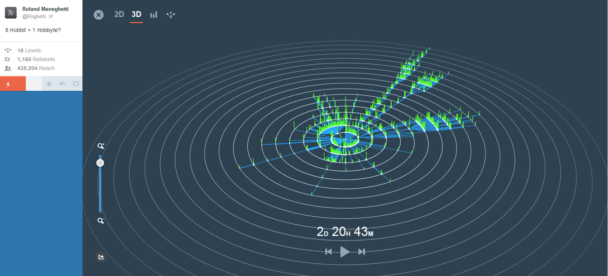
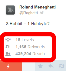
"Levels" showing how many actions of "retweeting retweets" was lasted, "Retweets" representing the number of retweets, "number of people who saw tweets" Reach "is displayed.
You can zoom in and out by moving the bar of the lower left magnifying glass.
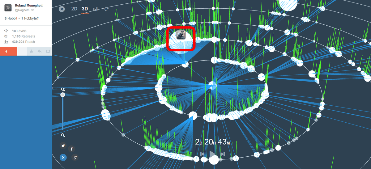
The white circle represents the Twitter user, and the user icon is displayed when clicked.
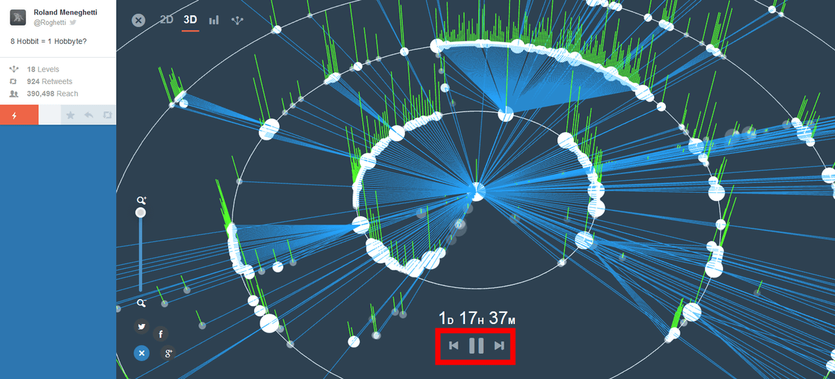
By clicking the play / pause button at the bottom of the screen, you can watch the animation showing how the tweets gradually spread outward from the center.
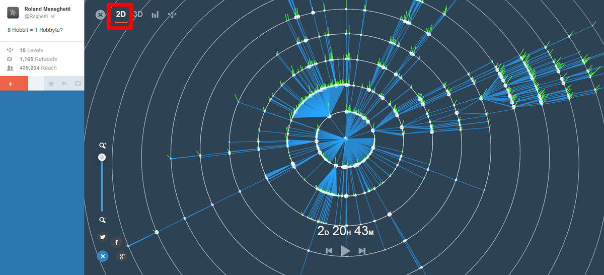
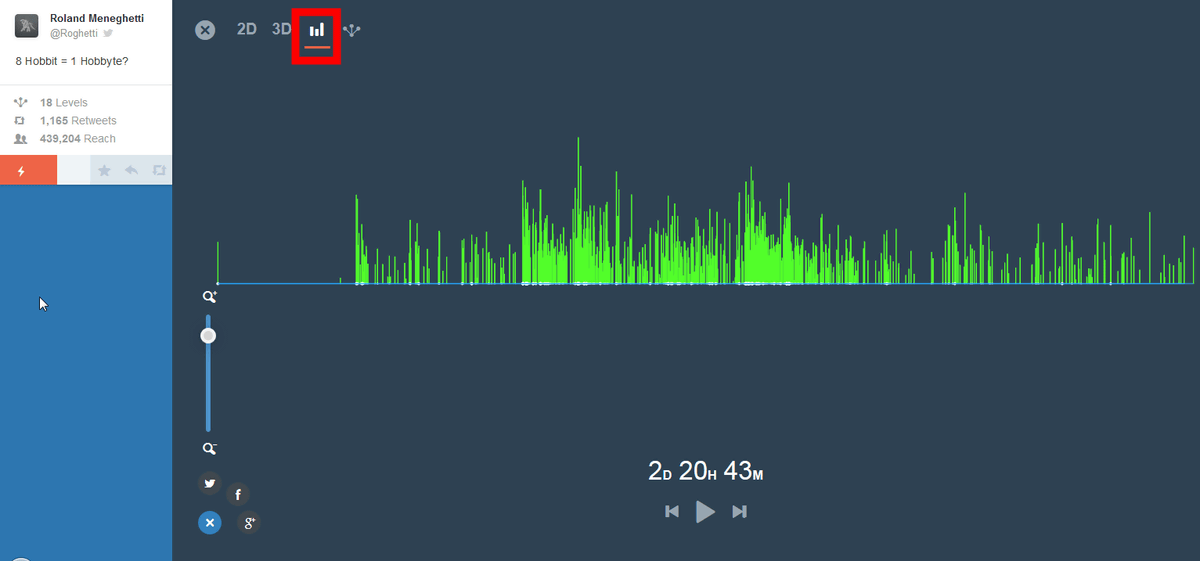
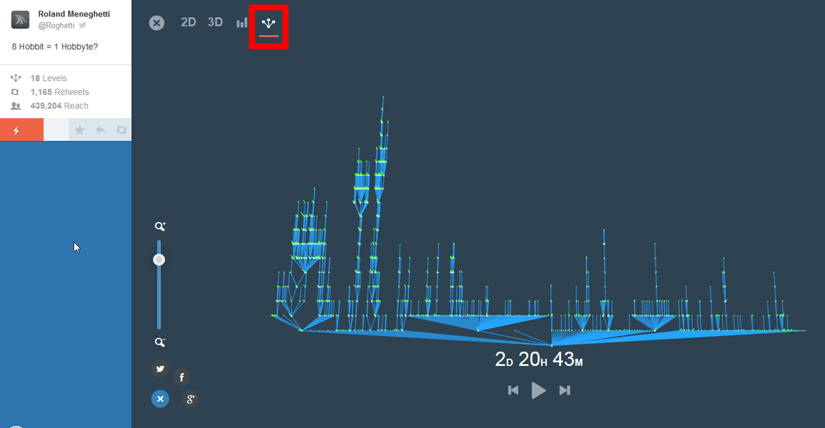
In addition to the default 3D display, 2D display and ...
With a bar chart ...
A tree diagram is prepared.
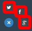
To share the graph, click the button on the bottom left.

You can share on Twitter, Facebook, Google +.
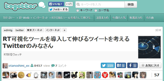
In addition, the following Togetter summarizes how Japanese Twitter users trial and error to make a huge pie chart.
Introducing RT visualization tool to grow tweet Twitter people - Togetter Summary
http://togetter.com/li/813557
Related Posts:


in Web Service, Posted by darkhorse_log