What is IKEA's store design that stimulates shoppers' desire to purchase with a thoroughly calculated layout?

Retailers such as department stores try to increase sales by stimulating customers' desire to buy with product layouts and displays. Software engineer Long Branch Mike explains the unique sales strategy implemented by IKEA, a Swedish furniture store.
IKEA's Crimes Against Cartography - London Reconnections
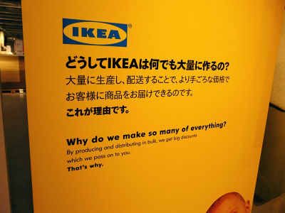
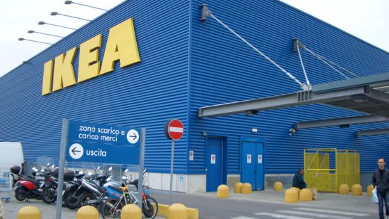
IKEA has more than 400 stores in 49 countries around the world, including Japan, but all stores are operated and managed based on the same principles. At any store, customers who entered IKEA are casually guided to move as much as possible in the store.
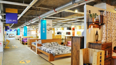
The layout of the store is very strategic, with customers navigating through every corner and product on two floors in a maze-like manner. To confuse shoppers, the streets zigzag and there are no windows to give any sense of direction or time.
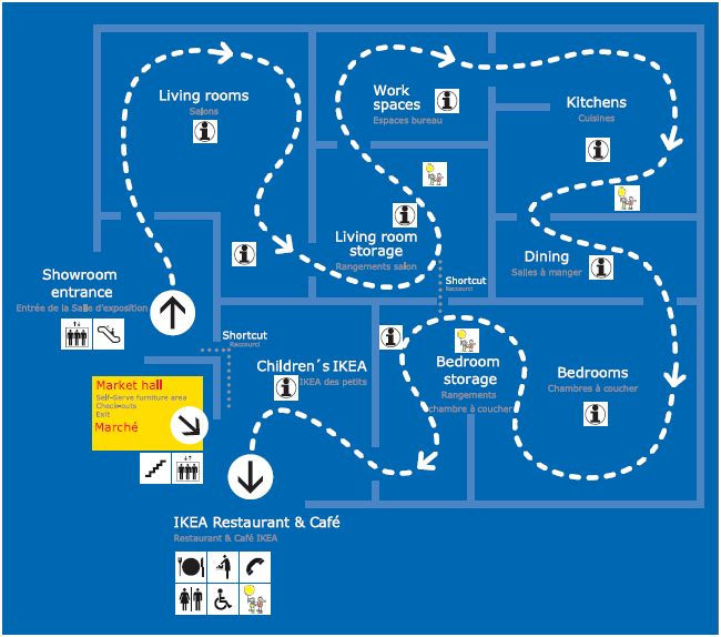
The theory that ``one-way streets reduce congestion'' has been largely debated among traffic engineers, but IKEA has incorporated this into its strategy by making the store one-way so that shoppers can see other customers. I try to keep up with This slows down the line as more people stop in front of the product they care about, giving each shopper more time to touch the product.
Due to such road construction, it usually takes at least an hour to walk to the second floor, and depending on the congestion of the aisles and the amount of purchases, it often takes more than two hours. The strategy of letting humans walk all the time seems to make a lot of sense, and Alan Penn, who teaches architecture at University College London, said, ``IKEA is a very confusing place, but the way to go. There is one, but if you stray from that path, you quickly lose your sense of direction, because by the time you reach the checkout shoppers are tired and most want to pay and leave quickly. , makes it easier to make impulse purchases.”
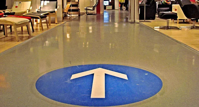
In addition, large arrows are displayed on the floor of the store for easy identification. This allows shoppers to focus on looking at the product.
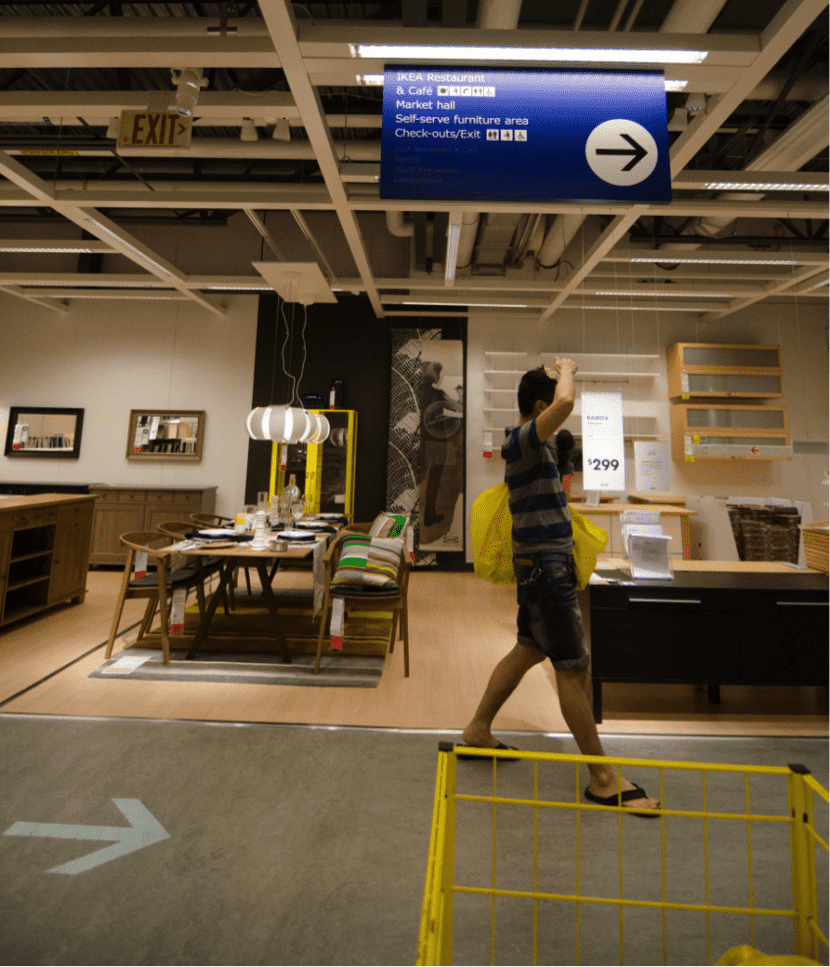
Signs are also attached to the ceiling, but many of these are printed only on one side. By doing this, Mike analyzes that it effectively prevents shoppers from going backwards.
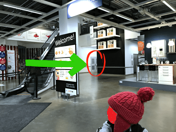
However, there are also 'shortcuts' such as doors directly connected to the cash register in the store. However, since these are installed to hide quietly between walls, it seems difficult to intentionally find shortcuts.
In addition to the calculated strategy of turning a two-dimensional store layout into a linear trekking course, the attractive furniture overstimulates the customer's brain and reduces their resistance to impulse purchases, Mike points out. Did.
Related Posts:


in Design, Posted by log1p_kr