How has the 20-year-old Mozilla Firefox user interface changed?
[Article] 0. Firefox UI UX history · black7375 / Firefox-UI-Fix Wiki · GitHub
https://github.com/black7375/Firefox-UI-Fix/wiki/%5BArticle%5D-0.-Firefox-UI-UX-history
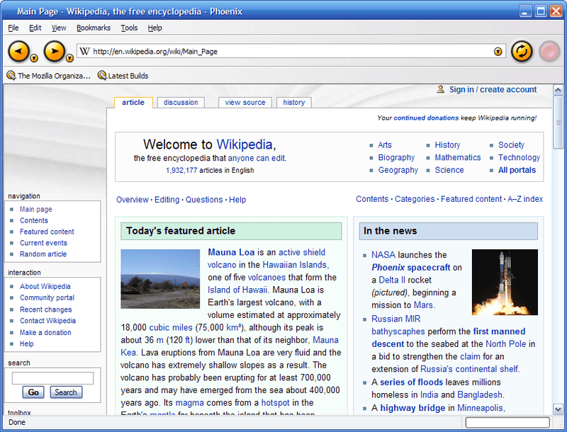
Mozilla was launched when Netscape Communicator became open source in 1998. After that, from Mozilla Application Suite developed based on Netscape Communicator, we decided to proceed with the development of web browser and mailer separately. The separately developed browser was named 'Phoenix' and was released in September 2002.
The UI of Phoenix is below, and it features a prominent orange button.
However, after that Phoenix
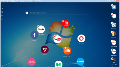
Firefox versions 1.0, 2.0, 3.0 from the top. Mr. MS_Y said that the features of the UI in these versions are 'easy to understand because the icon has only one role', 'adopting a unique color for each icon', 'mismatch with the OS UI', and 'the size of the space occupied by the UI'. 'Inconsistency in icon size and texture' is mentioned.
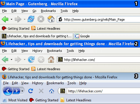
Internet Explorer 7, Chrome, Firefox version 3.5 UI side by side. MS_Y points out that the complicated toolbar structure, especially the menu bar and UI occupying space, was a problem with Firefox's UI up to version 3.
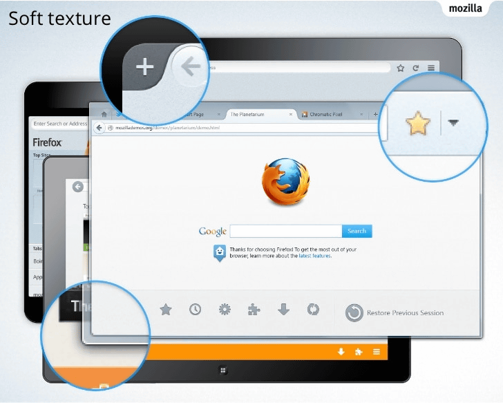
And with version 4, released in 2011, the Firefox UI has changed a lot. An orange app menu button has been added to the upper left, resulting in a calm overall design. In addition, it supports 'Aero Glass' which makes the frame of the screen semi-transparent with the standard function of Windows 7. Furthermore, we unified loading stop and reload into one button, and moved the tab to the top of the URL field. It has a much cleaner design than the UI before version 3.
What MS_Y appreciates most about this UI is the app menu button in the upper left. By combining all the various functions that were previously displayed on the browser with buttons into the app menu button, the UI space has been saved on the screen.
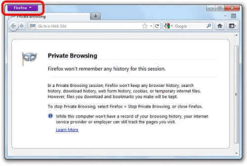
Furthermore, the color of this app menu button changes depending on the browser usage status and update channel, such as orange for the official version, purple for the privacy mode, and blue for the previously released development version Nightly. 'This color difference acts as a browser identity and is good for branding,' MS_Y said.
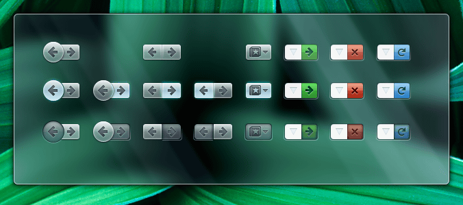
In addition, version 4 has redesigned the browsing 'forward' and 'back', favorites, and reload buttons. Despite its simple design, the color of the button and the three-dimensional design make it possible to tell at a glance whether the button is active or not.
Version 29, released in April 2014, introduced the Australis UI.
The overall rounded design was considered in the
Specifically, the tab headings and the four corners of the window are rounded. In addition, inactive tabs are now less noticeable. The overall menu layout etc. was designed using a
Also, from version 34, you can change the theme in customize mode. In addition, the UI can now be customized by dragging and dropping, making Firefox more extensible than other browsers.
In addition, the app menu button in the upper left has become the hamburger icon in the upper right, and the menu displayed by clicking this hamburger icon has become an icon panel display format that can be customized by dragging and dropping. MS_Y said the change was due to Mozilla's ambitious decision to 'integrate the PC version of Firefox with the smartphone and tablet versions,' resulting in controversy from users. increase.
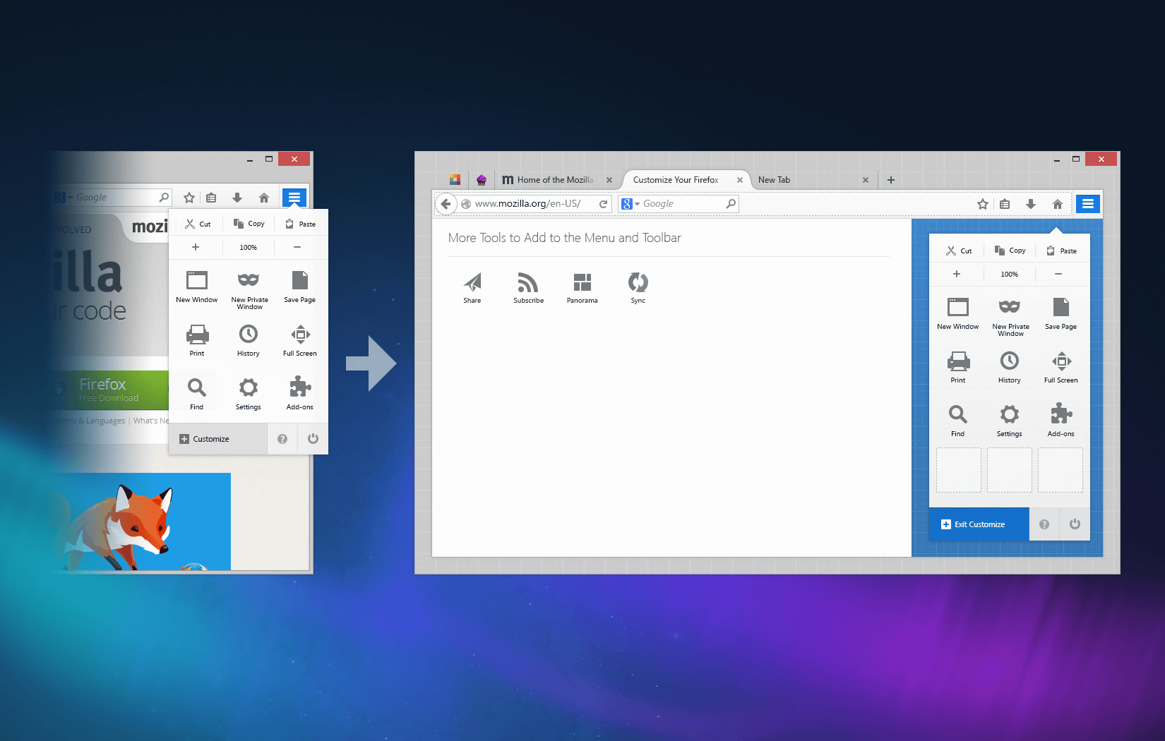
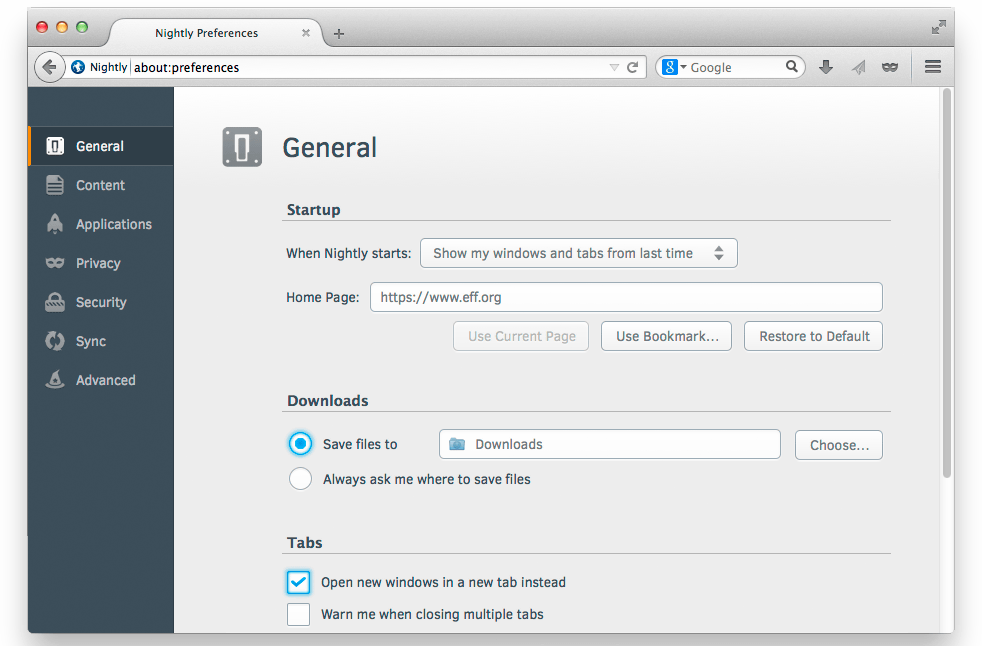
And, until now, the setting pop-up had a structure in which multiple windows opened ...
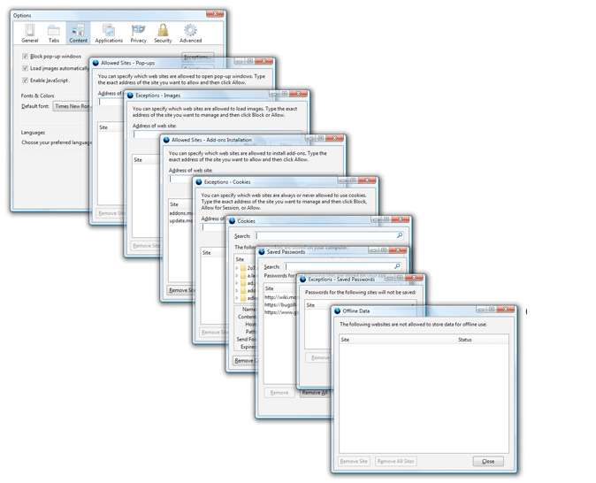
Changed to tab management UI. This makes the settings popup cleaner and easier to see.
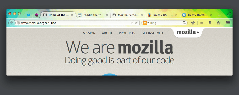
From version 57 released in November 2017, the brand name is '
The rounded tab shape is now right-angled in the Australis UI, and the
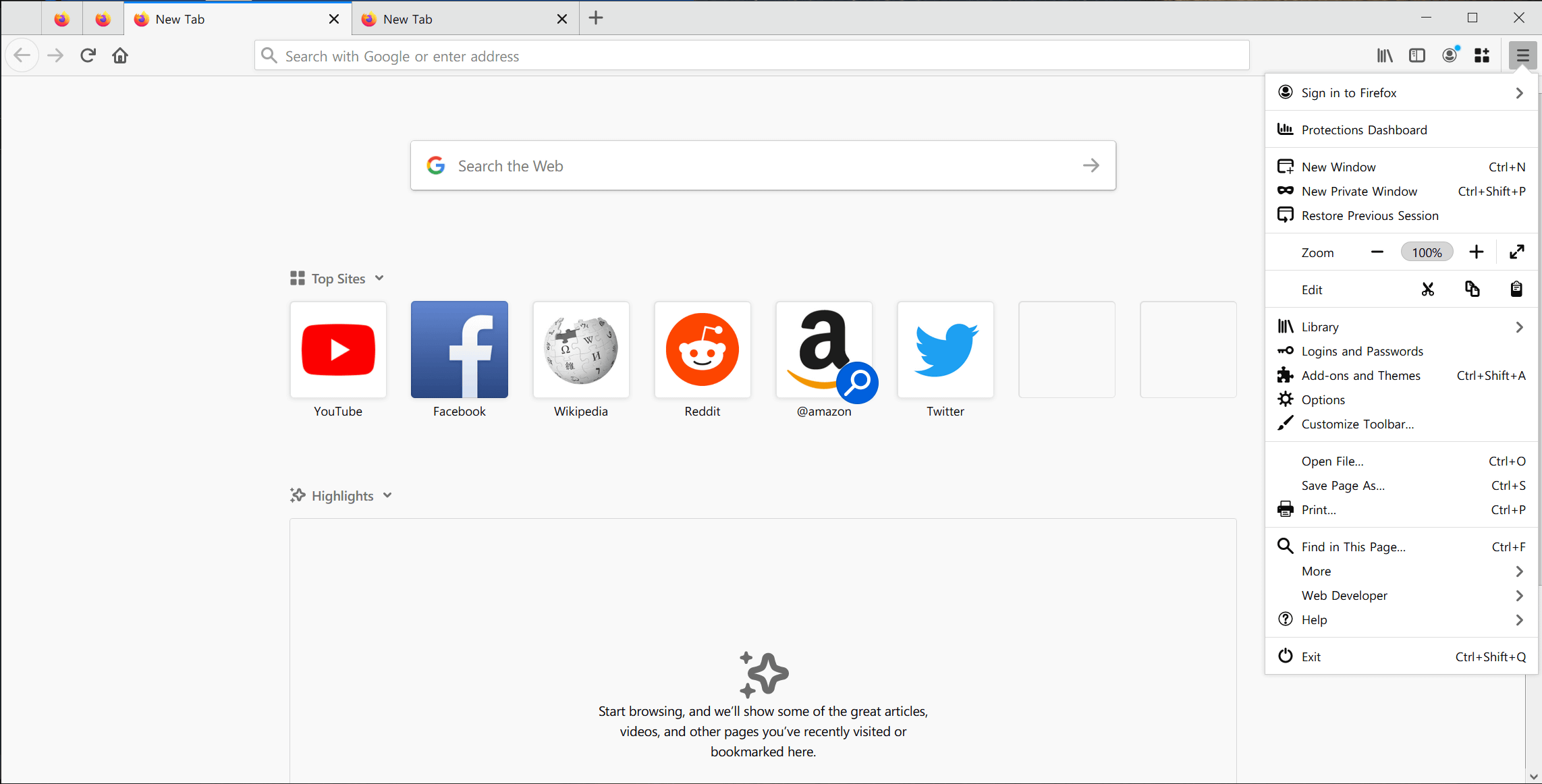
And the menu has changed from panel icon format to list format.
In addition, a 'Library' button has been added to group favorites, history, download history, and more.
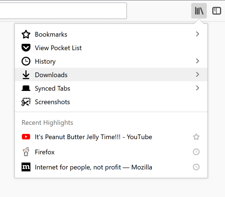
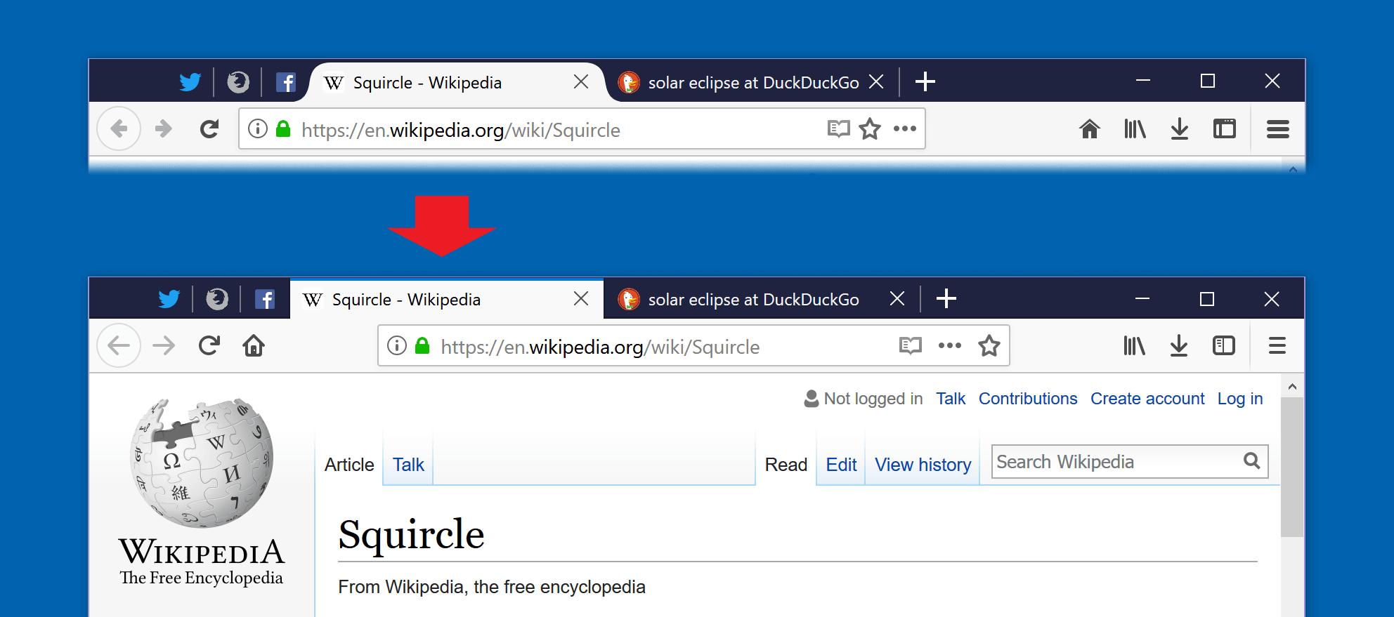
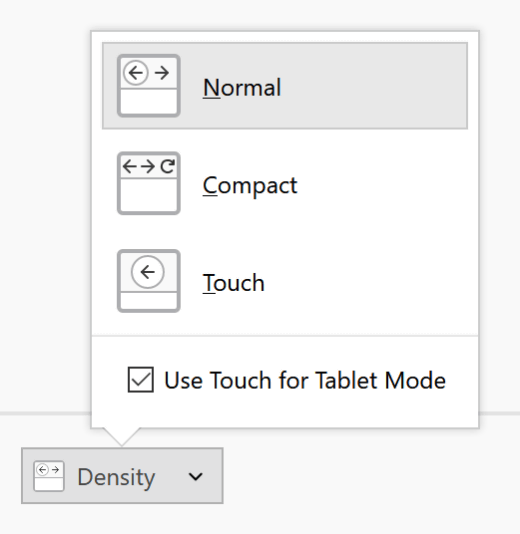
In addition, it also supports touch operation in tablet mode.
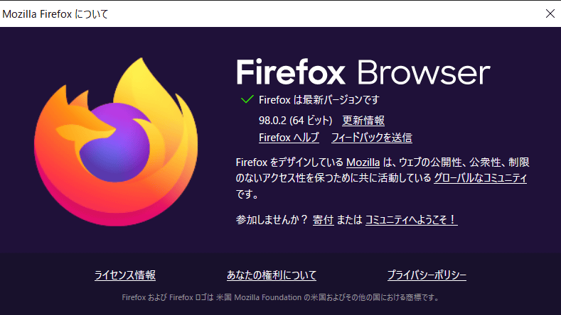
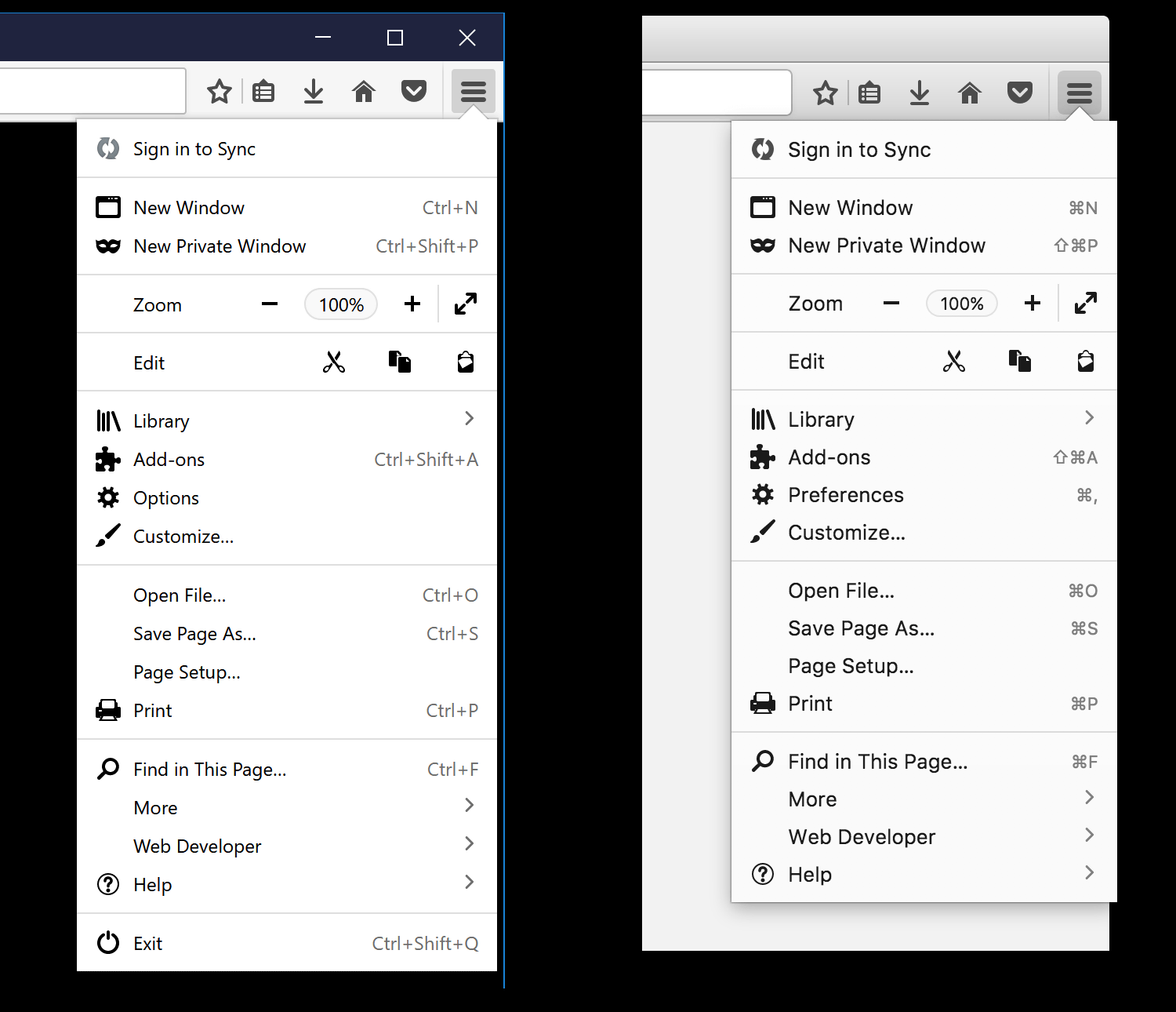
And since version 89 of Firefox released in June 2021, Proton UI has been adopted.
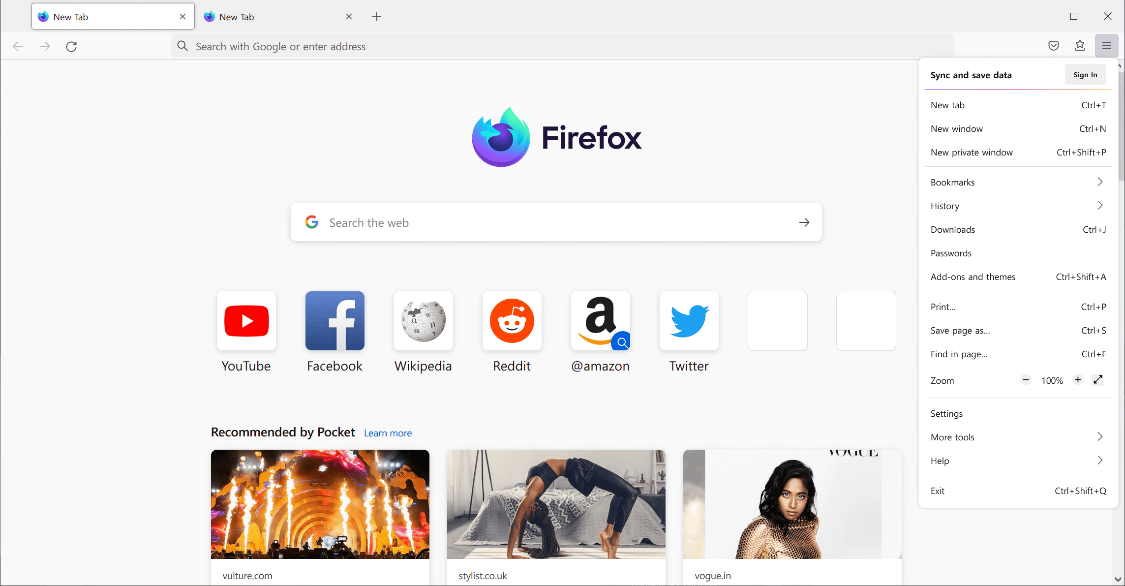
What MS_Y likes most about the Proton UI is that the right-click menus and
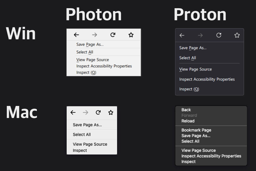
On the other hand, MS_Y says that the removal of the page action menu button in the Proton UI is 'most mysterious'. Other drawbacks include the confusion of tab indicators, the removal of animations and illustrations when registering favorites, and the change to run the tab search bar in the URL bar.
Related Posts: