The logo of the government's women's support network is on fire as 'penis no matter how you look at it'

The logo is important to shape the brand image of a company or organization, but the logo of Women's Network , a women's support network under the umbrella of the Australian
Statement on the Department's Women's Network logo | Department of the Prime Minister and Cabinet
https://www.pmc.gov.au/news-centre/pmc/statement-departments-womens-network-logo
Australian Government Removes Women's Group Logo That Looks Like a Dick
https://www.vice.com/en/article/epx8nz/australian-government-removes-womens-group-logo-that-looks-like-a-dick
Prime Minister's department takes down'phallic' Women's Network logo after criticism --ABC News
https://www.abc.net.au/news/2022-03-15/womens-network-logo-prime-minister-department/100910540
Samantha Cole , a writer for the overseas media Motherboard, has come across a number of opinions that 'the brand logo looks like a genital organ'. For example, ' The Airbnb logo looks like a vagina ' 'The 2012 London Olympics logo looks like a couple having oral sex ' ' Donald Trump and Mike Pence's campaign logo has a' T 'undercut It seems that there were various opinions such as ' It is in the hole of' P 'and reminds me of sex .'
Despite these opinions, Mr. Cole never considered these logos obscene, and he seems to think that those who associate with them in this way may have a strong sexual imagination. 'In many cases, the logo acts as a'Rorschach test'of our dirty heart,' he said. However, it seems that the logo of the government-affiliated network 'Women's Network' under the Cabinet Ministry of Australia, which became a hot topic this time, certainly looked like a penis.
This is the popular Women's Network logo. Although I knew that was not the case, the 'W' part that was probably taken from Women looks like the scrotum, and the oval part that extends from it looks like the penis. 'The Women's Network logo of the Australian Prime Minister's Cabinet is 100% absolutely penis,' Cole said.
Scott's own government department, the Women's Network, has a logo that is ... a little phallic. ????
— Women for Australia (W4A) (@ Women4Aus) March 13, 2022
You couldn't write this! #auspol #womensnetwork pic.twitter.com/cmKw6DhA31
The Australian Prime Minister's Ministry of Cabinet promotes a wide range of missions across Australia's public services, including various networks that promote diversity in the enterprise. An organization called 'Women's Network' is one of them, and it is said that it supports the implementation of equal opportunity for men and women in the workplace and other gender equality action plans. Of course, it has nothing to do with the penis.
According to the Prime Minister's Cabinet Ministry, it was in 2019 that the Women's Network logo was changed to the one that was talked about this time. Checking the Internet Archive , the logo was used on the official website of the Prime Minister's Cabinet Ministry at least as of August 2021.
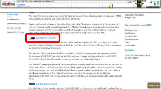
It seems that it was March 12, 2022 that the first topic was that 'The Women's Network logo resembles a penis'.
I really thought this logo for the Department of the Prime Minister and Cabinets womens network was fake but uh .. do they know?
Https://t.co/d4qCybvVFV pic.twitter.com/x2YwQ4g4zT — FuckingKangaroos (@FckingKangaroos) March 12, 2022
Since then, many have turned to the logo and criticized it by political groups Women for Australia and the nonprofit National Older Women's Network Australia , which seeks the rights of older women. National Older Women's Network Australia tweeted, '(At first) I thought this was a satire, but it's either thoughtless or insulting. The Prime Minister's Cabinet Women's Network logo is for graphic artists. Public funds have been spent on ordering, design adoption, color selection, approval, printing and publishing. It's a terrible message. '
I thought this was satire, but it is either thoughtless or an insult. Public money was spent getting a graphic artist, choosing the designing, selecting colors, approving, printing and publishing this logo for the Prime Minister's and Cabinet's Women's Network.
— National Older Women's Network Australia (@OlderWomenNetAu) March 13, 2022
Poor messaging. Pic.twitter.com/jDYKNdMCkg
Following a series of criticisms, the Prime Minister's Cabinet issued a statement. The logo in question was created by the staff of Women's Network by diverting the existing 'W' logo, and it was not an external order. It also claims that the Prime Minister and the Prime Minister's Office were not involved in the creation of the logo.
The logo has already been removed from the official website .
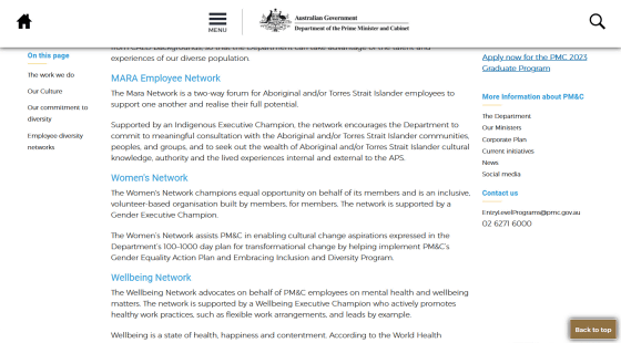
To answer the question, 'Why was the logo like a penis made?', 'As a result of putting together a horizontally long and rounded design to maintain the uniformity of the logo, in a limited time You may not have noticed that the staff who made it in a hurry resembled a penis. '
2. Whoever designed this “Women's Network” Logo looks like they had to keep it the same shape as 5 other logos for consistency. My experience tells me they probably a limited amount of time to design all of them as well. Pic.twitter. com / 9EhEHKfok0
— JenBNE (@BneJen) March 14, 2022
Related Posts:
in Note, Posted by log1h_ik
