Google Chrome logo changes for the first time in 8 years
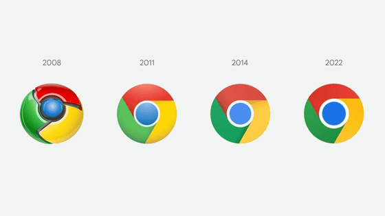
Chrome, a web browser developed by Google, has changed its logo for the first time in eight years since 2014. This logo change is explained by Google Chrome designer Elvin Hu.
Chrome is changing its logo for the first time in eight years --The Verge
https://www.theverge.com/2022/2/5/22919398/chrome-logo-change-eight-years
Hu talks about this Chrome logo change on Twitter. Chrome was first released in 2008, and this is the third logo change in total. The logo change has been applied from the latest Chrome Canary delivered on February 5, 2022, and will be applied to general users in sequence.
Some of you might have noticed a new icon in Chrome's Canary update today. Yes! We're refreshing Chrome's brand icons for the first time in 8 years. The new icons will start to appear across your devices soon. Pic.twitter.com/ aaaRRzFLI1
— Elvin ???? (@ elvin_not_11) February 4, 2022
Below are the 2014 logo and the 2022 logo. There are no changes to the basic components, but the blue circle in the middle has become slightly larger, the shadows have disappeared, and the red, yellow, and green hues have been adjusted to be slightly brighter.
We simplified the main brand icon by removing the shadows, refining the proportions and brightening the colors, to align with Google's more modern brand expression. Pic.twitter.com/Hyig51gqJq
— Elvin ???? (@ elvin_not_11) February 4, 2022
Also, although it looks like a single color, the three colors of red, yellow, and green have subtle gradations that you wouldn't notice unless you say so. This 'makes the logo more familiar,' Hu said.
Fun fact: we also found that placing certain shades of green and red next to each other created an unpleasant color vibration, so we introduced a very subtle gradient to the main icon to mitigate that, making the icon more accessible. Pic.twitter.com / H26wQKRhp9
— Elvin ???? (@ elvin_not_11) February 4, 2022
In addition, Hu and other design teams are customizing the Chrome logo for each OS. For example, the new logo for the Windows version has a darker red, yellow, and green gradation than the logos of other OSs.
Then, we created OS-specific customizations. We want the icons to feel recognizably Chrome, but also well crafted for each OS. For example, on Windows, the icons take on an obviously gradated look, appearing at home on Windows 10 & 11. pic.twitter.com/q598abI3Rx
— Elvin ???? (@ elvin_not_11) February 4, 2022
On the other hand, the Chrome OS version of the logo has a bright appearance with almost no gradation.
On ChromeOS, they use brighter colors without gradients to match the looks of the rest of system icons. Pic.twitter.com/aDtcgSEN66
— Elvin ???? (@ elvin_not_11) February 4, 2022
In addition, the macOS version logo has a rim for a more three-dimensional appearance. The difference in logo design for each OS is also reflected in the Chrome logo. In addition, the beta version has a ribbon on the top left, allowing users to determine at a glance whether it is a beta version or not.
On macOS, they look 3D. For Beta and Dev, we applied colorful ribbons to them. Pic.twitter.com/U3674XS7k6
— Elvin ???? (@ elvin_not_11) February 4, 2022
In addition, the macOS version of the Chrome logo has a ribbon size that changes depending on the logo size. When the logo size is large, the ribbon size is small, and when the logo size is small, the ribbon size is large, which improves the legibility. The letter 'Beta' indicating that it is a beta version is abbreviated as 'B' when the logo is small, and the letter 'Dev' indicating that it is a developer version is '' when the logo is small. It is abbreviated as 'D'.
The ribbons include many details when viewed at large sizes, but transform into simple badges at small sizes, maintaining their legibility. The letter 'B' and 'D' representing 'Beta' and 'Dev' are manually hinted, so they look crisp even at a very small size. pic.twitter.com/ElRAh2jiR0
— Elvin ???? (@ elvin_not_11) February 4, 2022
The iOS version of the Chrome logo (top) and the developer version logo (bottom) are as follows.
On iOS, our Beta app will start using a blueprint-like design, as a nod to Apple's developer-focused apps, and the Stable app icon will have new proportions on the tile. Pic.twitter.com/kkIeJkv8Uj
— Elvin ???? (@ elvin_not_11) February 4, 2022
Of course, he also considered other designs. For example, it was considered to incorporate more negative spaces (margins) into the logo design. However, it seems that there was a problem that the more negative space was secured, the smaller the icon became, and it became difficult to recognize it when it was lined up with another Google application icon.
You might also wonder, 'did you consider sth. More different?' We did! Eg, we explored introducing more negative space. However, in context, the white required a stroke that shrunk the icon overall, and made it more difficult to recognize , especially next to other Google apps. Pic.twitter.com/9BYZVbAlbf
— Elvin ???? (@ elvin_not_11) February 4, 2022
Related Posts:
