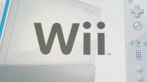
Nintendo 'Wii' logo draft is discovered
by
Regarding the logo of Nintendo's game machine ' Wii ', which was released in 2006 and the cumulative worldwide sales exceeded 100 million units, various logo proposals that died were published in the 2007 employee pamphlet. , Twitter user Nintendo Memories has published.
Unused Nintendo Wii logos drive fans wild | Creative Bloq
https://www.creativebloq.com/news/nintendo-wii-unused-logos
Nintendo #Wii tentative logos from the NCL 2007 Company Book.
— Nintendo Memories (@NintendoMemo) January 27, 2021
'Wii beginning new era' ????
Nintendo Weiird ???? pic.twitter.com/uKGqC31DAM
Regarding the Wii logo released in 2006, overseas media Creative Bloq said, 'It will not be one of the most exciting logos in history, but it did its job well. The Wii logo is simple. It's easy to understand, and the dots on the 'i' are playful, 'says the Wii logo.
by
Below is a page that summarizes the 'Wii logo candidates' released by Nintendo Memories. 49 types in the image below ...
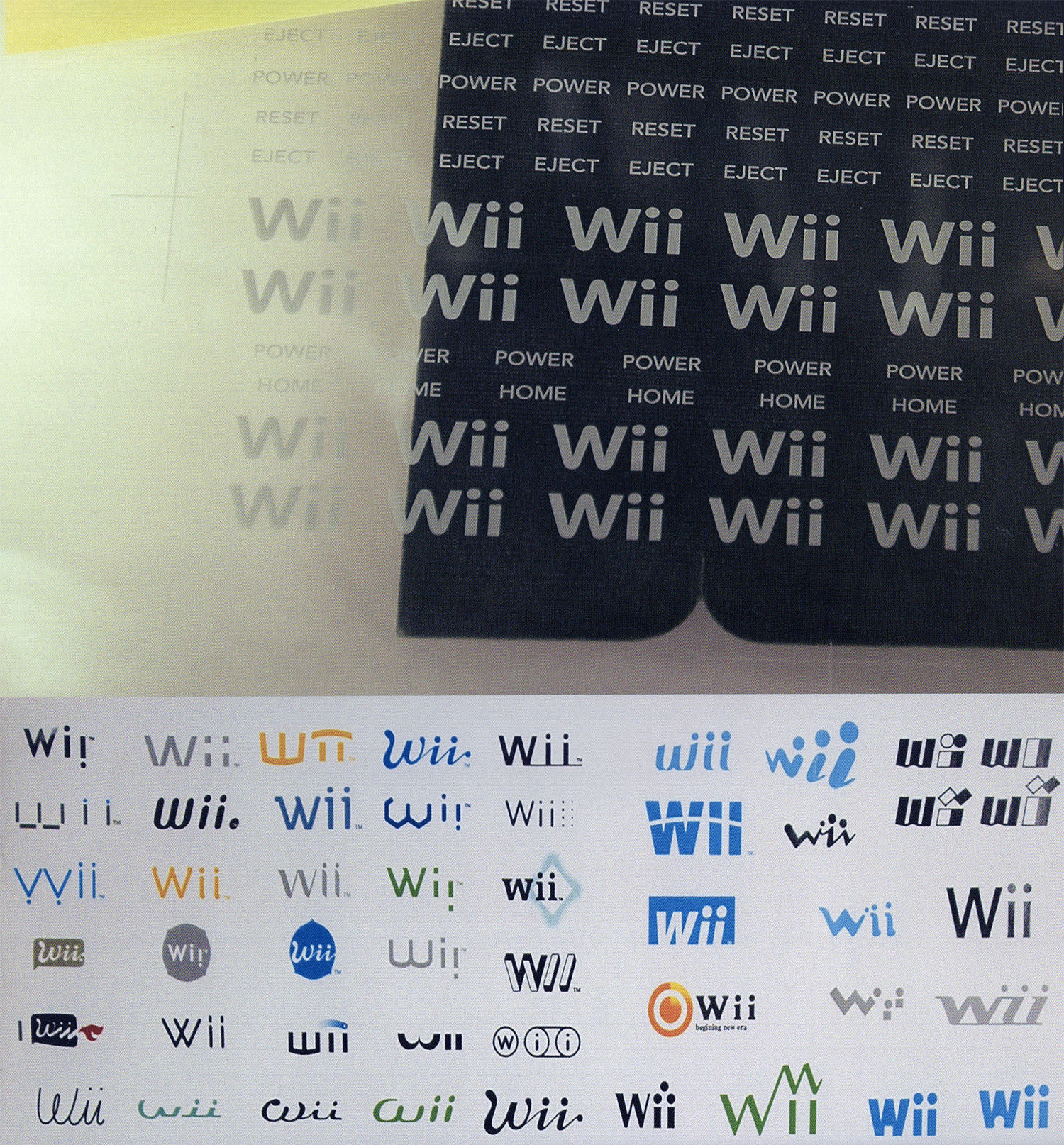
In the image below, 160 types of 'proposed logos' are lined up.
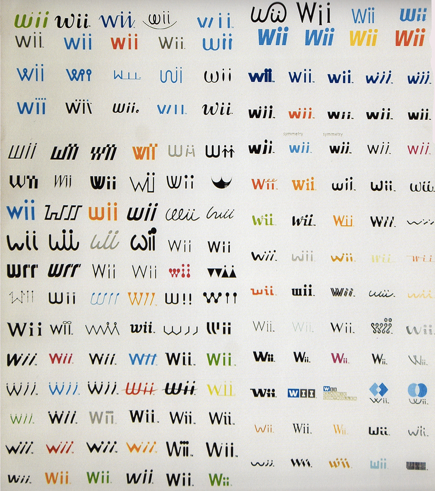
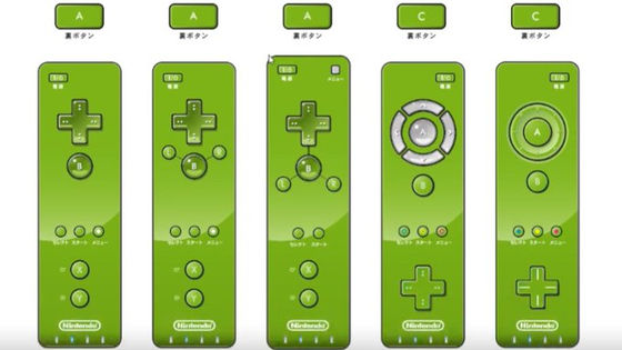
There are various opinions about the Wii logo candidate tweeted by Nintendo Memories. One user praised one of the drafts, saying, 'This logo is amazing! It looks like you're wielding a Wii remote, and the four dots look like dots that indicate your player number.'
this one is awesome, it looks like a wiimote being swung around and it even has the player number dots pic.twitter.com/nj4oWkawPy
— V ???? xy ???? ???? / ✊ ???? ✊ ???? ✊ ???? (@voxybuns) January 28, 2021
Another user listed four logos, the first was the result of hiring someone who designed the Sony VAIO logo, the second was the result of slamming Apple's design, and three. The eyes are 'wrr' instead of 'Wii', the fourth is the result of tilting the channel, and the impressions received from the four ideas are tweeted.
some personal highlights for me include:
— MylesOS (@combotent) January 28, 2021
1) 'who hired the guy who designed the sony vaio logo'
2) 'hey apple can i copy your homework?'
3) wrr. ~ wrr. ~
4) 'let's lean into the whole'channel ' thing' pic.twitter.com/9v4G4SXqPo
There is also a voice saying 'kawaii' to the logo where the letters 'i' of 'Wii' are lined up as if holding hands.
This one's cute. They're holding hands ❤️ pic.twitter.com/dGRu9G7lRH
— ♡ Wyvern ♡ (@wyvern_tail) January 28, 2021
Related Posts: