``The True Size Of ...'' shows the true size of the country that is not distorted by the Mercator projection, such as ``Surprisingly large Japanese archipelago''
The world maps that we often see on a daily basis are drawn using
The True Size Of...
https://thetruesize.com/
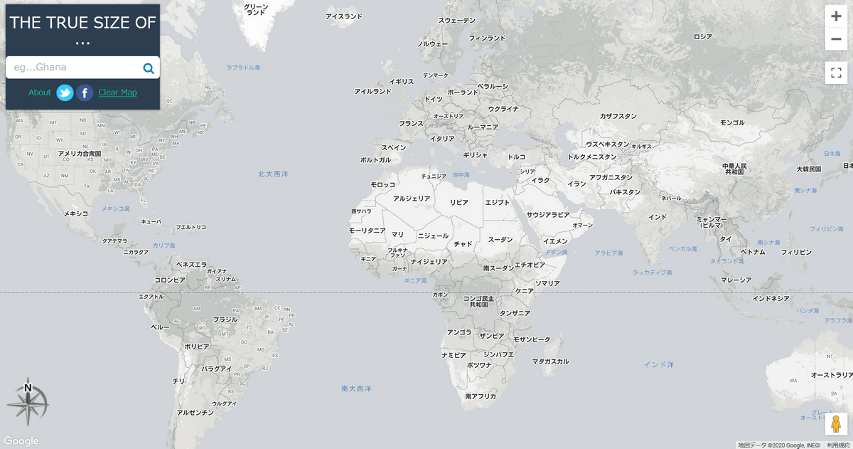
In its initial state, 'The True Size Of...' displays a world map using the familiar Mercator projection.
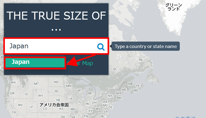
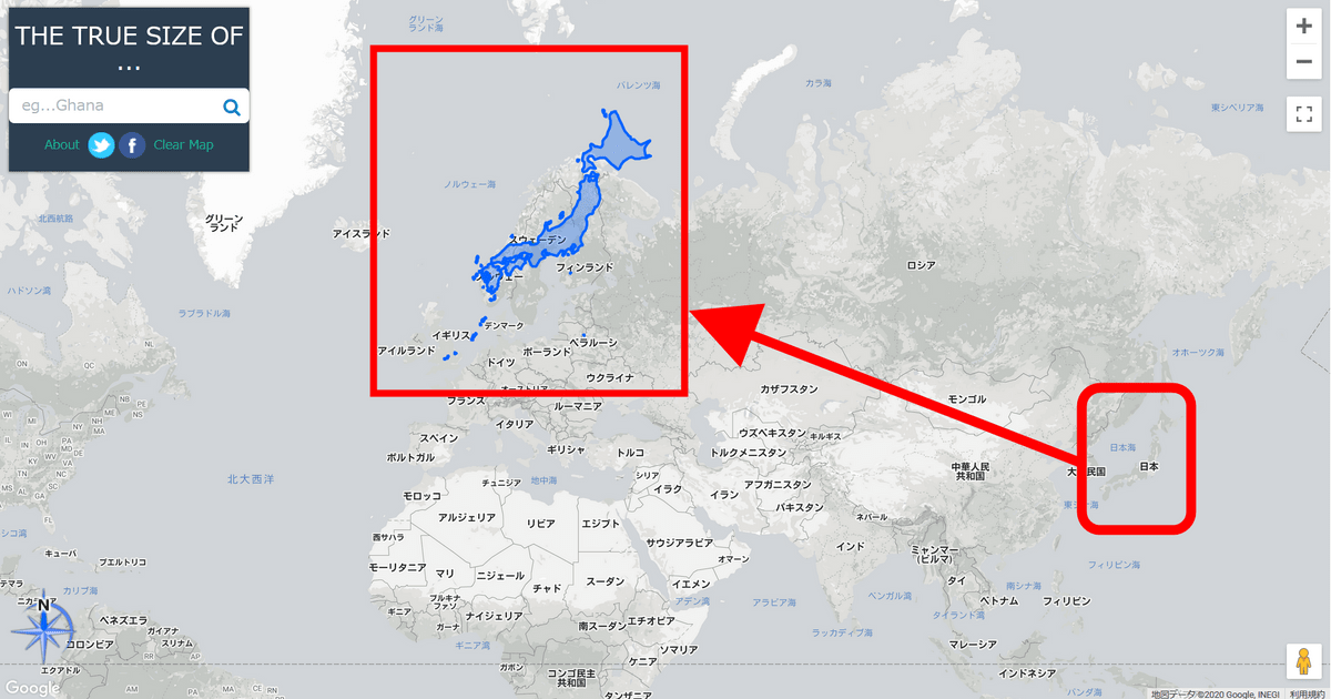
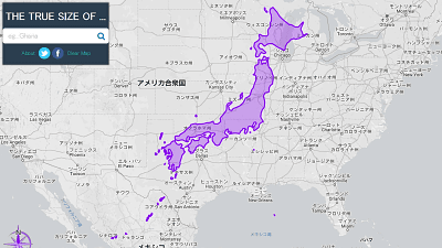
The feature of 'The True Size Of ...' is that it displays the size of the country entered in the search field in the upper left so that you can see it at a glance. To try it out, enter 'Japan' (Japan) in the input field in the upper left and click 'Japan' which is displayed as a suggestion just below the input field...
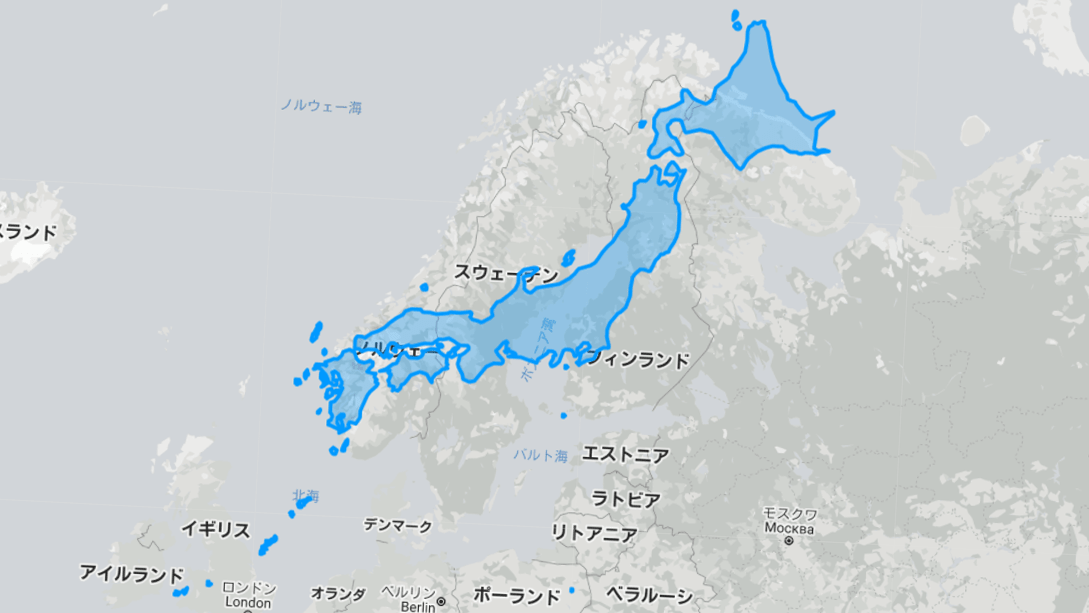
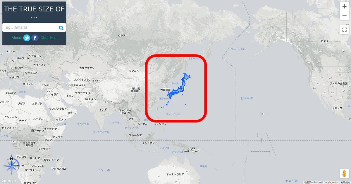
At the same time as Japan became the center of the map, a blue object in the shape of the Japanese archipelago appeared above Japan.
The scale of this blue object changes according to the position you move it, following the distortion of the Mercator projection. If you move a Japanese object so that it overlaps the Scandinavian Peninsula in Northern Europe, the Japanese archipelago will be displayed much larger, and the point that is difficult to understand with the Mercator projection is that ``The Japanese archipelago and the Scandinavian Peninsula are actually the same length.'' I can now understand it intuitively.
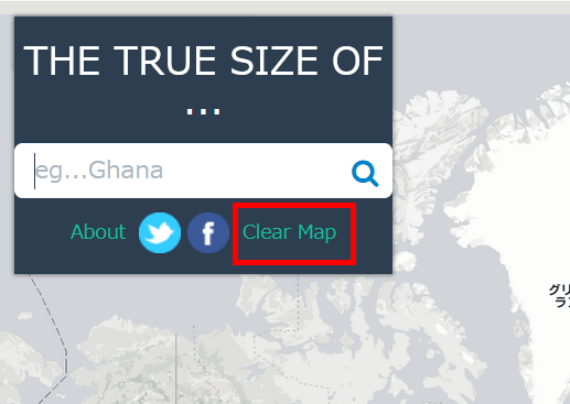
Click 'Clear Map' to erase objects and return to a blank map.
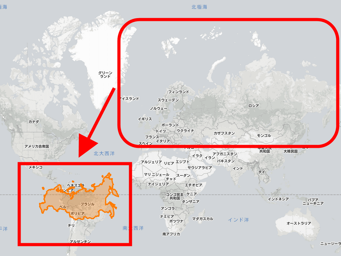
Using the same procedure as before to display Japan, this time I tried displaying Russia.

Next, let's move the object representing Russia to the South American continent near the equator. Being the largest country in the world, it's certainly a big deal, but the impression I get is quite different from what I usually see on a world map.
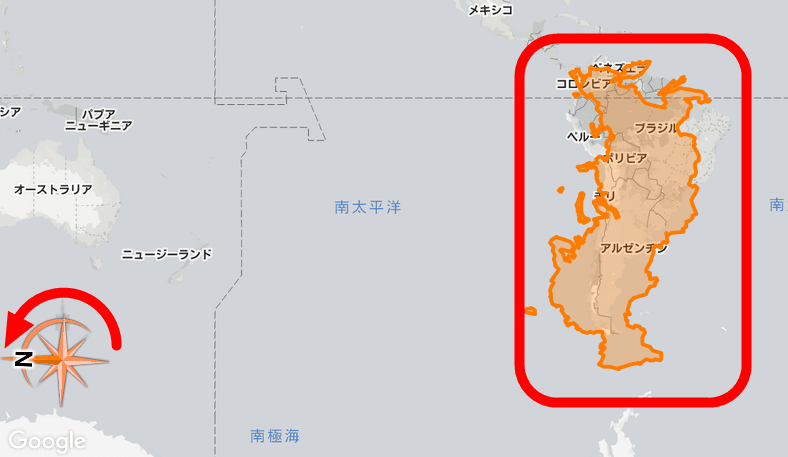
Drag the arrow mark at the bottom left to rotate the object. If you try turning Russia vertically and superimposing it on the South American continent, you will intuitively see that Russia and the South American continent are actually not that different in size. In this way, by using 'The True Size Of...' you can visually understand the characteristics of the Mercator projection, where the higher the latitude, the larger the size, and the lower the latitude, the smaller the size.
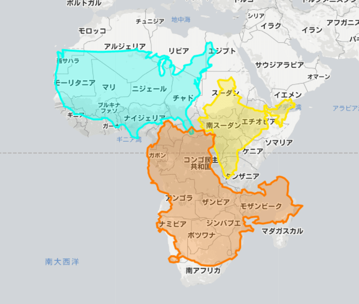
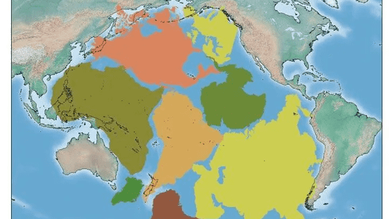
James Talmage and Damon Maneice, who created ``The True Size Of...'', say, ``All map projections are distorted and have their own problems.'' A famous criticism of the Mercator projection is This means that things near the equator are undersized, while the sizes of the United States, Russia, and Europe are exaggerated.'' He said he created this map to help people understand the true size of the world by using it in school lessons.
Related Posts:
in Review, Web Application, , Posted by log1l_ks