Summary of tips to select 'easy-to-see color' when creating a graph and visualizing data
Color selection is a
How to pick more beautiful colors for your data visualizations | Chartable
https://blog.datawrapper.de/beautifulcolors/
◆ Do not pick up hues too much
The colors on the color wheel are roughly divided into six hues of red, orange, yellow, green, blue, and purple, but it is not necessary to use all of these colors widely in order to visualize the data. Picking up a few hues and adding colors near them allows for a more professional look.
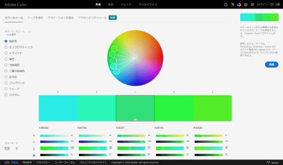
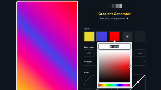
Tools such as 'Adobe Color' are used to select colors.
Adobe Color
https://color.adobe.com/create/color-wheel
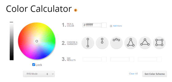
Color Calculator is convenient.
Color Wheel-Color Calculator | Sessions College
https://www.sessions.edu/color-calculator/
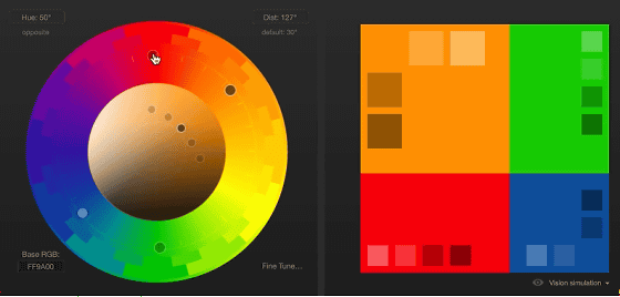
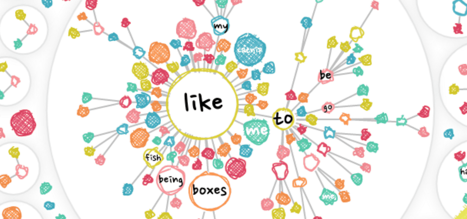
There are many other tools for color selection, but some of them try to let you choose more hues, so you shouldn't use them, Rost said. I will.
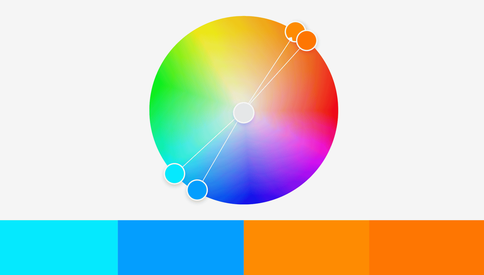
Click the image below to play the movie, and you can see the hue gradually approaching from the place where four colors on the color wheel are selected. In the latter half, when you select 'approximate hue', the color palette looks more harmonious and professional.
This is how you are using Adobe Color to select a “close color” on the color wheel. In the color wheel below, two approximate colors and two
◆ Adjust saturation and lightness first instead of choosing another color
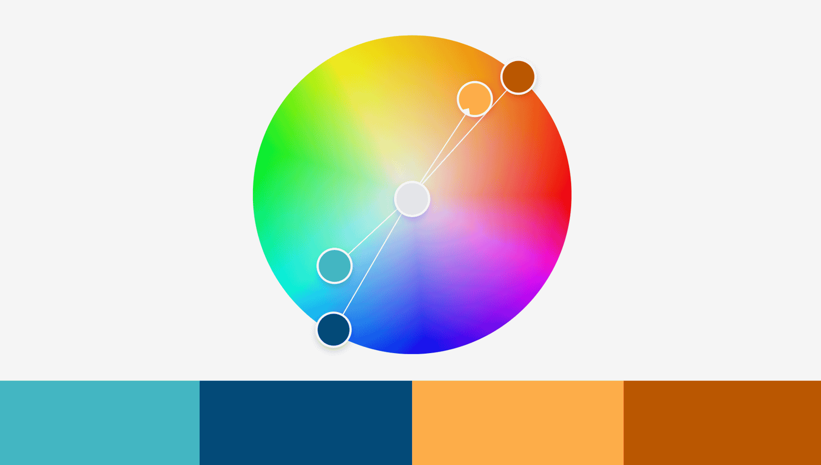
However, if you select with the above method, the problem that 'colors are too close to each other and it is difficult to distinguish' may occur. Therefore, you can visualize the data more easily by adjusting the two values of 'saturation' and 'brightness'.
The four colors that I chose with Adobe Color are the bases. The two blue colors and the two orange colors are too close to each other, making it difficult to distinguish.
If this happens, instead of 'choose a different color' immediately, first adjust the saturation and brightness. If you lower the saturation of the bright light blue at the left end and the second bright orange from the right, and further reduce the brightness of colors other than this bright orange, it will look like this. The difference between them is clear.
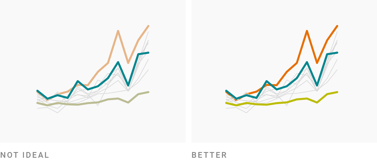
◆Why is the combination of 'warm color' and 'blue' popular among designers?
Designers who visualize data say that a combination of warm colors such as yellow/orange/red and complementary colors such as blue are popular.
This is because the combination of red, yellow, and orange is the same warm color, but they are compatible, but it is easy to distinguish, and blue is a flexible color. Blue is calm and noisy whether you raise or lower the brightness or raise or lower the saturation. In addition, it is also important that the combination of blue/orange is easy to distinguish even if you have color blindness.
◆When using green, shift to blue or yellow
Although green occupies a large part of the color wheel, it is a color that is rarely used in data visualization. This is because green is basically a dark color, but if you increase the brightness, it will become a neon-like shade. When using green in data visualization, it needs to be much less saturated than any other color, and the Washington Post has adopted a very desaturated green.

It should also be borne in mind that it is difficult for people with color blindness to distinguish combinations such as green and red, or green and orange.
Therefore, when using green, it is necessary to slightly shift it to yellow or blue. The following infographics use green to the yellow or green to the blue instead of pure green.
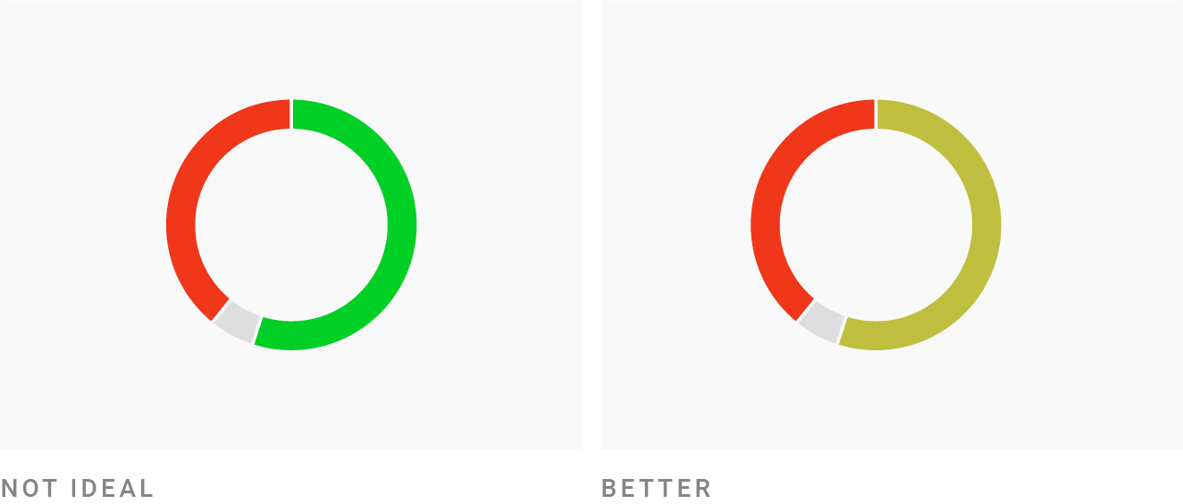
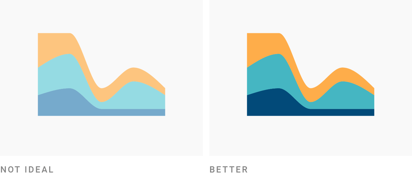
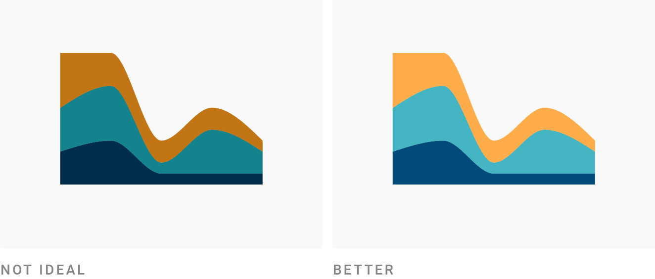
◆ Avoid 'pure colors'
Pure hues are those that are exactly at 60, 120, 180, 240, 300 and 360 degrees on the color wheel.
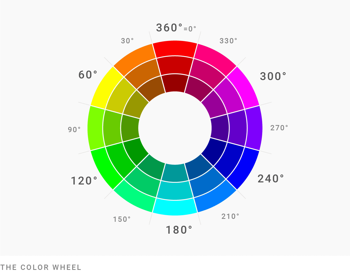
For a more natural look to the reader's eyes, it is recommended to reduce the saturation or lightness rather than choosing pure colors. Even if you want a brighter, more saturated color, you should choose a mix that is at least 5-10 degrees away from the pure color.
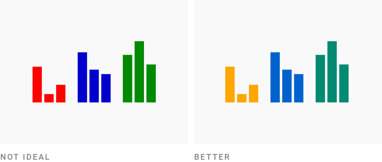
The graph on the left uses pure colors, and the graph on the right avoids pure colors.
◆ Avoid bright saturated colors
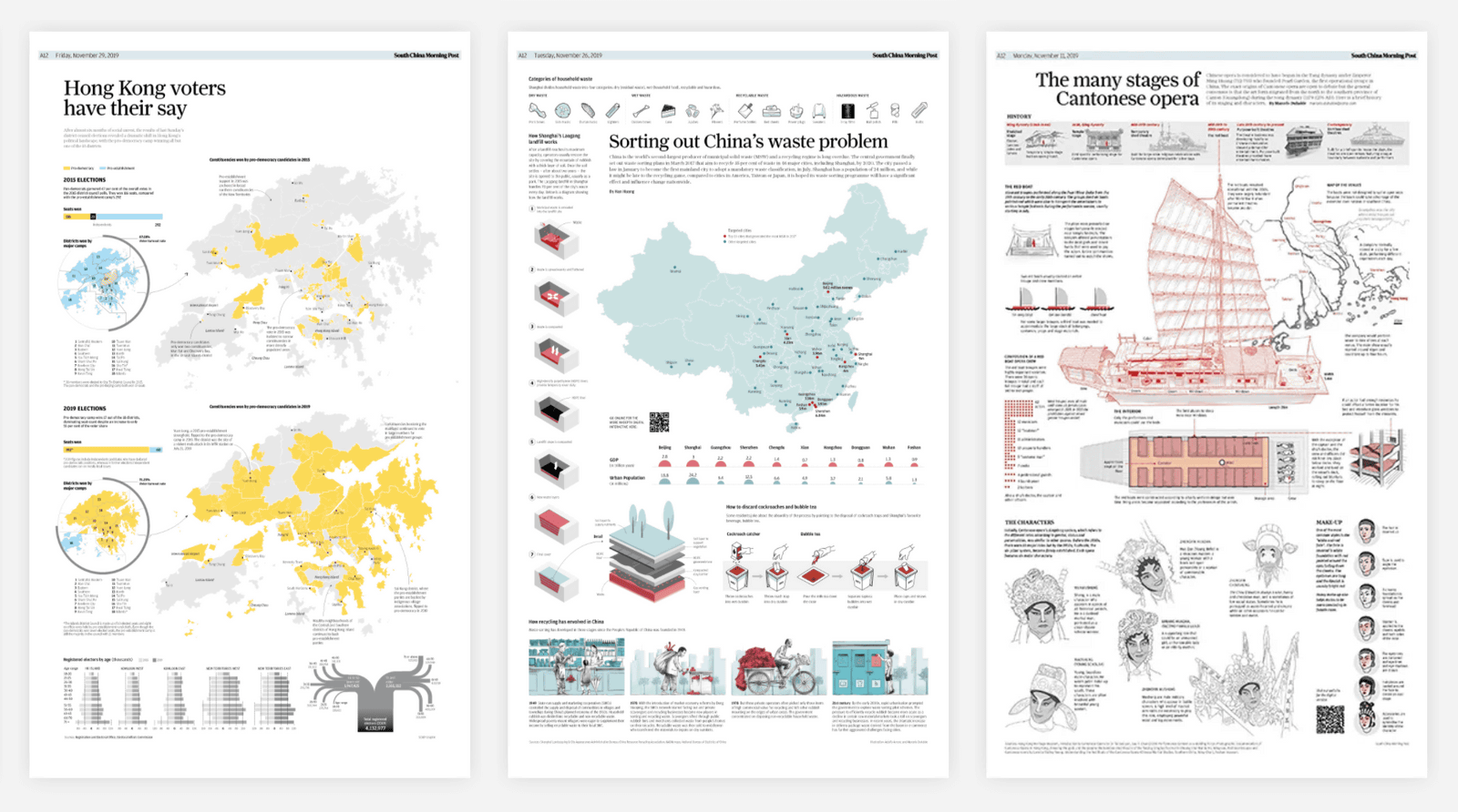
Although neon colors can get the reader's attention, they don't give a good impression. (PDF file) In a
Looking at the example of using colors like the image below, it seems that you can think that 'a neon color with saturation and brightness close to 100% can give a good impression', but in reality it is like this Color and subtle saturation and lightness are reduced. Even if you want to use neon-like colors, subtle adjustments are necessary.
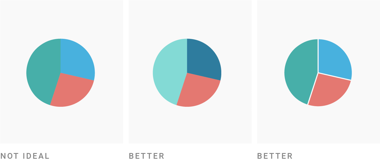
◆Combine colors with different brightness
A graph in which the brightness of adjacent colors is the same is a graph that is difficult for the reader to see. Whether or not the brightness of colors is different can be determined by making the graph monochrome, and if similar grays are lined up, it means that the graph has similar brightness.
If the colors have similar brightness (left image), you can either change the brightness (center image) or put a white border between each element (right image).
◆ How to make 'colorful' correctly
If you hold down the points of 'choose approximate colors' and 'do not choose a wide range of colors', you may not be able to make colorful graphs. I tend to think that. However, even if you keep the above points in mind, you can still create colorful graphs that stand out. In this case, in order to achieve the purpose of 'to stand out', 'a much darker color than others', 'a much brighter color than others', 'a much more saturated color than others', and 'a much purer color than others' You can mix them. At this time, one or two prominent colors seem to be good.
◆ Increase the contrast with the background
There are many graphs that use pastel shades, but when the background is white, the pastel graph makes it difficult to see. In this case, a graph with strong contrast can be created by both 'increasing saturation', 'decreasing brightness', and 'increasing saturation and decreasing brightness'.
◆ However, excessive contrast is prohibited
Creating an overly dark graph just makes it hard to see because you need to create contrast. In this case, it is necessary to take measures such as brightening the color.
◆ The background is desaturated enough
Once you have a better understanding of colors and feel confident in your choice of colors, you may be tempted to choose a “colorful background”. However, the colorful background distracts from the data and narrows the range of graph color selections.
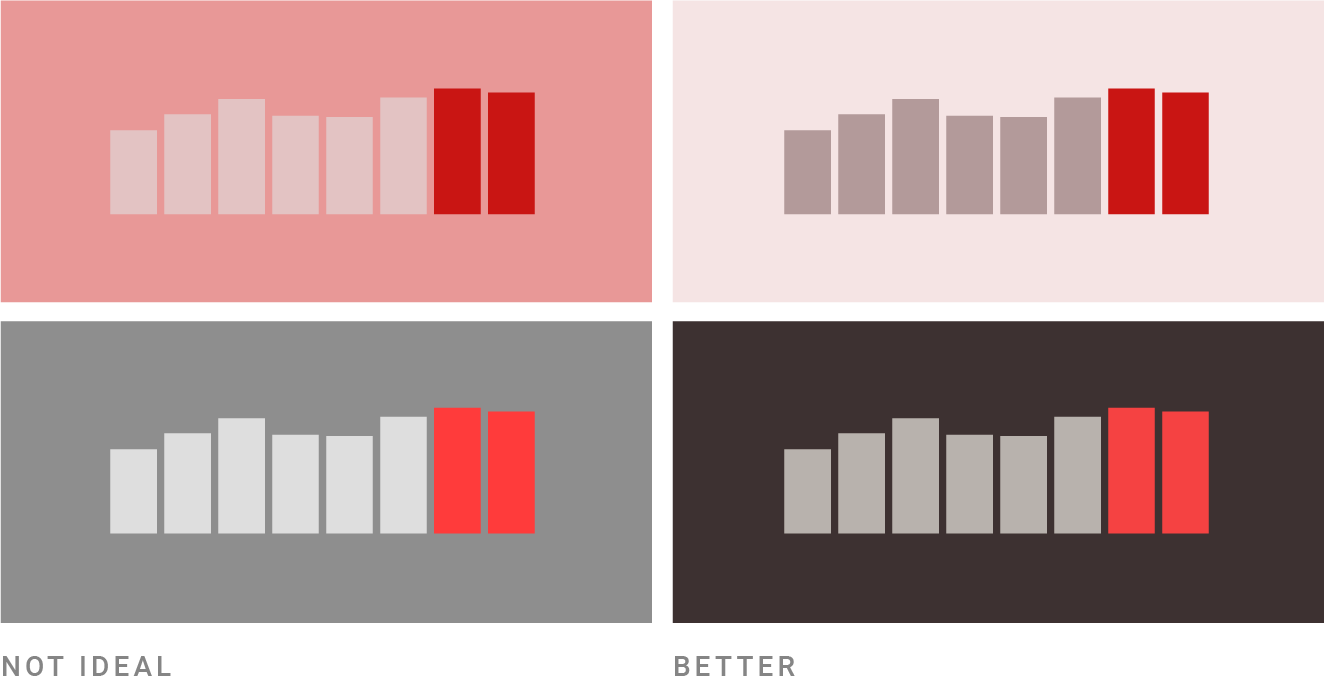
Therefore, it is recommended to keep the following two points.
・When a bright background is required, the brightness should be 95% or more and the saturation should be less than 7%.
-When a dark background is required, keep the saturation below 20%, avoid 'pure black', and keep the brightness at 10-25%.
◆ Copy color selection
'Choosing a good color combination' is a difficult task that requires a lot of understanding. For this reason, “copying a combination of colors” from movies, works of artists, color palettes created by others, etc. is one method.
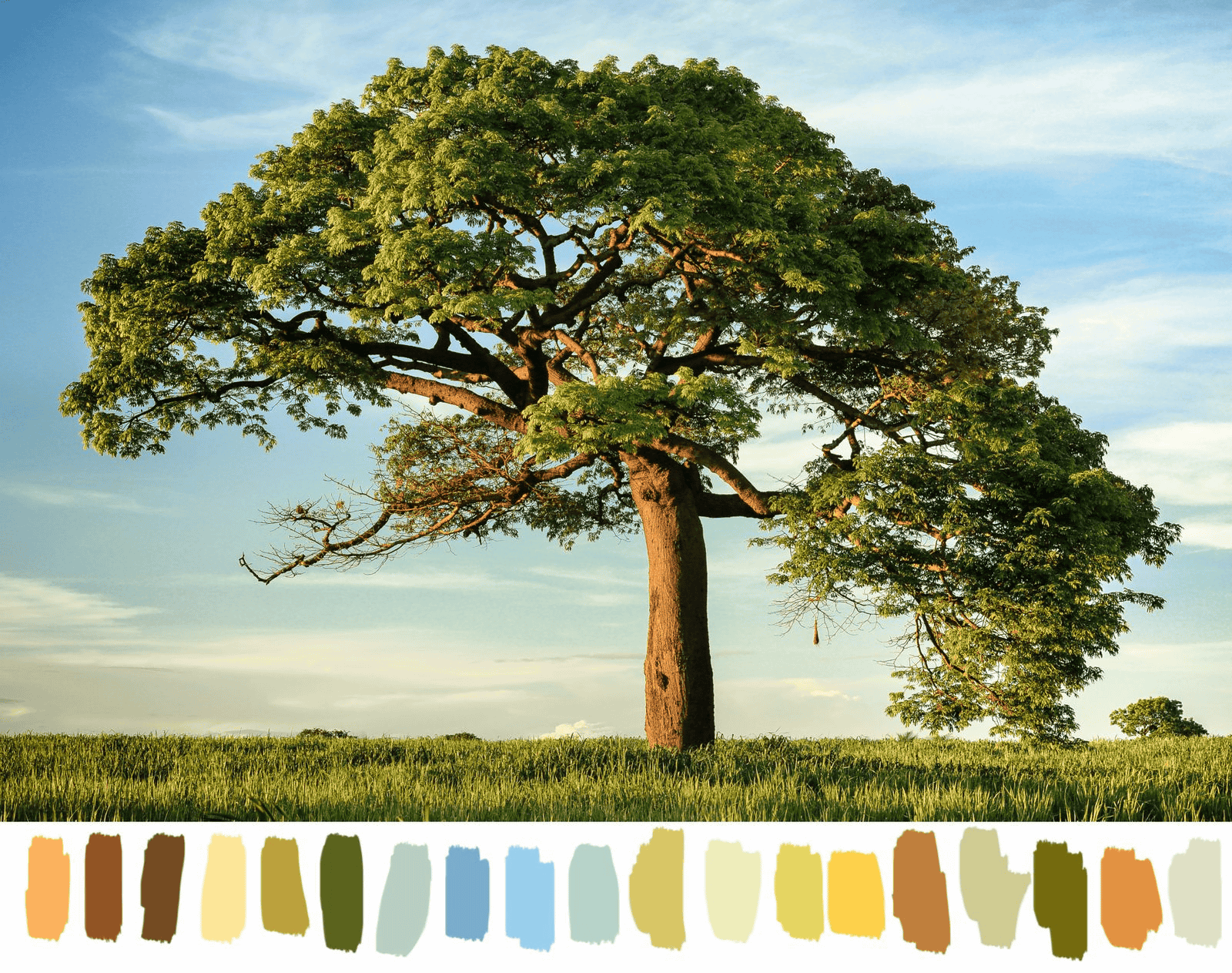
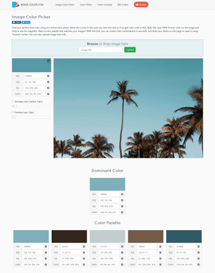
'Color Picker online' is a convenient tool that extracts the colors used in images. If you have a photo that you like, creating a color palette from that photo is a wise choice. Another option is to pick up the color using Photoshop's eyedropper tool.
Color Picker online | HTML Color Codes
https://image-color.com/
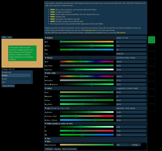
It is also recommended that you deepen your understanding of colors, such as by using 'Colorizer' to analyze the colors. When the understanding of colors deepened, what I thought was 'beautiful for some reason' was changed to 'this is beautiful, because...'.
Colorizer-Color picker and converter (RGB HSL HSB/HSV CMYK HEX LAB)
http://colorizer.org/
Related Posts:


in Design, Posted by darkhorse_log