After testing 100 people with the question 'Is it possible to accurately draw the car emblem only by memory?'
The logo of a famous car brand is also very famous, and the brand's emblem shines on the front bumper of the car. The results of an experiment in which 100 British people actually drew how exactly such a famous brand emblem can be drawn only by memory have been announced.
Drawing Motoring Logos from Memory | Van Monster
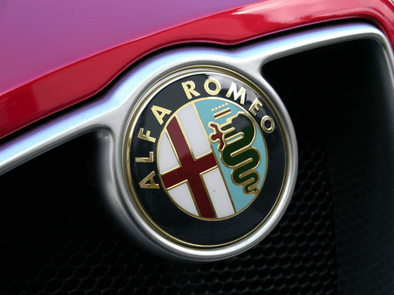
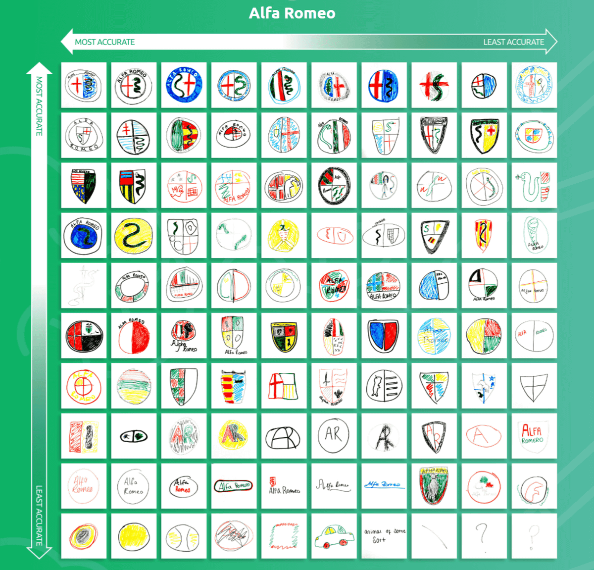
◆Alfa Romeo
First, the following image is the logo of Alfa Romeo, an Italian luxury car manufacturer. It has the 'St. Giorgio's Cross', the coat of arms of the city of Milan, and the 'Large Serpent' in the crest of the Visconti family , and its design has not changed much since 1910.
by
And the Alfa Romeo logo actually drawn by 100 people is as follows. The accuracy is higher in the upper left corner. It was said that St. Giorgio's cross was drawn in 26% of the total, the snake was drawn in 37%, and only 17% could draw both. Also, it seems that one-fourth of the whole draws a shield type logo instead of a circle.
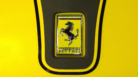
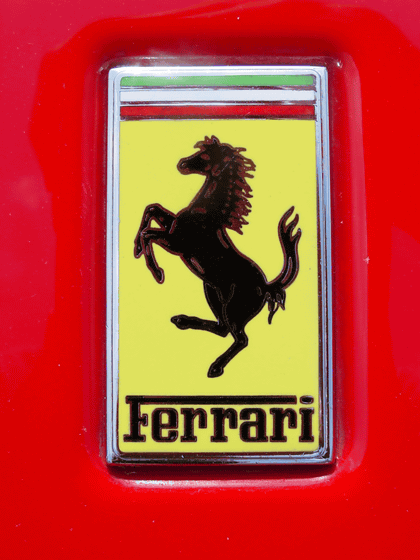
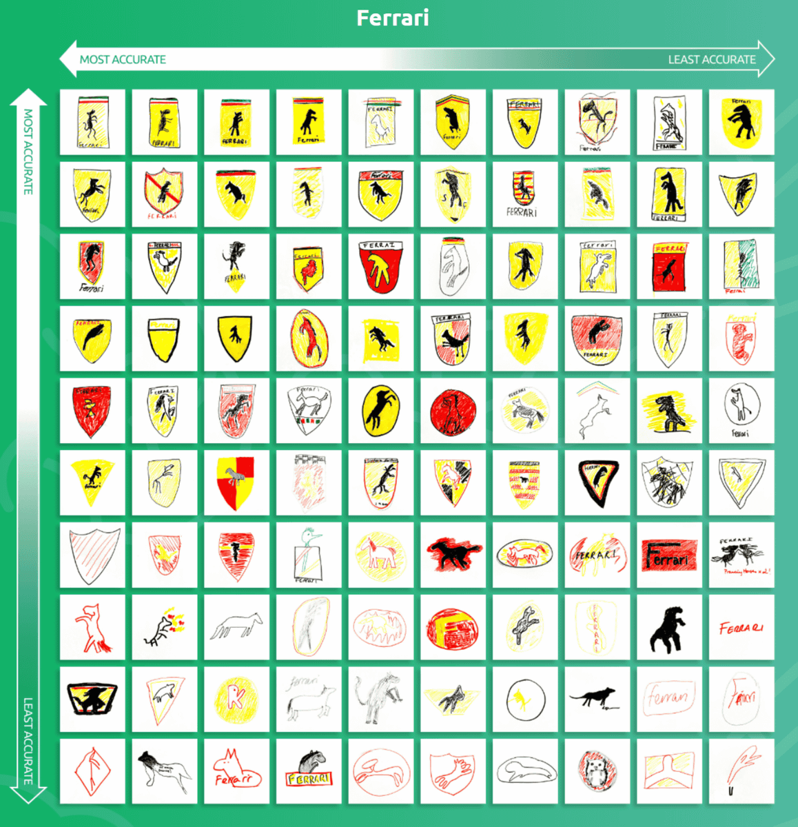
◆ Ferrari
Italy's luxury brand Ferrari is often mentioned as a representative luxury car brand, and the yellow emblem with the silhouette of a black prancing horse is famous. In addition, the emblem also incorporates the name 'Ferrari' and the tricolor of green, white and red that reminds of Italy.
by
And when 100 people actually draw it, it looks like this. Whether Ferrari still has top-class name as a luxury car brand, 88% of the people can draw the emblem yellow, and 82% of people try to draw the horse. However, 49% of the people wrote 'Ferrari' and 15% of the people could draw the Italian tricolor.
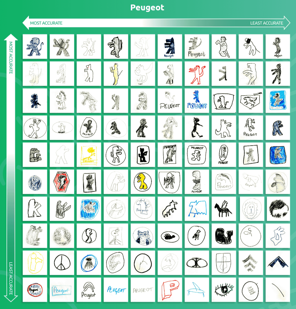
◆ Peugeot
France's Peugeot, the world's oldest mass-produced car maker, uses a lion that stands up on its hind legs as its logo. It seems that this lion is a lion statue placed at the entrance of the fortress in Belfort, eastern France.
by
For more than 100 years, Peugeot has been holding the lion in its brand logo, but it seems that many people didn't even remember it compared to other brands. In particular, 20% of the whole has no animals drawn, and 30% of the whole has a completely different logo shape and design.
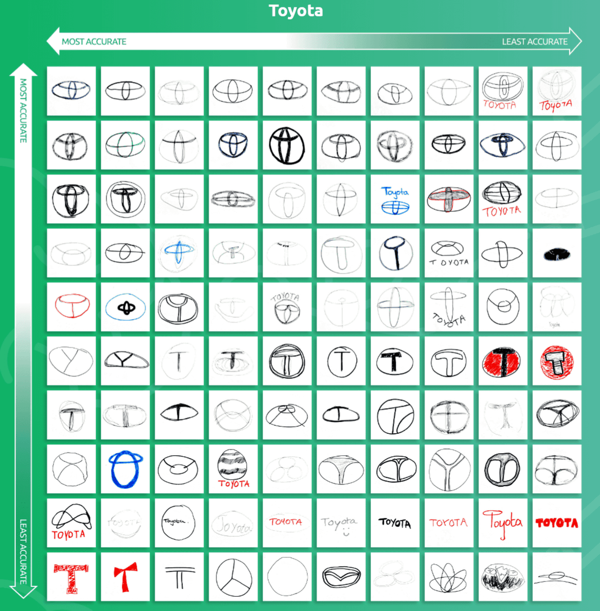
◆ Toyota
by
It seems that many people had the image that 'somehow the ellipses are combined', but it was less than half of the whole that I could remember that it was a combination of three ellipses, and 32% of people were inside He didn't draw the ellipse. Also, 12% of all logos had the letter 'T' drawn directly inside the logo instead of an ellipse.
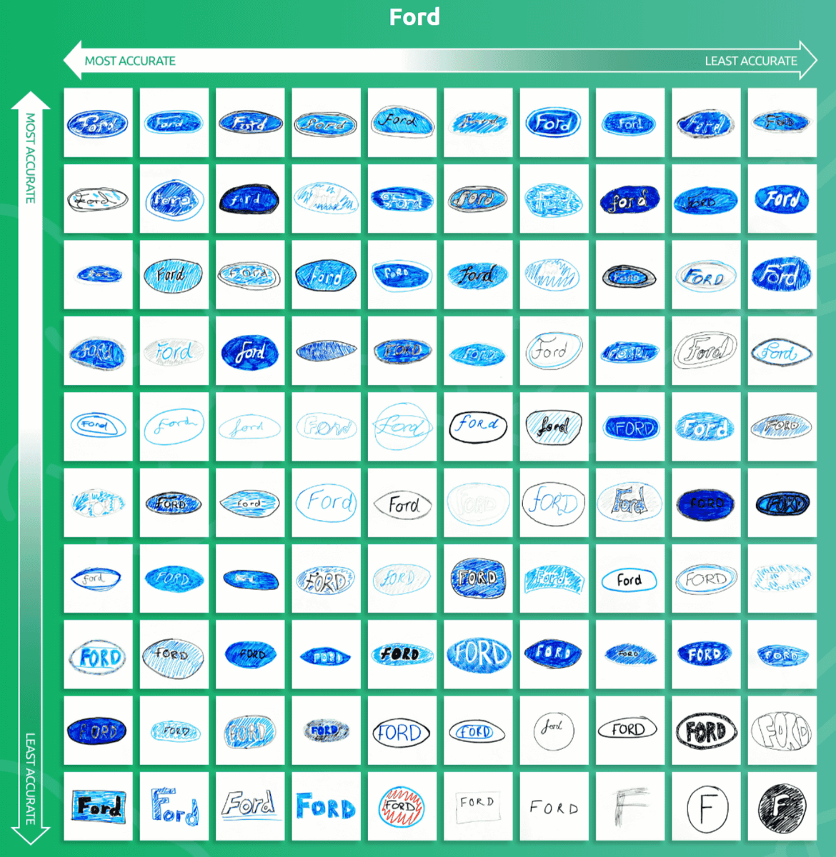
◆ Ford
The Ford logo has a design that is written in white cursive as 'Ford' on a royal blue oval base, and has not changed in 117 years of history.
by
The simple and easy-to-understand Ford logo seems to be deeply impressed by many people, 90% of the whole draws an ellipse, and 89% of the whole reproduces the royal blue. 58% of the cursive writing was Ford. Only 10% of people drew logos that were irrelevant to the real logo.
The site also announces the results of various other manufacturers, so if you are interested, please check it out.
Related Posts: