A data visualization professional explains how to select 'colors that humans can easily perceive' in design

There are RGB , HSV , HSL, etc. in the color space used to express a certain color, and the method of expressing the color is different in each color space. Gregor Aisch , CTO at Datawrapper , a data visualization tool, says in his blog that color space is important to use colors based on 'human-feeling colors'.
How To Avoid Equidistant HSV Colors
https://www.vis4.net/blog/2011/12/avoid-equidistant-hsv-colors/
Take Care of your Choropleth Maps
https://www.vis4.net/blog/2011/12/choropleth-maps/
The reason why Aisch noticed the importance of color selection was that the following class diagram visualized the poverty rate in the United States, which was published by ' The Guardian ', by region. When Mr. Aisch saw this figure, he thought, 'The poverty rate is high in the dark Central and Central America, which is close to Mexico.'
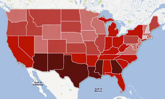
However, when Aisch created his own classification map using the same data as The Guardian, he completed something completely different from The Guardian's. From this incident, Aisch noticed the importance of the range of each class, the number of classes, and the colors used in the class diagram.
Mr. Aisch points out that there is a problem with the HSV that is used when selecting colors in a class diagram. Since the 'value' of HSV 'value' is a measure of 'physical brightness' rather than 'brightness that humans perceive,' even if different colors are displayed with the same brightness, they are re-expressed in grayscale. And the brightness will be completely different. In this way, the brightness that people perceive strongly depends not only on the lightness but also on the 'hue', which is the 'Hue' of the HSV.
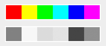
Furthermore, the change in brightness in a single hue is not linear. Aisch takes as an example an image in which the brightness is increased at regular intervals in HSL with a fixed hue. In the red image, the difference between the second and third colors looks much larger than the difference between the third and fourth colors from the left.
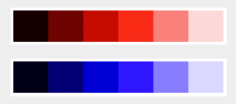
Also, if you try grayscale processing the above image using Photoshop, you can see that the change in brightness is different between red and blue. Aisch points out that the brightness that humans perceive also depends on the hue. Even if you think that you used colors differently so that you can easily distinguish them “numerically” using HSV and HSL, it is possible that the colors were difficult to distinguish when you actually see them.
As an easy way to solve this problem, Aisch introduces a tool called Color Brewer . ColorBrewer has a color set that is easy to distinguish from the beginning, so you can easily use different colors easily.

However, Color Brewer suffers from the limited number of colors available, Aisch said. Also, you have to use a predefined color set, so you have less freedom. “It's half the fun of choosing an existing solution,” Aisch said.
If you want to maximize the world of color, CIELAB is the right choice . CIELAB is proposed by the International Commission on Illumination (CIE) , which is the lightness of the color 'L', the position between red/magenta and green that corresponds to 'A', and the position between yellow and blue that corresponds to 'B'. A color space that is expressed using two coordinates.

However, there are some problems in using CIELAB. Regarding CIELAB, Aisch can express more colors than RGB, the effective range of 'A' and 'B' depends on each value, and selects colors by mixing four colors The difficulty is taken up as a problem.
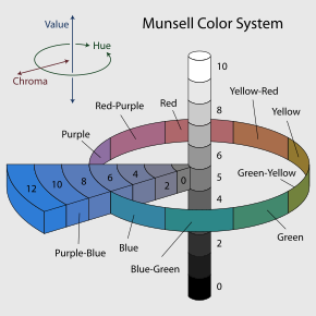
The HCL color space solves this problem. HCL is a color space converted from CIELAB into a cylindrical coordinate system , which is expressed by the hue corresponding to 'H', the saturation corresponding to 'C', and the luminance corresponding to 'L'. Similar to the Munsell color system for images, but the HCL uses luminance rather than lightness.
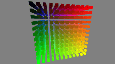
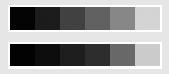
For example, when I fix the brightness and saturation with HCL and extract the colors, it looks like this.
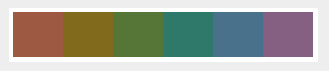
When I grayscaled this image in Photoshop, all the colors were converted to the exact same color. In other words, it can be seen that the 'brightness' that humans perceive is more complete when selecting colors using HCL than when using HSV.

Aisch says Colorpicker for data is a convenient way to try HCL easily. With Colorpicker for data, you can select a color while fixing either hue, saturation, or brightness. In the image below, 9 colors are selected while doing 'HL (fix saturation)'.

You can change the number of colors by clicking '+' or '-' and copy the color code of the color selected in 'Copy' to the clipboard.

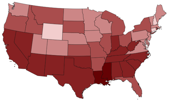
You can click 'Visualized' to color the 2008 US unemployment rate by region with the color of your choice and see if you have the proper color coding.

If you want to use HCL for web development, you can use the JavaScript library called Chroma.js published by Aisch.
gka/chroma.js: JavaScript library for all kinds of color manipulations
https://github.com/gka/chroma.js
Related Posts: