'Coronavirus tracked: has your country's epidemic peaked?' Comparing the new coronavirus infection status between two countries using 'excess mortality' and 'logarithmic graph'
Coronavirus tracked: has your country's epidemic, a web application that displays a graph of the number of deaths and the number of infected people of new type coronavirus infection (COVID-19) in each country and allows you to visually understand whether you have passed the peak of infection ' Peaked? ' has been published by the British economic newspaper Financial Times. This web application is focused on visually comparing the increase in the number of deaths and the number of infected people with 'excess mortality' and 'logarithmic graph', and from the graph the countries where the infection situation is similar You can look for it.
Coronavirus tracked: has your country's epidemic peaked? | Free to read | Financial Times
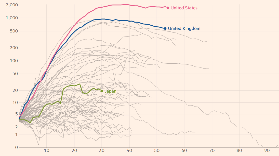
'Coronavirus tracked: has your country's epidemic peaked?' Is a web application that displays the number of deaths and infections due to COVID-19 in two specified countries in a graph. By default, the number of new deaths of COVID-19 around the world is displayed in a semi-log graph as follows.
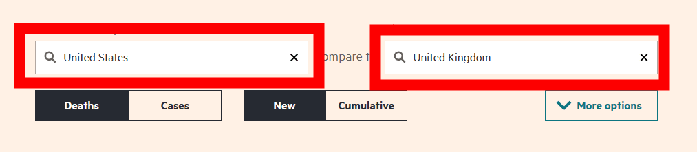
Let's actually use 'Coronavirus tracked: has your country's epidemic peaked?' First, enter the country name you want to compare in the input field at the top of the graph.
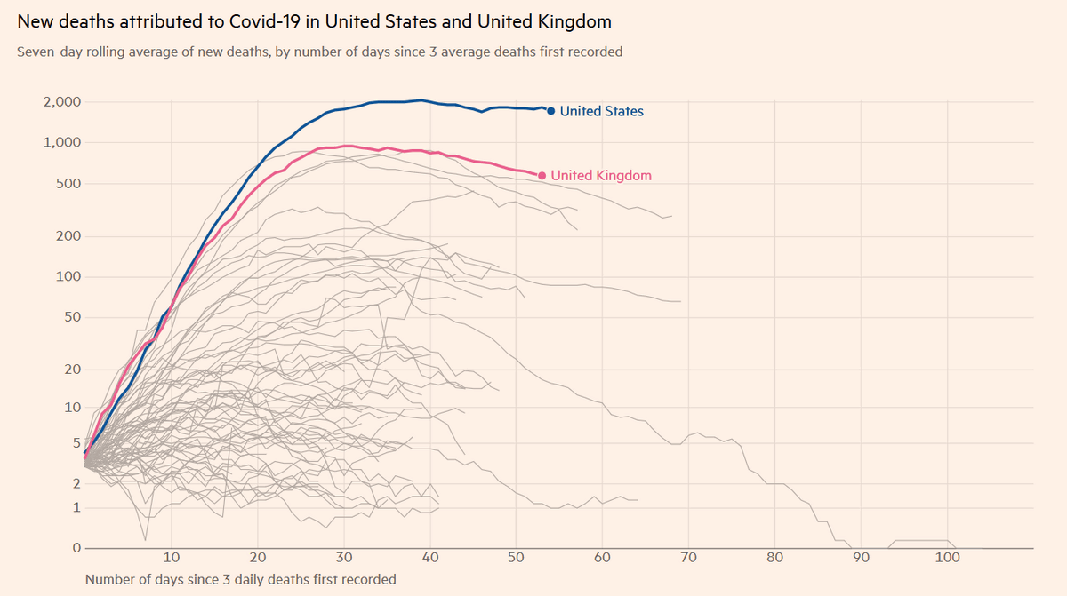
At the bottom of the entry field there is an option to change the reference data such as 'Deaths', 'Cases', 'New' and 'Cumulative'. First, select 'Deaths' and 'New' and look at the 'New fatalities' graph.

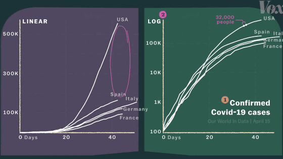
Below is a graph comparing the number of new deaths in the two countries of United States (United States) and United Kingdom (United Kingdom). Of the graphs of each country, only the graphs of the United States and United Kingdom are displayed in blue and pink respectively. The horizontal axis is the number of days elapsed since the day when the number of fatalities reached three, and the vertical axis is the number of new deaths corresponding to the number of days elapsed. Although the number of new deaths in the United States and the United Kingdom is similar, the number of new deaths at the peak of the United States is more than double that in the United Kingdom. Also, the British graph is already sloping down and you can visually see that you have gone off peak, but the United States remains almost flat. The situation is still in the peak.
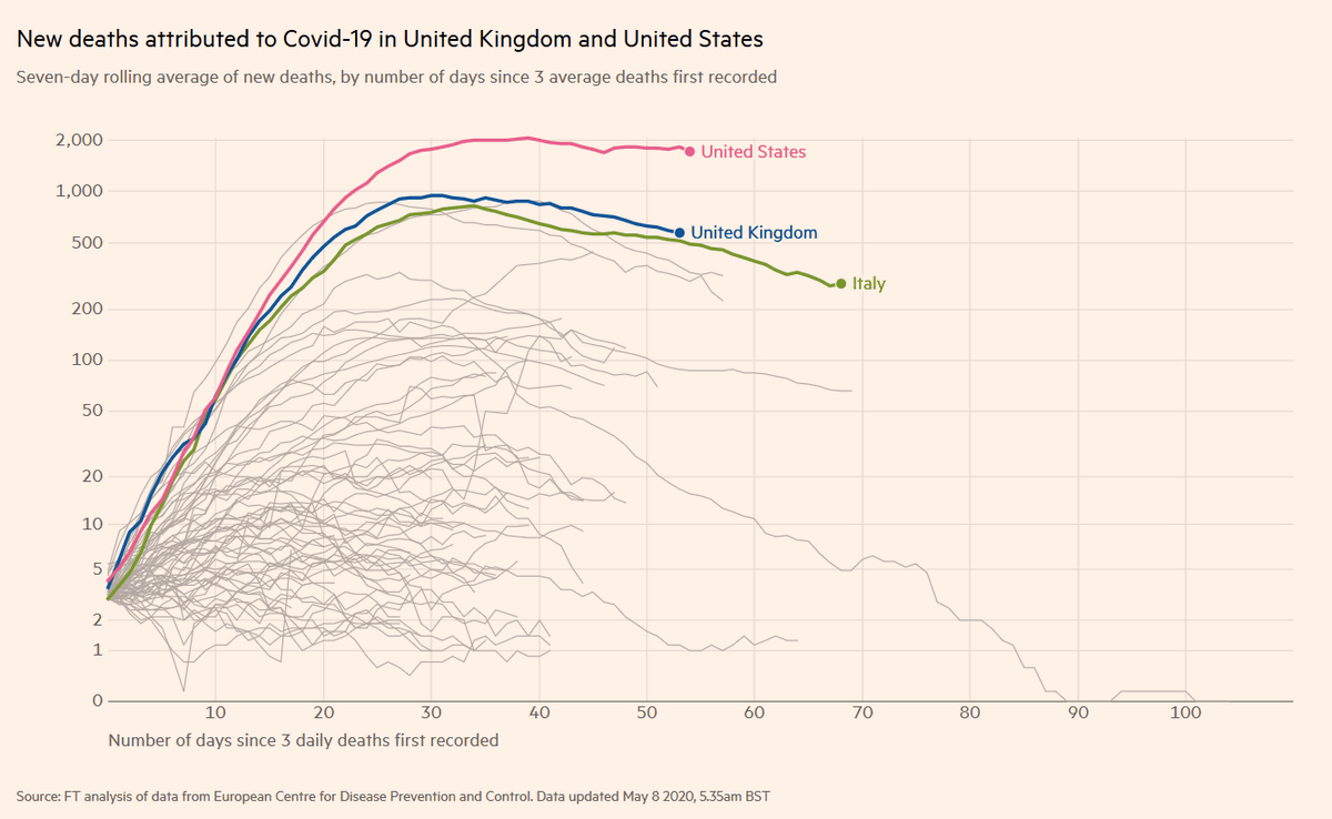
The graph where the cursor is placed is highlighted in green and the country name is displayed. Looking at the graphs of Italy and the UK below, it is possible to visually understand that the infection status of these two countries is close. It is expected that the number of new deaths in the United Kingdom will follow the number of new deaths in Italy.
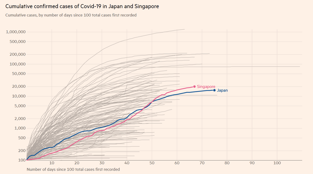
Next, select 'Cases' and 'Cumulative' as options, and look at the 'total number of infected people'. The graph of total infected cases in Japan is very similar to Singapore.
Regarding the number of deaths due to COVID-19, there is a problem that the count formula differs depending on the country such as 'whether it includes deaths outside the hospital' or 'whether it includes deaths at nursing homes'. Therefore, 'Coronavirus tracked: has your country's epidemic peaked?' Uses the 'excess mortality' as much as possible for the number of deaths. The number of excess deaths is the number of total deaths during a pandemic (regardless of the cause of death) minus the average number of deaths during normal times, and the number of deaths generated by a pandemic, whether direct or indirect. A number that is believed to represent. The Financial Times wrote, 'Compared to the number of excess deaths, each country officially announces that the number of deaths is considerably lower.'
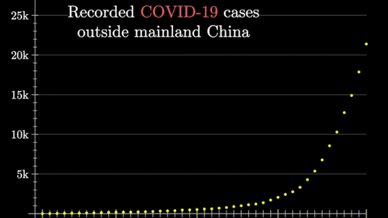
The graph displayed by 'Coronavirus tracked: has your country's epidemic peaked?' Is a 'logarithmic graph' with a logarithmic scale on the vertical axis. For logarithmic graphs, Kazuki @ Graph Philosophy ( @kazukigraph ) publishes an easy-to-understand explanation comic on Twitter.
I see a semi-logarithmic graph and draw myself about the new-type coronavirus infection, but I drew a manga to convey that 'what is a logarithmic graph?'
— Kazuki @ Graph Philosophy (@kazukigraph) April 10, 2020
'Looking at an infectious disease on a logarithmic graph' (1/3)
I uploaded it as a pdf file on the site, so if you want to read it in bulk, please click here https://t.co/mwrRCkZ6AD pic.twitter.com/0USW9Eil0a
It is a continuation.
— Kazuki @ Graph Philosophy (@kazukigraph) April 10, 2020
'Watching infectious diseases with logarithmic graph' (2/3) # New coronavirus pic.twitter.com/R460zzZveH
It is a continuation. This is the last.
— Kazuki @ Graph Philosophy (@kazukigraph) April 10, 2020
'Watching infectious diseases with logarithmic graph' (3/3) # New coronavirus https://t.co/R460zzZveH pic.twitter.com/UljLSpoMu6
Related Posts:

in Web Application, Posted by darkhorse_log