Experts explain `` a method for accurately transmitting information using a map '' using new coronavirus data

Mapping coronavirus, responsibly
https://www.esri.com/arcgis-blog/products/product/mapping/mapping-coronavirus-responsibly/
Since the discovery of the new coronavirus in December 2019, more than 77,000 people have been infected by the virus and more than 2,600 have died in Hubei, China, as of February 25, 2020. As of February 25, the World Health Organization (WHO) had evaluated the new coronavirus as `` not a pandemic, '' but on February 27, `` there is a possibility of a pandemic. '' Demands vigilance.
In response to the spread of the new coronavirus, Kenneth Field , a professional at creating maps at Esri, created a 'map that visually shows the spread of the new coronavirus' using only aggregated data in China. It also explains the points to be aware of when multiplying the data with the map.
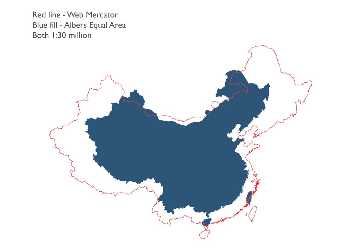
First, Field argues that when mapping data on the new coronavirus in China, maps should be represented using isometric projections . Mr. Field said, `` If the size of each area on the map is not correctly represented by using Mercator projection etc., it may change many impressions, '' Albers equal-area cone which is an equal area projection method And the law should be used.
The following map shows the whole of China with the Mercator projection (red line), which is not an equal area projection, and the Albers Equal Area Conic (blue), which is one of the equal area projections. As you can see again, the overall shape of China depends greatly on the projection used.
One common method used to present data on a map is a
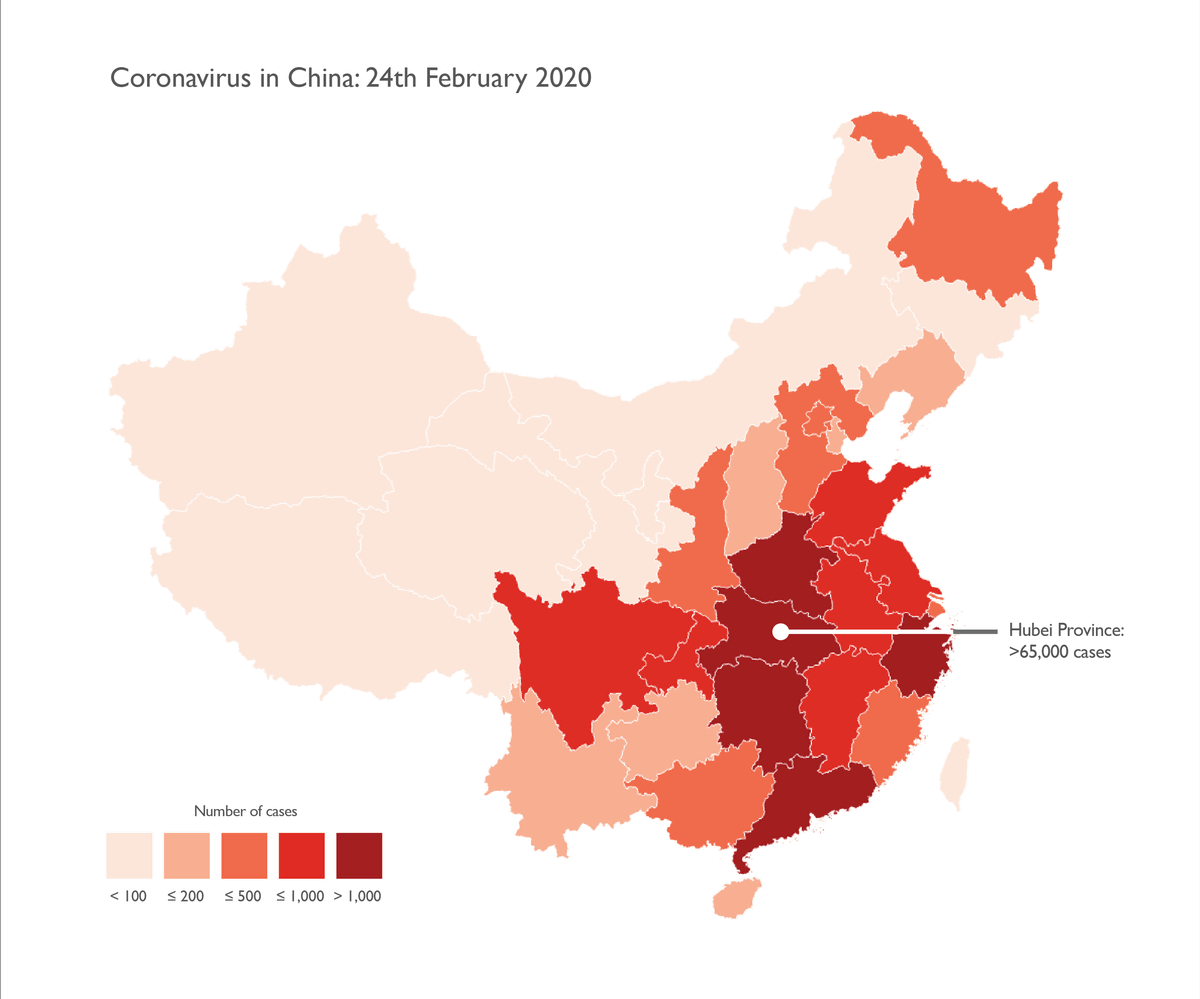
For example, the class diagram below shows data for the new coronavirus as of February 24, 2020. It is a summary of the number of infected people of the new coronavirus by region, and it seems that the number of infected people increases as the color tone becomes darker, so it records the highest number of infected people in multiple regions You. However, in fact, Hubei Province, which is the source of the new coronavirus, has 65,000 infected people, far more than any other region. Therefore, Mr. Field claims that the following class diagram is not appropriate.
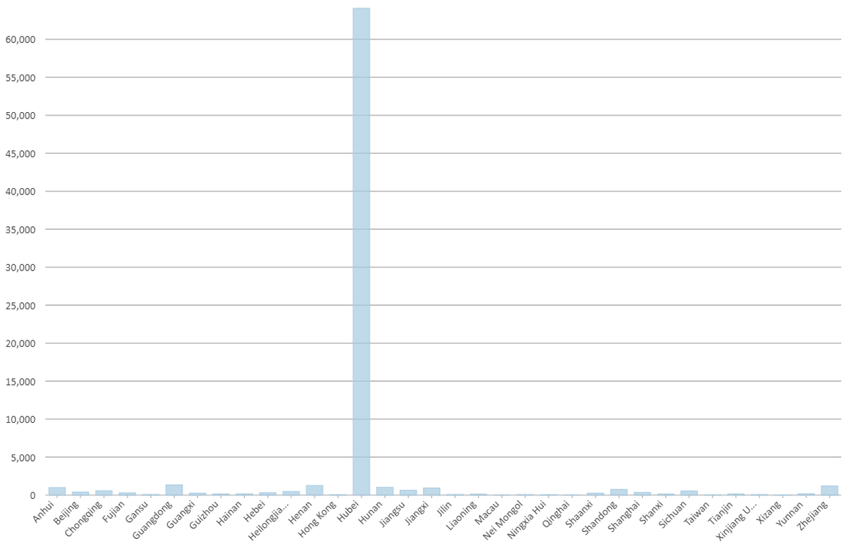
The actual number of infected people in each region is shown below as a bar graph. You can see that the number of infected people is outstanding in Hubei Province.
In addition, the class diagram that Mr. Field gave as a 'wrong example' does not include the population by region or the proportion of infected people in the population. If the population of Hubei is only 100,000, the proportion of infected people is threatening, but if you have a population of 1 billion, the effects of infection may be insignificant. Hmm.
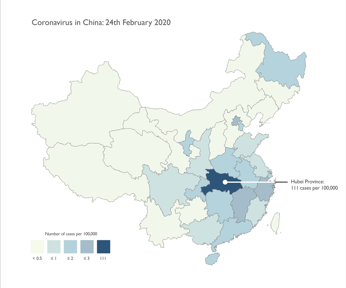
Therefore, Mr. Field emphasizes that it is important to clearly show the disparity in the number of infected people between Hubei and other regions, using Hubei as an outlier. Similar to the 'wrong example', the figure below summarizes the proportion of new coronavirus infections by region in China in a class diagram. `` 0.5 out of 100,000 '', `` 1 out of 100,000 '', `` 2 out of 100,000 '', `` 3 out of 100,000 '', `` 111 out of 100,000 '', and `` The outlier data for Hubei Province is indicated by 'percentage' instead of 'number', and emphasized by using different colors and numbers from other regions.
He explained why he changed the colors used in class diagram from reddish to bluedish, 'People like red maps, and red is eye-catching. However, considering the dataset, We are mapping a tragedy that could be even worse in the future, would you like to scream at the bright red map? Still statistically, death by the new coronavirus is extremely rare But the red color implies it. '
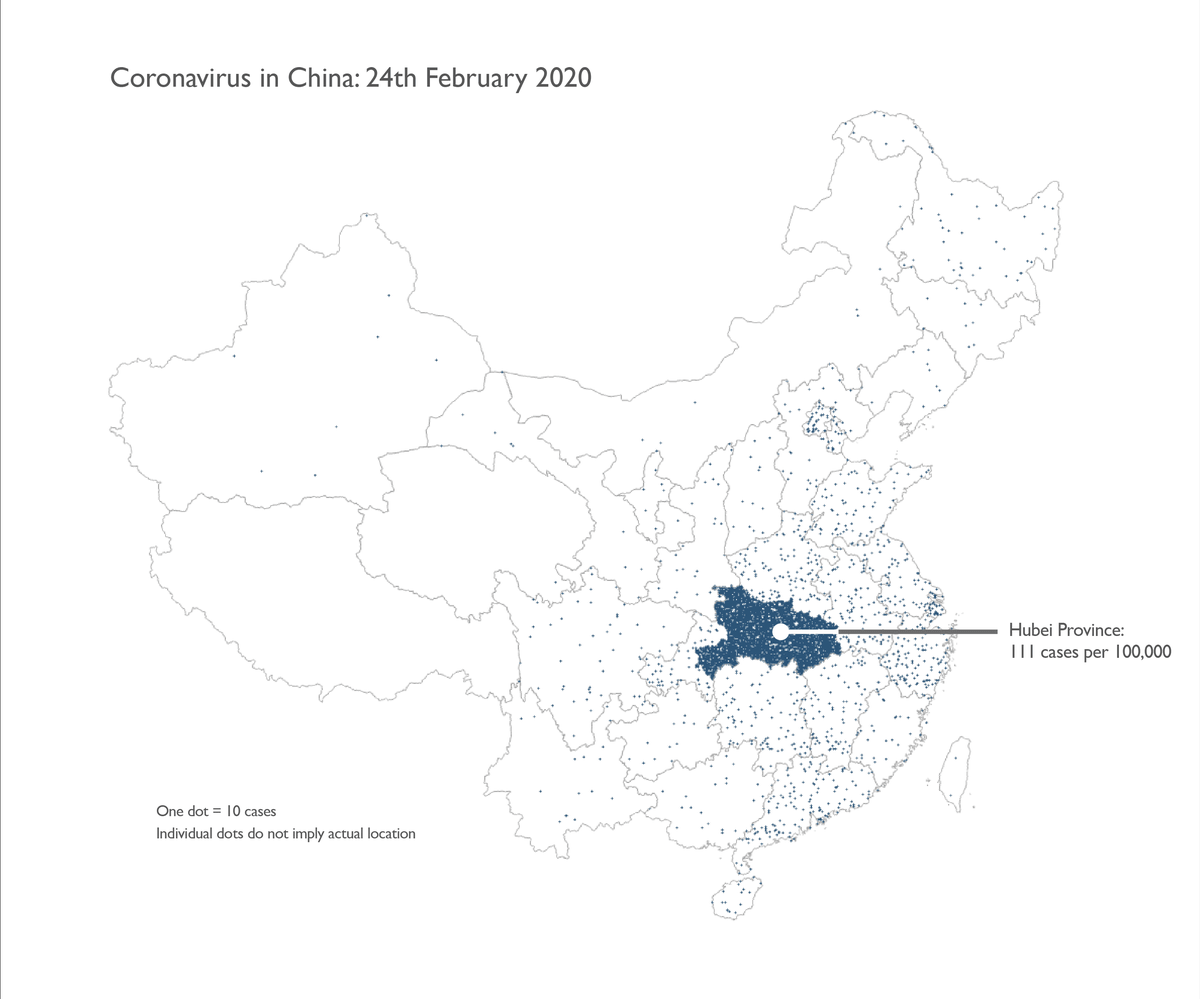
Also, class diagram is not the only technique that can be used to show data on a map. For example, with dot density display , it is possible to clearly show the number on the map instead of the percentage of infected people. In the map below, one dot represents 10 infected people. However, if dots are shown on the map to indicate the infected person, there is a problem that 'it is possible to identify cases of infection,' said Field.
In addition, the
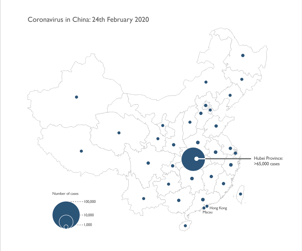
Small areas such as Hong Kong and Macau cannot be distinguished on the class map or dot density map, but the proportional symbol map can show the number of infected people by area. 'For countries with large territories, such as China, it is inevitable that small areas will be overlooked, but using proportional symbol maps to emphasize small areas such as Hong Kong and Macau,' said Field. Is possible, 'explains the benefits.
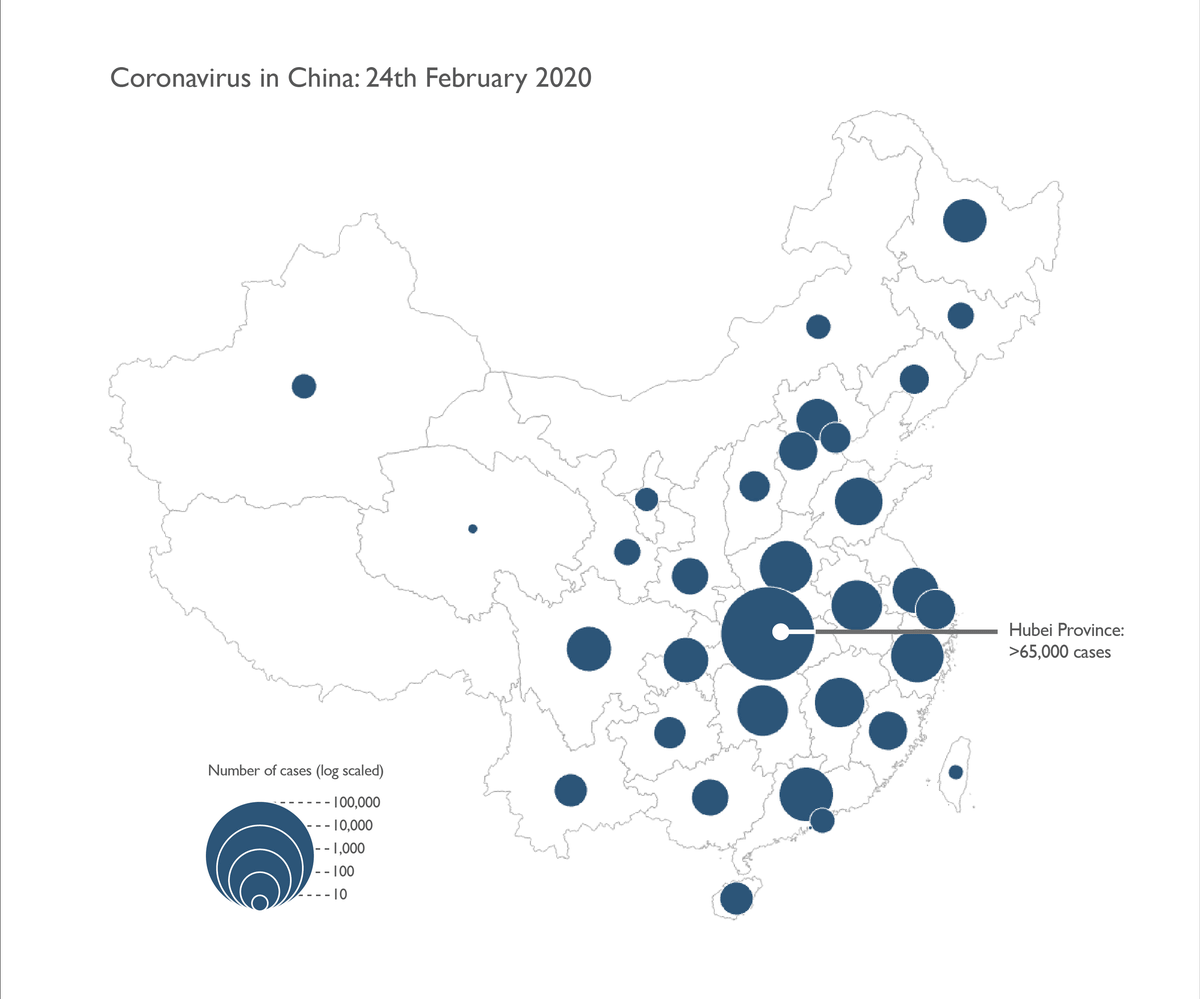
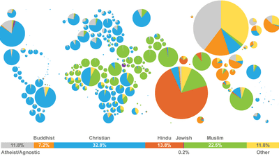
It also explains that using a
When it comes to responsible data, such as maps showing the spread of the new coronavirus, Field says it's important to know exactly what's important. For example, in the case of the new coronavirus, '111 out of 100,000 people are infected with the new coronavirus in Hubei (0.1% of the population).' 'In areas other than Hubei in China, the infection rate is 2.5 / 100,000. It is important to pay attention to the percentage of people under the population, 'The infection rate is lower in other countries,' 'Maps sometimes contain messages, but those that look good are often useless.' That.
Also, when creating a map, it is necessary to consider these factors and take care not to create something that contains incorrect information.
Related Posts:


in Note, Posted by logu_ii