`` Coronavirus 2020-nCoV '' map that shows at a glance the momentum of the new coronavirus that spreads infection
The spread of the
Coronavirus 2020-nCoV
https://gisanddata.maps.arcgis.com/apps/opsdashboard/index.html#/bda7594740fd40299423467b48e9ecf6
ncov – CSSE
https://systems.jhu.edu/research/public-health/ncov/
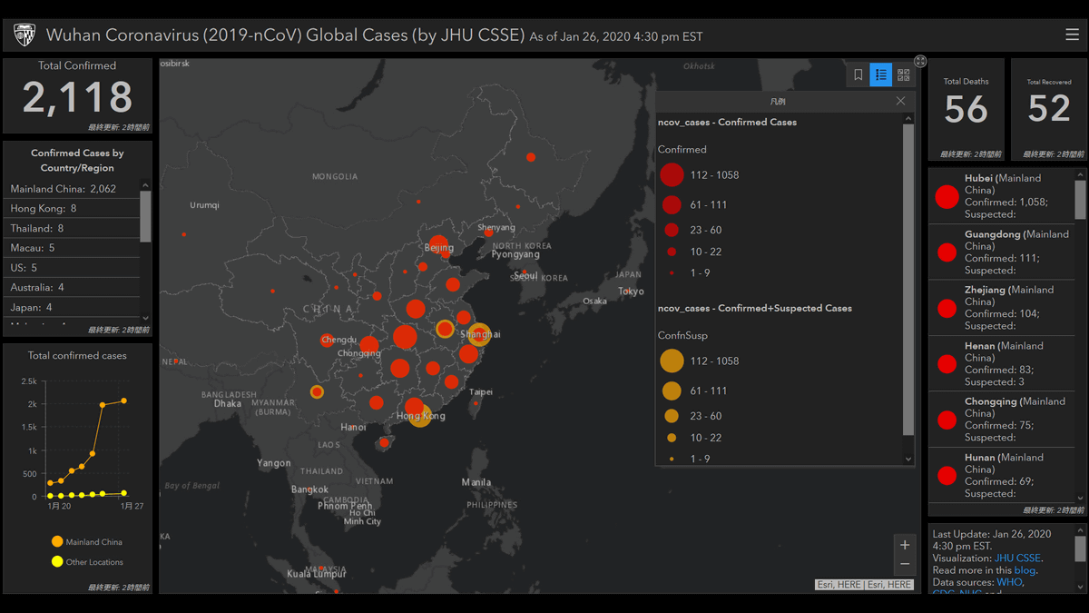
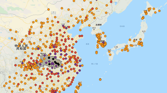
Opening the map looks like this. Data source is the World Health Organization and (WHO) the United States Centers for Disease Control and Prevention (CDC), the National Sanitation health committee China (NHC), China's medical information site DXY.cn is based on, Esri ArcGIS Online base map of map of Visualized above.
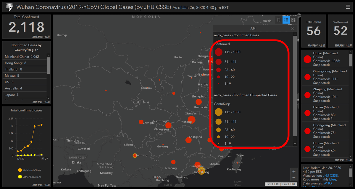
The points with circles on the map are the areas where infection with the new coronavirus has been reported. The red circle indicates 'cases where infection was confirmed', and the yellow circle indicates 'cases suspected of infection'. The size of the circle is displayed larger according to the number of cases.
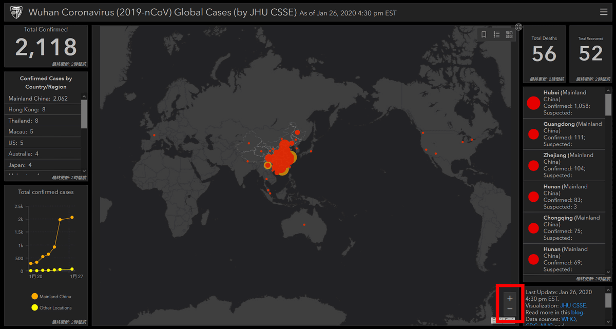
The map can be enlarged or reduced with the +/- icon on the lower right of the map or the mouse wheel. If you look at the map, you can see that the infected area is concentrated in southern China, and there are few cases of infection in Europe, the United States, and Australia.
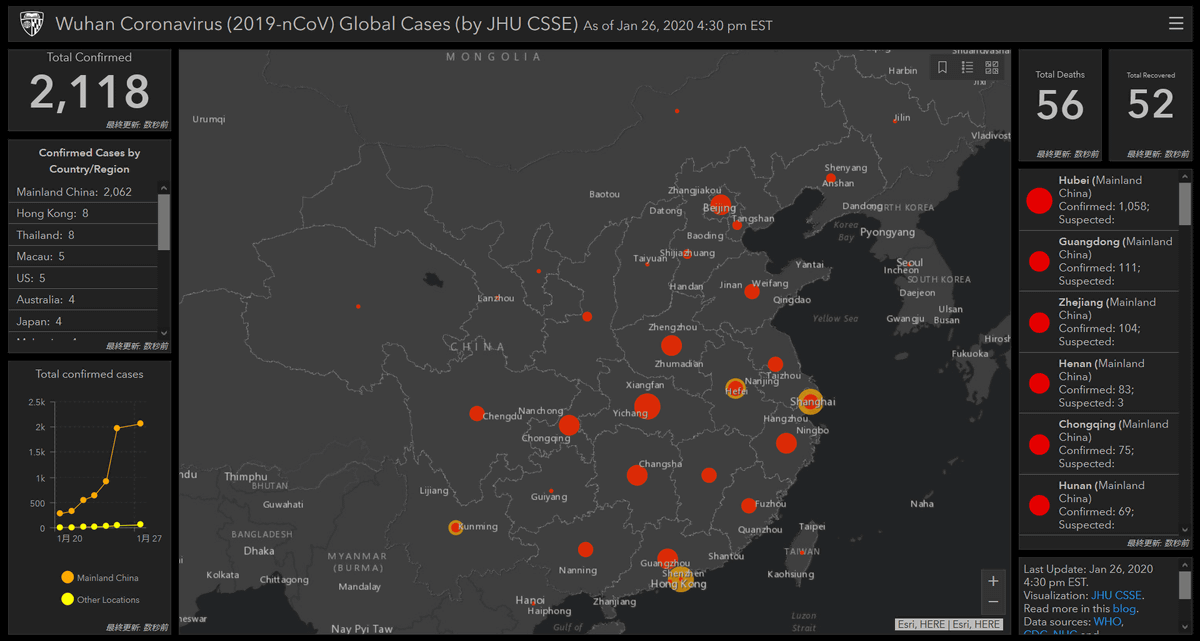
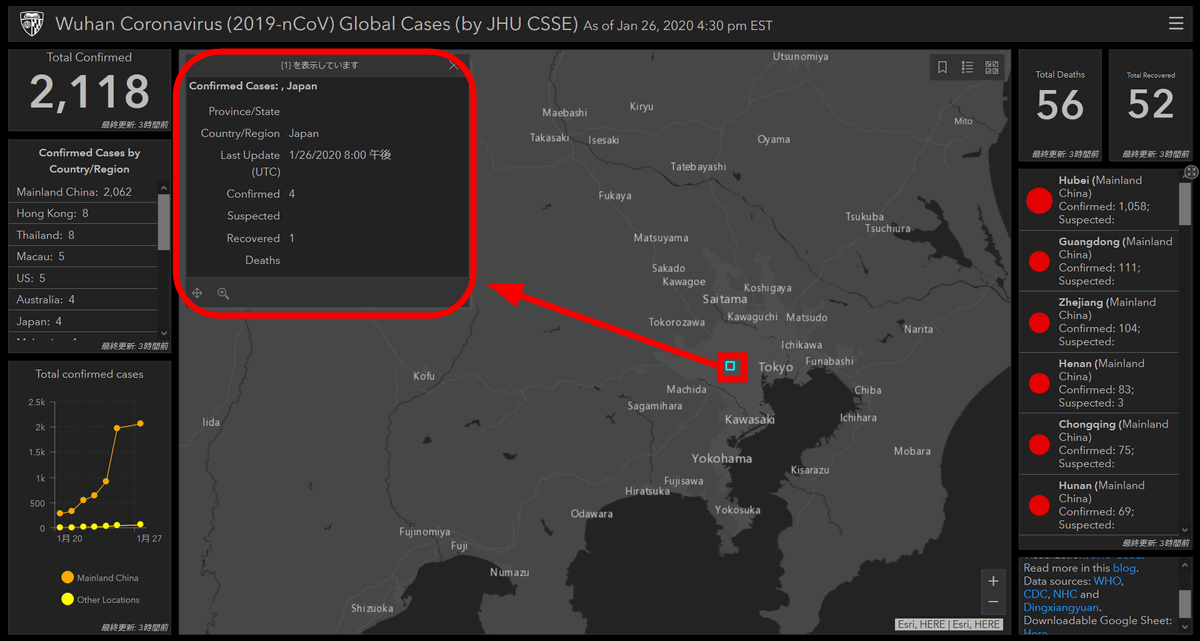
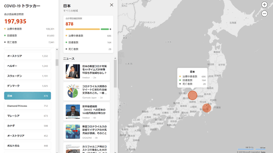
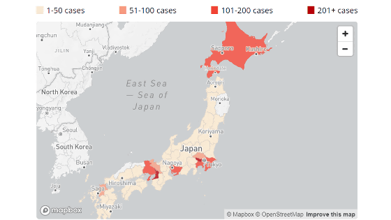
Zoom to Japan where the
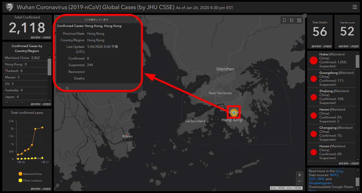
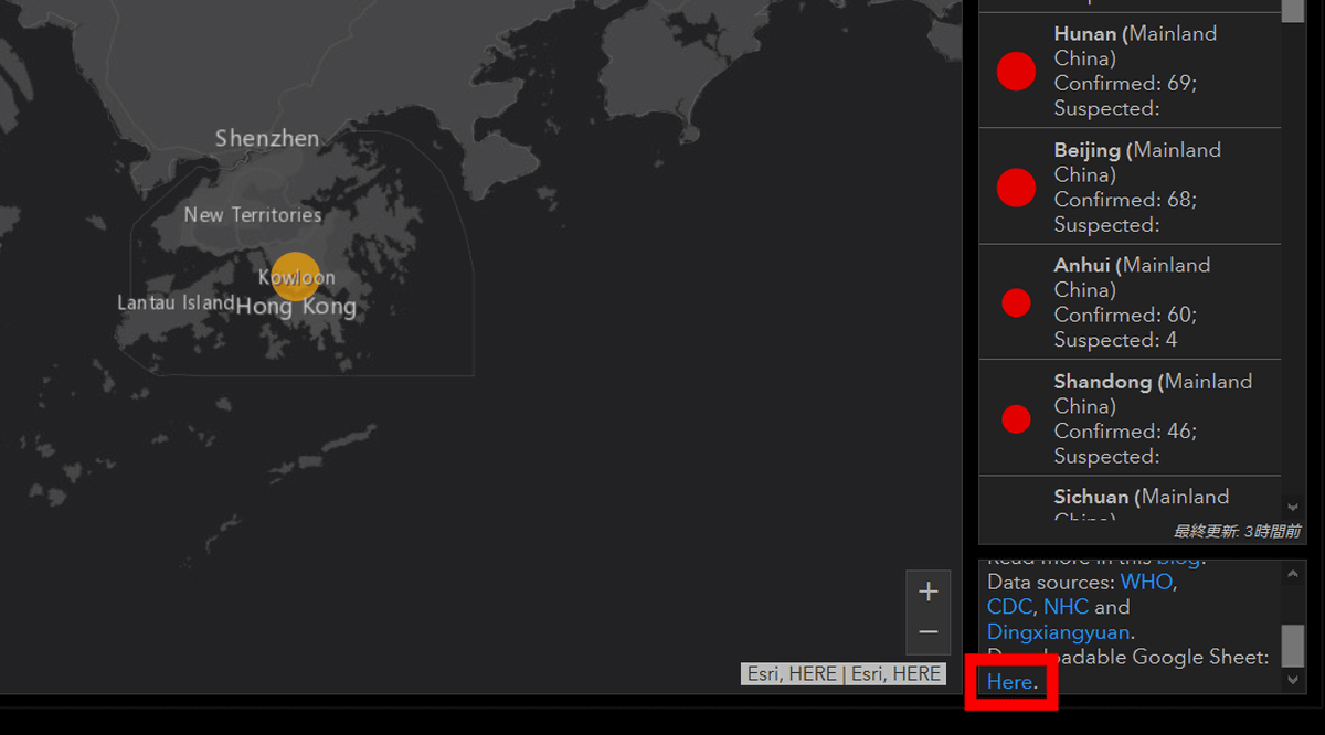
In Hong Kong, shaken by democratization demonstrations starting in March 2019, eight people have been confirmed infected and 244 have been suspected (Suspected). The yellow circle is larger than the red circle, because the infection has not been confirmed.
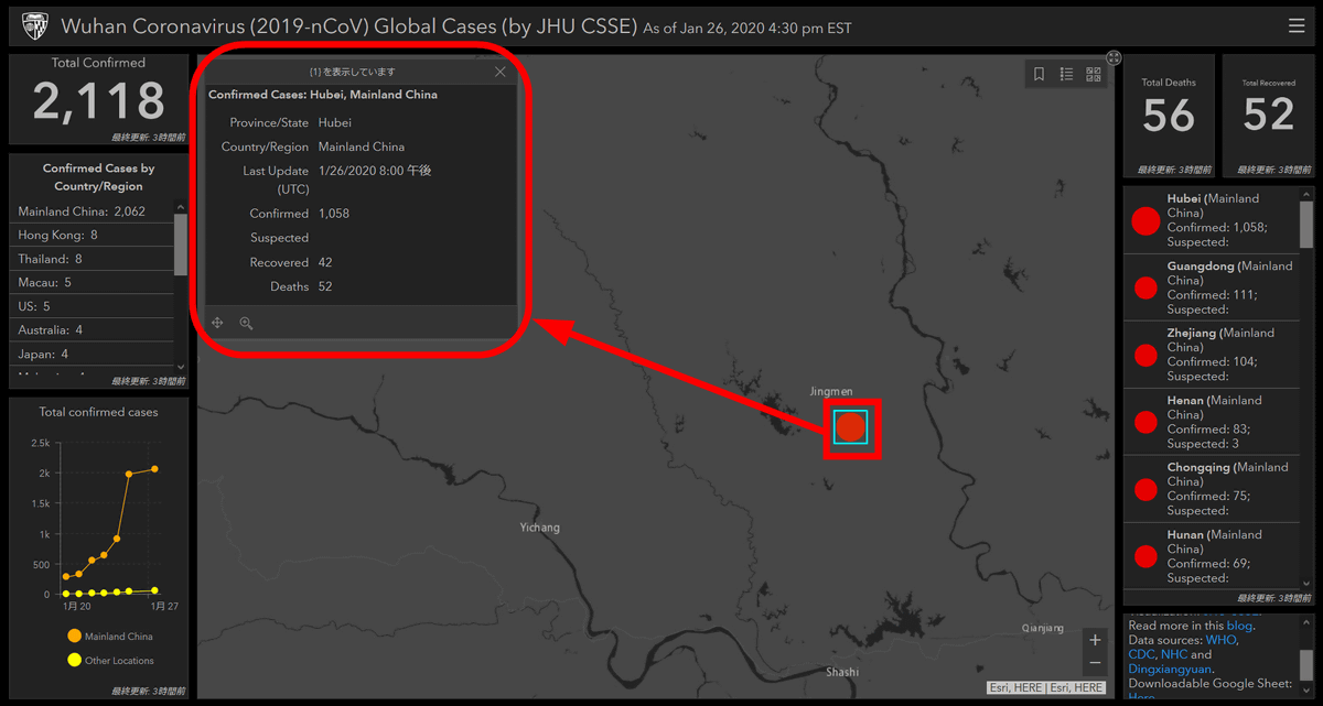
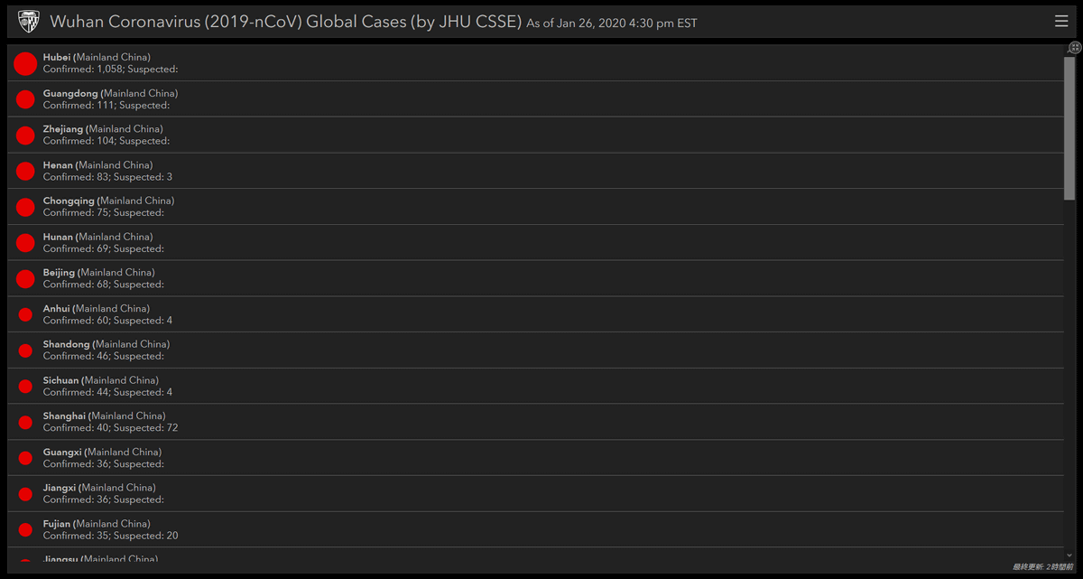
In Hubei Province, which is presumed to be the epidemic of the new coronavirus, information was displayed indicating that '1058 people were infected and 42 people recovered, but 52 people died.'
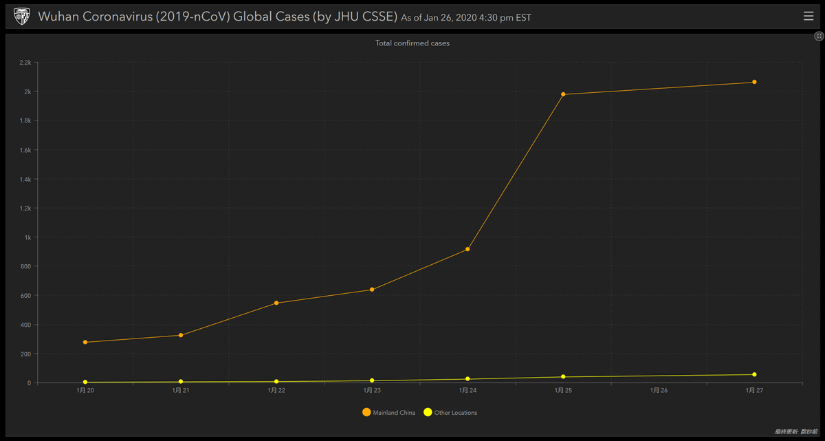
The left and right columns show various statistics. For example, the lower left window shows the change in the number of infected people. Hover over the window and click on the magnifying icon in the upper right ...
A line graph showing the change in the number of infected people was displayed on the full screen. The vertical axis is the number of infected people, the horizontal axis is the date, and the orange line indicates the number of infected people in mainland China, and the yellow line indicates the number of infected people outside mainland China.
Besides, if you click on the window in the center right ...

It was also possible to confirm in descending order those areas where the number of patients confirmed to be infected with the new coronavirus was large.
The data visualized on the map is updated daily and can be downloaded in Google Spreadsheet format. Google Spreadsheet can be accessed by clicking 'Here' from the lower right window.
Related Posts:


in Web Service, Posted by log1i_yk