Font 'National Park Typeface' taken from the free downloadable National Park signs with analog sketches
The ' National Park Typeface ' font, taken from the wood carving sign that stands at National Park, is available for free download. The license is the
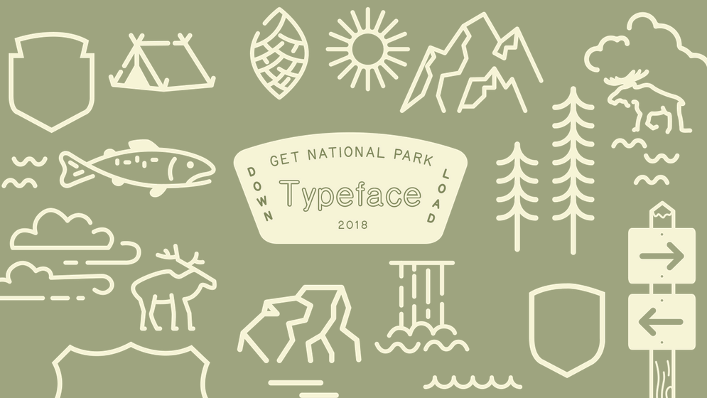
National Park Typeface
https://nationalparktypeface.com/
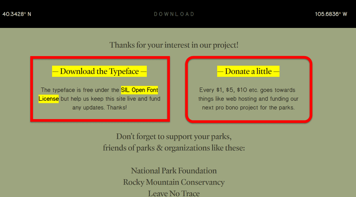
To download National Park Typeface, first click 'DOWNLOAD' at the top of the page above.
Then you will move to the following page. There is a free download button on the left, a donation button on the right, and click Download the Typeface on the left to download.
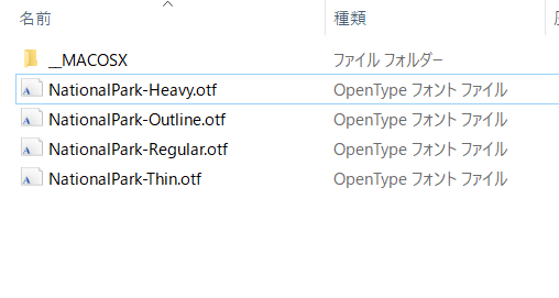
When the ZIP file actually downloaded is decompressed with free software such as '
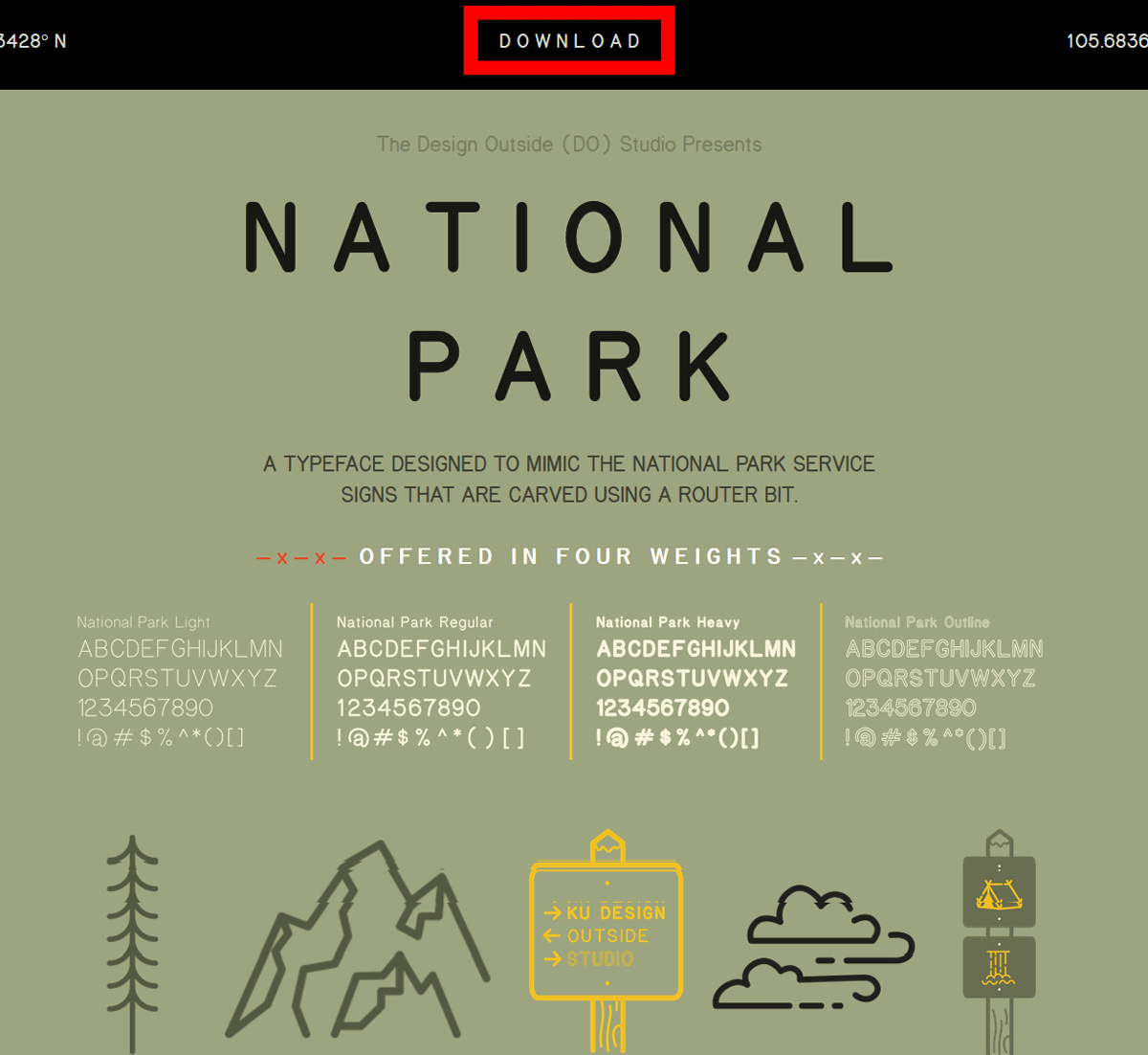
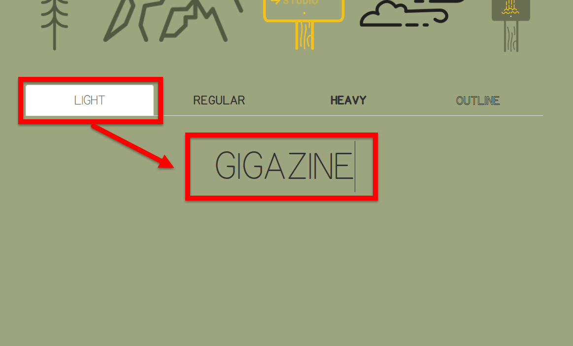
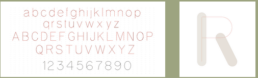
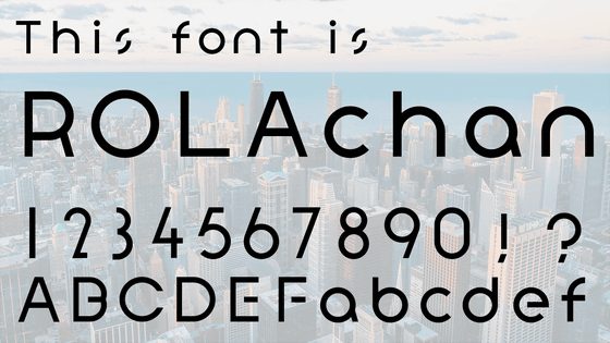
It is possible to try out each font on the website. When I type in 'GIGAZINE' using 'LIGHT' on the left, I feel like this.
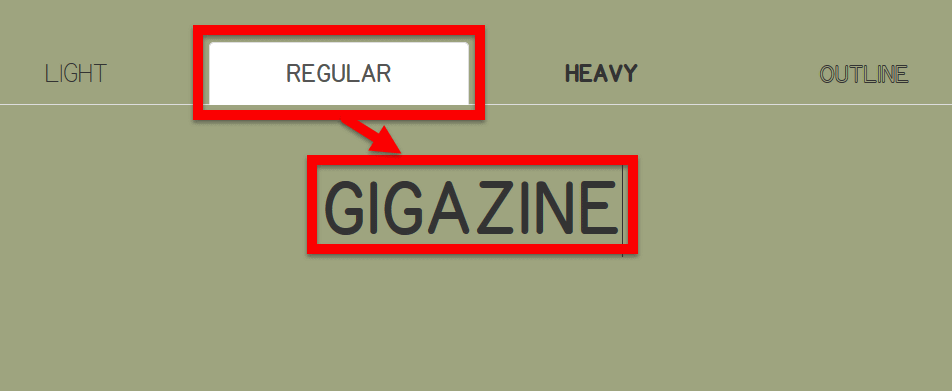
'REGULAR' is a little bold and improves visibility.
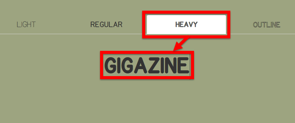
When I used 'HEAVY' I got a little round.
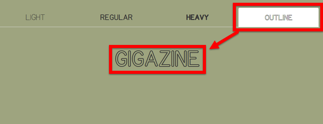
And 'OUTLINE' is a hollow design.
When I actually use it for logos, it looks like the following, a simple and minimal atmosphere. National Park Typeface works well with retro-looking designs and is also fashionable.
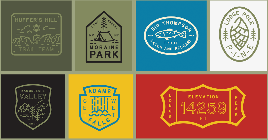
The affinity with icons and illustrations is also high.

National Park Typeface was created with the idea of Jeremy Shellhorn, founder of Design Outside Studio and associate professor at the University of Kansas. While walking around the vast National Park, Mr. Shellhorn felt that 'I am not lost but I feel confident that I am in the right direction and want to feel relieved.' The signs of the National Park that I found at that time were engraved with some round letters in the form of wood carvings. Shellhorn looked at the rounded letters and wondered, 'Is this what National Park officials use on computers as well?'
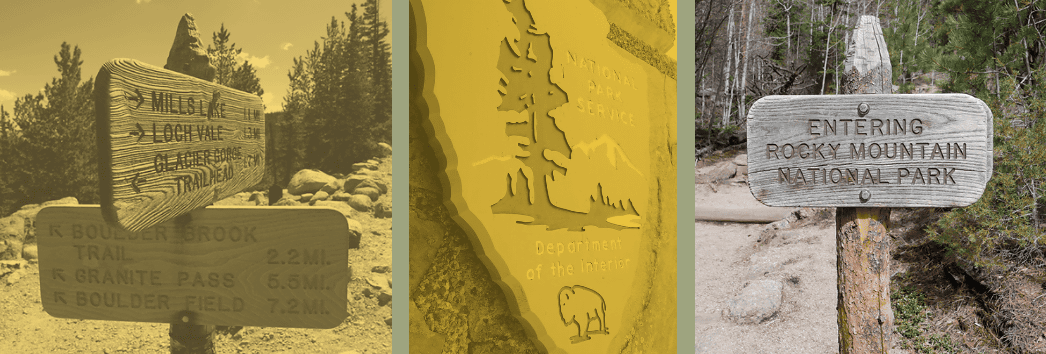
So, Mr. Shellhorn applies paper to the letters on the signs and rubs them from above with a pencil to copy the letters. When asked Miles Barger, a friend and visual information expert, it turned out that the letters used in the signs were not typefaces.
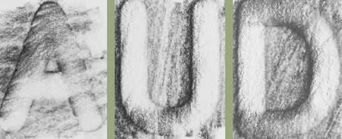
On the other hand, the letters were written according to the same rules such as pass, point and curve. The National Park Typeface was created based on this design.
National Park Typeface is a graduate of Kansas University, Jenny O'Grady, who works as a graphic designer, Jeremy Shellhorn, who is a designer and illustrator, Andrea Herstowski, an associate professor of visual communication design at the University of Kansas, and five others. It was created by the team.

Related Posts:


in Design, Posted by darkhorse_log