What is the 'global cancer trend' that you can see from various graphs?

The first cause of death in Japan in 2016 is "cancer", and about 30% of all causes of death are reported as being caused by cancer. Also, even on a worldwide basis, cancer is the second leading cause of death, and it has become clear that not only Japan but also many countries are located above the cause of death. Our World in Data is investigating "Trends in Cancer" and explains what kind of cancer trends are in the global view.
Cancer - Our World in Data
https://ourworldindata.org/cancer
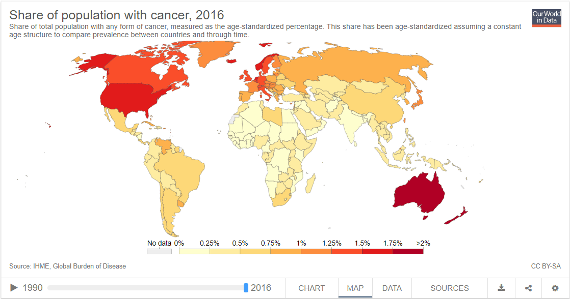
The figure below shows how many people affected with cancer for the population of each country. If it is close to white, the percentage of people suffering from cancer is low, and the percentage is higher as it approaches purple color, and the most dark red color shows the prevalence rate of 1.75% or more. As you can see from the figure, the higher the income, the higher the percentage of people suffering from cancer.
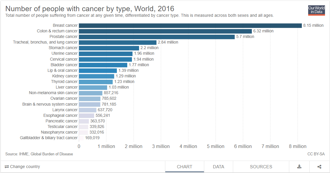
The graph below ranks the number of people suffering from cancer by type of cancer. From around the world, 1st place is about 8.15 million "breast cancer", 2nd place is about 6.32 million "colon cancer", 3rd place is about 5.7 million "prostate cancer". In Japan, 1st place was about 590,000 in "colon cancer", 2nd in "Breast cancer" about 330,000 people, 3rd place was "about 300 thousand people in" prostate cancer ".
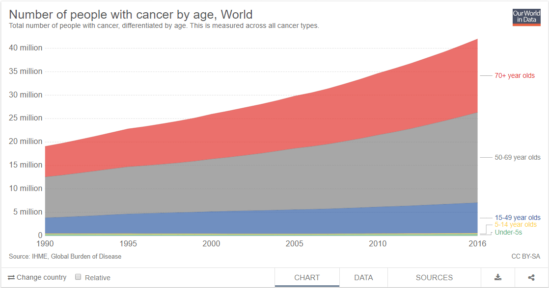
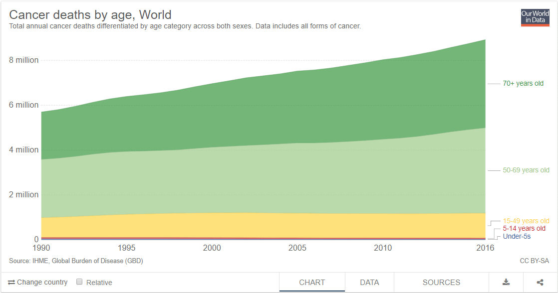
The following graph shows the trends in the number of people suffering from cancer between 1990 and 2016 by age. Red is over 70 years old, gray is between 50 and 70 years old, blue is between 15 and 50 years old, yellow is between 5 and 14 years old, yellow green is less than 5 years old. On the graph, the number of people suffering from cancer rises on the right, and more than 80% of them are over 50 years old.
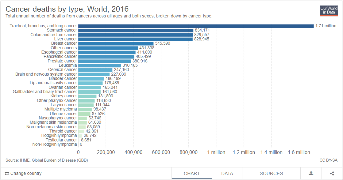
The graph below ranks the number of cancer deaths in 2016 by type. According to this graph, about 1.71 million people in "trachea, bronchus and lung cancer" are ranked first, "stomach cancer", "colon cancer", "liver cancer" in the 2nd, 3rd and 4th place are almost the same number of about 830,000 Has become. This ranking is the same in Japan, and the deaths of "trachea, bronchi, lung cancer" are about 72,000, "stomach cancer" is about 55,000 people, "colon cancer" is about 50,000 people, "Liver cancer" was about 36,000 people. According to Our World in Data, there are many deaths of "trachea, bronchial tree, lung cancer" in countries with relatively high income, and deaths of "colorectal cancer", "liver cancer", "cervical cancer" in low income countries It seems that it tends to be more.
This graph shows the number of people who died from cancer by age. In the graph, the number of deaths aged 70 years or older is 44% of the total, and the number of deaths between 50 and 70 years old is 43% of the total. In this graph, the number of deaths under the age of 14 is less than 1% of the total, but still 80,000 lives are lost annually.
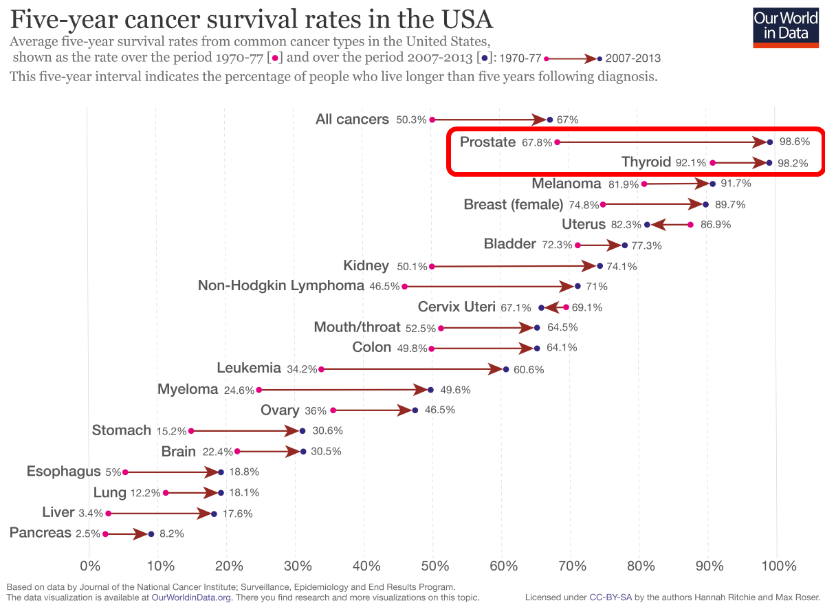
Next, I will look at the viewpoint of "5-year survival rate of cancer". The following figure shows the change in the 5-year survival rate of people suffering from cancer in the United States, compared with the 1970s (1970 to 1977), after 2007 (2007-2013) It shows how it changed. A rightward arrow pointing out that the 5-year survival rate has increased with many types of cancer is marked. On the whole cancer (All cancers), the 5-year survival rate has increased from 50.3% to 67%, and it reaches 98% or more in the red frame "prostate cancer" and "thyroid cancer" I understand this. According to Our World in Data, the reason why the 5-year survival rate has increased in many kinds of cancer is that "increase in early detection of cancer" and "advancement in medical technology" are the factors .
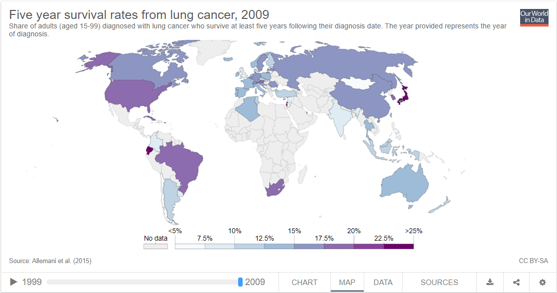
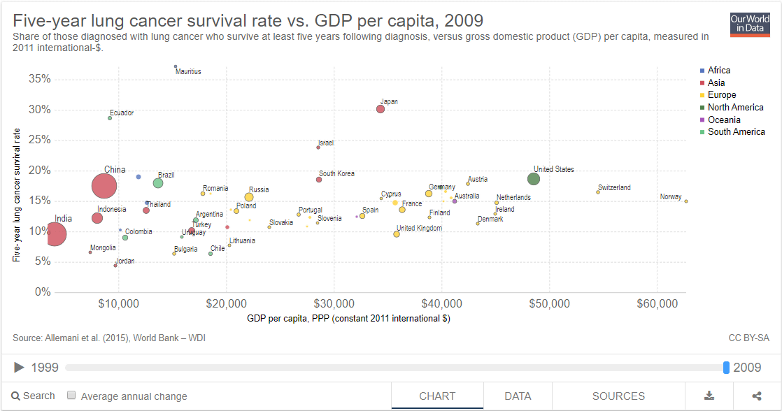
The figure below shows the 5-year survival rate of "lung cancer" in each country. The first place is 30.1% in Japan, the second in Ecuador is 28.7%, the third in Israel is 23.8%.
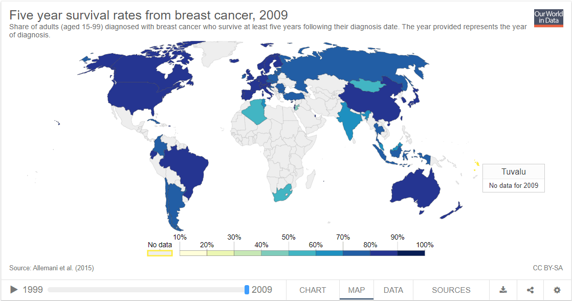
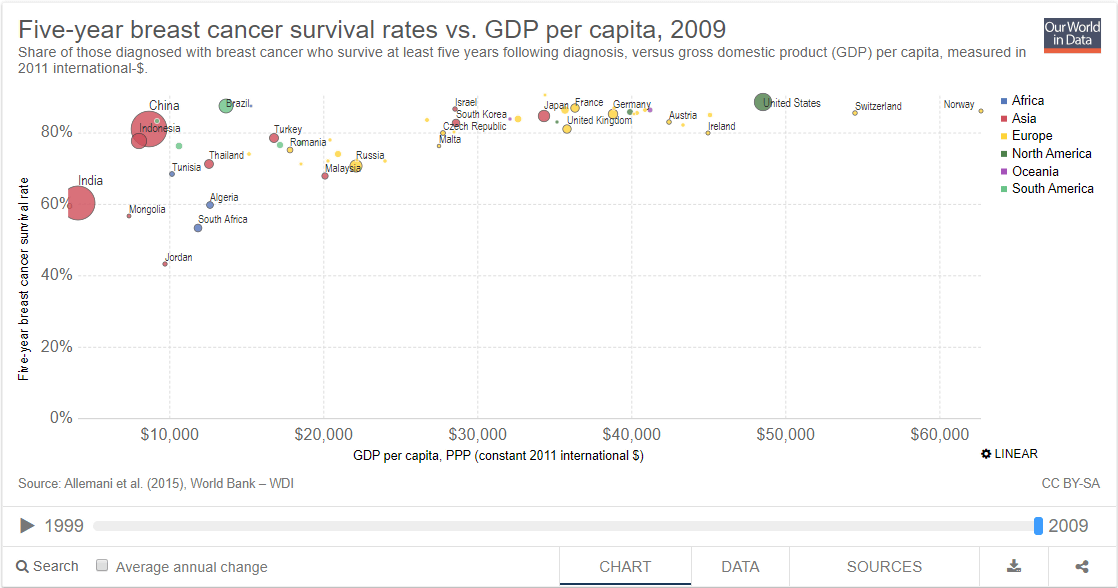
Looking at the 5-year survival rate of breast cancer, the first place is 88.6% in the US, the second place is 87.4% in Brazil, the third place is 86.9% in France, and the survival rate in North America and Europe tends to be high You can see that there is. The 5 - year survival rate in Japan was ranked at the top with 84.7%.
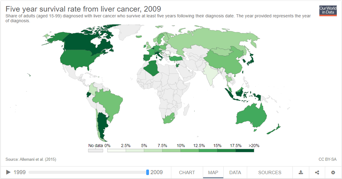
The 5-year survival rate of liver cancer is 27% in Japan, 24.2% in Argentina in 2nd place and 22.2% in Taiwan in 3rd place. Looking at these three graphs, you can see that the cancer treatment technology in Japan is superior.
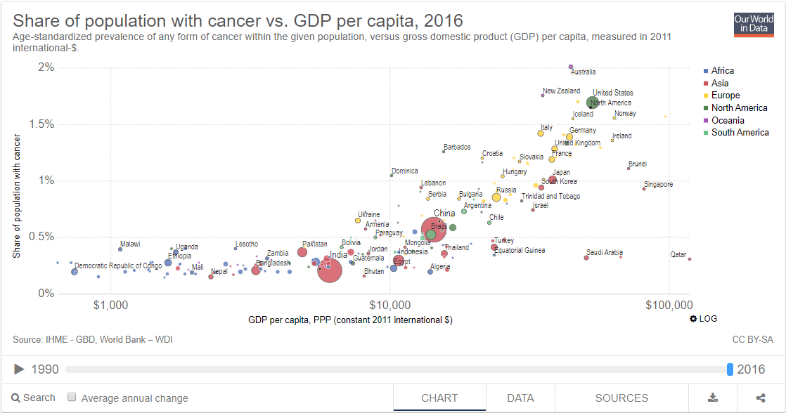
The graph below examines the relationship between income and incidence of cancer. It can be confirmed that the incidence of cancer is represented on the vertical axis, the income is shown on the horizontal axis, and the incidence of cancer increases as the higher income is obtained. Our World in Data says that there is a tendency for cancer to be more likely to be caused by lifestyle such as smoking, alcohol intake, diet, etc. as income increases.
Next, looking at the relationship between income and the 5-year survival rate of breast cancer, there is a tendency that survival rate is higher as higher income is obtained ...
There is a great variation in the survival rate of lung cancer, so there seems to be no relationship between income and 5-year survival rate of all cancers.
Related Posts:


in Note, Posted by darkhorse_log