Devices of GUI design of game "Factorio" that started with "right button or left button" problem
byNeal Jennings
In addition to characters and the world view, as one of the important points in the game,Graphical user interface(GUI) is available. GUI means a user interface designed to handle computer operations intuitively with pictures and symbols. A simulation game for building a factory while automating various tasks, how to design this GUIFactorioStaff speak on the official blog.
Friday Facts # 246 - The GUI update (Part 3) | Factorio
https://www.factorio.com/blog/post/fff-246
We have already reviewed what game Factorio is like with GIGAZINE.
Real-time simulation game "Factorio" that builds and expands a factory to a star drifting while automating various works - GIGAZINE
Mr. kovarex, production staff of Factorio, insisted that anything should always place the OK button on the left and the cancel button on the right.
However, in the GUI of the PC, "OK" is on the left and "Cancel" is on the right The specification is actually only for Windows. For example, as you can see from the images in macOS below, macOS and Linux have "Cancel" on the left and "OK" on the right. Mr. kovarex was surprised to learn of this for the first time for the first time. In fact, the controversy about the position of the OK and Cancel buttonsIt is not what it began to do now.
Even one position on the left and right of the buttons, you have to think firmly about GUI settings. If an Apple user plays a game on the assumption that OK is on the left and the cancellation is on the right, you may click Cancel as usual when you want to click on OK. Kovarex thought that by designing the user interface unique to Factorio, the user could avoid the situation "You clicked on a button that should not be clicked with coast."
For example, the following image is the sound setting screen with version 0.16 of Factorio. There is a "Reset" button on the left and a "Back" button on the right. Actually, if you click "Back", the changed settings are reflected, but whether the "Back" button is "OK button to reflect the change" for the player or "Return to the previous screen without reflecting the change Mr. kovarex thought that it was a problem to see at a glance whether it was a button or the like.
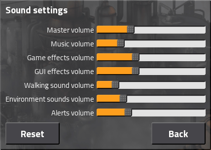
So the picture of the sound setting whose design was changed by version up is the image below. We set up "Back" on the left and "Reset" and "Confirm" on the right. "Back" becomes a button to return to the previous screen without reflecting the change, and clicking "Confirm" saves the setting and returns.
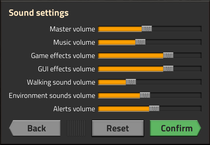
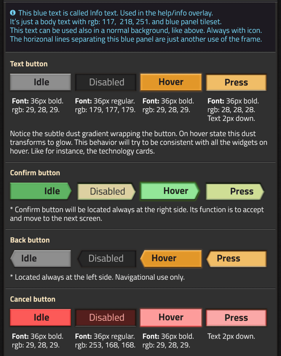
In addition, button design, "Confirm", "Back" and "Cancel" respectively change the color, shape and font size of the button. For example, "Confirm", which is more likely to be clicked, is green in design and has a user-friendly design, and the "Cancel" button is red-tone design to prompt attention. Each button is visually transmitted to the user by giving a change to the color and design in the neglected state · the selected state · the state where the mouse cursor is over · in the pressed state.
Also, on the screen of the map generator which generates the terrain, setting items such as "Resources", "Terrain", "Enemy" and "Advanced" are separated using the tab display. By using the slide bar to adjust each item, it is designed so that users can see at a glance.
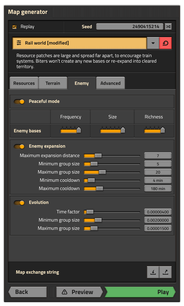
In addition, a warning mark is written next to "Preview" at the bottom. When you click "Preview", it will show what kind of terrain is made in the current setting, so you can set it while watching the situation, but the information on where and what resources are spoiled becomes spoiler . Therefore, a warning mark is drawn so that the user does not easily press the "Preview" button.
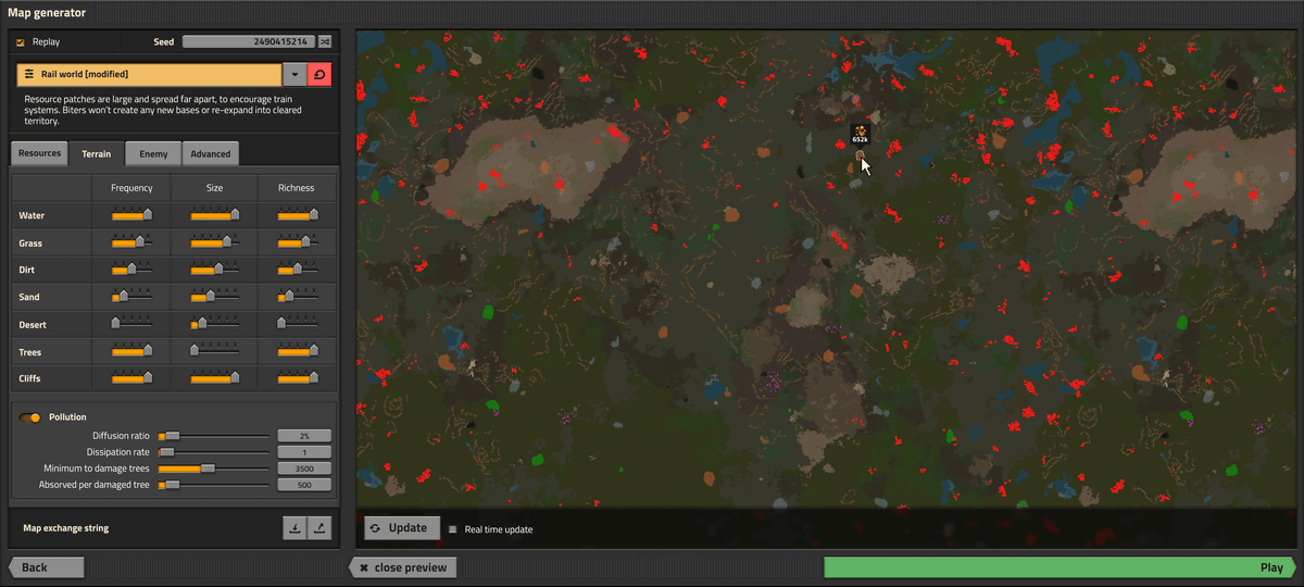
In addition, the production staff is thinking about functions that allow users to grasp the details of the map at a glance by displaying specific information such as the amount of resources and enemy size in the preview map.
Related Posts: