Airbnb introduces new font "Airbnb Cereal"
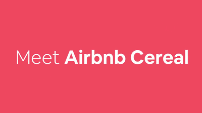
We can rent a house from local people Night-stay service "Airbnb"It is possible to support our service both on-line and off-lineTypeface"Airbnb CerealWe announced.
Introducing Airbnb Cereal - Airbnb Design
https://airbnb.design/introducing-airbnb-cereal/
Airbnb Cereal is an international font design officeDalton MaagA typeface created with. You can tell what kind of design you are finished by watching the following movie.
Meet our new font, Airbnb Cereal | Airbnb - YouTube
Regarding the process of creating Airbnb Cereal, Airbnb's Drake Mr. Chan said, "Our work is quite involved with letterpress printing," through Airbnbmag (magazine by Airbnb) "and advertisements on the subway through a variety of things We are trying to inform the brand Airbnb, in which we distinguish the brands we serve, respond to readability, scalability, specific business needs, reflect the brand's individuality, and even both online and offline I was looking for a typeface that works beautifully with the. "
In AirbnbSystem fontAlthough it seems that it analyzed various fonts with reference to, etc, it meets Airbnb's criteria for both on-line use and off-line use such as "It is not suitable for UI use even if it is suitable for printing" It seems he could not find anything. Therefore, it seems that it was decided to create Airbnb Cereal with Dalton Maag of a prominent font design office.
Airbnb's typeface needs to be beautiful everywhere, from buttons on the website to huge billboards installed in the real world, so it seems that cooperation from multiple teams was necessary for development. Mr. Chan belonged to a brand marketing team composed of people involved in various fields such as designers, photographers, picture producers, writers and producers, so it is developing under the various contents and formats that Airbnb creates internally I was able to test Airbnb Cereal.
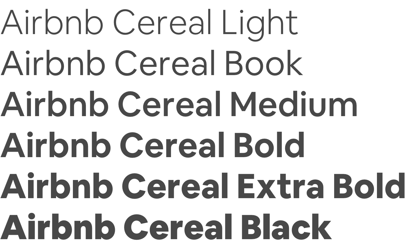
The design system team in charge of producing Airbnb's design guidelines, such as typefaces, styles, color palettes, seems to have been involved in the Airbnb Cereal production project while thinking about "subsequent product design". The design system team focused on four aspects of font readability, weight, texture and overall beauty, collecting feedback from product designers and accessibility teams and supporting development.
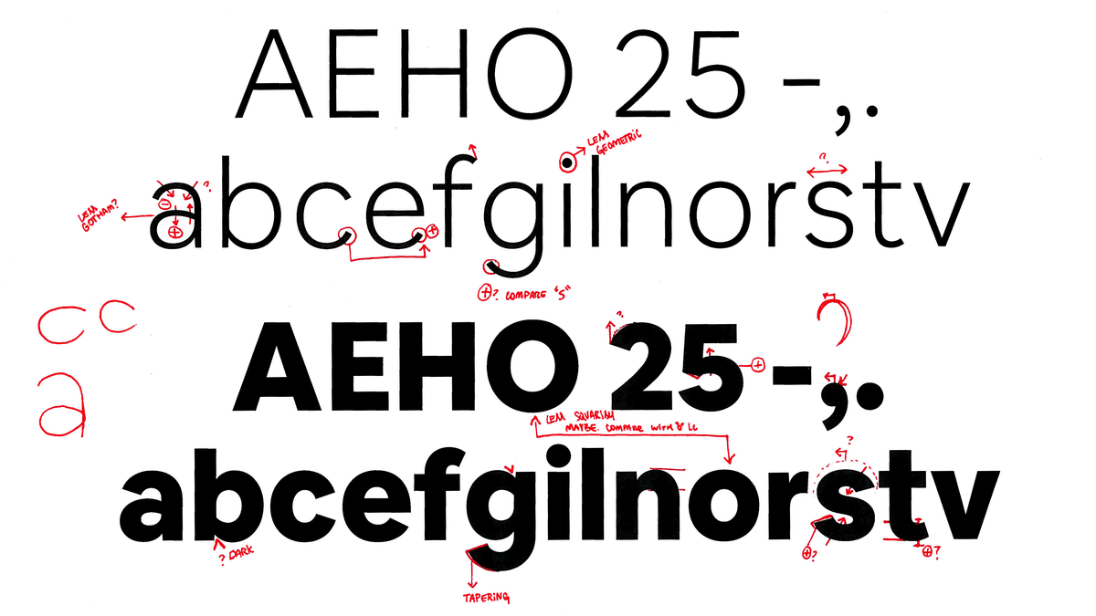
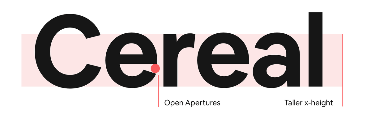
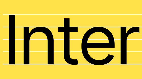
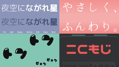
Airbnb Cereal has a variety of ideas to make fonts easier to read. For example, to make it clear that distinctions between similar looking letters and similar looking characters of another font are clear, the font opening is made larger. Also, in order to improve readability, lower case letters are totally tall design.
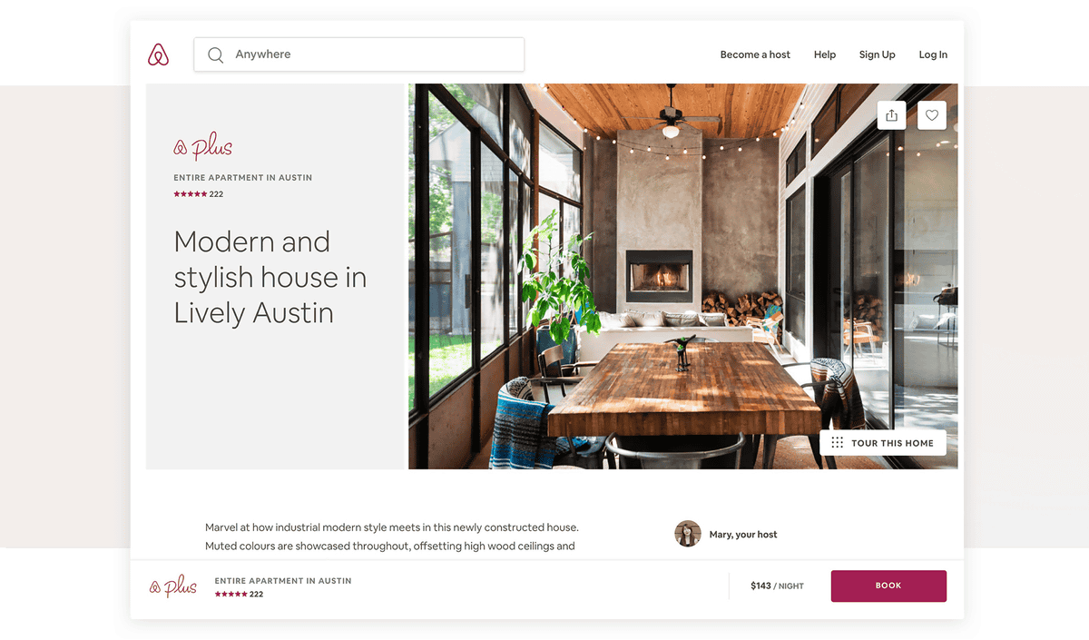
Characters in UI designs are sometimes used quite a bit and may be completely gone depending on the font used. So, Airbnb Cereal seems to be designed with aiming for an exquisite balance that is not too light and not too heavy. On the Airbnb website, Airbnb Cereal is used with easy to read thickness ...
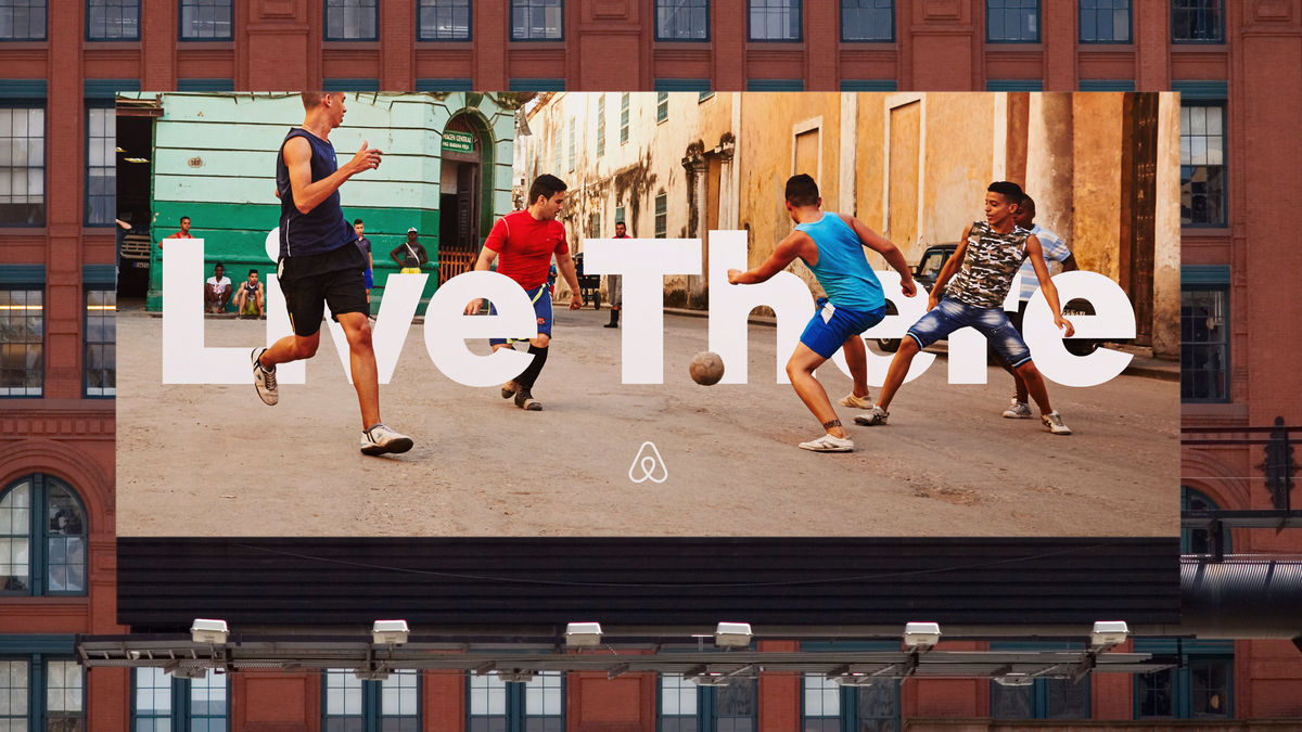
For signage ads written "Live There", it is used as a font with a heavy weight. Both are Airbnb Cereal, which is an example that you can see well that it has become a font that can be used both on-line and off-line.
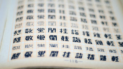
Airbnb Cereal supports seven non - Latin languages, and it seems that future aim is to support more languages.
Related Posts:

in Web Service, Video, Design, Posted by logu_ii