Apollo 11 and the font that reached the moon while prohibited by the Nazis "Futura"
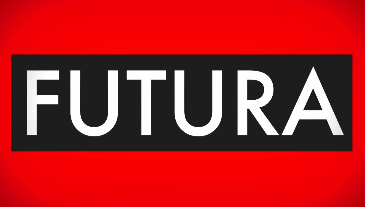
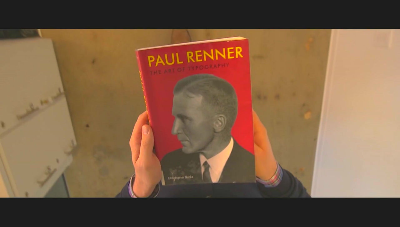
In the early font design where there were many geometric designs, in the 1920's, modern and readable font which is still used all over the world "Futura (Hutsura) "Was published by German designer Paul Renner. Hutsura has overcome the crisis such as being forbidden to use in Nazi · Germany and the movie has been summarized as a font loved as a font loved by wedding invitations to artists and film directors.
The font that escaped the Nazis and landed on the moon - YouTube
The font "Futura" is widely used all over the world.
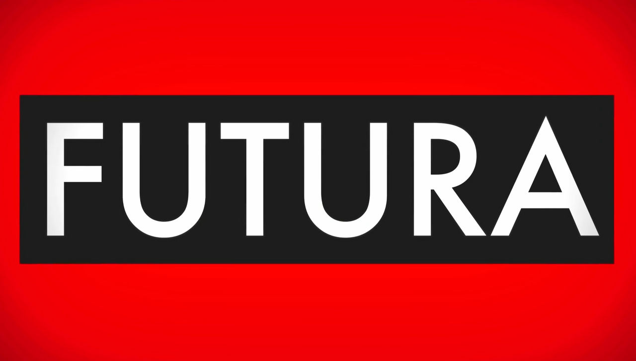
Hutsura's font is as sharp as cut with a knife ......

It is characterized by a curve drawn largely round.

Hutsura is an artistBarbara KrugerIt is used for pop art of ... ...
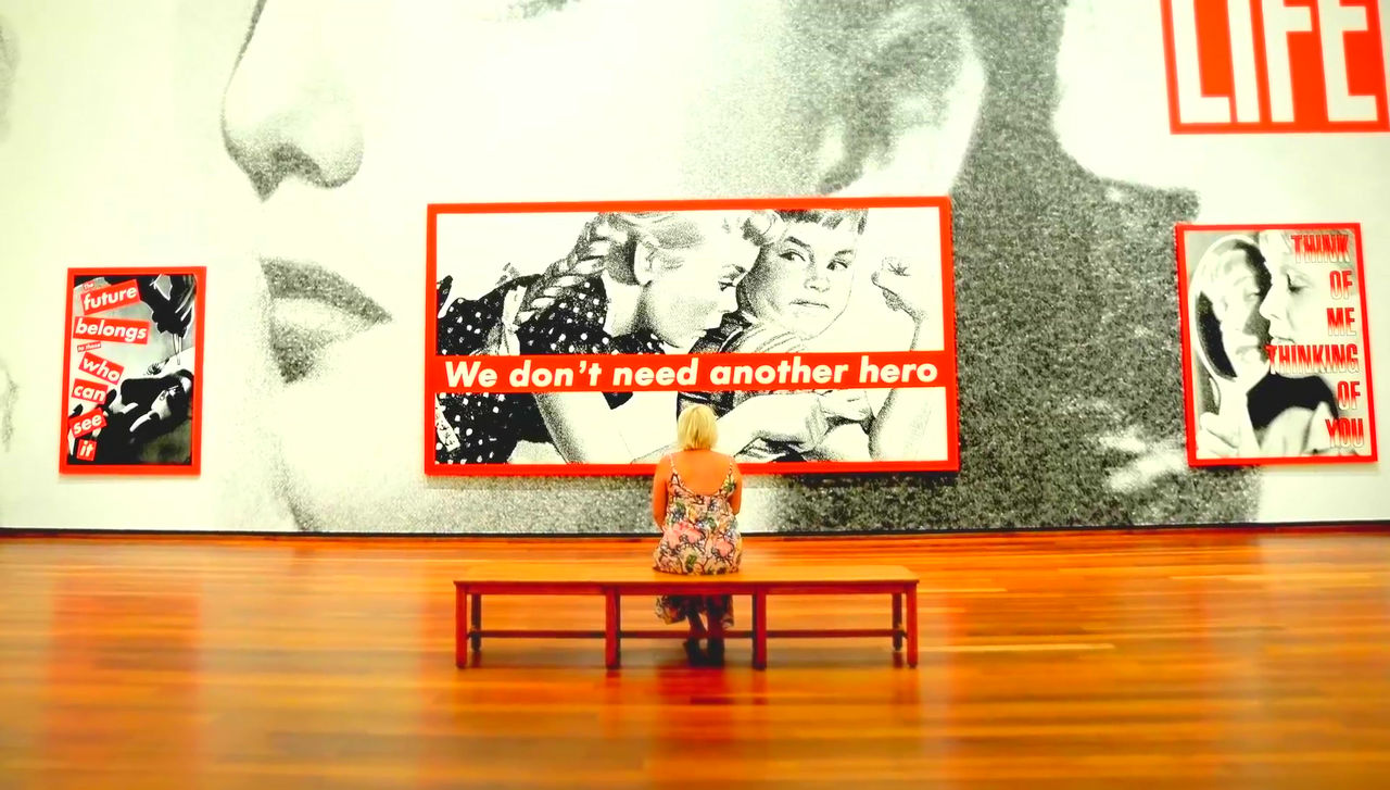
As a Barbara Kruger's parody art, the logo of the street brand "Supreme" is also being created.

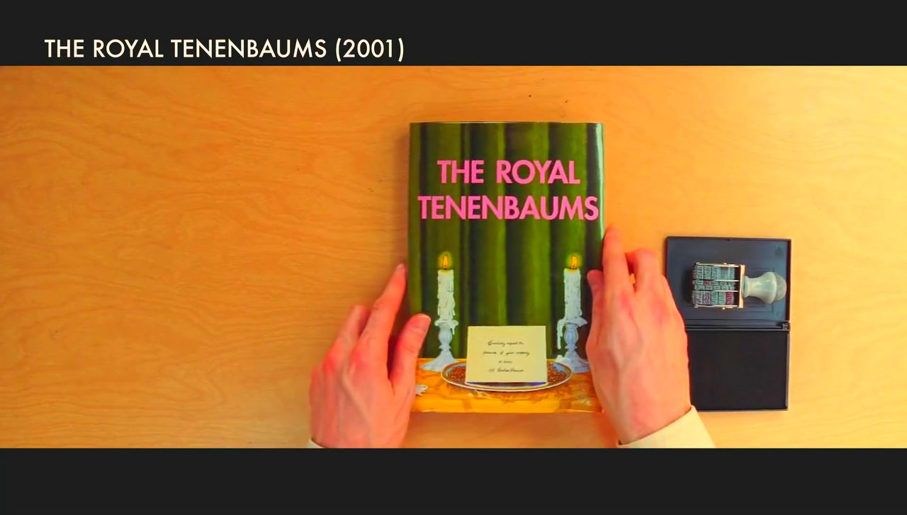
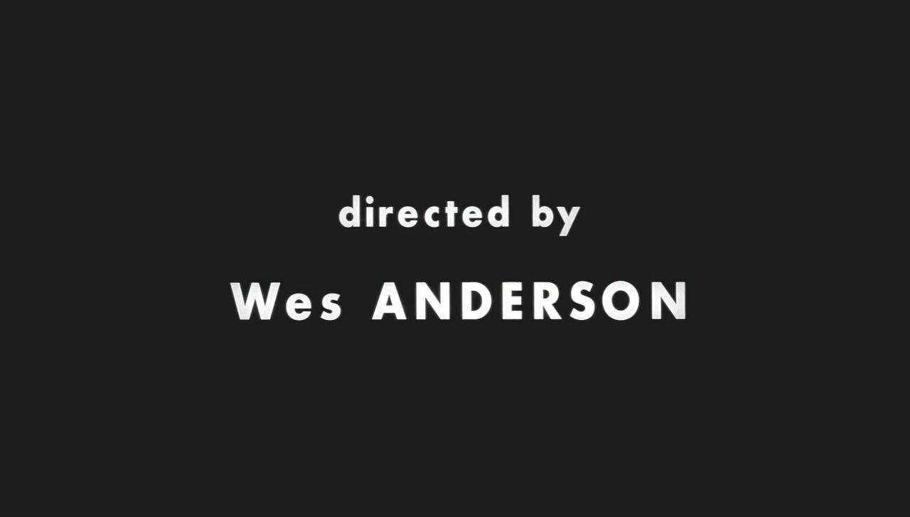
Directed by Wes Anderson's 2001 film "The Royal TenenbaumsEven adopting this font.
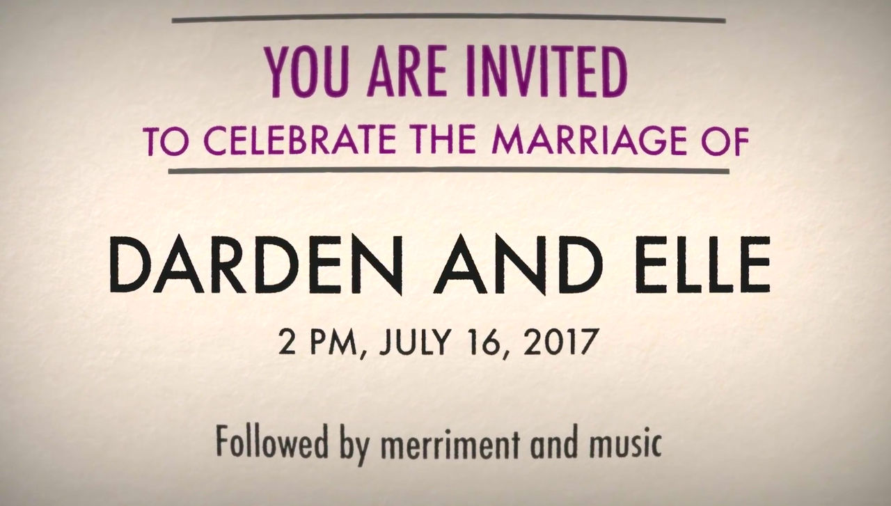
In familiar places it is also used for wedding invitations, etc. It has become a popular font all over the world.
However, there are various walls before Hutsura gains such a degree of recognition, and that was the biggest wall in that Nazis / Germany.
Hutsura was announced by designer Paul Renner.
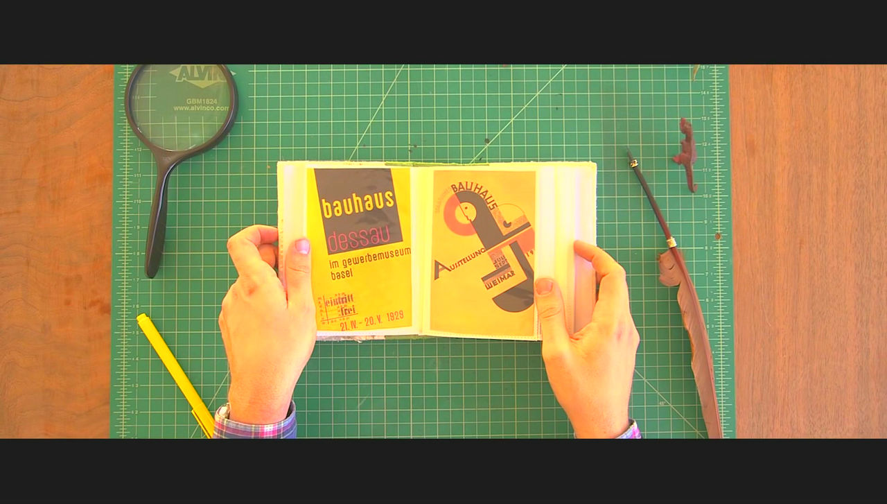
It is a design movement that occurred in the 1920'sBauhaus MovementAlthough there was no direct relation with Renner, Renner strongly supported that idea and asked for functional beauty for fonts.
The mainstream font at that time was "FractutureWas it ...?

Renner states "Fracture" as "obsolete and old"Radar Hozen"It's like a leather shirt)".
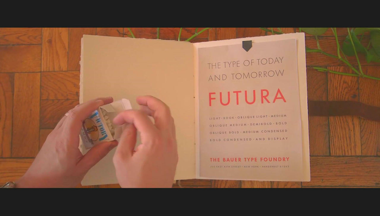
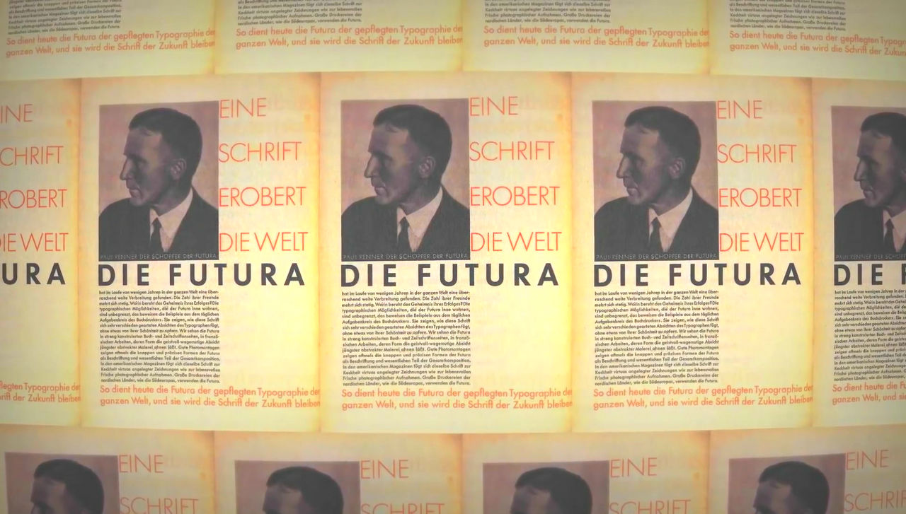
So, in 1927 Renner produced the font "Hutsura" was announced. "Futura" means "future" in Latin, and it was sold with the touch of "the font of our era".
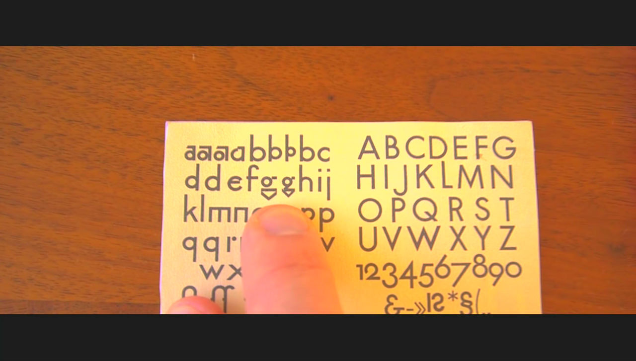
Futura was a very contemporary design as at that time, while the font at that time had many distinctive and geometric things like "g" shown in the image below.
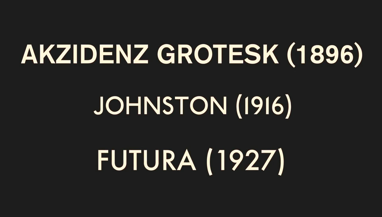
Even before Hutsura appeared, such as "Akzidenz Grotesk" in 1896 and "Johnston" in 1916, there was a font with the same atmosphere, but Renner says Futura as "unique and extremely German typeface It was called.
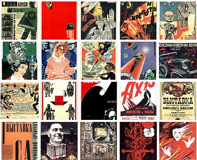
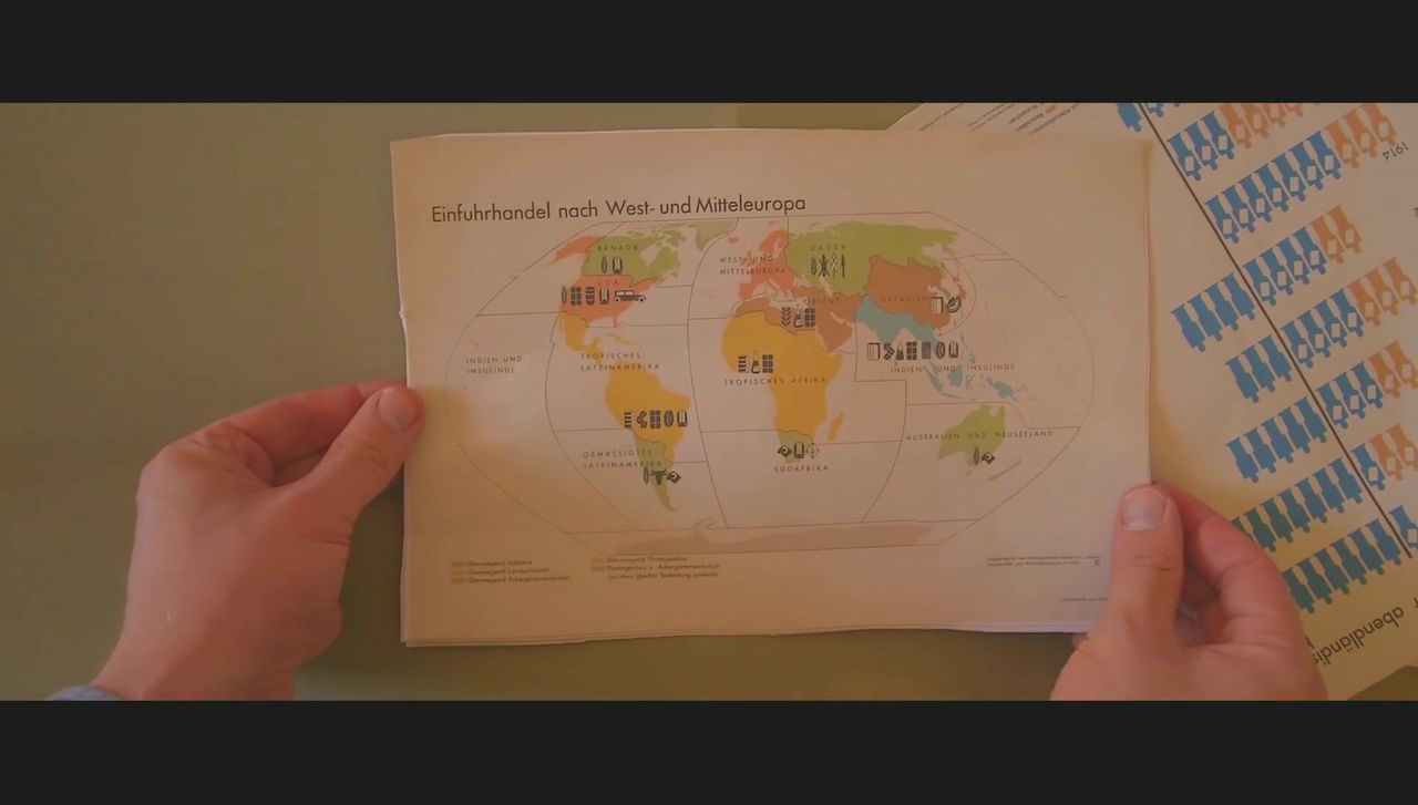
Hutsura began to be used in captions to explain texts and graphs in illustrations, and began to spread all over the world as well as Germany.
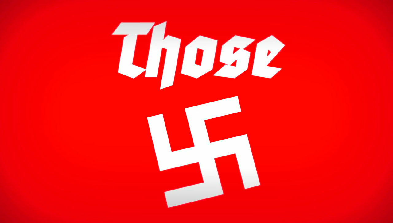
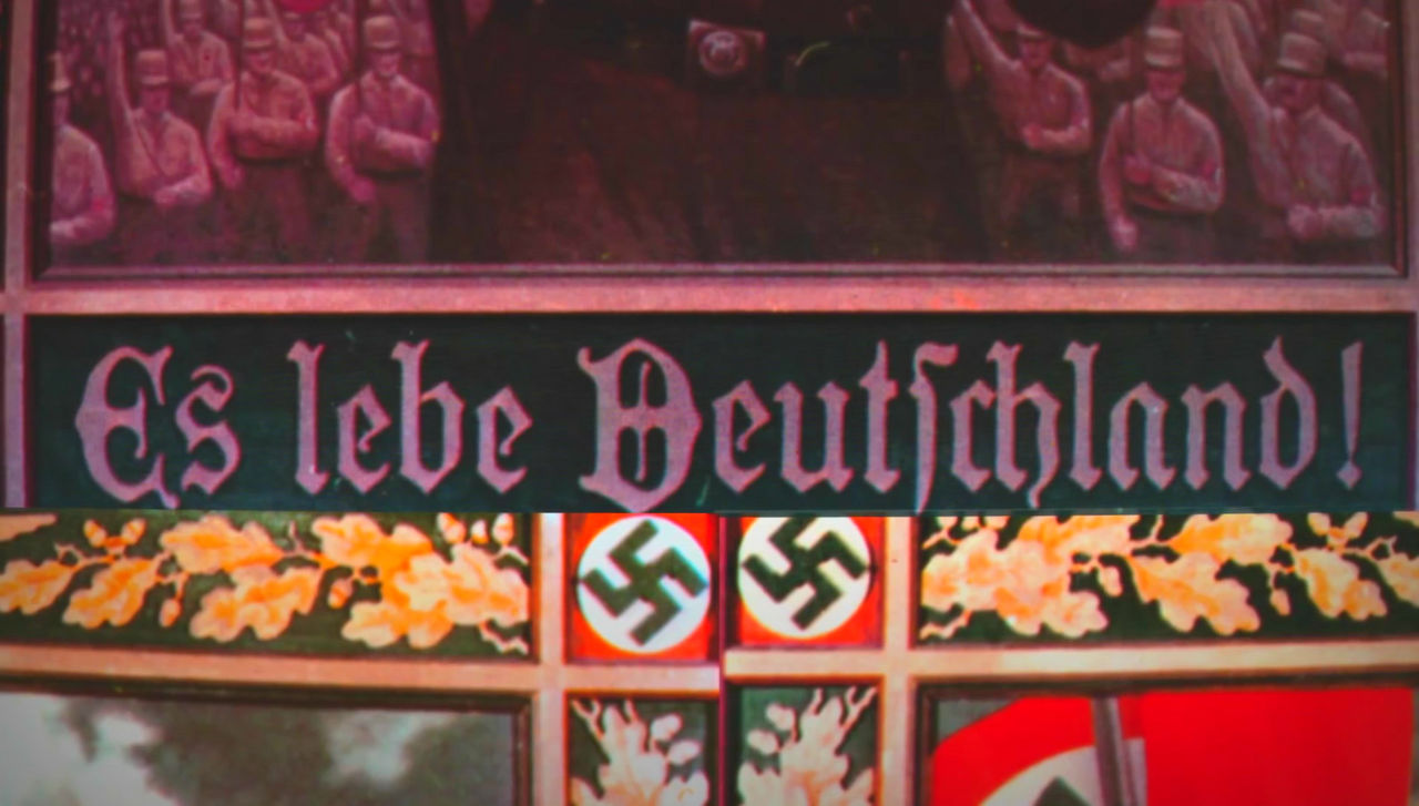
Although it was Hutsura who gained recognition as "the symbol of the future", it will be able to watch the Nazis · German army of those days.
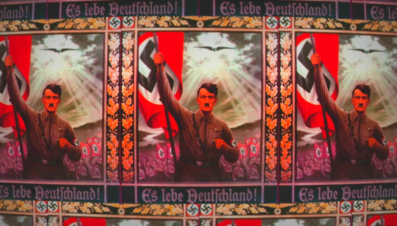
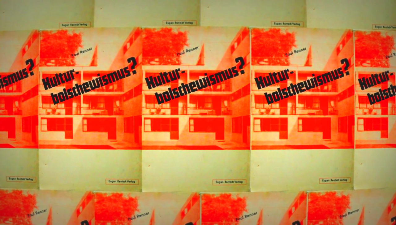
Nazis · Germany adopted fractool which Renner called "out of date" from the 1930s, and Fractut became a font representing Nazi · Germany. At the same time Nazi · Germany eliminated contemporary fonts other than fructool including Hutsura.
In addition, Renner has published a famous anti-Nazi · German essay, it was expelled from Nazi · Germany to Switzerland and was also arrested during expulsion.
However, the policy of Nazi Germany is not consistent, and fractuture is heavily used in the Nazis · German uniform regulation ... ...

Hutsura was used for some charts.

In 1941, Nazi · Germany turned the policy and prohibited the use of fractut as "Jewish style" ... ...

He said he was listening to the claim that Renner's "German book in the future must be easy to read". By this time Hutsura is established as an international font.
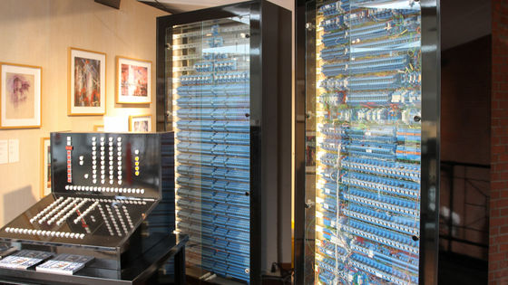
During the Second World War, it is the predecessor of NASAAmerican Airlines Advisory Committee(NACA), but also modernSans serifSystem fonts are now used frequently. Sans serif fonts such as Hutsura are highly readable, and they are useful in physical places such as instruments.
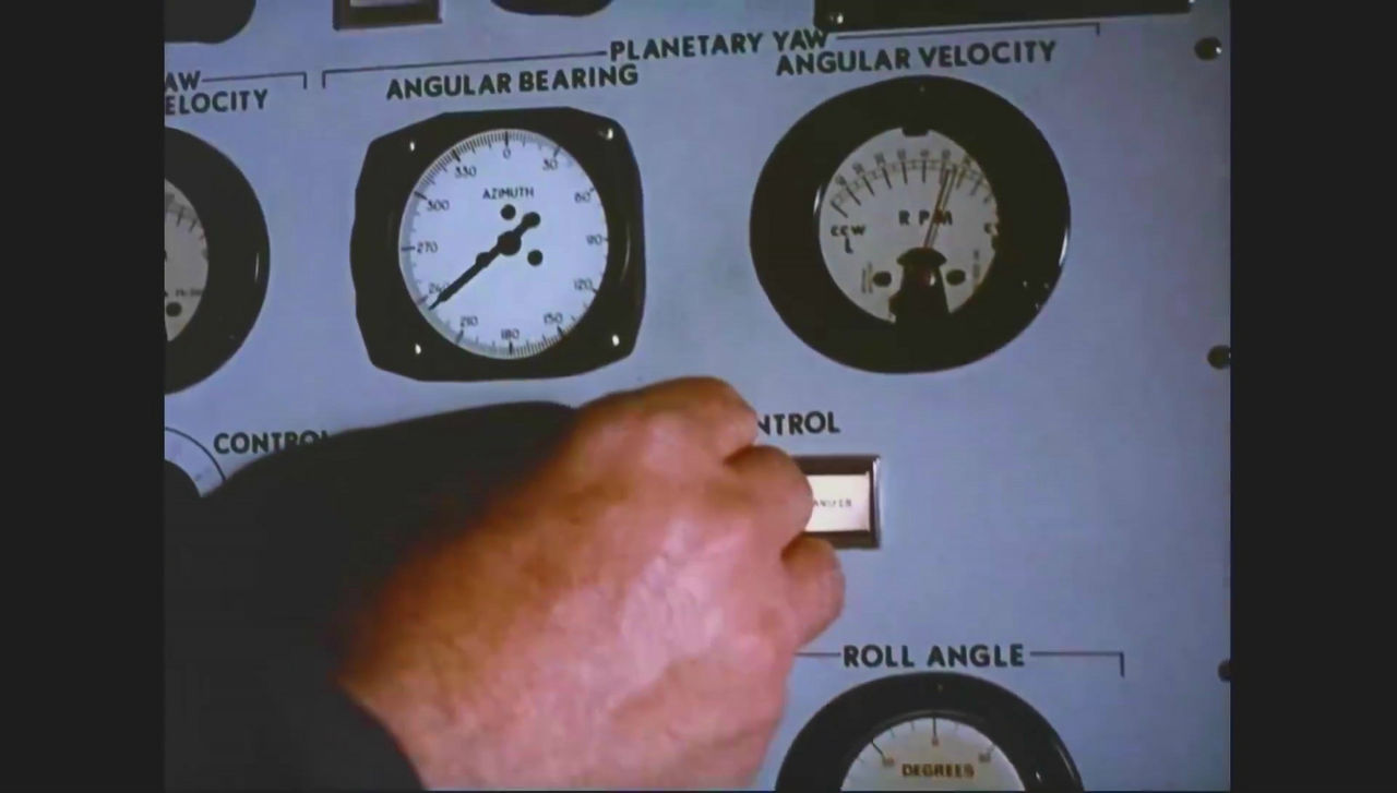
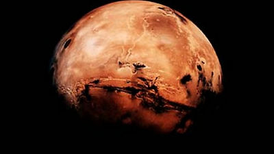
Hutsura 's font was used when NASA made a shield chain set up in Apollo 11.

Then famous movie director Stanley Kubrick and ... ...

Wes Anderson is also known to have favorite Hutsura.
Related Posts: