A wonderful graph that you can clearly recognize by comparing with your prediction what it really changed from Bush to Obama

ByMichael Pittman
Until January 20, 2017, Mr. Donald Trumph finally became the 45th president of the United States of America, President Barack Obama ends the term of office that has been in effect since 2009. Meanwhile, the New York Times compares how various numbers changed in President Obama's term, such as "non-employment rate", "number of immigrant offenders", "number of violent crimes" and so on We are disclosing graphs that can be done.
You Draw It: What Got Better or Worse During Obama's Presidency - The New York Times
http://www.nytimes.com/interactive/2017/01/15/us/politics/you-draw-obama-legacy.html
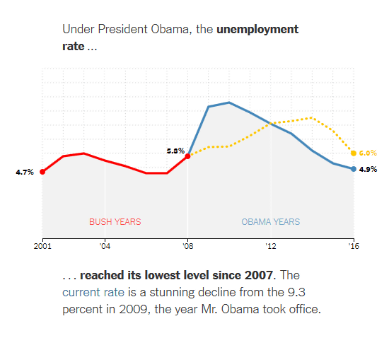
When accessing the above URL, the following graph is displayed on the page. The first graph to be displayed is a graph showing "Under President Obama, the unemployment rate ..." (Non-employment rate under President Obama). The red line on the left of the graph shows the change in the non-employment rate under the Bush administration from 2001 to 2008.
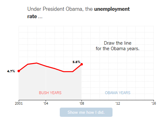
You can hit the mouse cursor on the part on the right of the graph where the line is not drawn so that you can draw your own forecast on the graph.
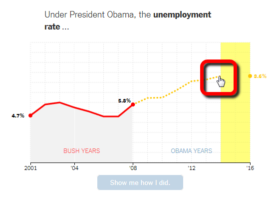
When expectation is decided, click "Show me how I did."
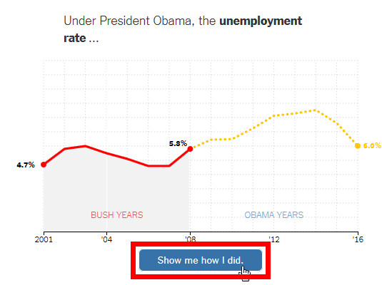
Then the actual number change will be displayed in blue line as follows. The lowest non-employment rate was under the Bush administration in 2007, the highest was 9.3% in 2009 when President Obama assumed office. From there, the non-employment rate has declined every year, and it has declined to 4.9% in 2016.
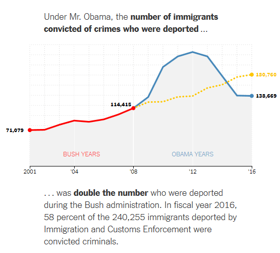
The following graph shows the trend of the number of expulsion of immigrant offenders abroad. According to the graphs, the largest number of immigrant offenders have been expelled from the country in 2011-2012, and in 2016 out of the 242,55 immigrant criminals, about 58% of the 138,669 people are mobilized by the Immigration & Customs Investigation Bureau You can see that it has been exiled from abroad.
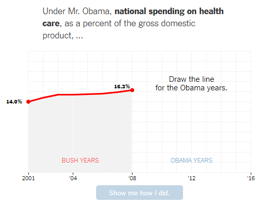
Other graphs showing spending on health care (relative to GDP)
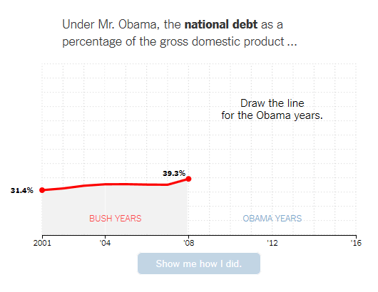
Graph showing government debt (against GDP)
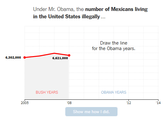
Graph showing the number of Mexicans who stay illegally in the United States
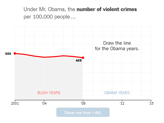
Graph showing the number of violent criminals per 100,000 people
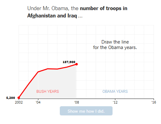
Since there are seven graphs and the number of soldiers sent to Afghanistan and Iraq, it is fun to compare their predictions with actual figures.
Illegal immigration in the US "Forcibly repatriate 3 million people or imprison"A commitment to run after himself as president"100 day plan"The next President who is also revealing that" to build a wall along the border with Mexico to eradicate illegal immigrants. " Trump If you make a similar graph after the term of office of the next president, how will the figures of the graph change, including illegal immigration issues?
Related Posts:


in Note, Posted by logu_ii