'The True Size Of...' allows you to easily compare the true sizes of countries around the world on a map
The True Size Of...
http://thetruesize.com/
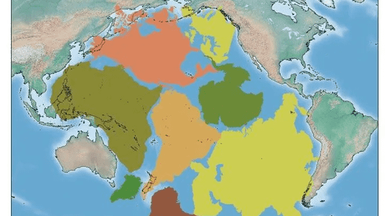
When I opened the site, a map using Google Maps was displayed. If you look closely, you can see three shapes displayed above the African continent.
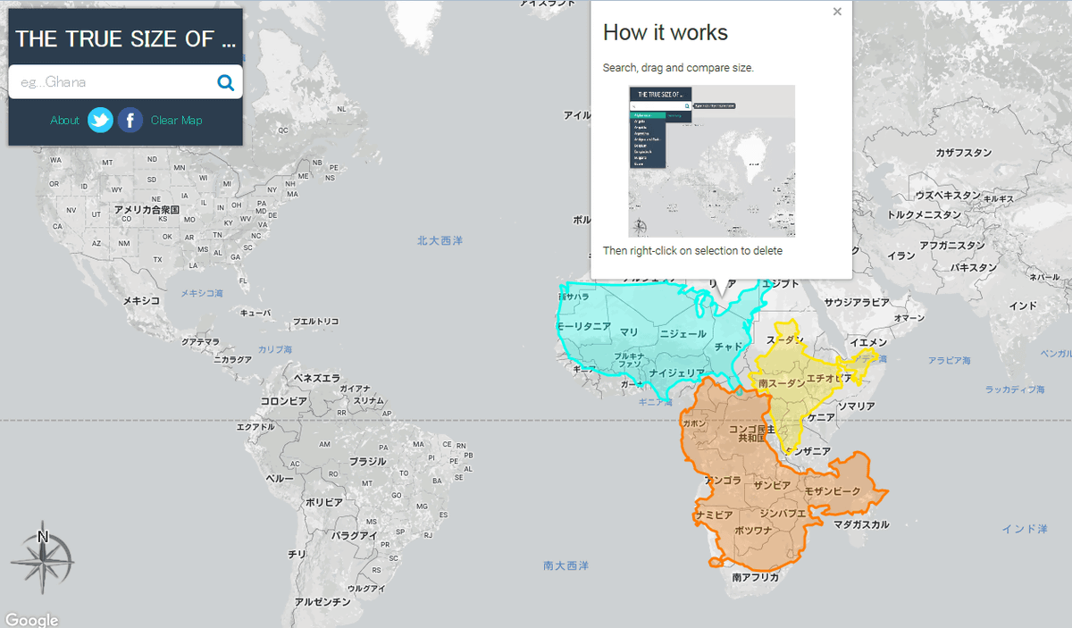
The three shapes are color-coded, especially the light blue one that looks like something you've seen somewhere before.
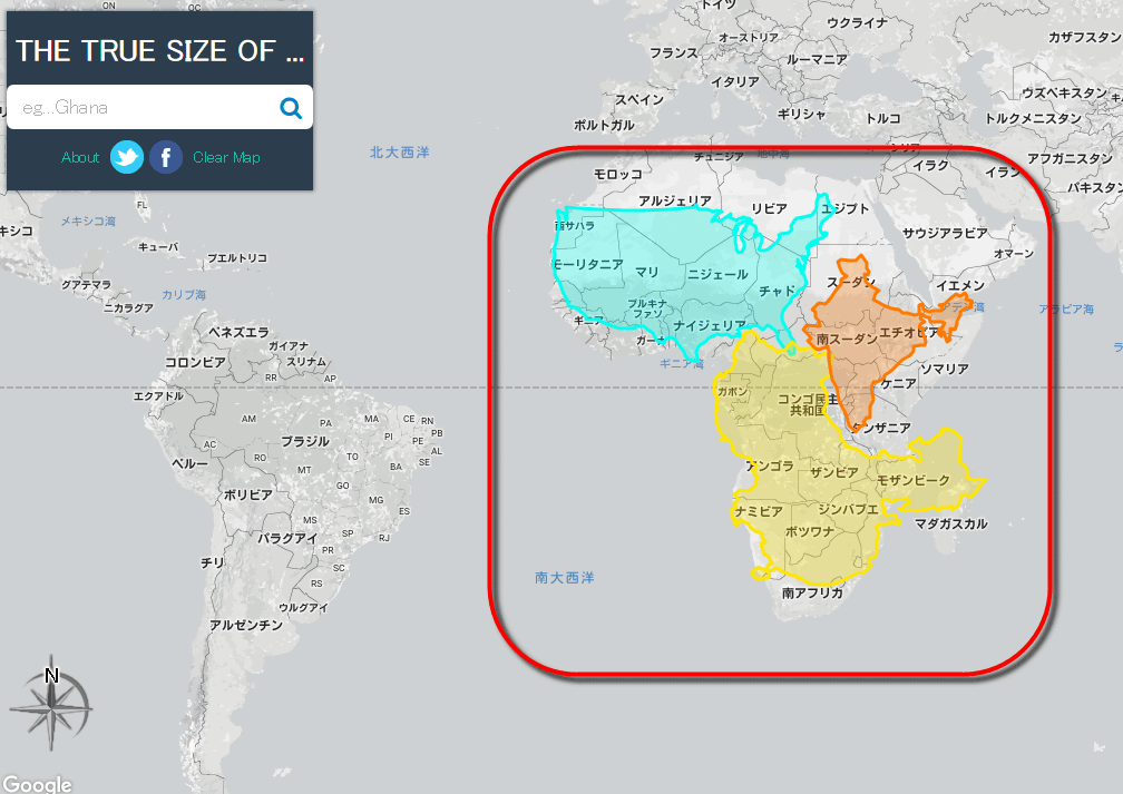
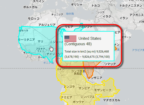
Each of these shapes represents the land of a different country, and in the initial state, the land of the United States (light blue), India (orange), and China (yellow) are displayed overlapping the African continent. I am. This means that the area of the African continent is approximately the same as the United States + India + China.
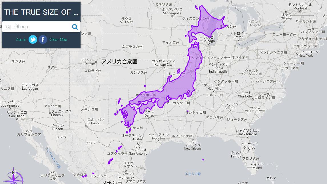
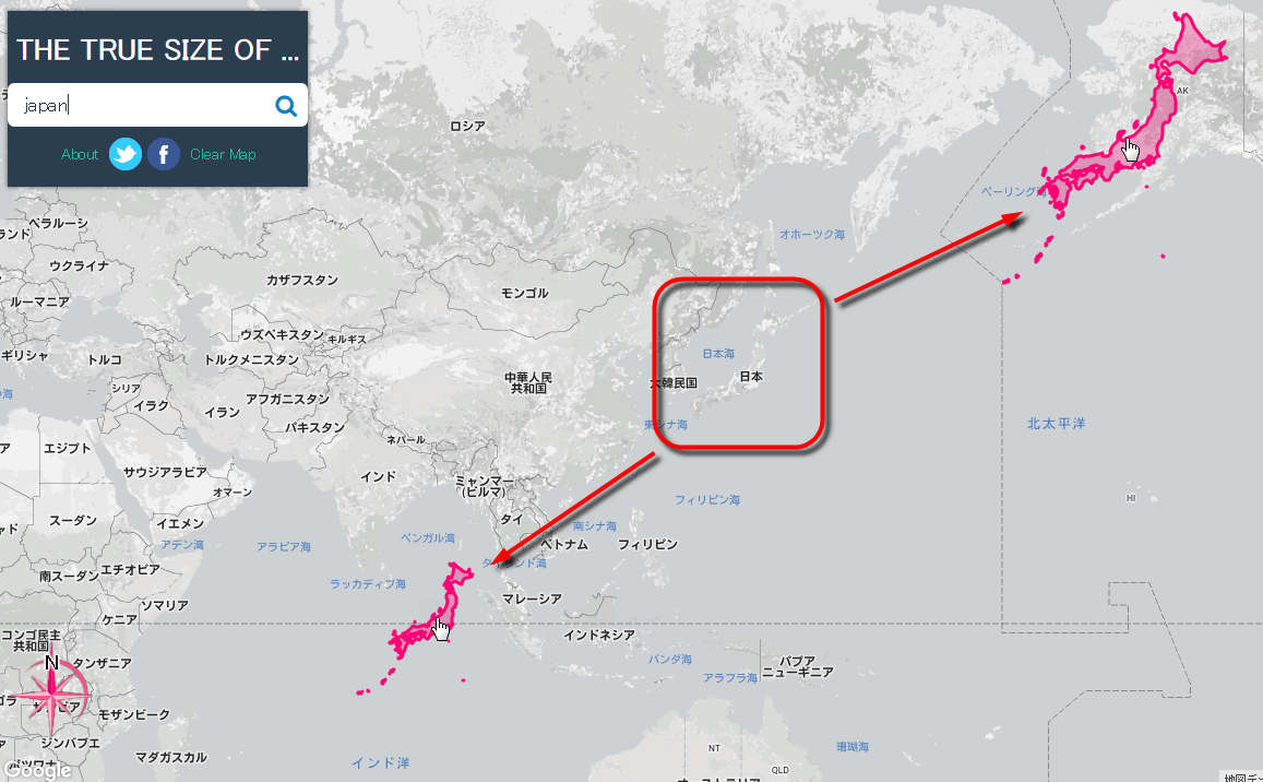
You can also search for the country you want to check and compare. In the case of Japan, if you enter 'Japan' and search, the land of Japan will be highlighted.

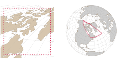
The highlighted part can be dragged with the mouse. As a test, if you grab Japan and move it to the vicinity of Alaska and the equator, you will see that the size of the display changes so much. In the Mercator projection, the displayed size changes by this much.
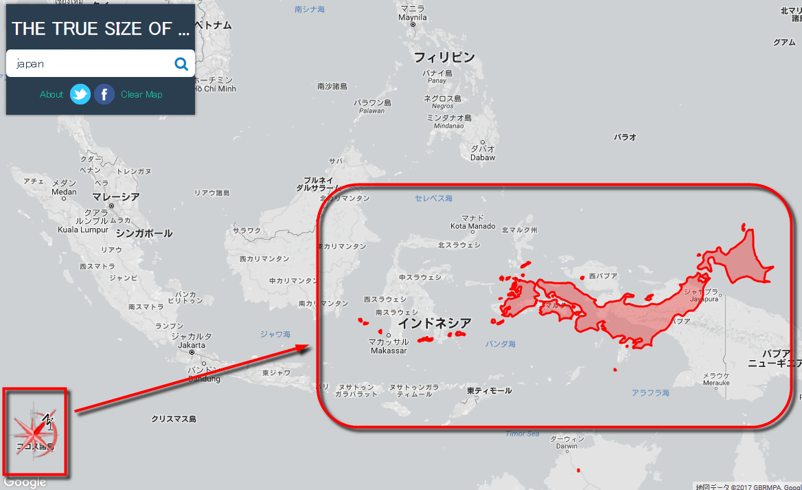
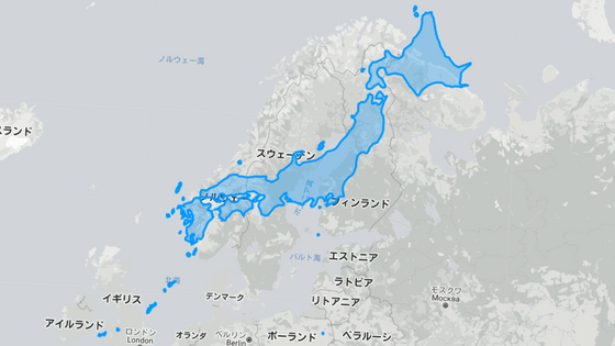
If you look at Japan on top of Indonesia, a country with a population of 200 million people, you will find that Indonesia is larger than you might have imagined. In particular, you can see that the island of Borneo (Kalimantan) is unexpectedly larger than the Japanese archipelago, but that's not surprising.Borneo's area is 725,500 square kilometers, which is about 1.9 times the land area of Japan, so if you compare it side by side directly. This is the result.
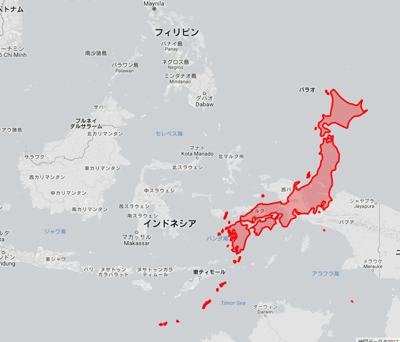
By operating the orientation mark at the bottom left of the screen with the mouse, it is possible to rotate only the highlighted country. If you compare Japan to the shape of Indonesia, you will see that Indonesia is longer than Japan (longer from east to west).
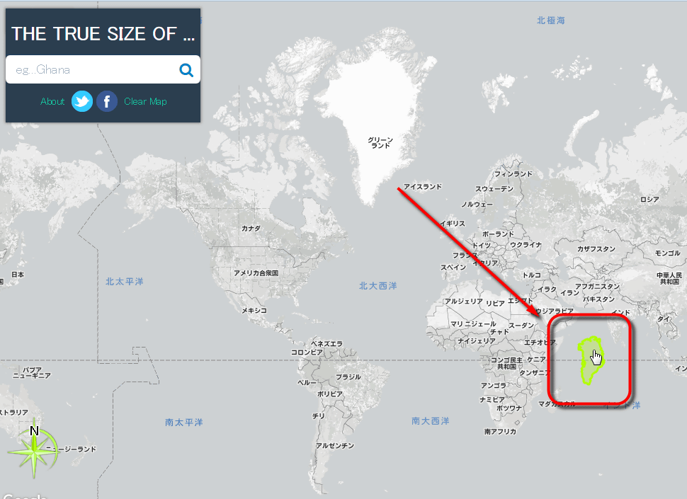
Now, let's take a look at the true size of Greenland, which is said to have the largest error in understanding its size in the world. If you highlight Greenland like this and move it to the vicinity of the equator...
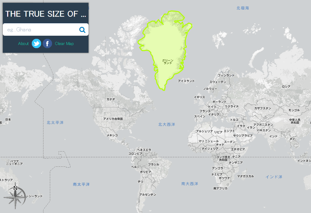
It turned out that it was about the same size as India. In this way, 'The True Size Of...' allows you to accurately grasp the size of each country that was 'misunderstood' by the Mercator projection.
Related Posts:
in Review, Web Service, , Posted by darkhorse_log