Seven points of design that should be held when creating an application
ByJorge Quinteros
Software developers such as "one task per screen", "How to use push notifications", "Making margins"Nick BabichMr. Masu is summarizing the seven points of UX design that should be suppressed with mobile application creation.
Mobile Design Best Practices
http://babich.biz/mobile-design-best-practices/
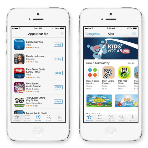
◆ 1: One task per screen
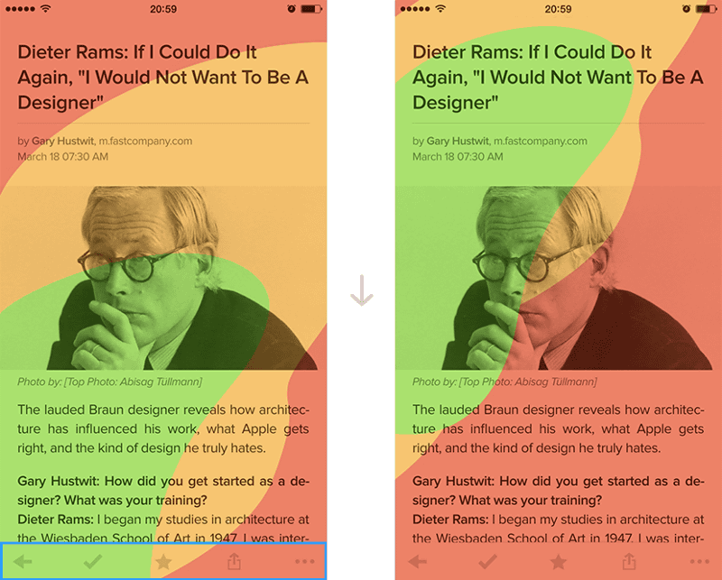
Looking at the application of dispatch service "Uber", you can see that it is making it very simple. Because the purpose of a person using Uber is clearly "to catch a taxi", the user's current location is automatically displayed on the screen of the application, and what the user should do is to say "place to catch a taxi It is only to be chosen.

To make it easier to understand the application and make it easier to operate, the operation that can be done on one screen should be limited to only one "what you really need to do". A plurality ofCTAIt is important not to set up.
◆ 2: "There is an invisible interface"
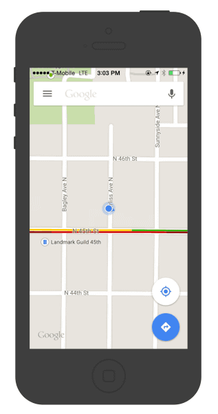
In order to make the application easy to use, it is important to "reduce unnecessary elements" rather than "increase elements on the screen". For example, after redesigning Google Maps, extra buttons and panels have been deleted, and only the central content "map" is now displayed. As Google says "Map is the interface", let's get rid of unnecessary elements so that the user of the application can find the desired content as soon as possible.
◆ 3: Making margins
The existence of "margin" tends to be overlooked in design. Some designers think "margins are part of the background" and "waste on the screen", but in mobile design it is actually a fairly important factor. Paying attention to the margin not only helps to indicate readability and content importance but also makes UI simpler and leads to improvements in UX.
◆ 4: Navigation simplifies things
The element of "navigation" to inform you that "There is such a feature here" is one with a very high priority in designing an application. It is easier to find the function that the user of the application wants to use, easy to access, and design it as much space as possible. However, designing adequate navigation within a small screen of mobile applications is also a challenge.
For example, the tab bar and the navigation bar as used in the App Store are very good in that it is possible to access the page you want to see with a simple operation called "tap" and display all the important options. Such a display method is suitable when the number of options is relatively small.
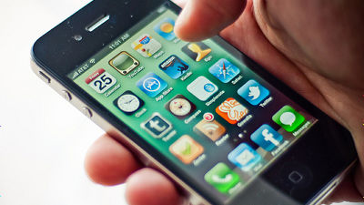
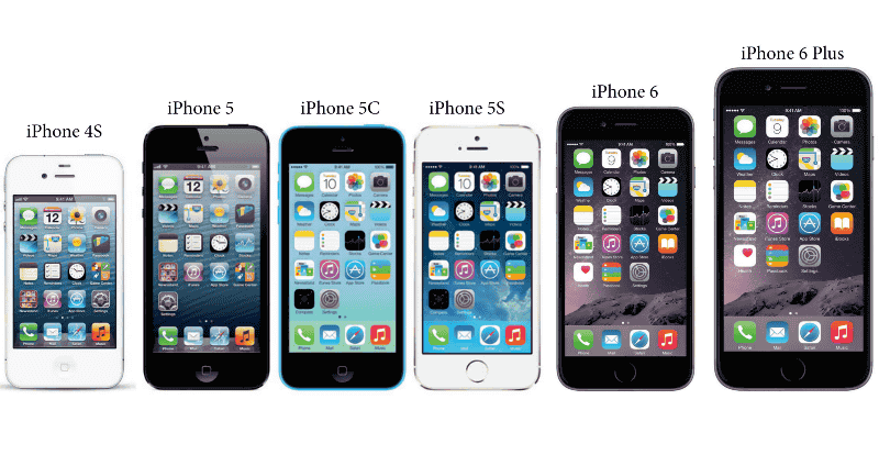
◆ 5: Can be operated with one hand
As you can see from the evolution of the iPhone, the display of the mobile terminal is getting bigger year by year.
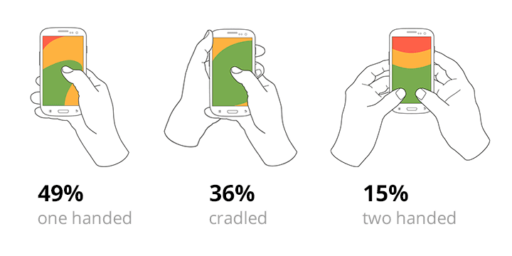
But,Steven HooberAccording to Mr. survey, 49% of the smartphone users are operating with one hand, 36% hold the smartphone with one hand and use the other hand and the user operating with both hands It is said that it is only 15%. In other words, although the display is huge, 85% of users operate with one hand.
He is the product manager and lead designer of the dating application "Tinder"Scott HurffIn the iPhone whose display size is different, Mr. Visual makes it possible to operate with thumb up to which point. In order to improve the user experience, with these in mind, we need to think about "how far the thumb will reach", that is, "where can I operate with one hand if putting any elements?"
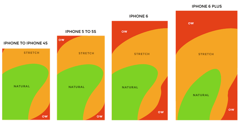
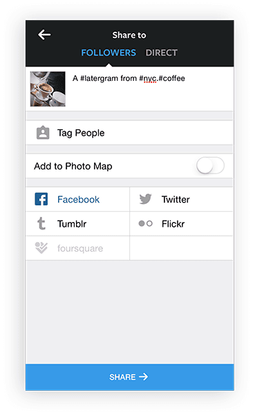
For exampleService "Convenient to Read" "Pocket"In the iOS application, the navigation controls are displayed at the bottom of the screen. Because this is also considering the range that the thumb can reach.
◆ 6: The time until the screen appears is as short as possible
Please react as fast as possible when you react the application and when the screen appears. In Instagram, uploading starts as soon as you select a photo, so you can add captions and tags while images are being uploaded where you are not visible. Such a form of "the application moves in a place where the user can not see" does not give the user a feeling of "waiting" for the application user.
◆ 7: "Push Notification" is Cleverly Used
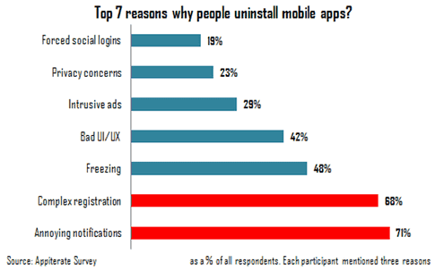
Although smartphone users receive several notifications every day, in fact it is the best reason to uninstall the application that "notifications are bad". Let's send a notice only when it is "important to the user of the application".
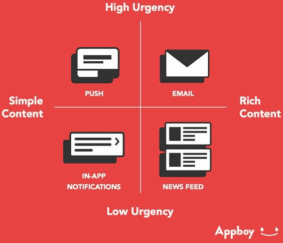
In addition, there are methods such as push notification, mail, notification in the application, news feed, etc. when sending notifications, but this also needs to be used properly according to the content of the notification. If content is simple and importance is high, push notification, e-mail if contents are high, importance is high, e-mail is important, content is more news feed, etc. You can choose a notification method appropriate to the announcement It is a point.
Related Posts: