Twitter changed the design dramatically, what changed and how it changed?

ByUncalno Tekno
The Android version of Twitter was updated on June 7, 2016 and the UI such as tab bar and navigation menu was changed drastically, so I actually tried it.
Twitter for Android gets a refresh | Twitter Blogs
https://blog.twitter.com/2016/twitter-for-android-gets-a-refresh
I updated Twitter for Android version | Twitter Blogs
https://blog.twitter.com/ja/2016/0607android
You can see how the changes have been made by looking at the movie tweeted by the official account of Ttwtter.
In order to make it easier to use on Android, I made a new twitter design for Android.https://t.co/xUZHJTxstiPic.twitter.com/smctyaeLDB
- TwitterJP (@ TwitterJP)June 7, 2016
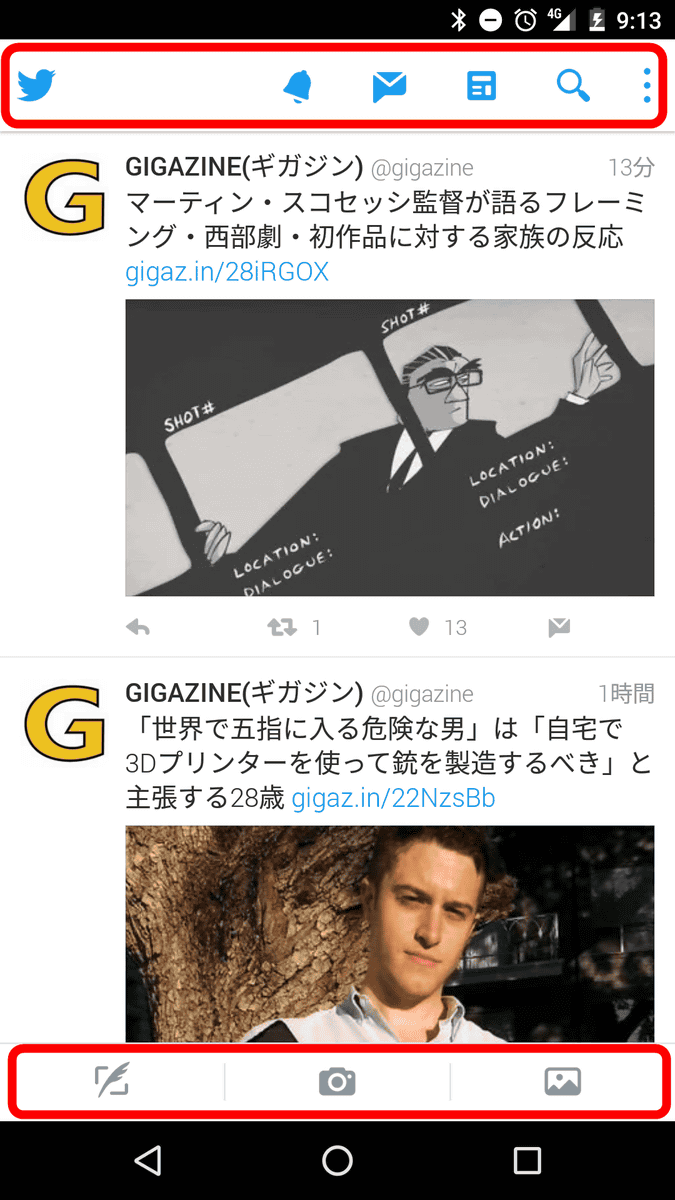
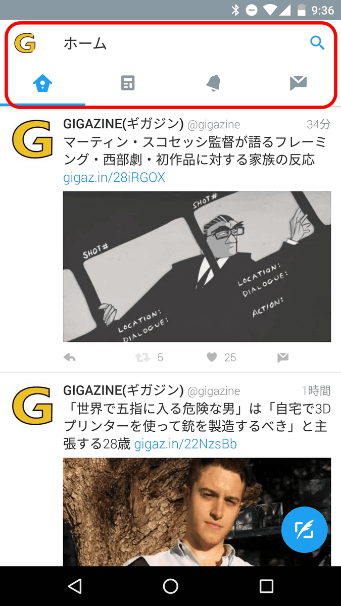
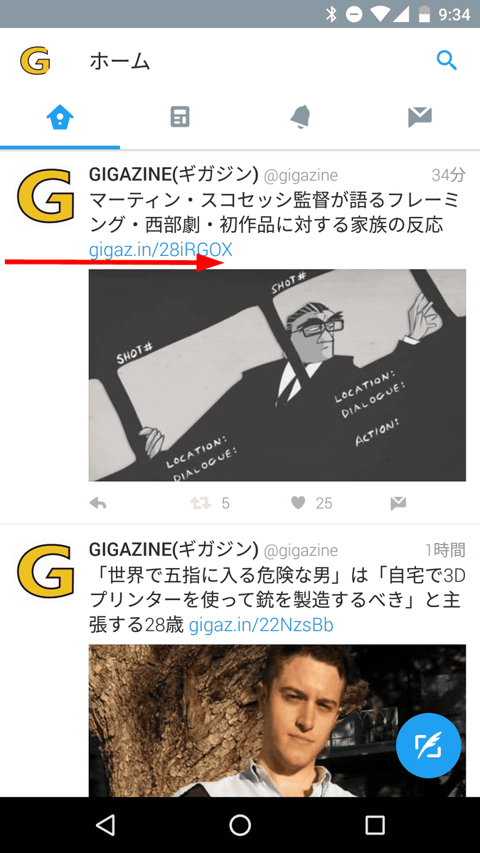
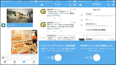
◆ Home screen
Below is the old UI. A menu bar was displayed at the top and bottom of the home screen.
In the new UI, the lower bar disappears and "Account name" and "Tab bar" are displayed at the top of the screen.
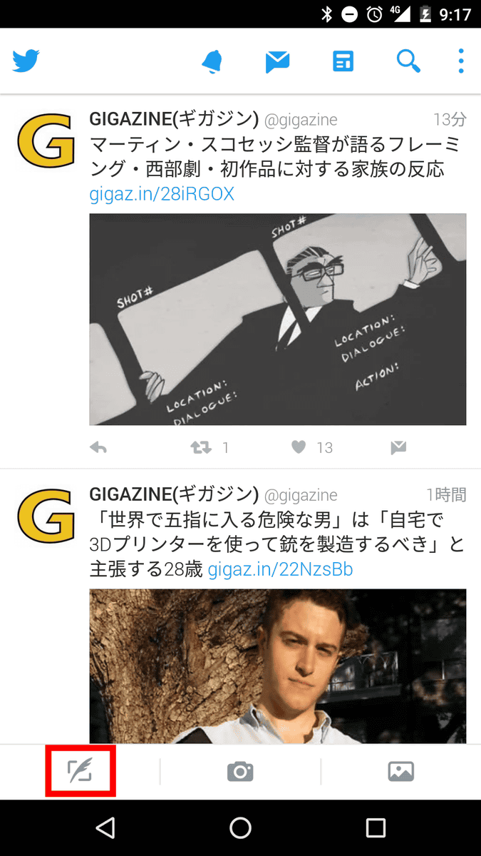
◆ Tweet button
In the case of the old UI, tap the tweet icon at the bottom left of the screen ... ...
Open Tweet entry screen.
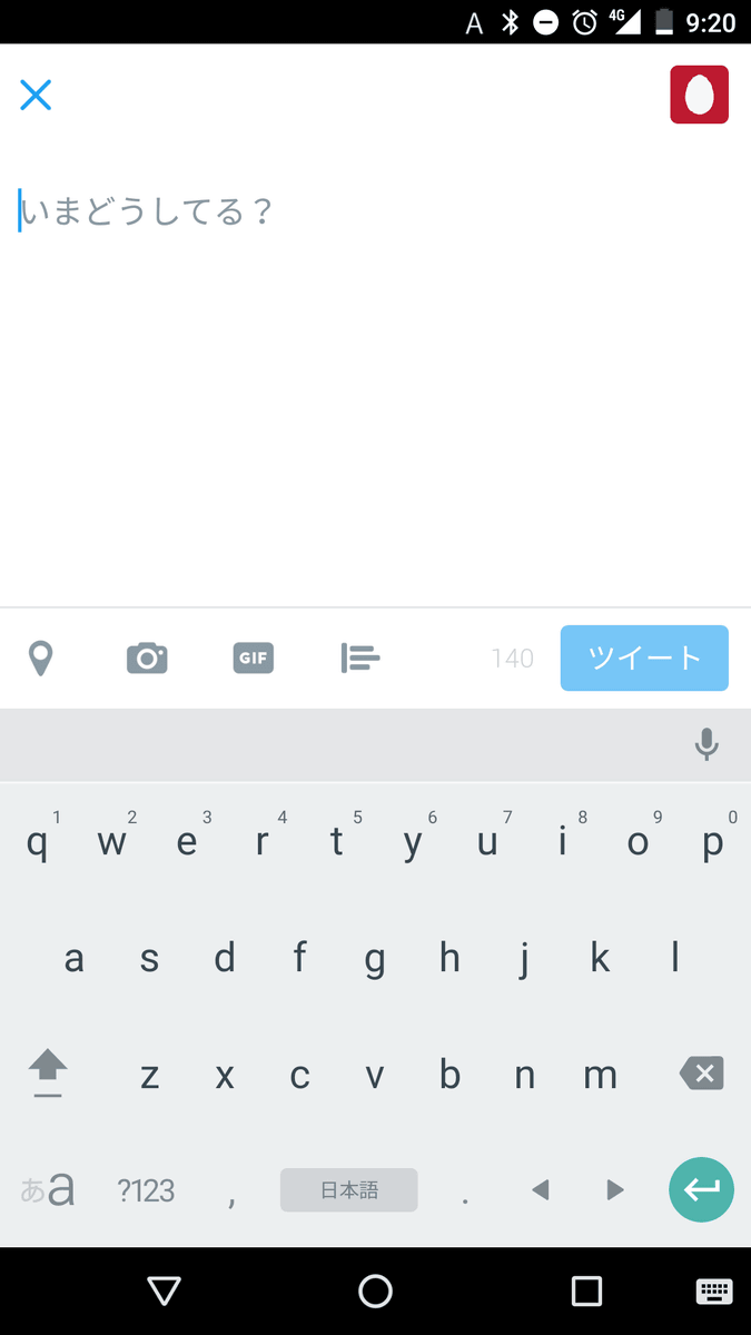
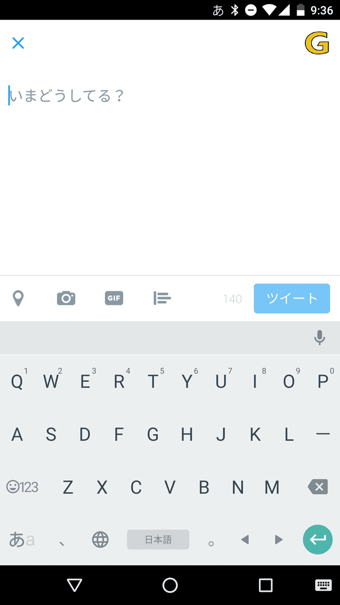
However, if it is a new UI, a tweet button is arranged at the lower right of the screen. Tap the button ......
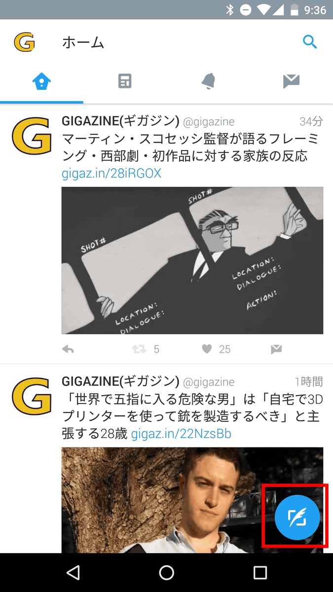
Tweet input screen opened.
Also, because the new tweet button is a floating button, it will always be displayed in the lower right, even if you are watching the timeline or moving the screen.
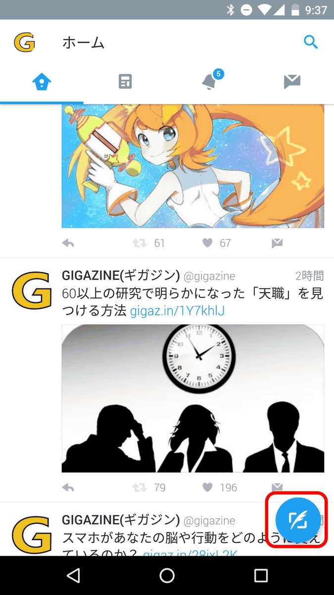
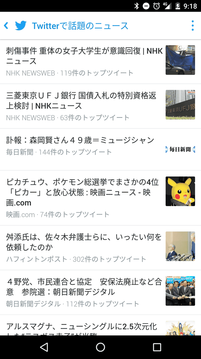
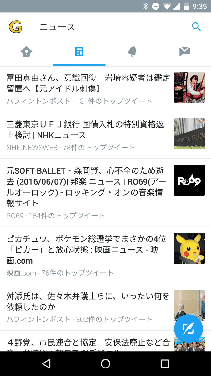
◆ Tab bar
In the old UI, tap the icons such as "notification", "direct message", "news", etc. arranged at the top of the screen ......
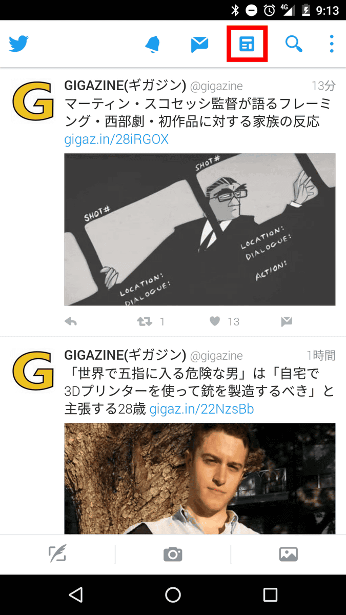
You can check the details of the tapped icon.
In the new UI, icons of "News", "Notification" and "Direct Message" are arranged in "Tab Bar", and when swiping from right to left ......
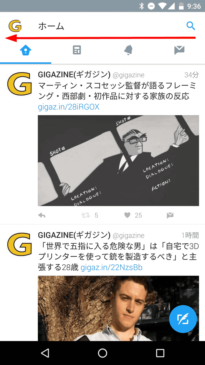
Details of each icon are displayed. In other words, the old UI "Tap Icon → Move" changed to "Swipe to move tab bar → Move". By swiping left and right you can move "Home", "News", "Notification", "Direct Message", and accessibility is improved.
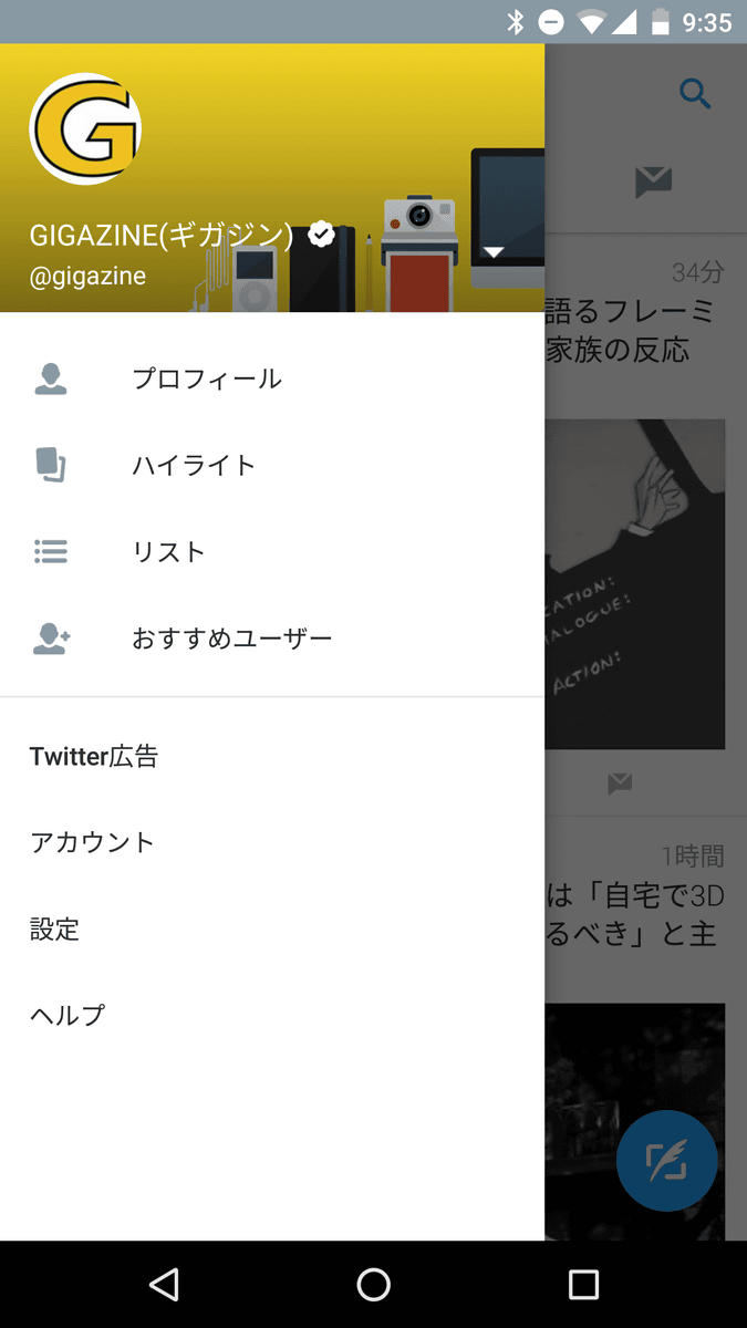
◆ Navigation menu
In the case of the old UI, tap the menu icon at the upper right of the screen ... ...
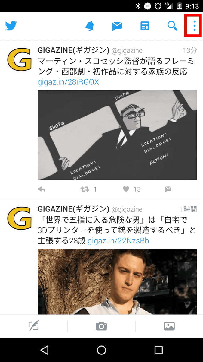
"Recommended User" "Highlight" "Show List" "Account" "Setting" "Help" was successfully accessed.

In the new UI, when you swipe the screen from left to right ... ....
A navigation menu is displayed, from which you can access "Profiles", "Highlights", "Lists", "Recommended Users", and so on.
Related Posts:


in Review, Mobile, Software, Web Application, Posted by darkhorse_log