When and how are marks such as the stairs, escalators, etc. familiar in the city been made?
Now it is natural that stations, buildings, etc. "stairs", "escalator", "nursing room" etc. displayed in the cityPictogramIt was 40 years ago from now that the present form came. Even if there is a gap between culture and language, pictograms that convey messages are indispensable to the internationalization of modern times, but Atlas Obscura summarizes the state at the time, how it was designed.
How the Universal Symbols for Escalators, Restrooms, and Transport Were Designed | Atlas Obscura
http://www.atlasobscura.com/articles/how-the-universal-symbols-for-escalators-restrooms-and-transport-were-designed
In Japan it was developed in 1964PictogramHowever, it was in 1976 that pictograms such as "stairs" and "shooting prohibited" currently in use were invented. When the 200-year festival of the foundation was held in the US,OlympicAs we look forward to the era in which people 's interactions around the world are becoming active,United States Department of Transportation(DOT) thought that it was necessary to standardize the use of pictograms for travelers.
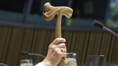
So, DOTAmerican Graphic Design Association(AIGA), we will review pictograms around the world and start devising a new pictogram to convey messages to travelers. A design company called Cook and Shanosky Associates was in charge of designing the pictogram by contracting with AIGA. He was a graphic designer and then presidentRoger CookMr. 85 years old, he retires from the company and works as an artist, but his company Don Shanosky, who also worked on the design, has already left the world.

It took almost a year for Cook and others to design 34 pictograms. Because I was concentrating and working on design, there were people who were worried that some companies would lose other clients. Since computers were not popular at the time, Mr. Cook and Shanosky painted designs on hundreds of tracing papers and repeated discussions until every detail. Mr. Cook says "There is no time to think about what the meaning of the pictogram is sitting," and the design of the pictogram does not lose the impact of the message, but how to delete decorative ornaments is heartblood Was poured.
The first design was a pictogram showing "men". DOT already used male pictograms, but Mr. Cook and Mr. Shanosky redesigned themselves to their own smooth, decorative shape rather than just using them. A man's pictogram is a simple font of Mr. Cook's beloved sans serifHelvetica"It was called Helvetica Man.
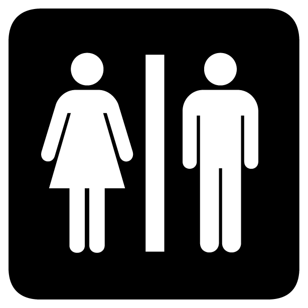
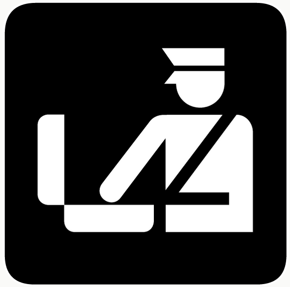
To design a simple pictogram, designers first started by understanding what "pictogram is about to convey". Human marks were relatively easy for men and women, but for abstract things the work is not that simple. For example, in order to tell that Helvetica man is official of authorities, there were many points to discuss, such as whether to hat a hat, to attach a belt, to put a mark on an immigrant ... That's it.
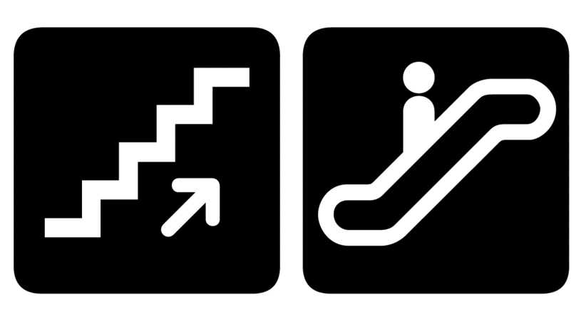
"Whether Helvetica should be included in the pictogram of the" staircase "was also a big problem. Currently it is difficult to associate other steps than stairs by looking at the stepped upwardly rising marks, but before this stairway mark penetrated, I did not know "how much information would be written as stairs" It was.
Ultimately, it means that "Pictogram is too overwritten" and Helvetica · man is not included in the stairs mark, but on the other hand it was included in the pictogram of the "escalator". It was because it was thought that it would be difficult for people who saw pictograms without helvetica man to understand "escalator".

Whether the helvetica · man of Mark marking "watering place" should draw an arm or the dog's nose of "dogs off limits" mark should be round or should be square, "baggage Does not the helvetica man who has hands raising his hands waving to a friend or trying to stop a taxi? Many pictograms, such as DOT, AIGA, designers, as well as many others were rewritten involving their families and friends.
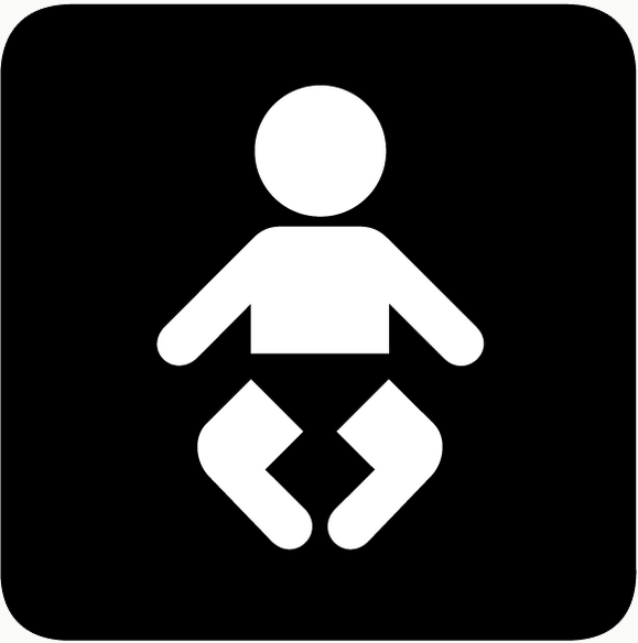
The pictogram designed over about a year started operation in New York, Boston, Philadelphia, Washington, D.C., etc., and then gradually applied to the nation's transportation system gradually. And requests from various organizations to create pictograms such as "no shooting" and "not a weapon" came in one after another, and AIGA and DOT brought 16 pictograms in 1979 and 5 pictograms in 1985 Added. The baby 's mark shown in the following figure is now familiar, but before the design change it changed the mark of the bottle to helvetica · baby, since the baby' s parents can change the diaper It became easy to understand.
In 1985, Cook and Shanosky Associates received the Presidential Award issued by US president Ronald Reagan of that time, Mr. Cook said "We have shown" many ways to go "to more people. It should have a record about "I talk about invisible achievement.
Related Posts:

in Design, Posted by darkhorse_log