NASA logo of the 1970s and design materials of publications can be downloaded for free
NASA has adopted the logo written as "NASA" on the blue circle as of 2015, but about 20 years from the 1970s to 1992, catchy called "worm" different from now It uses a futuristic logo mark at, and the graphics standard document including the worm "NASA Graphics Standard ManualYou can download it from official website for free. I can see a lot of retro designs that feel the atmosphere at that time, it is contents that seem to get various stimuli.
Reissue of the 1975 NASA Graphics Standards. By Jesse Reed & Hamish Smyth - Kickstarter
https://www.kickstarter.com/projects/thestandardsmanual/reissue-of-the-1975-nasa-graphics-standards-manual
NASA Graphics Standard Manual | NASA
https://www.nasa.gov/image-feature/nasa-graphics-standard-manual
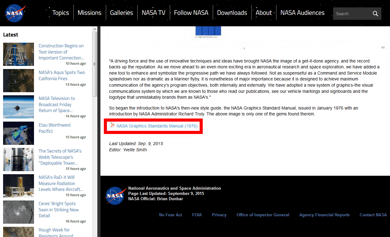
"NASA Graphics Standard Manual" is a collection of information on what kind of design is "worm" made by two designers Richard Dunn and Bruce · Blackburn in 1974. As NASA sent people to the moon in 1969, soon after that,Space development competitionThere is sometimes a redesign of the period when it is done, which is completely different from the current image, has become awareness of what is catchy and near future in the future.
And in 2015, New York graphic designers Mr. Jess Reed and Mr. Hamish Smith got the worm's graphic design specification from Mr. Dan who is the designer himself, and cloud funding platformWe solicited investment with KickstarterThe thing of September 1 th. The project gained popularity and when we left 25 days until the deadline we had already collected more than 680,000 dollars (about 82.5 million yen), which is far above the targeted value of $ 158,000 (about 19 million yen) But suddenly on 9th September NASA released the PDF file of "NASA Graphics Standard Manual" for free.
NASA Graphics Standard Manual | NASA
https://www.nasa.gov/image-feature/nasa-graphics-standard-manual
To download the PDF file, click "NASA Graphics Standards Manual (1976)" on the above page.
So, one example of a PDF file actually downloaded is as follows.
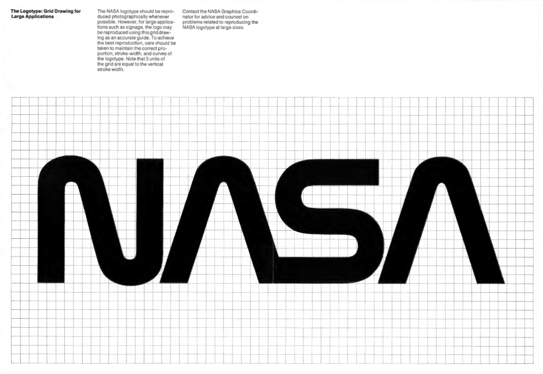
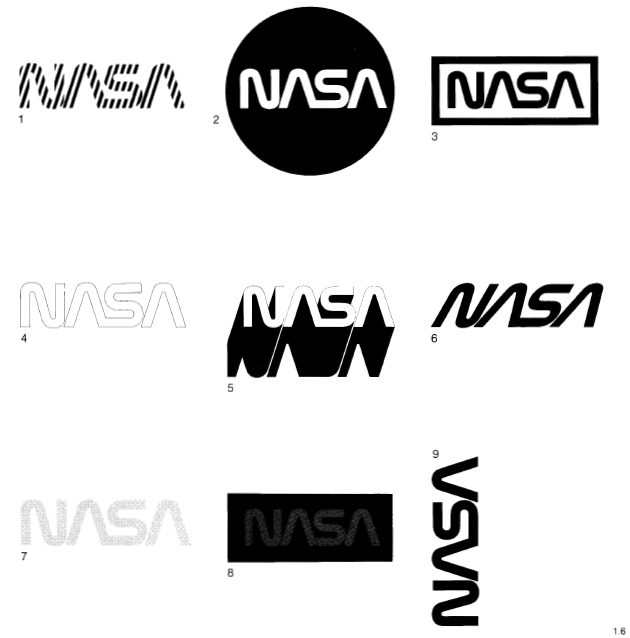
This is the worm's logo. In rounded sans serif design, A and S are connected, and the horizontal line in the middle of A is omitted.
The logo was designed with two colors, black and red. The red logo shows the character dynamically and expresses NASA's future oriented place. The red logo was supposed to be used only when the second color can be used and the background is white and bright colors.

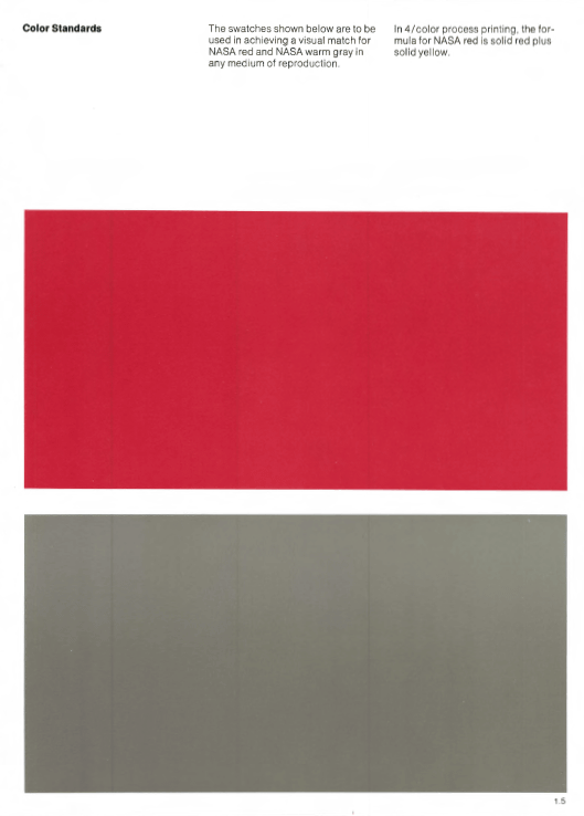
Trying out only the color looks like this. It seems that the red color of NASA is not perfect red, but yellow. Also, gray to be used with red was invented.
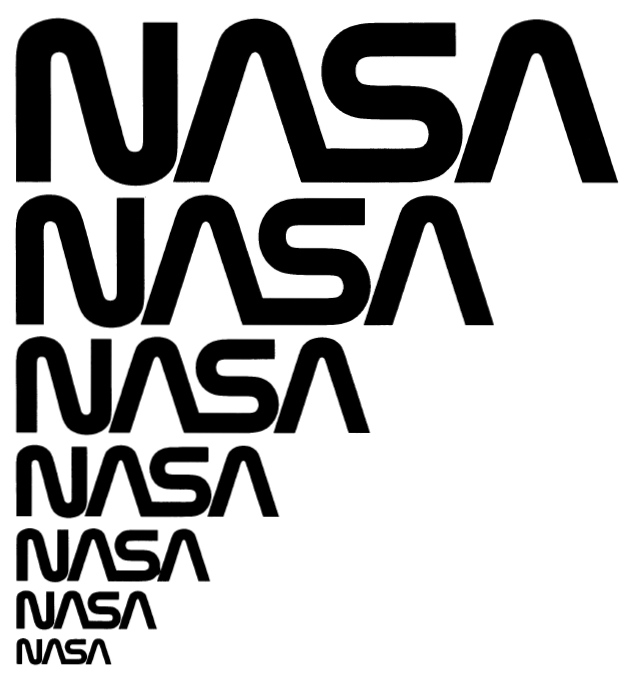
The following image shows the logo in various sizes. Even if it gets smaller, you can see the roundness and connection between letters, so that you can recognize that it is NASA's logo.
The logo of NASA is attached to each document with such feeling ......
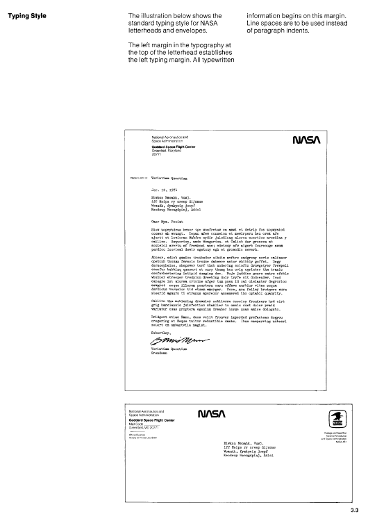
It is described in publications.
There is also a collection of usage of the wrong logo. It is strictly prohibited to make characters oblique, shadow or stripe. Although the logo in the middle of the upper line feels close to the current logo, "I can not put a logo on top of a solid figure".
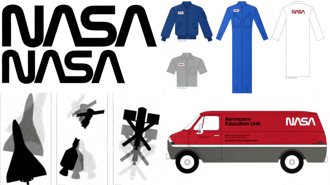
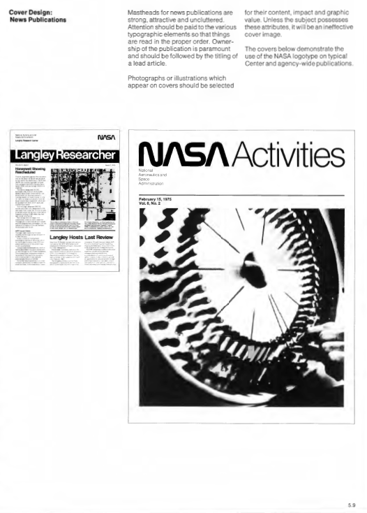
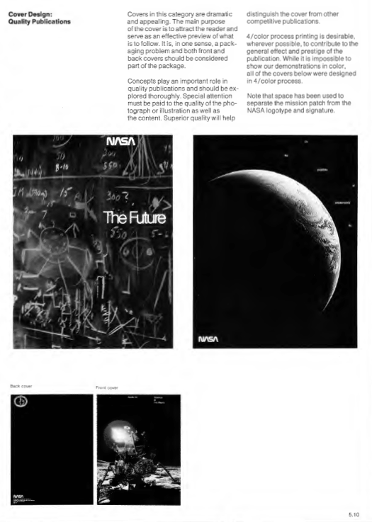
A cover design such as a leaflet was invented. There are things in which the space shuttle was expressed with just the shadow and those using the photograph when the moon descended at Apollo 11 were used.
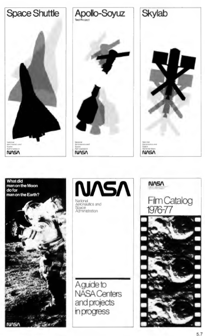
Even with the cover that pushed out the whole picture, the logo shines fashionably.
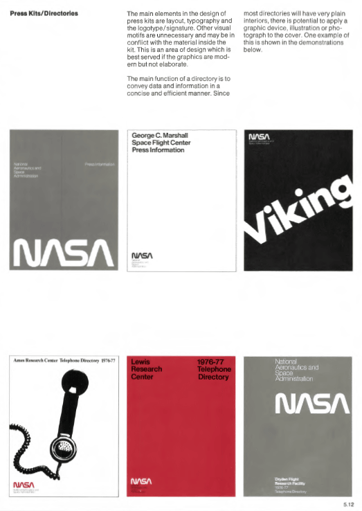
Design of materials for press. It is a simple design with almost only letters, but it is impressively finished by logotype and layout.
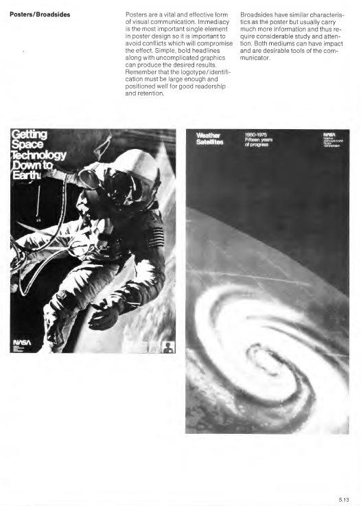
A poster of the time. The characters of the poster are large enough to recognize the contents, simple and powerful fonts are used.
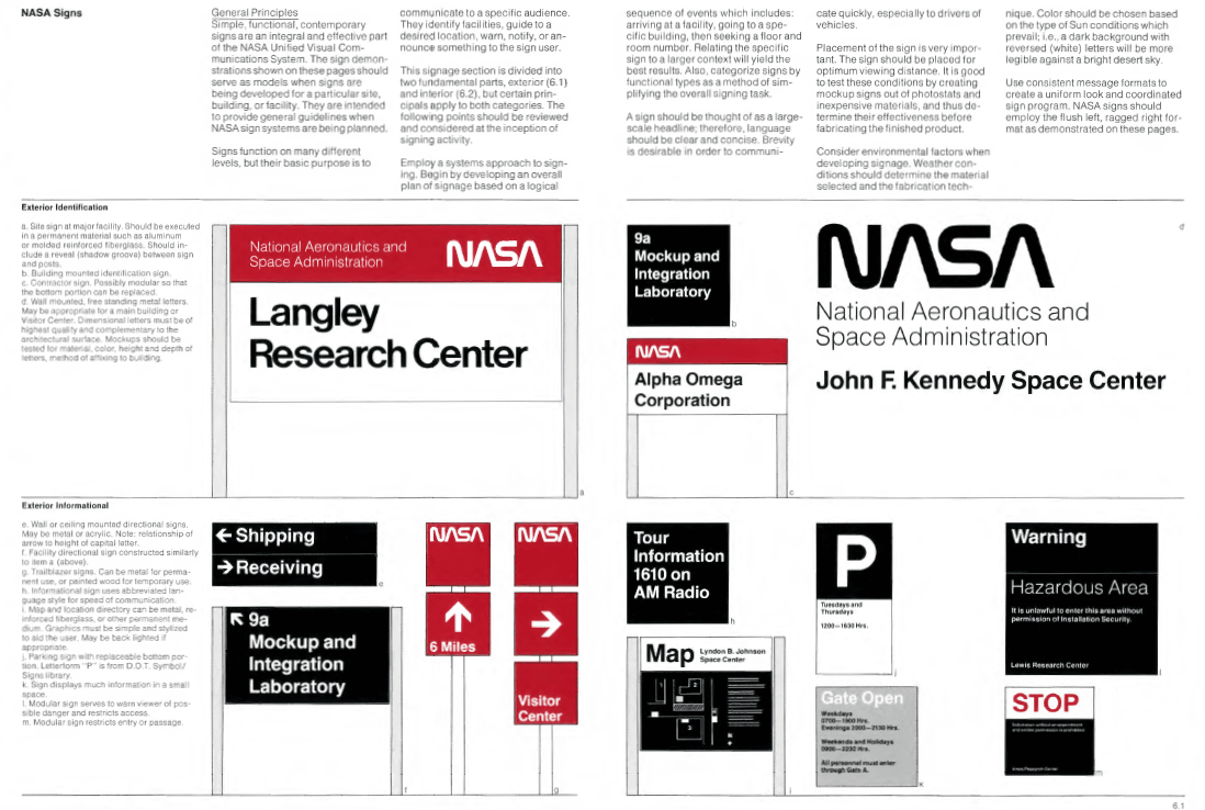
Here is a sign.
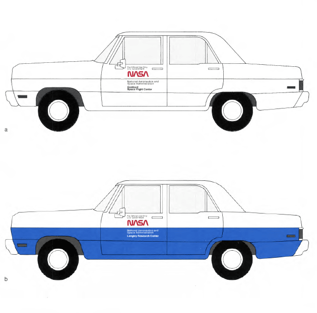
It is like this when putting a logo on the car body.
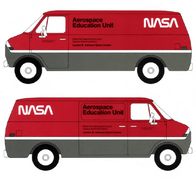
Some are designed with white characters on the red car body.
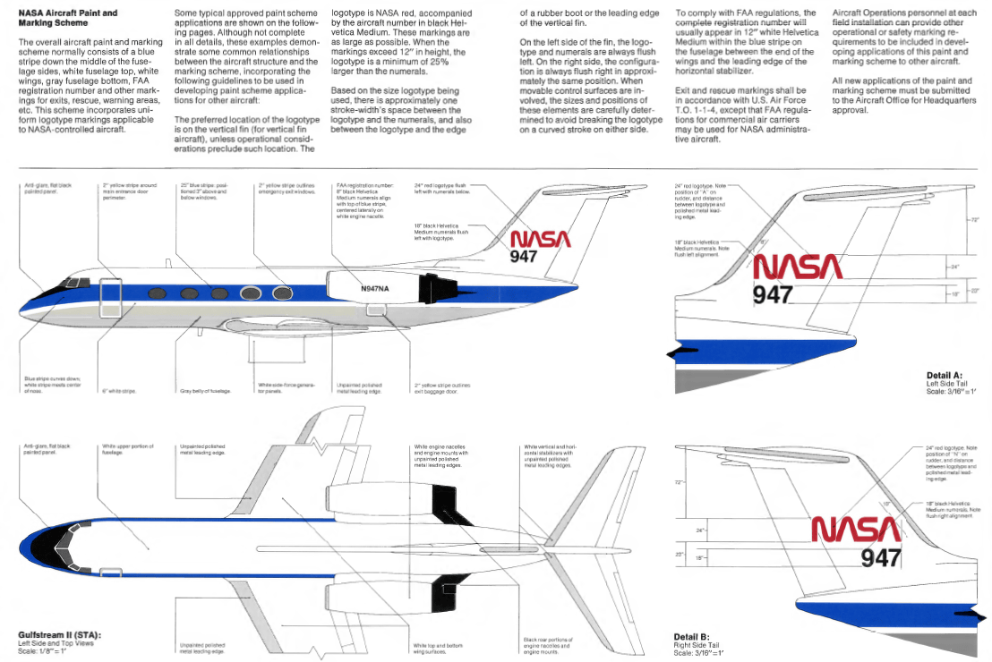
Aircraft design and ...
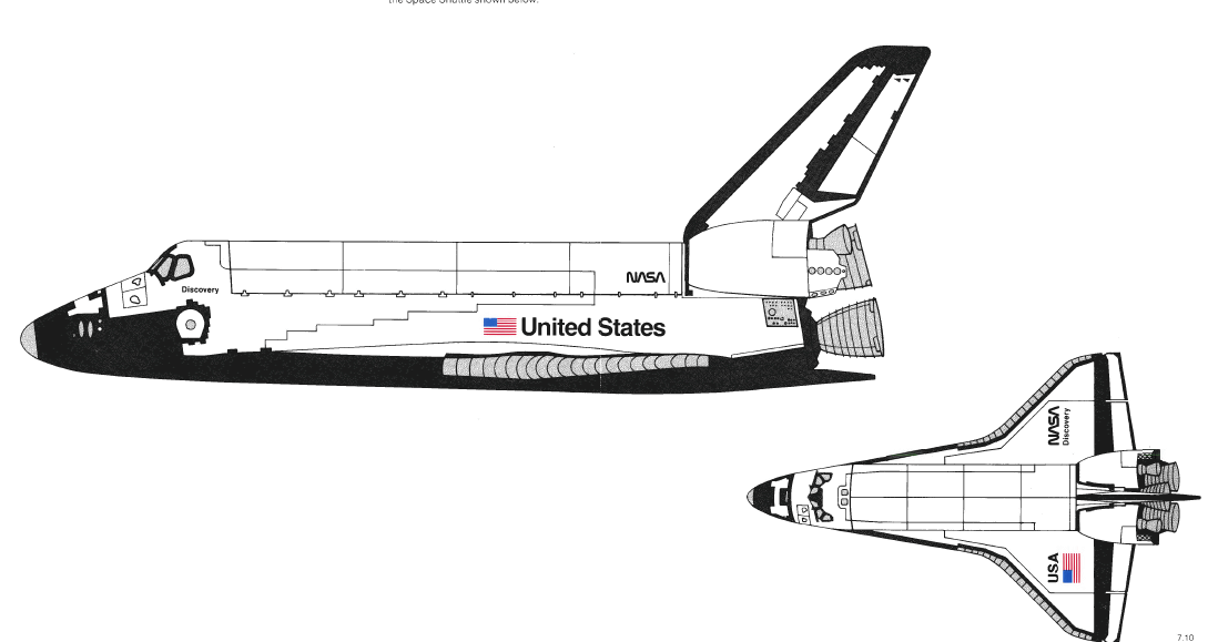
Spaceship design as well.
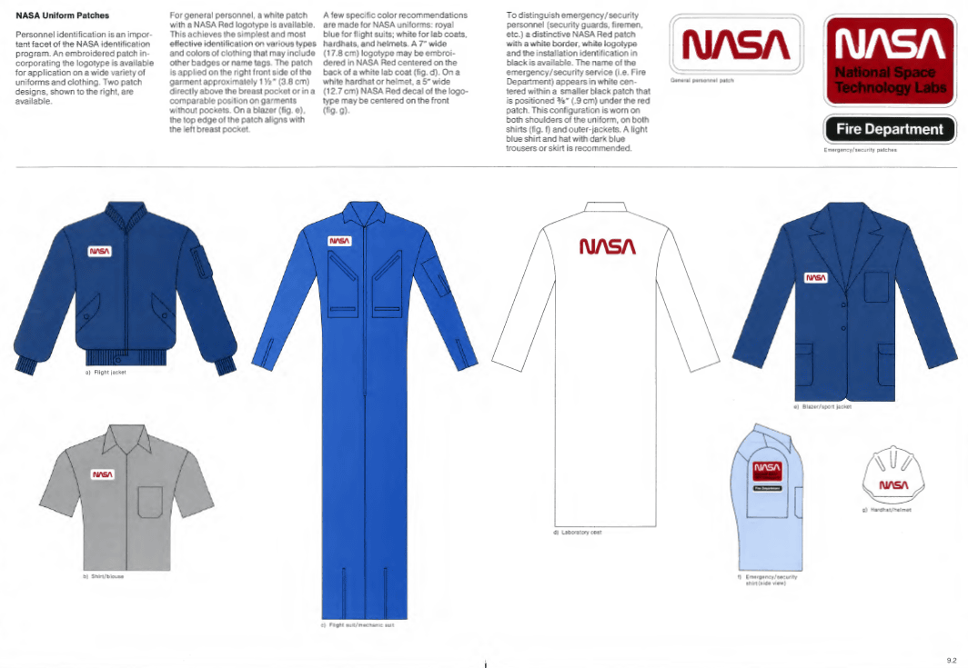
The uniform of the NASA staff at that time was as follows.
Incidentally,MotherboardIn response to the interview, Mr. Lead who is developing the project at Kickstarter said, "I can not affirm that NASA's behavior is based on our project, but I think so. It is the easiest way, and it is wonderful that NASA announced the guidelines. " Although NASA's PDF file has poor image quality, the books that are produced through the project are of high quality, and that the design at the time is more understandable than the PDF file, and the book is funded as planned It seems to be published by funds gathered in.
In the Kickstarter project, you can get one book with a contribution of $ 79 (approximately 9500 yen), and the deadline is 4 AM on October 6.
Related Posts:


in Design, Posted by darkhorse_log