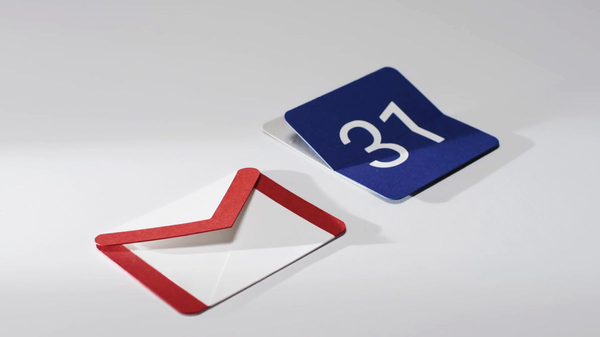
From Google 's material design that started with "What is software material?"
It is adopted in Google's mobile OS "Android 5.0 Lollipop", and other products of the company are being introduced one after the otherMaterial designIt is a software design called. Google is publishing on YouTubeGoogle DesignIt has released a movie introducing the details of the concept and the making movie until material design can be done in the channel of it, and it is contents which can understand until material design can be done.
Making Material Design - YouTube
Material design is a framework of design that may be utilized not only on Android but also on different platforms.
Designing material design in one word seems to be troublesome for immediate responses even by designers who made material design, and it is also transmitted to the side who sees what is not simple "OS design".
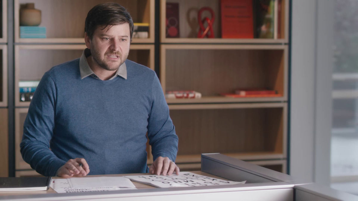
According to Jon Wiley, who created the concept of material design, it was all the beginning that I thought about "What software is made of?" In other words, it started off from the existing method in software design development so far and started thinking about the material of software.

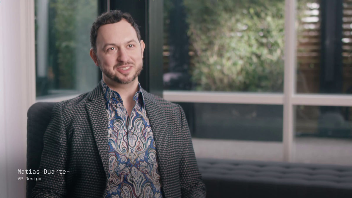
Here is Matias Duarte, the head of the Google design department.
According to Mr. Duarte, the idea of "quantum paper" was invented by Mr. Wiley at the beginning of the project.
Mr. Wiley thinks quantum paper is a material close to paper, but not paper, it is a smart paper that exists in the device. I will question the limit to how the surface of the smart paper moves with software and why it moves like that.
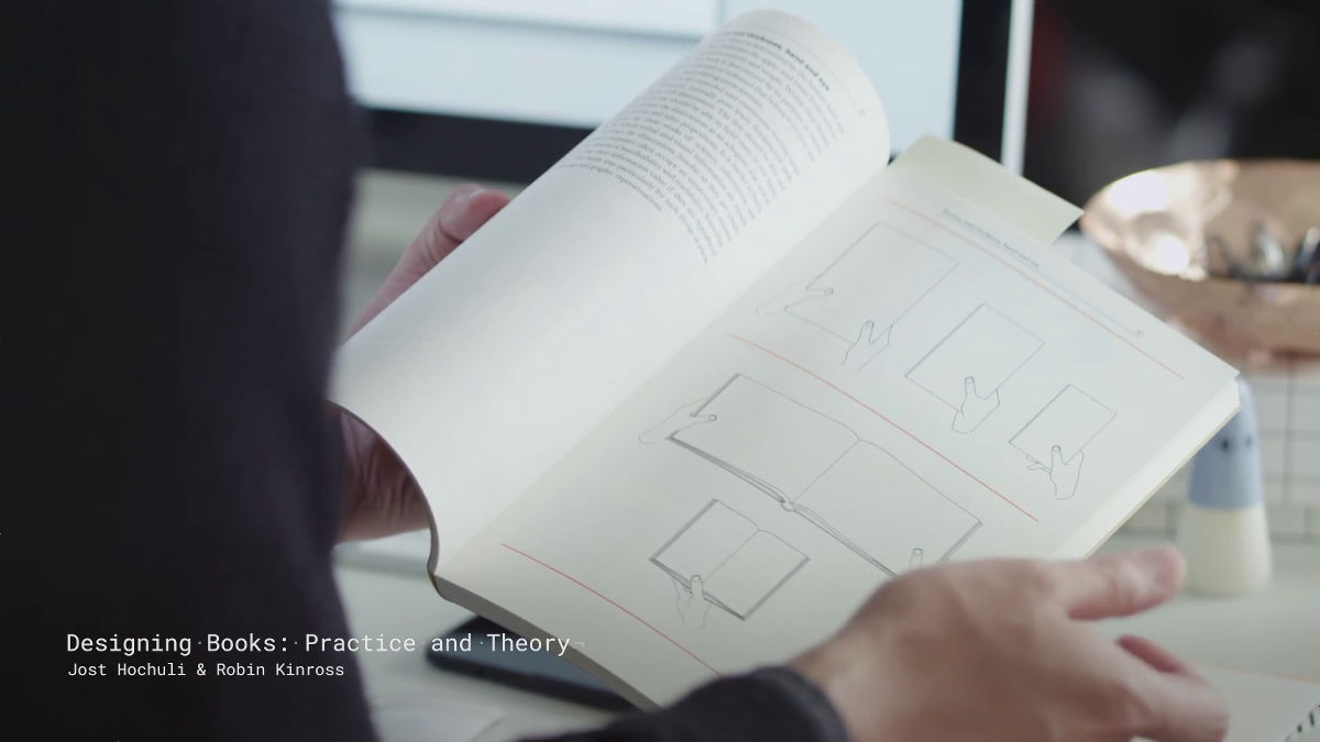
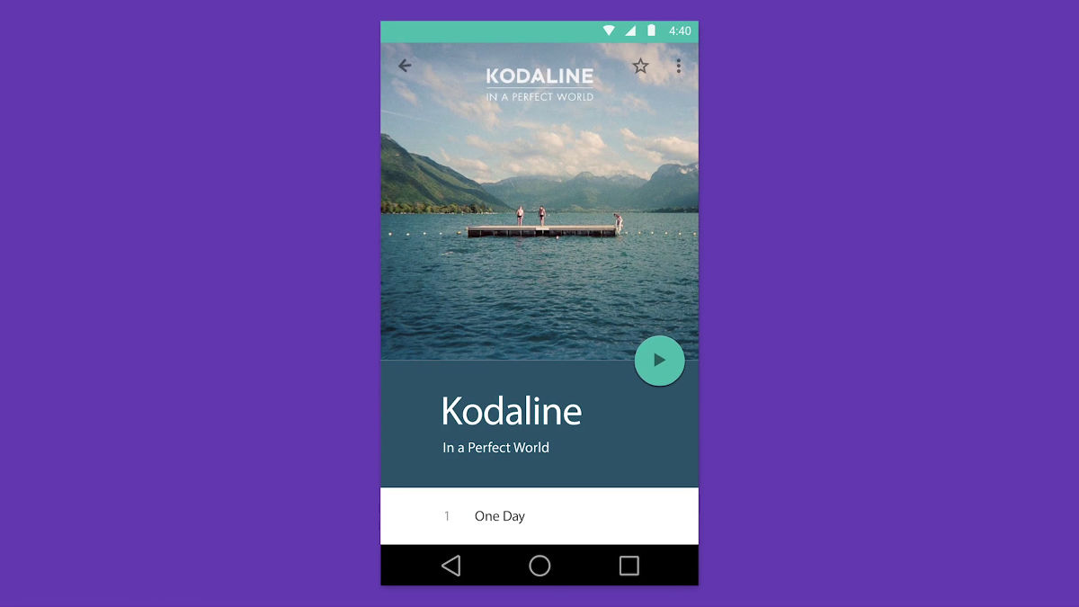
"Designing Books: Practice and Theory"There is a description about the design to use smartphones in the same way as books. Material design seems to have asked software also the viewpoint of "feeling like a book" with the same reason as thinking about device design.
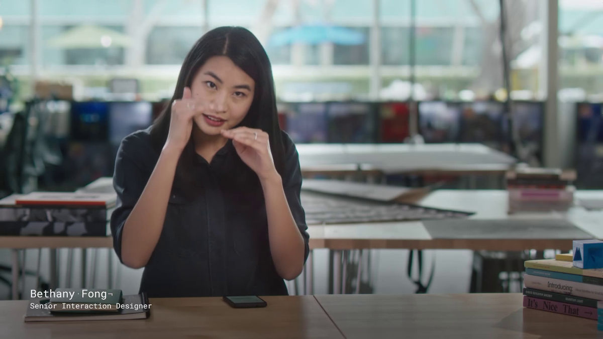
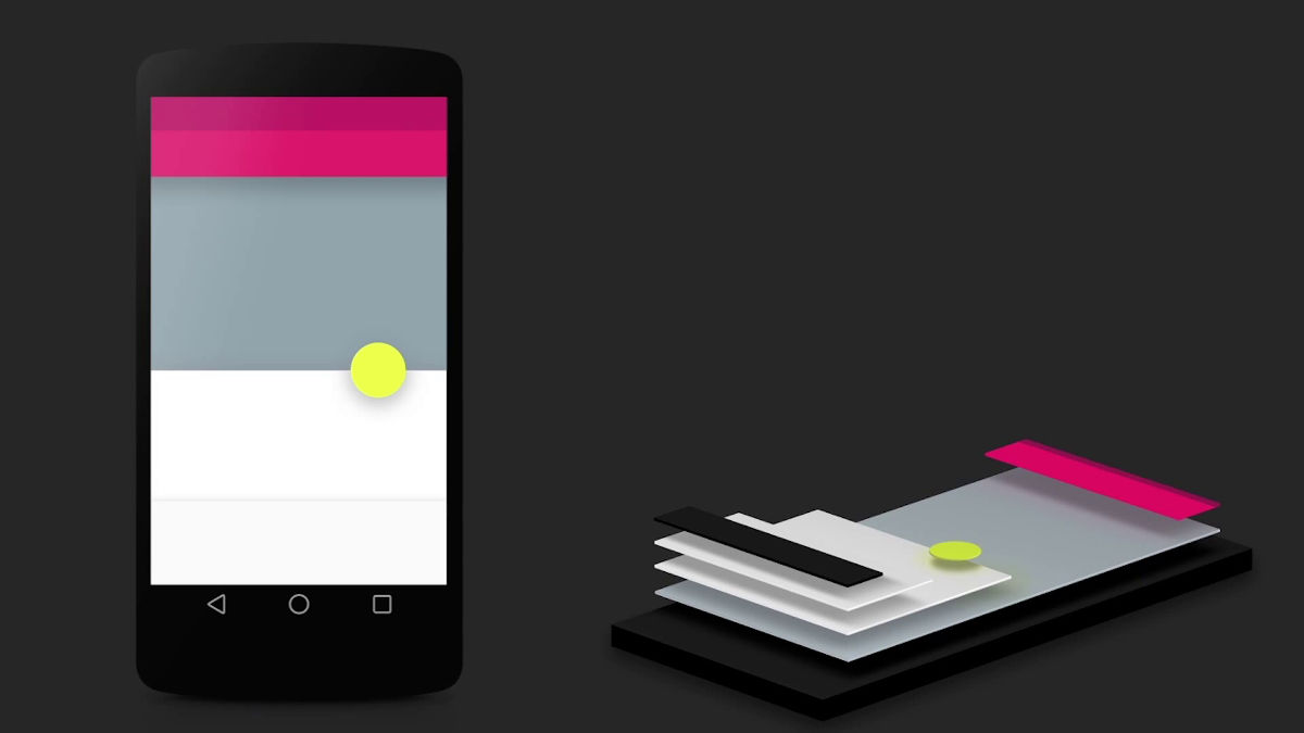
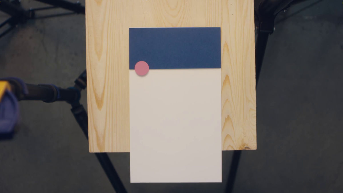
Bethany Fong says, "Inside the device there is a small gap between the display and the back, we tried to make use of that space and create a meaningful structure."
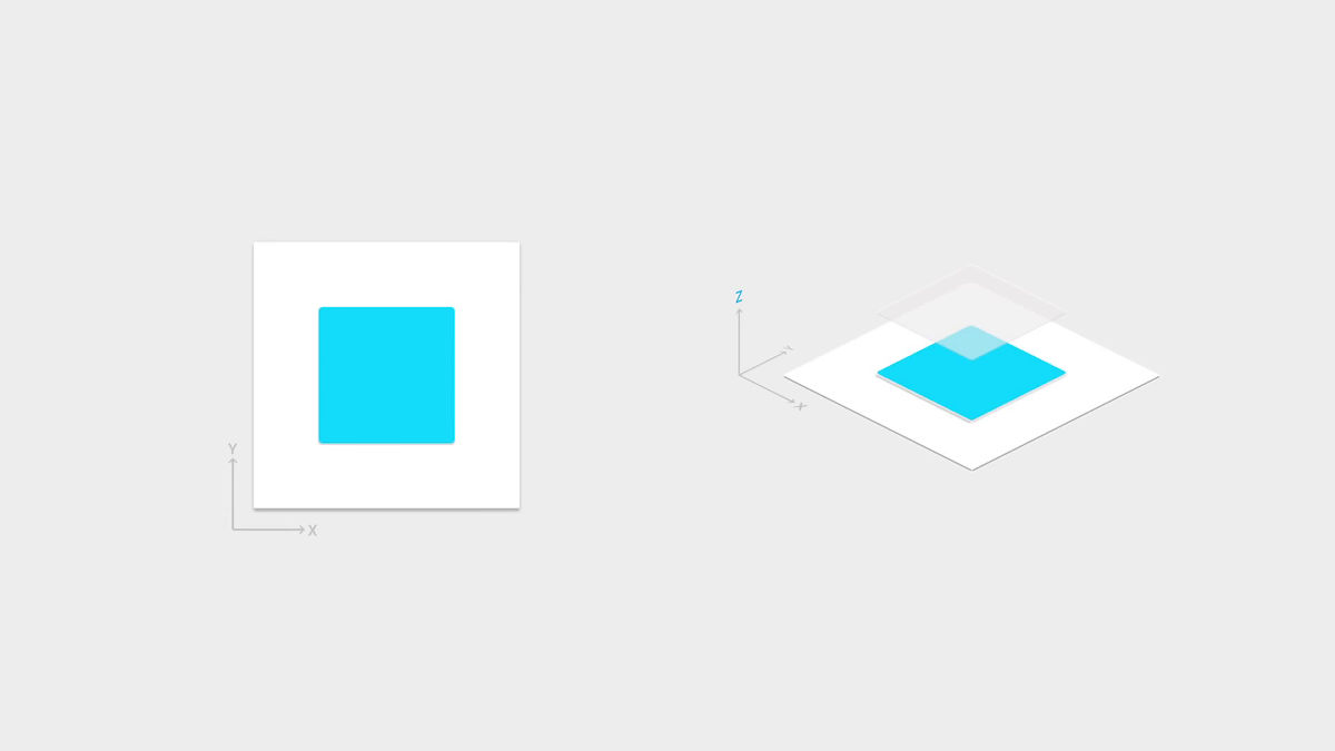
If you visualize the point that Mr. Fong talks as follows, you can see that it creates a structure that stacks several sheets of paper in the device.
Although it is a material design with a design concept such as ......, it is only inexperience for the design team that emphasized the "practical" part in design efforts so far, and at the beginning of the project many times Discussion was also held. The material design was said that the project was said by Google's design team for the first time that it was said that "I will try it anyway without worrying whether it is practical or not and see what happens as a result".
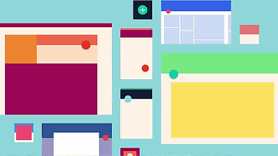
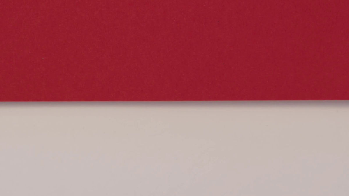
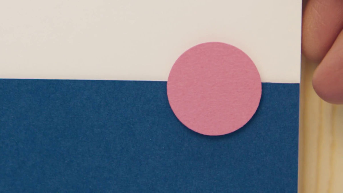
Just laying the paper on the software, there is no stereoscopic feeling when looking at the display, it looks like only a single piece of paper. The design team of Google adopts a traditional design as if paper exists as if shadowing the paper, but the design of the shadow was studied using the actual studio.
Besides not only making a model of the icon with paper, but applying light to check the condition of the shadow, even the change of the surface of the paper due to the condition of light is also subject to the design concept.
Just looking at the model of the paper, you will get the impression that material design jumped out of the device. By adopting the same shadow as the actual shadow in the software design, the user can see that the various layers of paper on which various information is displayed are located in which layer on the screen only the user sees the screen It is possible to understand. The concept of designing software in the same way as operating a device with the same feeling as books is clearly realized.
This is also a paper model, but it is a level to believe even if it is told that the device screen is close-up.
The circular action button that seems to float is what I want to pay attention even in material design.
Mr. Duarte said, "I made an important decision to stop working with multiple buttons in order to take some action, at first there was a confusion, but as a result it was a wonderful decision." I will.
Also, in order to shorten the distance between users and software, material design incorporates actions such as "buttons suck on your finger at the moment you touch." This allows the user to press a button on the software that does not exist in the same way as if the user were pressing a real button.
Material design typography and clear graphic design, into the systemRobustnessIt is said that it is playing a role to give. This realizes comfortable operability. Some meaning is put in every design.
The color system adopted for material design is to first select the main color, then select the color to be the next accent, the color pattern was decided to make the software simpler and easy to use. Thanks to this color system, even those who have never studied colors at colleges or vocational schools seem to be able to easily combine the colors used for software.
For material design developed as such, Mr. Fong explained that "Material design is like a tool for designers to evolve at the same speed as technology evolves."

"What I love in material design is that other users adopt the basic concept of material design and create new things," Wiley said. "It's great that material design is open to outside designers, not for Google's use for its products," Google's designers say,Material design is adopted in many applicationsIt may be a new form of software design.
People who want to know more details about the smart paper told in the Making Movie of Material Design can check it from the following movie.
Smart Paper - YouTube
In addition, the following movie is recommended for those who want to have a deep understanding of the structure of material design composed of smart paper.
Crafting material - YouTube
It is easy to understand how the developer introduces the color system adopted in material design to the UI by seeing the following movie.
Palette perfect - YouTube
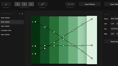
Google has released a color palette of material design, allowing developers to easily decide the color scheme of applications and software based on material design.
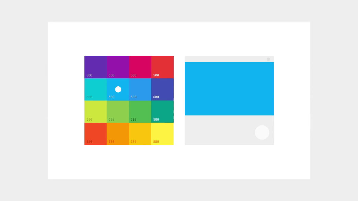
Firstly choose the main color consisting of 500 colors.
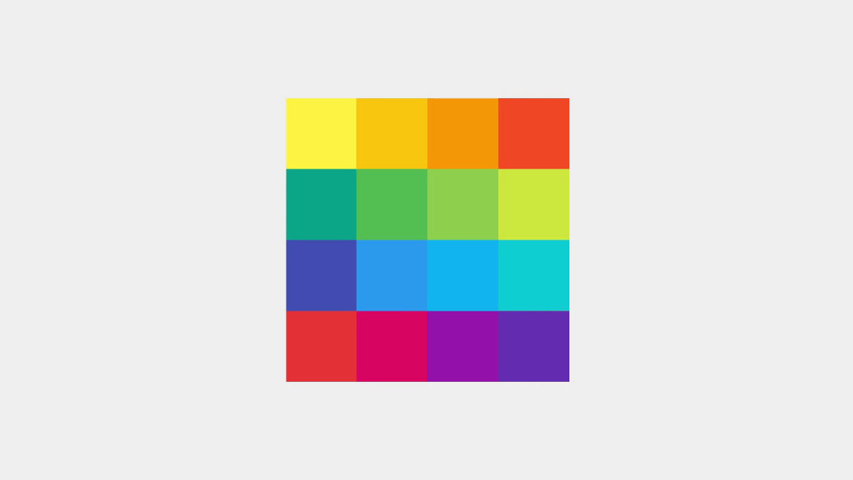
You can also select the brightness of the selected main color.

Decide where to place the main color.
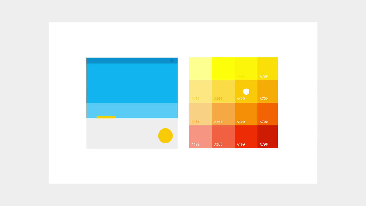
Next, choose a brighter accent color than the main color. Place the accent color on the action button.
If you use a color palette that decides the color scheme with a touch like that, you can easily color it without having to be a designer who specializes in color.
Google implemented "Material Design Showcase and Awards" to recognize excellence among applications using material design. You can check the movie that introduced the winning application stylish from the following.
2015 Google Design Showcase - Highlights & Award Winners - YouTube
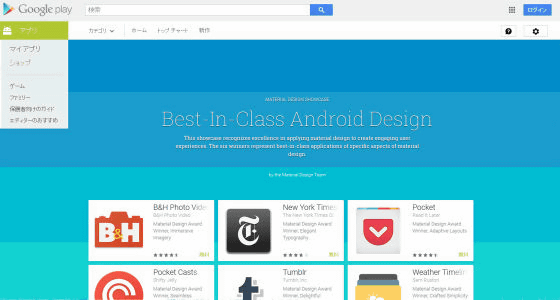
The special page of the application won in "Material Design Showcase and Awards" has also been opened and it is possible to download from the following page. By actually downloading and seeing high level designs, there may be something to be obtained.
Best-In-Class Android Design - Android application on Google Play
https://play.google.com/store/apps/collection/promotion_3001769_io_awards
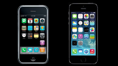
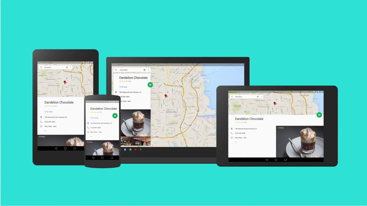
Knowing how the material design was completed may change the view of the smartphone casually using it. According to the editorial staff who is living a life full of material design, the material design is covered with material design, the material design is not only "appearance" but also "ease of use" design, Even if the OS, applications, and sites are unified by material design, it is excelled that they can be used on different devices such as smartphones, tablets and PCs without any discomfort.
Related Posts: