Why are oranges and blue frequently used in movies?
The trend of the movie industry since around 1990 is to use Orange and Blue frequently in the color scheme. Sometimes it is a trend of color usage sometimes criticized by film critic, but from what point did you start to use Orange and Blue for a long time, for detailsPriceonomicsIt is open to the public.
Why Every Movie Looks Sort of Orange and Blue
http://priceonomics.com/why-every-movie-looks-sort-of-orange-and-blue/
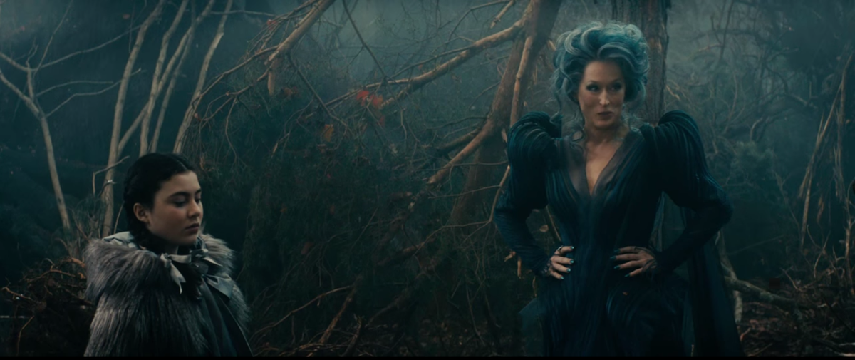
Published in Japan in March 2015 "Into the WoodsOne scene of. You can see that the whole is bluish though it is dim.
Published in 2013 "Wolf of Wall StreetBut the color scheme of blue is conspicuous.

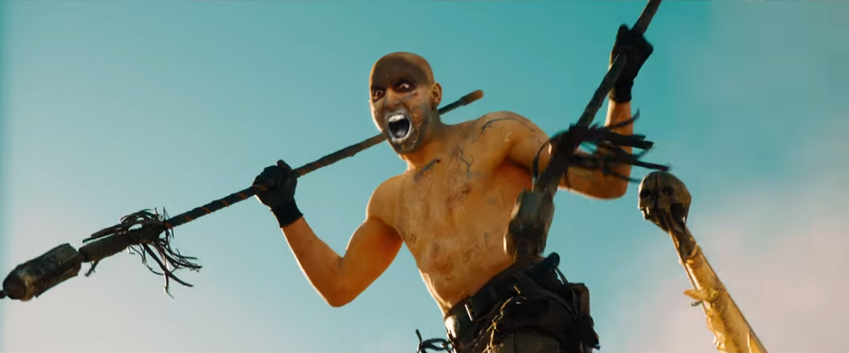
Scheduled to be released on 20th June 2015 "Mad Max"Is a bit yellowish, but you can not deny that blue and orange is used.
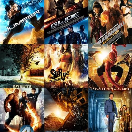
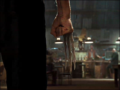
Priceonomics made the most orange and blue-intensive movies as "Transformers"series. Transformers are using blue and orange a lot through the series.
![]()
Looking at the movie poster, it is obvious that Blue and Orange are dare used. Explosive objects and light are oranges, and expressing sky and shadow in blue is like a recent trend.
Movie databaseThe NumbersAnalyzing the trailer of the movie published at the time, it is obvious that the color scheme of orange and blue are often used. I can see that I am overwhelmed with other colors especially with regard to oranges.

However, in 1939 published "Oz's WizardIf you look at one scene of "The color usage is completely different from recent movies. It is a very worrisome point why there is a difference in color usage between old movies and recent movies.

Actually, the shooting method is deeply involved in the reason why the difference in color usage in the movie was born. The mainstream filming method for filming until around 1990 is filming with silver salt film, but digital recording shooting digital video for shooting and saving it on magnetic tape or hard disk appeared in the 1990's. Published in 2002 "Star Wars Episode 2 / Attack of ClonesThe first full-length digital photography is done for the first time, in 2014Paramount stops movie distribution on film and shifts to full digital distributionFor example, as of 2015, most movies are taken with digital shooting.
What influenced by shifting from film to digital shooting is work of color grading which arranges colors and tones and creates a worldview of the work. With the shift to digital, it was easy to make it possible to apply "monochrome color scheme" to various scenes using software.
Among monochrome color schemes, it was Orange that was used more often. The most commonly appearing in one movie is a human being such as an actor or an actress, the color of the skin is the color most appearing in the movie. The skin has a lot of colors such as pale peachy and dark brown on the skin, and since these colors are included in the colors that make up oranges, it seems that orange has been chosen as a monochrome color scheme.

Orange and blue are located at diametrically opposed positions when seen in the hue circle, and two are "Complementary color"It is in a relationship. The color scheme by complementary color is the combination that gives the highest contrast, so using Orange and Blue in one scene means that you can express the paky contrast. In other words, color grading of actor or actress's skin color in orange type, and making the sky or light around it color blue makes it possible to achieve eye-catching vivid colors.
However Priceonomics said, "It is only one theory that digital photography has promoted the use of Orange and Blue, but it is true that Orange and Blue are heavily used," and the transition to digital It seems that it is not the only reason to spread the heavy use of oranges and blue.
The use of orange and blue is a trend of color grading born after 1990, so there is a possibility that new color usage will become popular in the future. When viewing a movie, looking not only at stories and casts, but also on color usage seems to be unexpectedly fun.
Related Posts:

in Movie, Posted by darkhorse_log