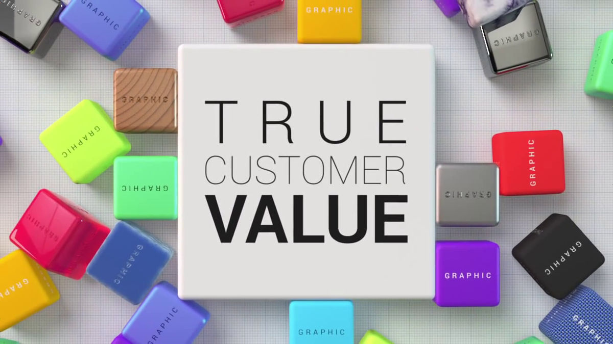
A movie that understands how well a flat design is created and how to actually use it for a GUI

We eliminated unnecessary decorations such as shadows and texturesFlat designWhen used on the webUsers will not know where to click on the pageAlthough it has the drawback, it is currently used in various places. Why flat design is excellent, how can you use flat design for content,LGWhen you look at the movie that is released, it has come to be understood very well.
LG G3: Graphic User Interface - YouTube
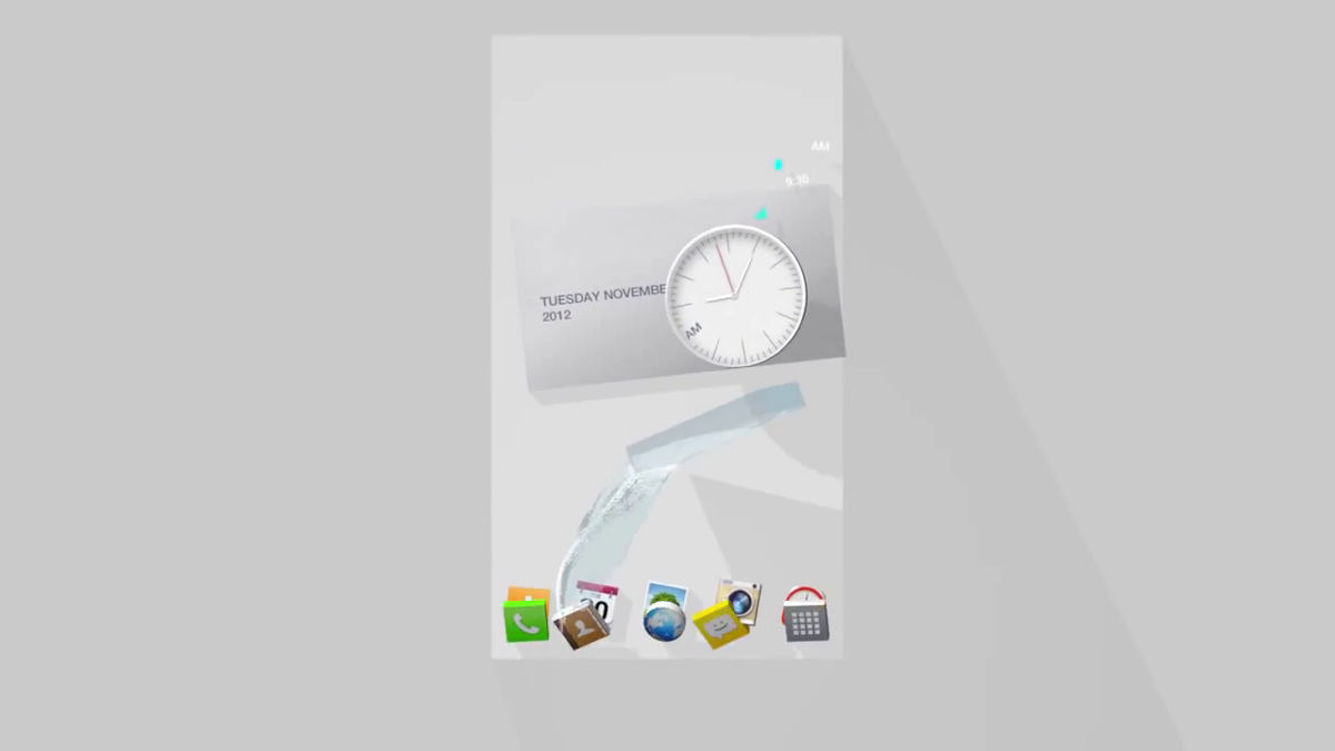
LG has used graphic icons rather somewhat using shiny, texture etc. when hit with lights.
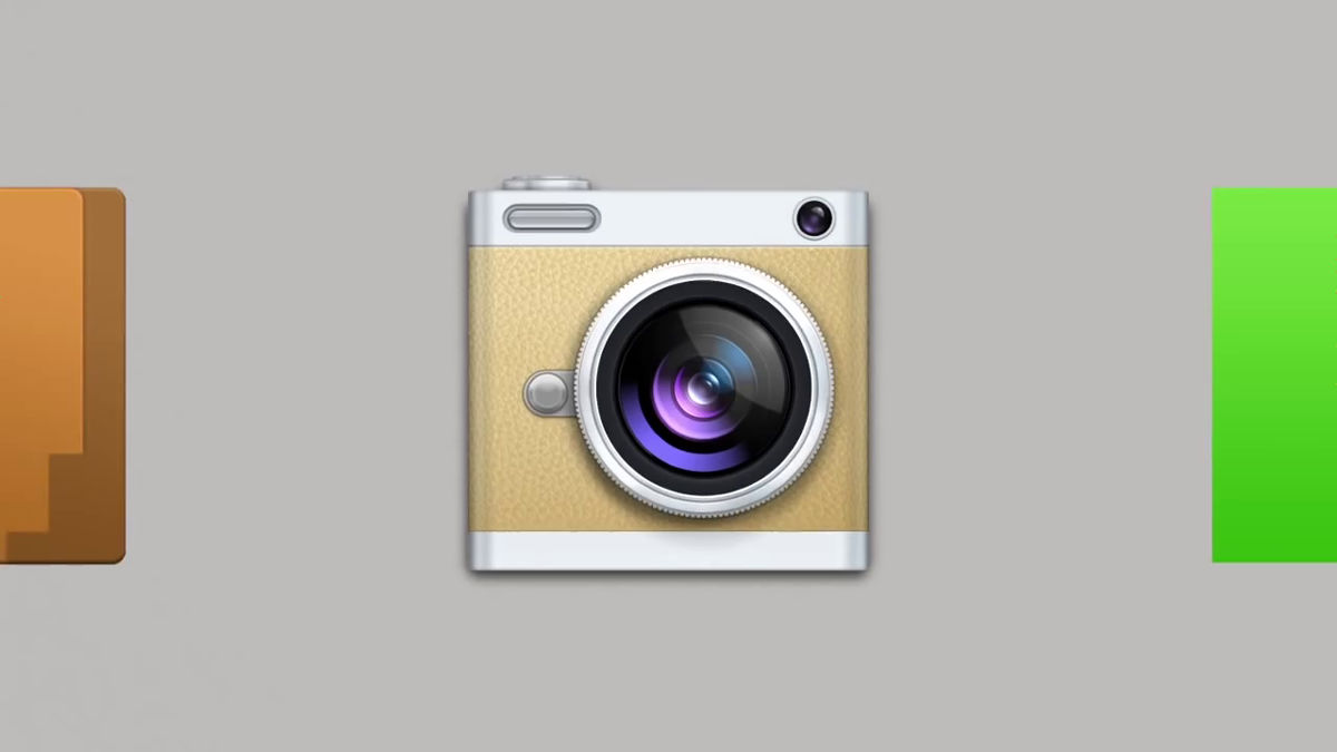
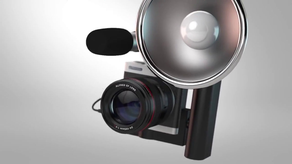
We added a variety of materials to make it easy for users to draw attention. But turn on the lens ......
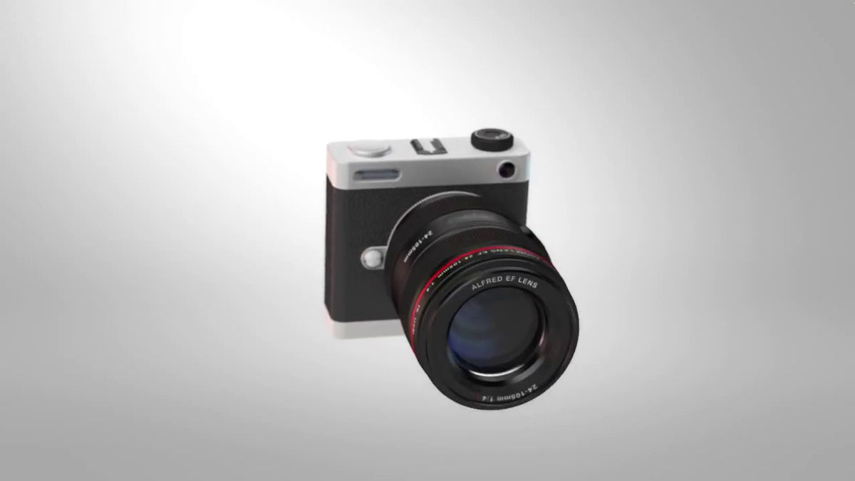
Even if I move closer to a full-fledged camera, I notice that the user experience does not improve in a true sense.
Gashan, and falling out of the broken camera came out a "dice" written as "UX".
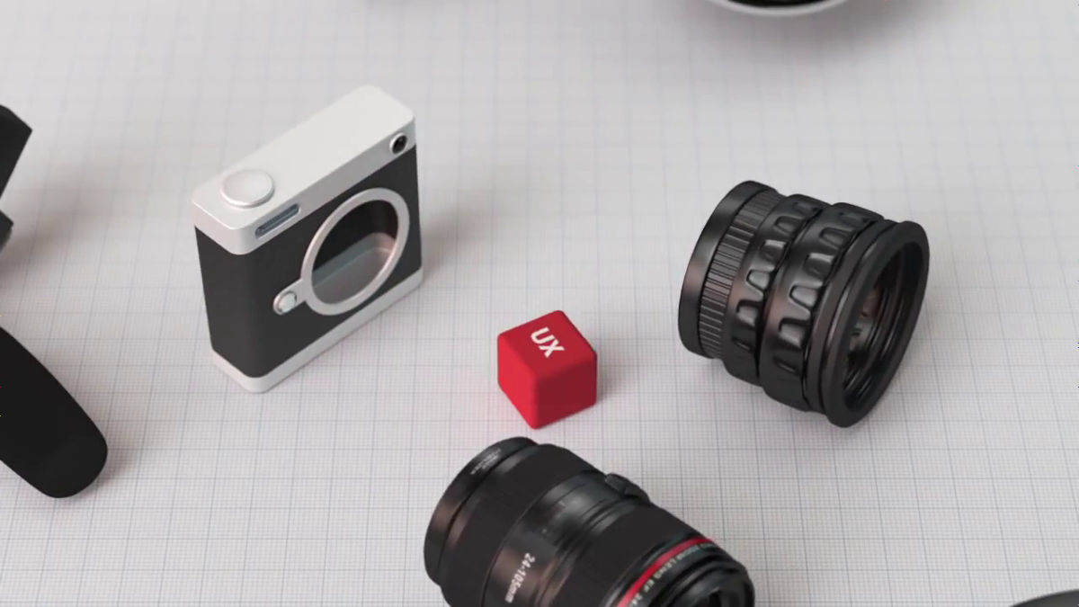
LG has focused on "what is really worthworthy for the user" here.
Take off extra things ......
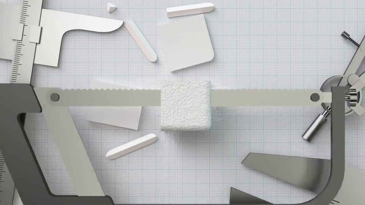
We made it possible for users to concentrate on 'content itself' instead of decoration.
Cleaning scraps scattered around others cleanly.
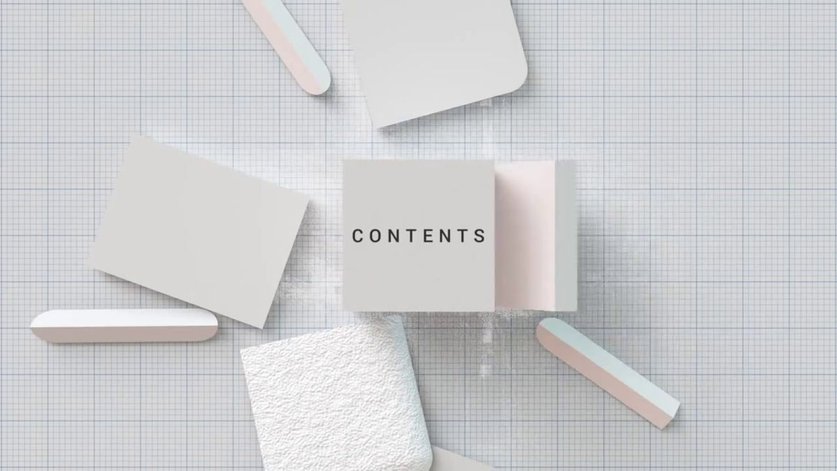
I reworked the design again.
A new design.
Do not forget beauty while being simple to color.
And by adding visual elements and dynamic animations to simple designs here and there, LG has established its own visual style.
Fused a beautiful interface and a better customer experience, LG philosophyGraphical user interface(GUI) was born.
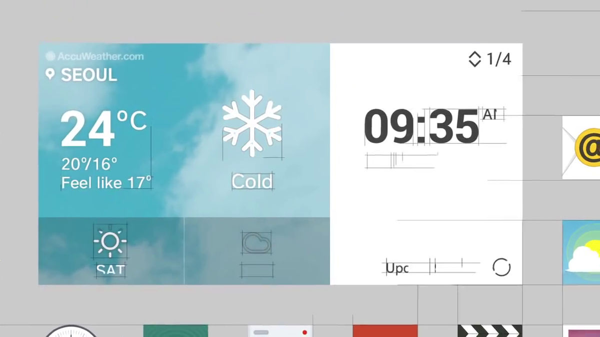
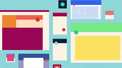
One of the features of the newly designed LG is a simple flat design graphic. First remove the shadows and embossing, and minimize the decoration.
Next, designing is performed focusing on necessary minimum functions "Minimal design"To focus users on the content.
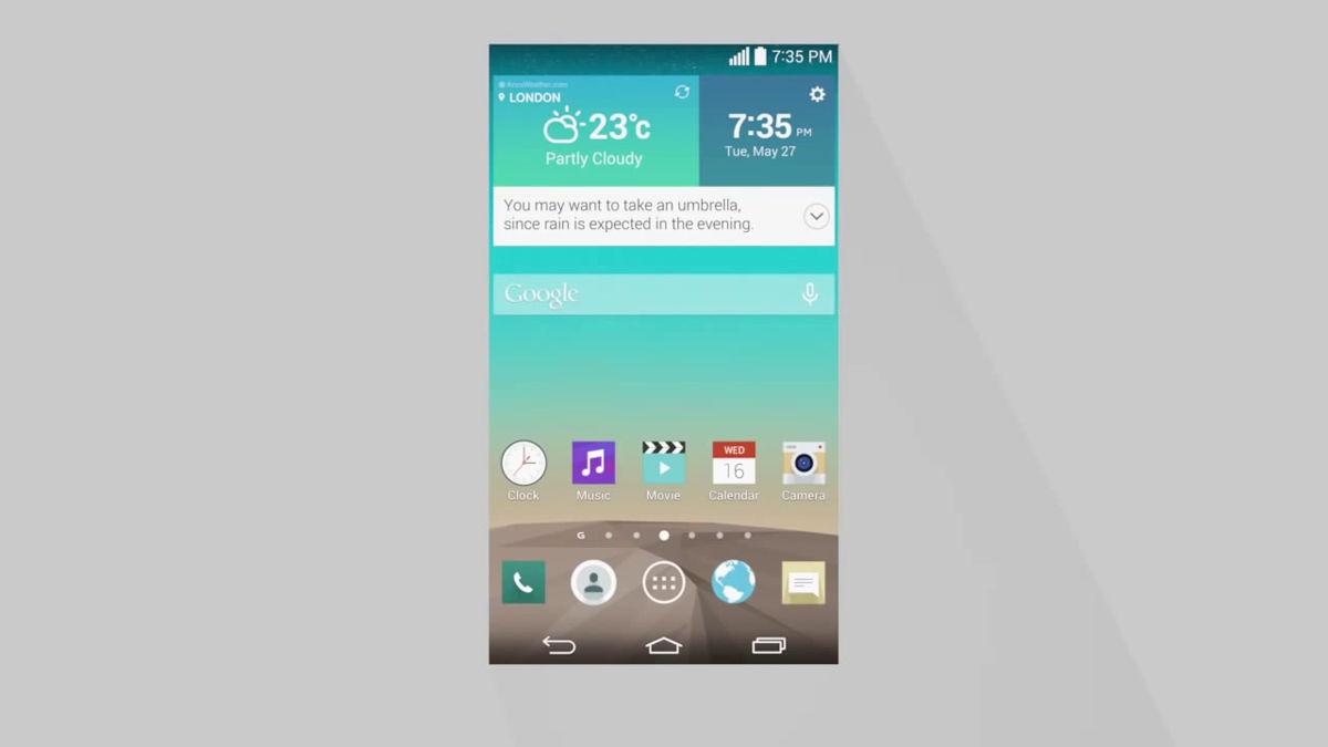
Use font with clear and light atmosphere.

Also, I used a circle for the graphic motif.

What is born from the yen ... ...

LG logo mark. The logo of LG born from the geometry of circle is said to be "perfect design".
Apparently, people feel most beautifulGolden ratioIt seems that it is also used. Even though it is a flat design, there is no decoration such as a shadow at all, and ingenuity has been made to show the icon effectively while keeping it to the minimum.
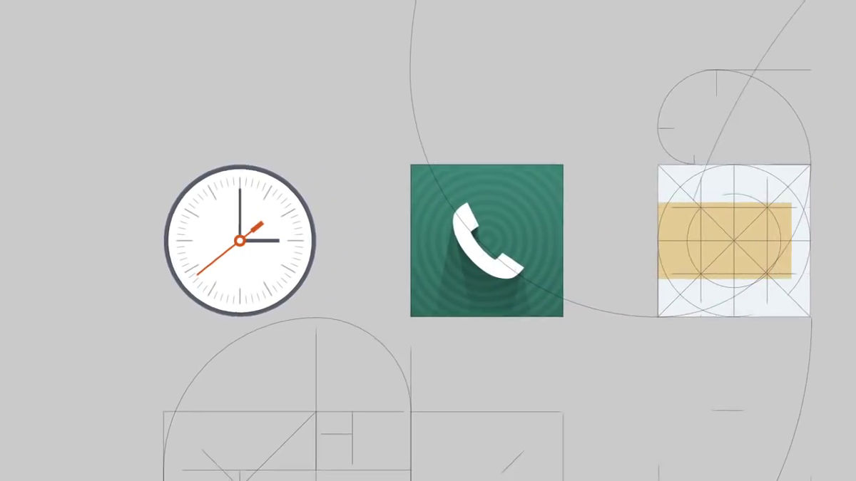
By using the principle of geometry, a design that makes people feel a comfortable feeling while giving a firm impression is made.

The position of letters and so on are all calculated, too.
It multiplied "yen" and "gracefulness" and created a GUI with rhythmical dynamics, which is different from the vertical and horizontal flat design which is likely to be in Android OS.
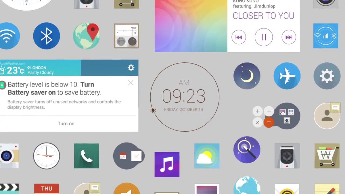
Also, we are also paying attention to color usage.
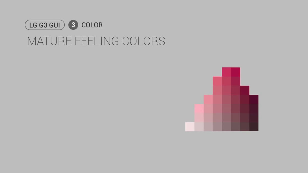
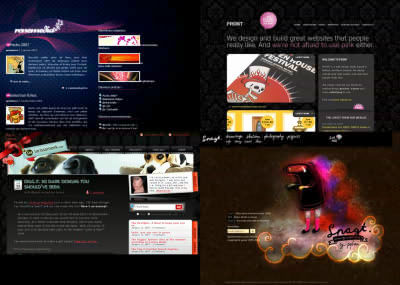
Boxes of bright hues are lined up on the left side, but LG avoided shades like these primaries.
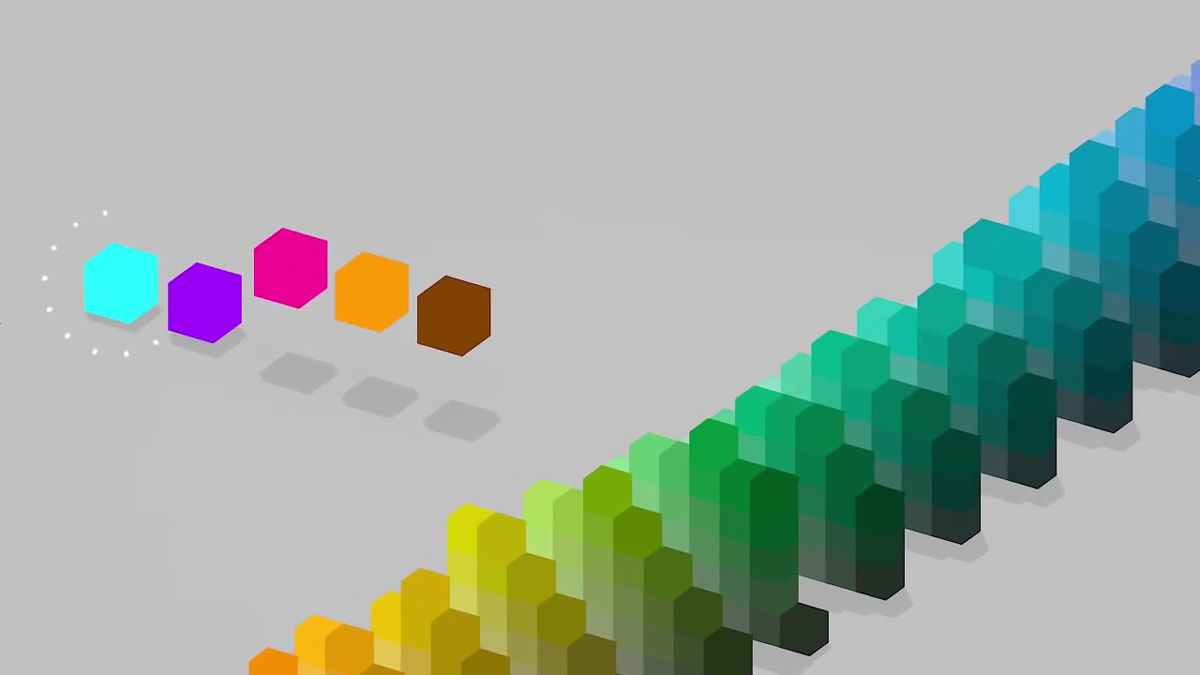
I chose the color code "# 268a91"Or"# 856e 55"It looks like a little dull.

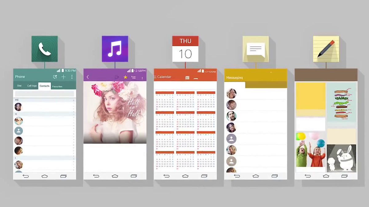
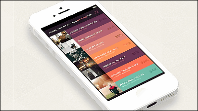
Users can unconsciously recognize "what application they are using" by creating icons from the base color of each application and designing the application itself along the base color. By deciding the theme of color you will be able to understand before reading the letters.
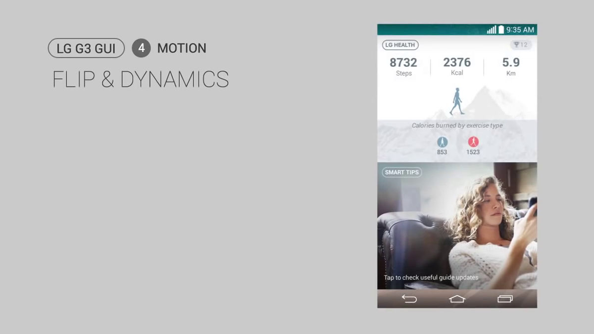
Finally "Flip and Dynamics". Flip is the action of repelling with fingers, and dynamics is "movement" of the interface.
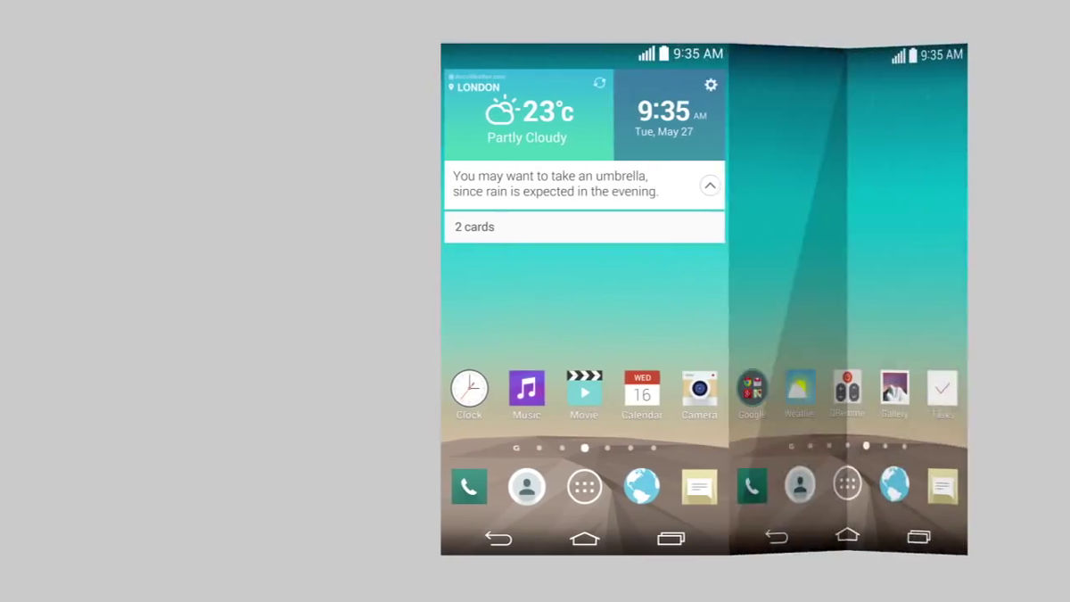
What LG adopts is basically a simple 2D graphics, but there is one contrivance there. As you move the screen with your fingers, a part or the whole shows a movement as if you opened the folded paper, plus the familiarity as if you were turning a paper book. This is not necessarily a "completely flat design", but it seems that it is kept with the minimum necessary decoration.
Flat design says to minimize the functionMinimalist approachAlthough it is taken, the minimalist approach is not beginning now, but it is often seen in Apple, the Google logo, or past works of art. Examples of minimal designs can be seen from the following articles.
The Entrenchment of Modern Minimalism - Eli Schiff
http://www.elischiff.com/blog/2015/2/18/the-entrenchment-of-modern-minimalism
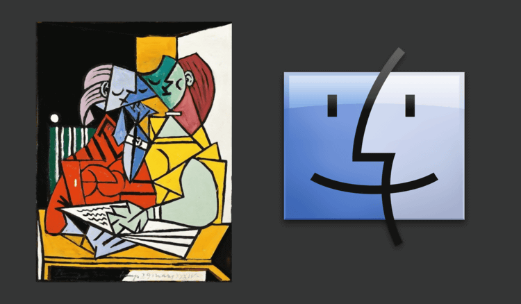
Pablo Picasso was doing a minimalist approach in the field of art. In the image below, as the copied cattle goes to the right more and more extra things are removed and symbolized.
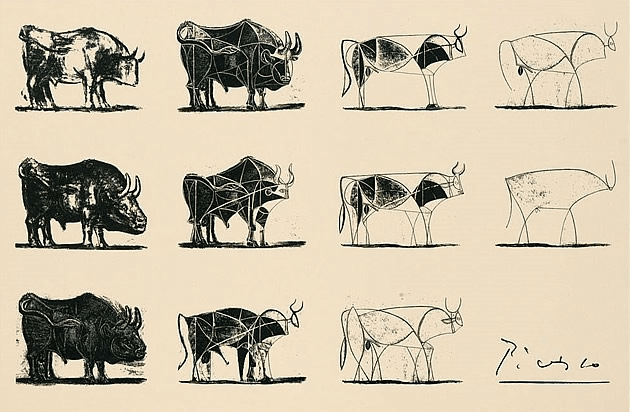
"Two Characters" drawn by Picasso in 1934 on the left side, Finder icon of Mac on the right side. Picasso for AppleThink DifferentIt has also been featured in the campaign and you can see that Apple is inspired.Apple mouse designIt is clear that we are doing the same minimalist approach as Picasso, even if we look at the transition of.
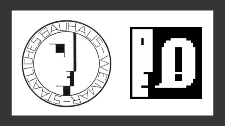
Furthermore, sculptorsOscar SchlemmerThe emblem is an early Apple designerSusan CareIt affected the Notification icon on Mac designed.
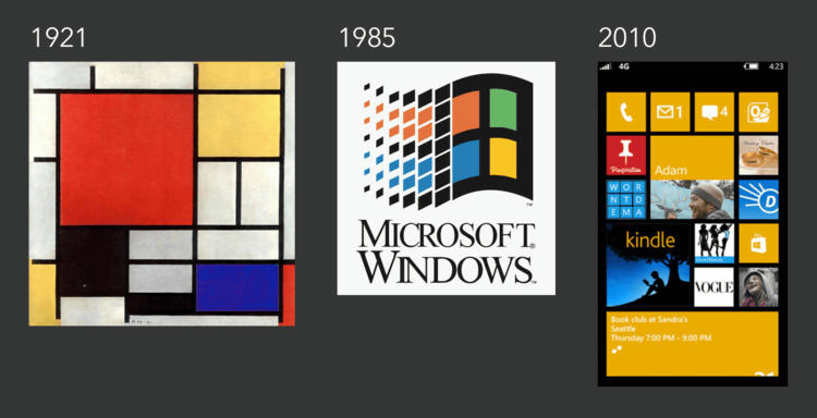
On the other hand, WindowsPiet MondrianIt is a pattern that I am inspired by the paintings of.
Related Posts:
in Design, Posted by darkhorse_log