How do fonts affect human emotions?
ByArnoKath
According to the latest research, fonts have been found to have elements that stimulate human emotions separately, independently of the meaning of words.
The Science Of Comic Sans | Co. Design | business + design
http://www.fastcodesign.com/3031622/evidence/the-science-of-comic-sans

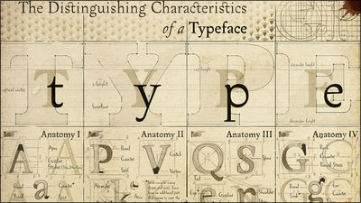
As words similar to "font" there are words "typeface" and "typeface", but they can be defined as follows.
Letter form:The part that makes the basic form of letters, the form of letters.
Typeface:About gathered letters such as "alphabet" and "hiragana", it is a letter shape that coherent features and unique designs. In terms of kanji, commonly used "Scripts"Used in Hanko and calligraphy and engravings"BookThere are such as "Mincho body" and "Gothic body" used in computers are font for printing.
font:It is the same type of font of the same design, for example Windows is standard "MS Mincho" "MS Gothic" etc. are loaded. Those with adjusted thickness and inter-character are treated as different fonts.
"We are conducting research to understand what type of font it reads when it reads emotional responses," says the University of South Alabama, who studied communication Mr. Nicole Amare. She said that, "What kind of features strongly link with feelings", such as the meaning of words that appear as typefaces and letters, is gradually becoming understood.
Ancient Greeks and Romans as 'symbols of empire'SerifWe have adopted a typeface with. In the same way, in GermanyFractutureAnd FranceGaramon,ItalianBodoniAs you can see, each country tends to prefer its own typeface.

ByRalf_H.
In the earliest study on fonts in 1923,Cheltenham BoldYaCentury BoldSimple fonts such as "It is economical" or "Powerful" are imaged so that it fits perfectly for products like coffee and cars,Caslon Old Style ItalicAnd Typo Slope's fancy fonts make images "luxury" and "luxury" so they match well with jewelry and perfumes, so that the font has relevance to human emotional parts It is known.
In addition, serif bodies are san serif bodiesscriptIt is a typeface that can concentrate and settle down more, it also knows that rounded fonts give happiness, sharp fonts cause anger. Although other fonts that are arranged at irregular intervals arouse people's attention, they also stimulate aggression, and if they are arranged at equal intervals, they will make expertise imaginable, but they also make you feel boring Thing. And finally it is also clear that most fonts can be categorized into three groups of "elegance" "friendly" "direct".

ByNick Sherman
In 2004, 63 students were asked to evaluate 15 kinds of common typefacesthe studyWas done. This research result is one of the most detailed research on record.
According to the research, the typeface developed by the Times in the UK in 1932Times New RomanI understood that it is the typeface that feels the most "expertise" and "stiffness".
Courier NewShe can not feel the most familiar typeface.

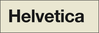
HelveticaThe font with the least artistic and dramatic elements.
Of the fifteen kinds of fonts verified in the research, the script that makes you feel the most "elegance" is a script.

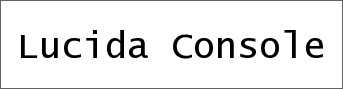
further,Lucida ConsoleWas judged to be the typeface that felt the most future from irregular intervals between letters.
Comic SansAlthough it may be natural, it was evaluated as the typeface that does not feel the most "stiffness".

In addition, it seems that human beings are born with a typeface font, it seems like whether the typeface matches the situations, so if the letters "heavy" are thin and written in fonts that make the image "light" immediate You seem to be able to notice.
Published in 2004 "Font appropriateness and brand choice"Is one of the spectacular typefaces for the subjectSignet Roundhand, Or an aggressive typefaceSalemI showed two boxes of chocolate written as "Temptation" or "Indulgence" and I studied which one I would like to purchase. Experimental results show that 30 to 40 subjects chose a box written in Signet Roundhand, whether this font matches the product properly is a factor of choosing consumer products It means that it is.
In addition, a psychologist at New York University conducted an experiment that allowed 102 subjects to read and evaluate two articles written by Mr. William Safire. According to this, those who read articles written in Times New Roman,ArialIt seems that the article was a little strange and he realized that the authors were angry than those who read the same article written in. This means that the Times New Roman typeface emphasizes the individuality and assertiveness of the article more.

ByGuwashi 999
However, there is no perfect font that matches each situation,GeorgiaThere are also some typefaces that can be used for a wide range of uses. Also, if you use an appropriate font you can show elegant products more gracefully, but using a wrong typeface does not mean that it will lead to lowering the image. Furthermore, it is not a typeface but "what is written" is also an important element.
Mr. Amare discovered that most fonts strongly stimulate one emotion in his own research, but only Comic Sans stimulated various emotional spectra ranging from "shaking" to "calm" I said.
Related Posts:

in Design, Posted by logu_ii