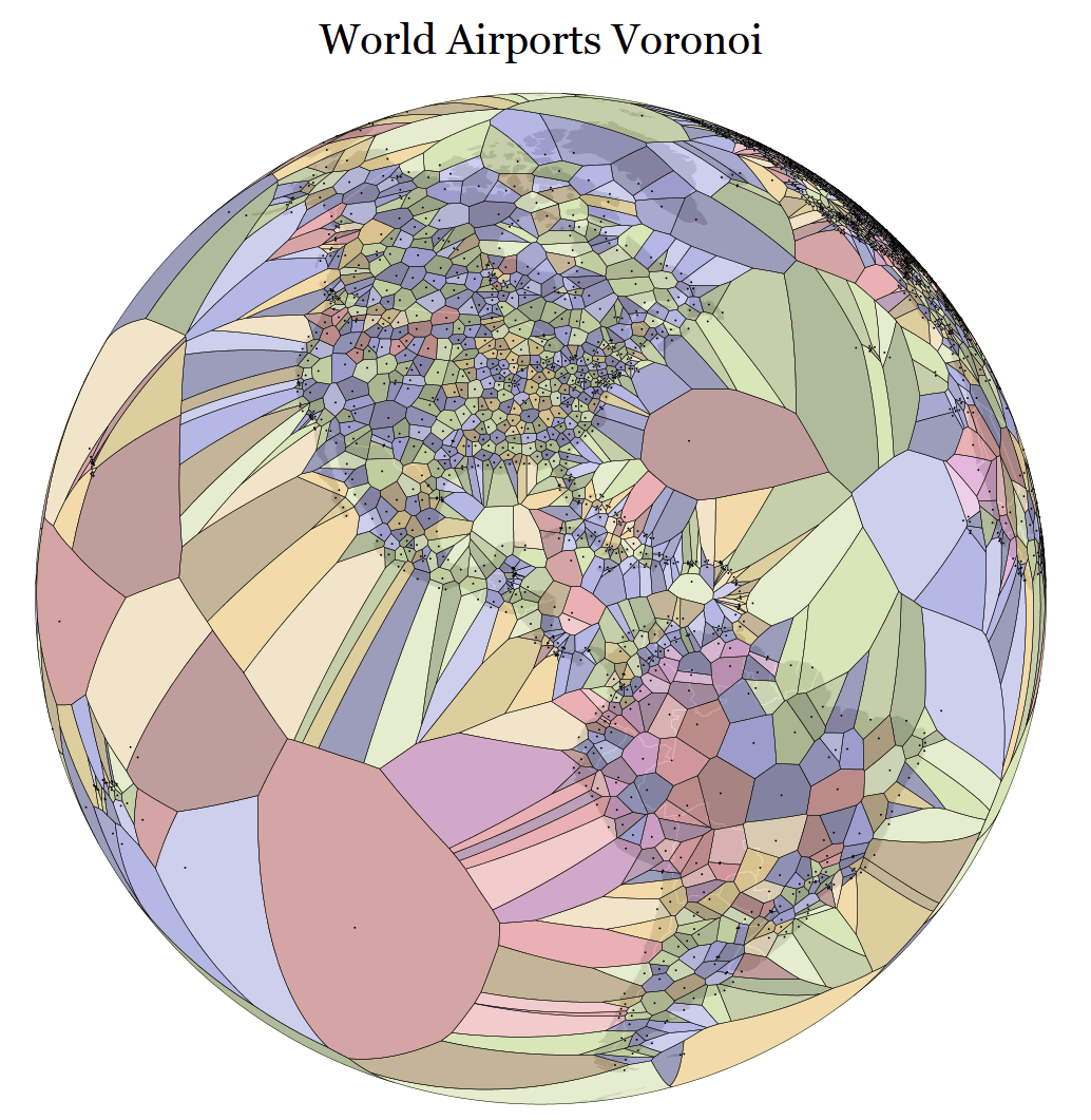
"World Airports Voronoi" expressing the location of airports all over the world in "Voronoi diagram"
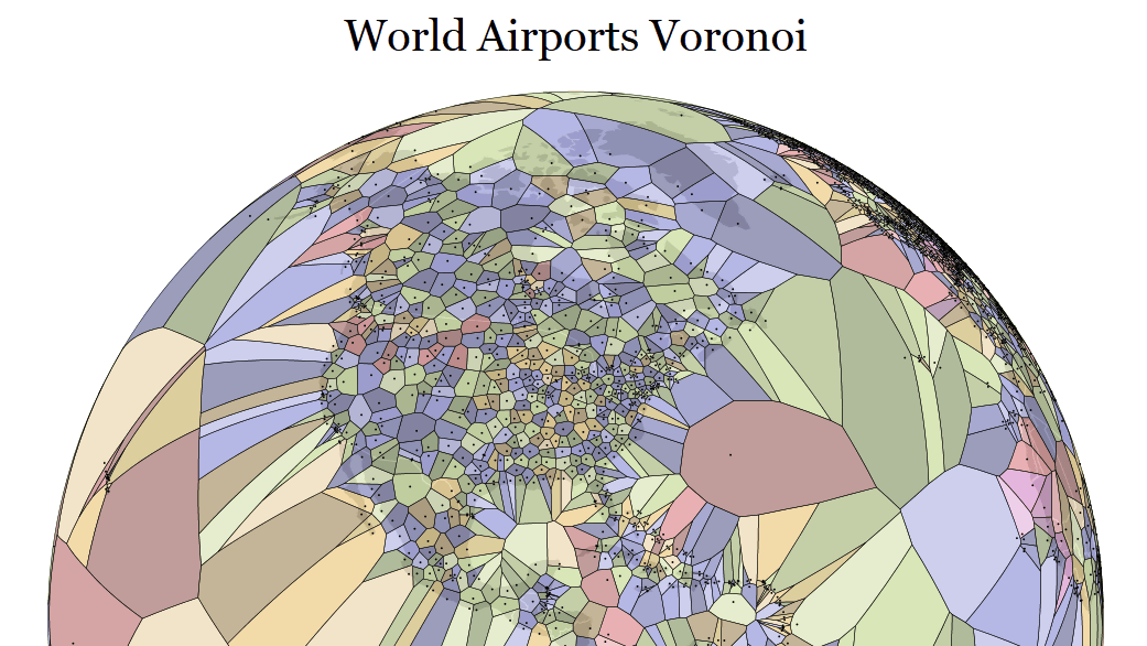
Even with a familiar world map, if you change the viewpoint and the way of partitioning you see than usual you may see a completely different shape. I divided the area of the airport around the world according to which other airport it is close to, and showed it over the usual mapWorld Airports Voronoi"is.
World Airports Voronoi
https://www.jasondavies.com/maps/voronoi/airports/
(* It may take time to render the page of the link destination.PC environment recommendation)
"Voronoi diagram" means "When there are a plurality of randomly aligned points, a line passing through a position of the same distance from each point (vertical bisector) is drawn, and a region for each point is shown Fig. ". It is hard to understand if written in letters, but it is used when dividing the area so that the distance to the school district in the elementary school does not become extremely long by calculating the distance from the neighboring school.
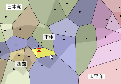
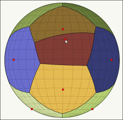
Taking a part of "World Airports Voronoi" as an example, the yellow part is the region of Kansai International Airport, and the black dot in the yellow region shows the location of the airport. Located just above is Kobe Airport, on the upper right is Itami Airport (Osaka International Airport), the one on the left is the Tokushima Awaodori Airport, and the lower one is the Nanki Shirahama Airport. The line which divides the area of Kansai International Airport and Nanki Shirahama Airport is hitting the area of Chubu International Airport (Centrair) on the east side. In the case where the distance from the airport indicating the area to the line indicating the area is far away, it means that another airport in that direction is far away, so that the area is wide and the size of the airport and the number of employees are particularly related There is none.
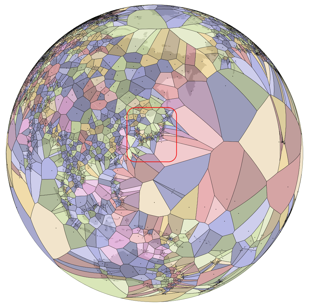
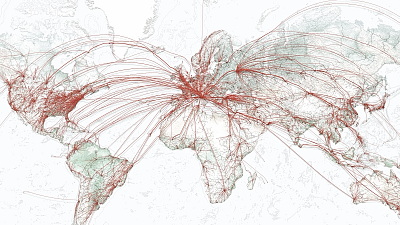
A map showing the location of airports all over the world and expressed in the Voronoi map is here. You can see the figure of the Americas drawn in gray in the earth drawn in a circle.
Here is a diagram of the expanded North American continent. Each small point shown in the figure shows a medium to large airport. Pacific Ocean on the left side of the figure and the Atlantic Ocean on the right side, it floats in the Caribbean from the middle of the North American Continent to the EasternWest IndiesYou can see how many airports are concentrating along.
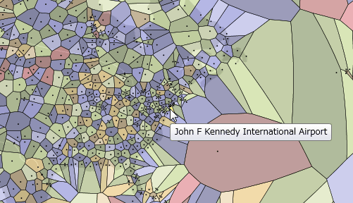
When pointing the mouse cursor to each block which is delimited, the airport name of the block was displayed.
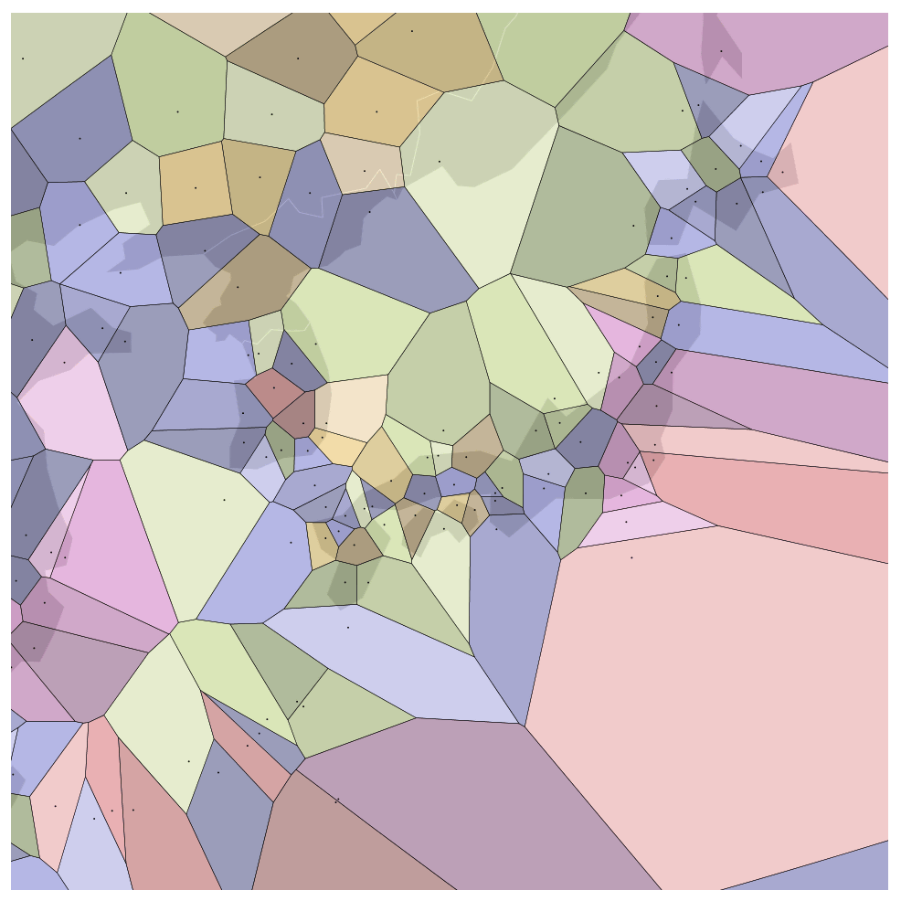
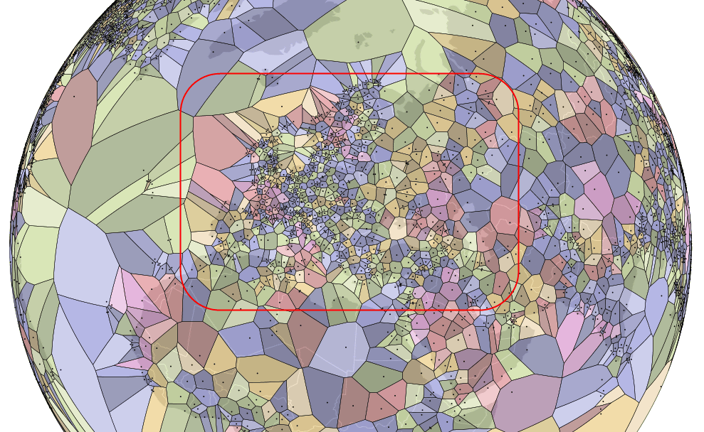
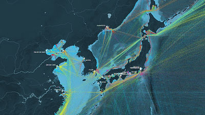
This Voronoi diagram can also be rotated by dragging with a mouse like Google Earth. I tried to display the East Asia region centering on Japan. In the center is the Japanese archipelago, on the right side a large Pacific Ocean is spreading, and to the left is the area to Southeast Asia, Asia Continent, India and the Middle East.
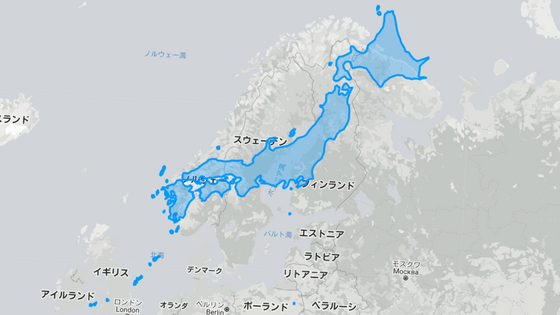
Now try zooming up using the mouse wheel. When I display the Japanese archipelago from the north to the south, it looks like this. A part of the Korean Peninsula and China is displayed on the upper left of the map.
Airport in the easternmost extremity of Japan,Naka-Tsu AirportFrom
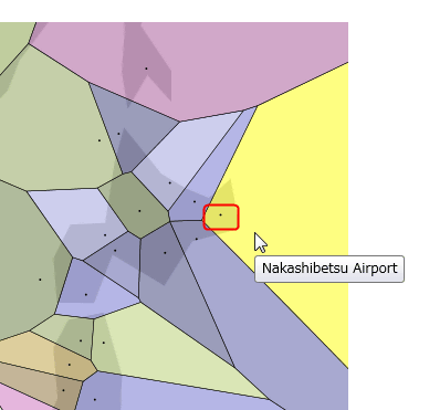
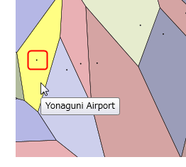
On the other side, the airport is located at the westernmost extremity of JapanYonaguni airportUp to is displayed.
It is like this when centering on the Europe region. You can see that there are so many airports.
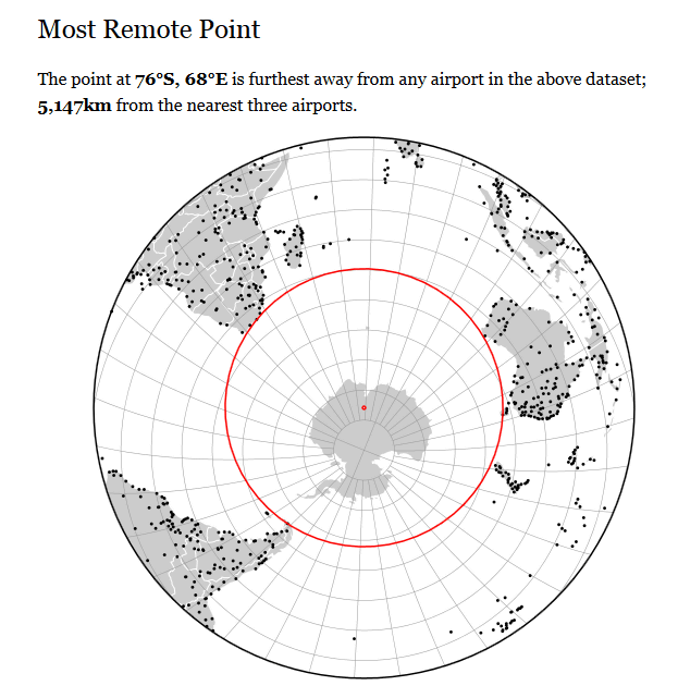
The "spot where the distance to the airport is the longest on Earth" that was flicked out from this figure was the point of 76 degrees south latitude and east longitude 68 degrees located on the Antarctic Continent, and the distance to the nearest airport was 5147 kilometers It was. (Excluding small airports)
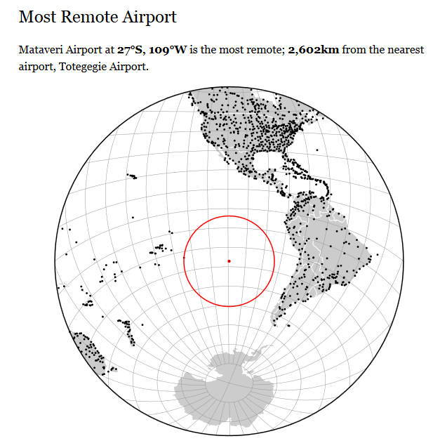
In addition, 'Airport which is far away from the airport of the nearest suburbs' is located at 27 degrees south latitude and 109 degrees west longitude, offshore of Chile of South AmericaMataberg International Airportwas. This airport is famous for Moai statue "Isle of Oshima"Easter IslandIt is an international airport built on.
This pageIt is also possible to interactively move Voronoi diagrams. It is easier to understand the concept of Voronoi diagram.
This map was created by free programmer Jason Davis. Make numeric data "visualize" by using methods such as JavaScriptData VisualizationWe are consulting, and within Davis' s page it is possible to touch many other interactive works.
Jason Davies - Freelance Programmer
http://www.jasondavies.com/
Related Posts:
in Web Service, Design, Posted by darkhorse_log