Seven deadly crimes committed by sites that should have been optimized for smartphones

ByNukamari
Some sites that can be browsed on a PC have created sites for smartphones separately. Many smartphone sites that were supposed to be built to improve the user experience seem to have many inconvenient elements, Umer Mansoor says "Seven deadly crimes committed by sites that should have been optimized for smartphonesAs a result, we have released bad examples of smart phone sites.
7 Deadly Sins of Mobile Websites | 10K-LOC
http://10kloc.wordpress.com/2013/12/26/7-deadly-sins-of-mobile-websites/
◆ 01: Loading time is too long

Load time is one of the important factors for making a site successful. If you include many high-quality images and Javascript on your site, the loading time will become extremely long and frustrating the user.
◆ 02: characters that are displayed too many

For sites displaying many characters, information that is hard to read and important is not communicated to the user. It is said that it is better for the site to make fewer letters and to pick up information securely so that the talker can put together the necessary information well and concisely summarize the story.
◆ 03: Navigation menu that can not be used

The main menu button is hidden · The button is too small · The buttons are too close together so it is difficult to tap, etc. There is no choice but to list the unusable navigation menu. Mansoor has tapped the button under the intended button no matter how many times it is tapped, and that he wants the site to be designed considering the person who has a big finger.
◆ 04: Content and design completely different from PC site

Although it was easy to see when browsing on a PC, the design and contents of the site changed significantly when looking at the smartphone, and there are things that even doubt whether it is the same site or not.
◆ 05: Popup

Pop-ups may be displayed to urge downloading of applications specific to the site you are accessing. According to Mansoor, the smartphone site may be hard to use, but it is better than the application dedicated to the site. Instead of improving the user experience, pop-ups are one of the reasons for declining.
◆ 06: Automatic redirect which is not functional at all

When browsing the site for PC with smartphone, it may be redirected automatically to the site for smartphone. In the automatic redirect, whichever page of the PC version is opened, the redirect destination is set as the top page of the site for smartphones, it seems that there is a case that it can not arrive at the content which you want to see at all. About Google Automatic RedirectDedicated pageWe are preparing, and urge attention to the site owner.
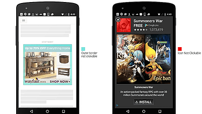
◆ 07: too many banners and advertisements

When browsing the site with a small display of the smart phone, if there are too many banners and advertisements, it becomes difficult to see the contents of the important.
"Seven dead sins committed by a site that should have been optimized for smartphones" were content that I once felt as if I was browsing a site for smartphones, and it nodded contents in unexpected ways It was.
Related Posts:


in Note, Web Service, Posted by darkhorse_log