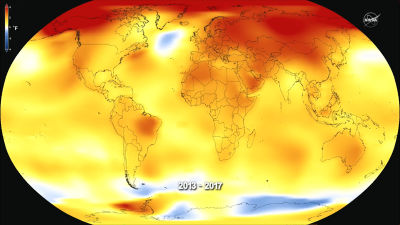
"Global Land Temperatures" that visualizes how the Earth's surface temperature changed from 1900
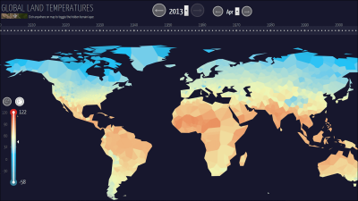
The global warming phenomenon in which the average temperature of the ground surface and the ocean rises over time may be taken up as an environmental problem, but actually how much the temperature of the surface of the earth or ocean is rising, even if indicated only by the numerical value There are things that do not come with much pins. So, as you can see by just looking at eyes it is the color that represents the change in the surface temperature from 1900 "Global Land Temperatures"is.
Global Land Temperatures | Halftone | Data Visualization Consulting and Design
http://halftone.co/projects/temperatures/
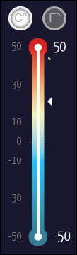
In Global Land Temperatures, the low temperature is blue and the high temperature is red so that it can be easily understood by eye.
Firstly from the surface temperature chart of January 1900. Most parts of the Northern Hemisphere are blue.

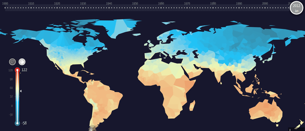
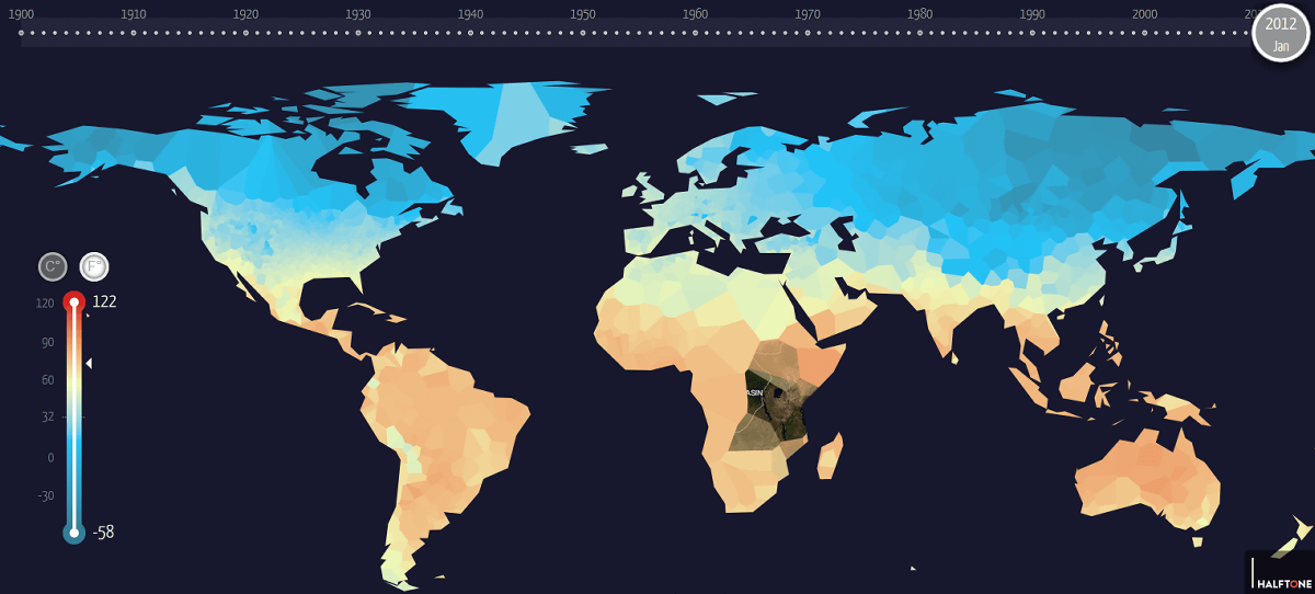
On the other hand, January 2012 looks like this, the surface temperature of the southern hemisphere is almost unchanged compared to January 1900, but in the northern hemisphere the dark blue part is decreasing and the surface temperature rises slightly It seems like.
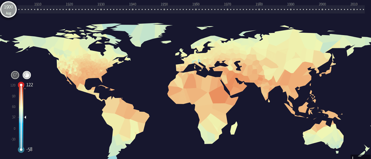
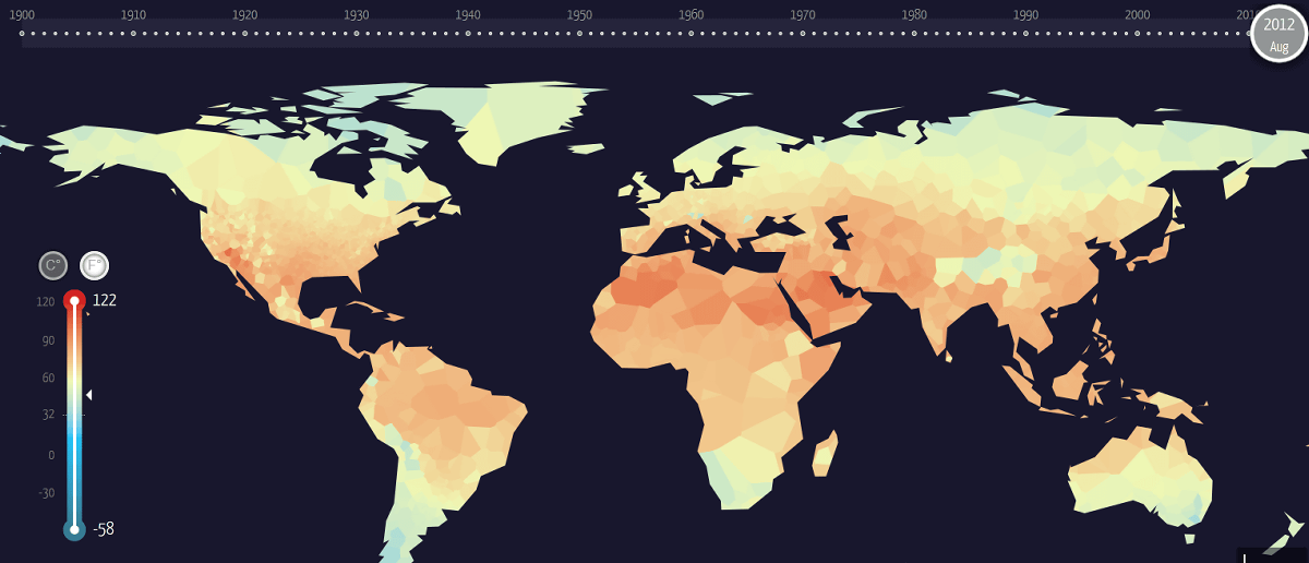
The upper temperature is 1900 and the lower is the surface temperature chart of August, respectively. In comparison, we can not see a big change, but in the place near the North Pole, such as the Greenland of the Northern Hemisphere, a slight rise in temperature was seen.
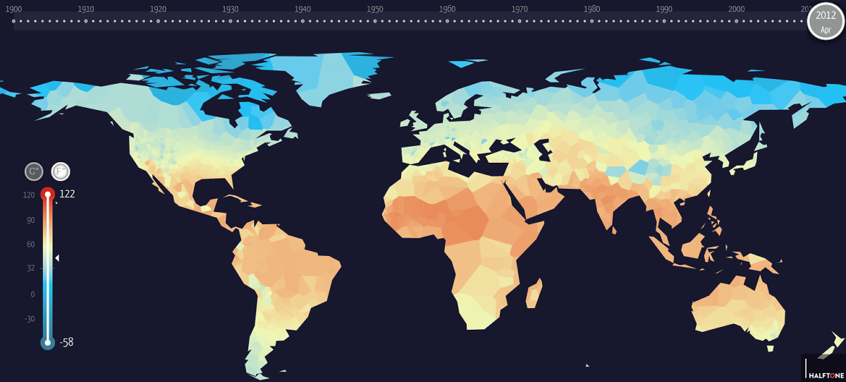
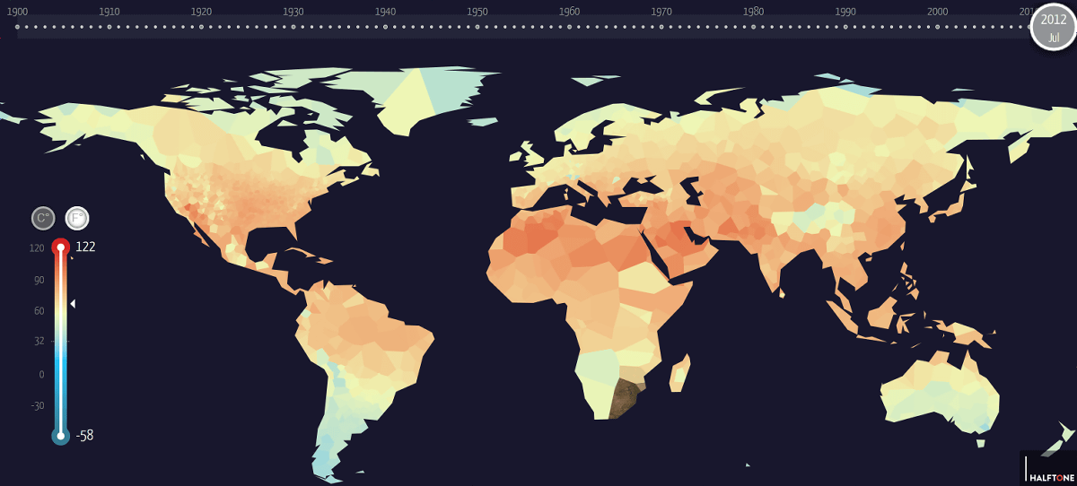
The January, April and July of 2012 are as follows and you can understand the change of the surface temperature per season well. "Global Land Temperatures" seems to be useful for familiarizing with global warming, but you can enjoy just watching the change in the surface temperature of various ages.
Related Posts:


in Web Service, Science, Posted by darkhorse_log