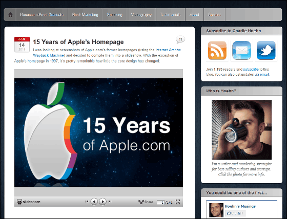
Slide "15 Years of Apple's Homepage" which summarizes the changes of Apple.com design using 140 images for 15 years

Over 15 years from 1997 when Steve Jobs returned to Apple to January 2013Apple.comA screenshot of about 140 slides has been released.
15 Years of Apple's Homepage | Charlie Hoehn's Musings
http://charliehoehn.com/2013/01/14/15-years-of-apple-dot-com-homepage/
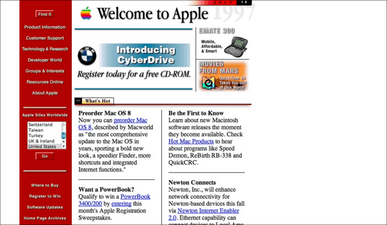
First of all, the top page design of 1997. Letters are written carefully and the margin is small. Not a single picture is used.
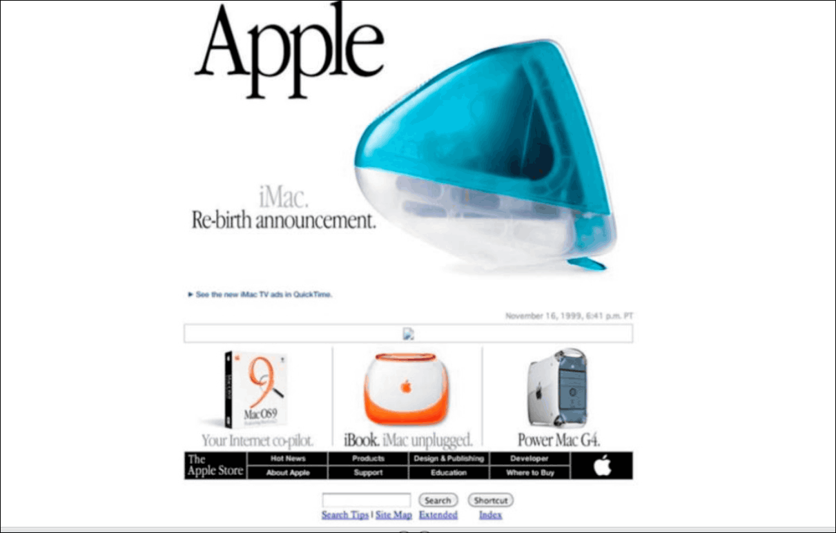
In 1998, pictures of candy-colored iMac, which is an eye-catcher, are displayed at the top in large size. Under it there is a noteworthy item iBook etc. Also under it there are buttons such as About and Apple along with the Apple mark.
The buttons under the photo are now displayed at the top, and the monochrome Apple mark changed to red.
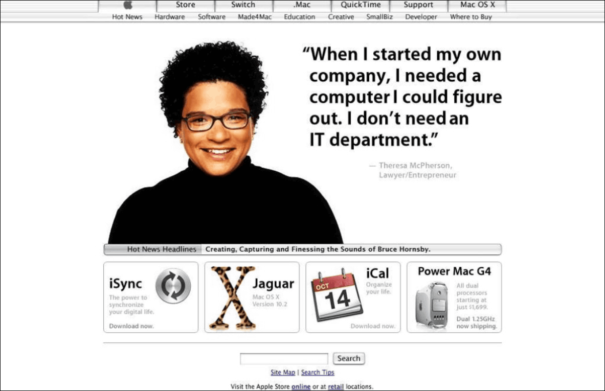
A design that makes it possible to purchase products displayed on the top page by clicking.
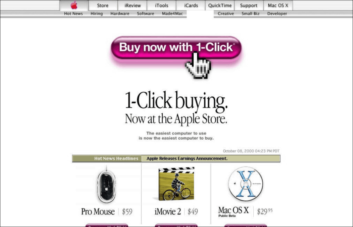
At the same time as the number of pictures arranged under the top image became 4, we also achieved unification of the overall color.
The Apple mark changes to blue. Also, the design of the button got a little thinner.
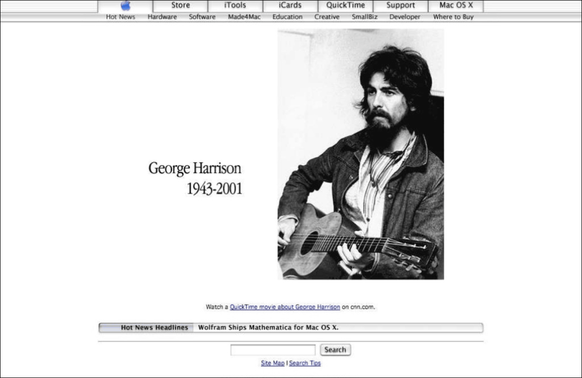
When the Beatles' George Harrison dies, the picture on the top page is one of him.
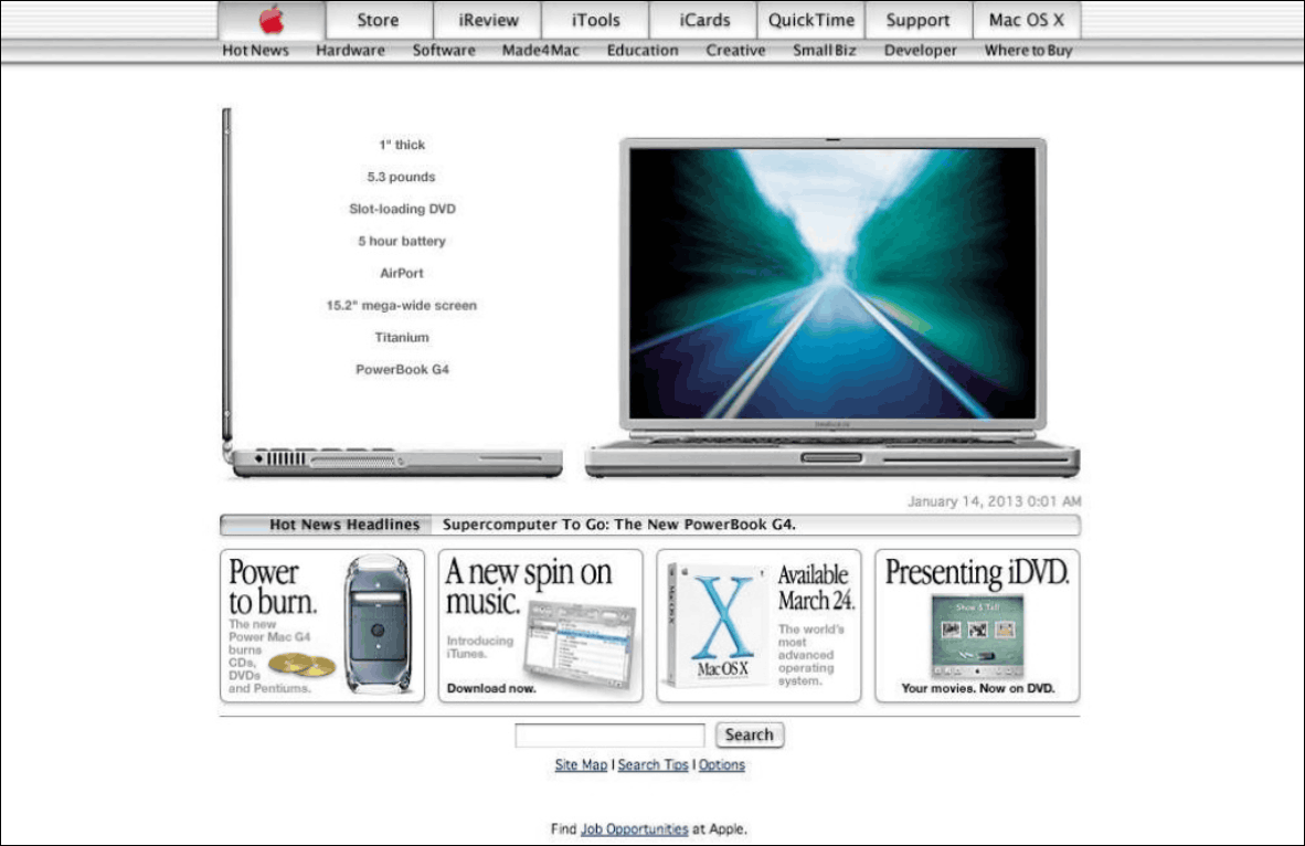
The Apple button is gray again.
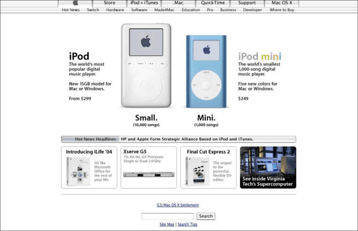
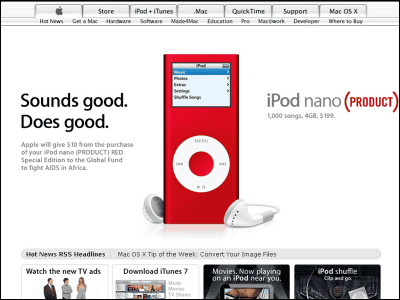
When the iPod was released in 2001, the Switch button goes to a new notation called iPod + iTunes. Descriptions and prices etc. are also displayed along with merchandise photos.
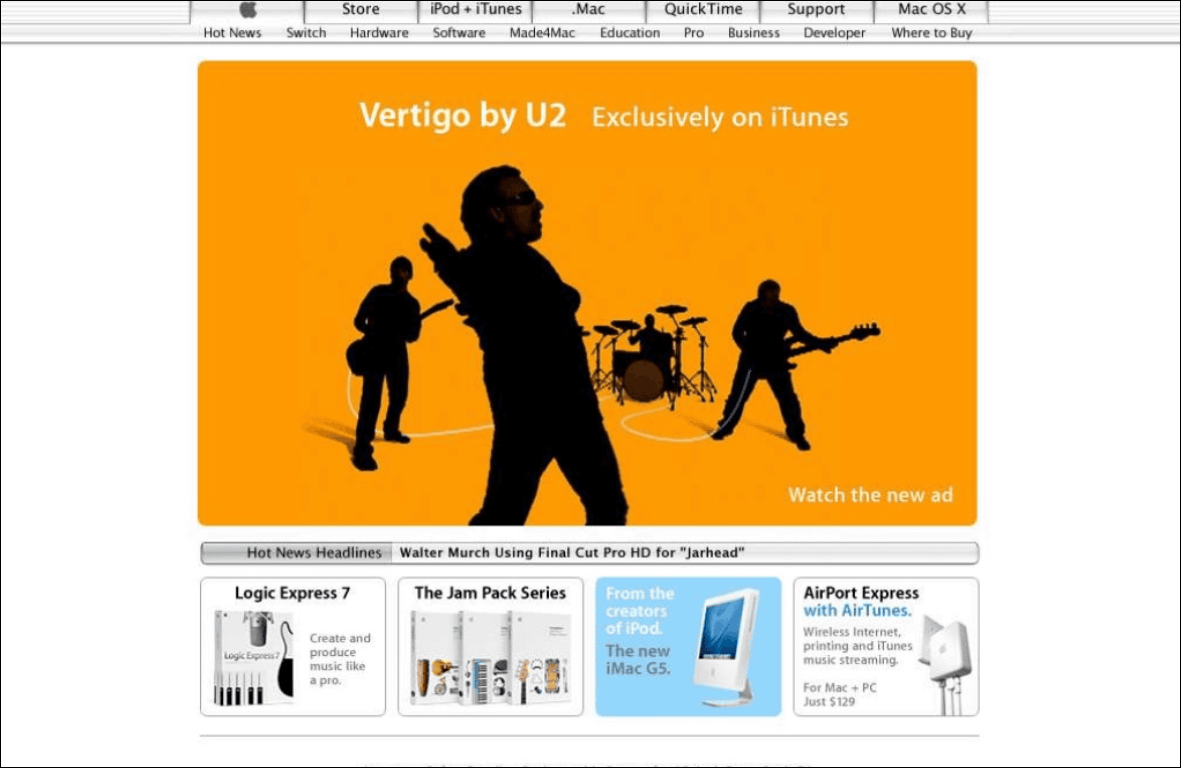
From this time on, images of advertising campaigns as well as items will be displayed as top images. "Silhouette" series of iPod.
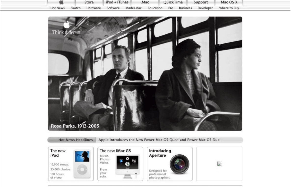
"Think different"
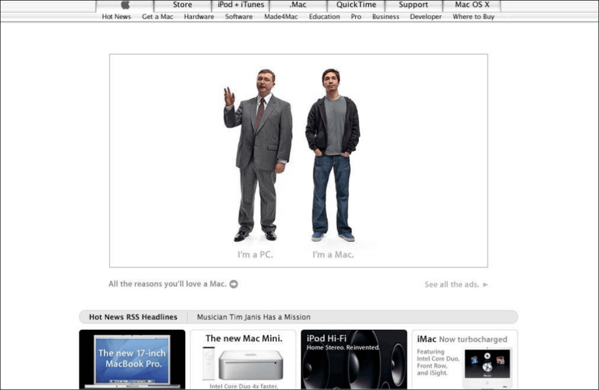
In Japan "CM is a Mac" "Hello, PC is the beginning" CM was broadcasted "Get a Mac" series.
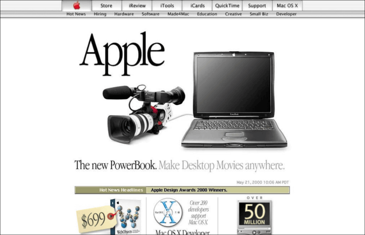
And the appearance of the iPhone. The design of the site was renewed, and the screen that was white center was changed to black until now. The design of the button was changed greatly, and the search box arranged under the image was placed at the top of the page. Big photos are used more than ever.

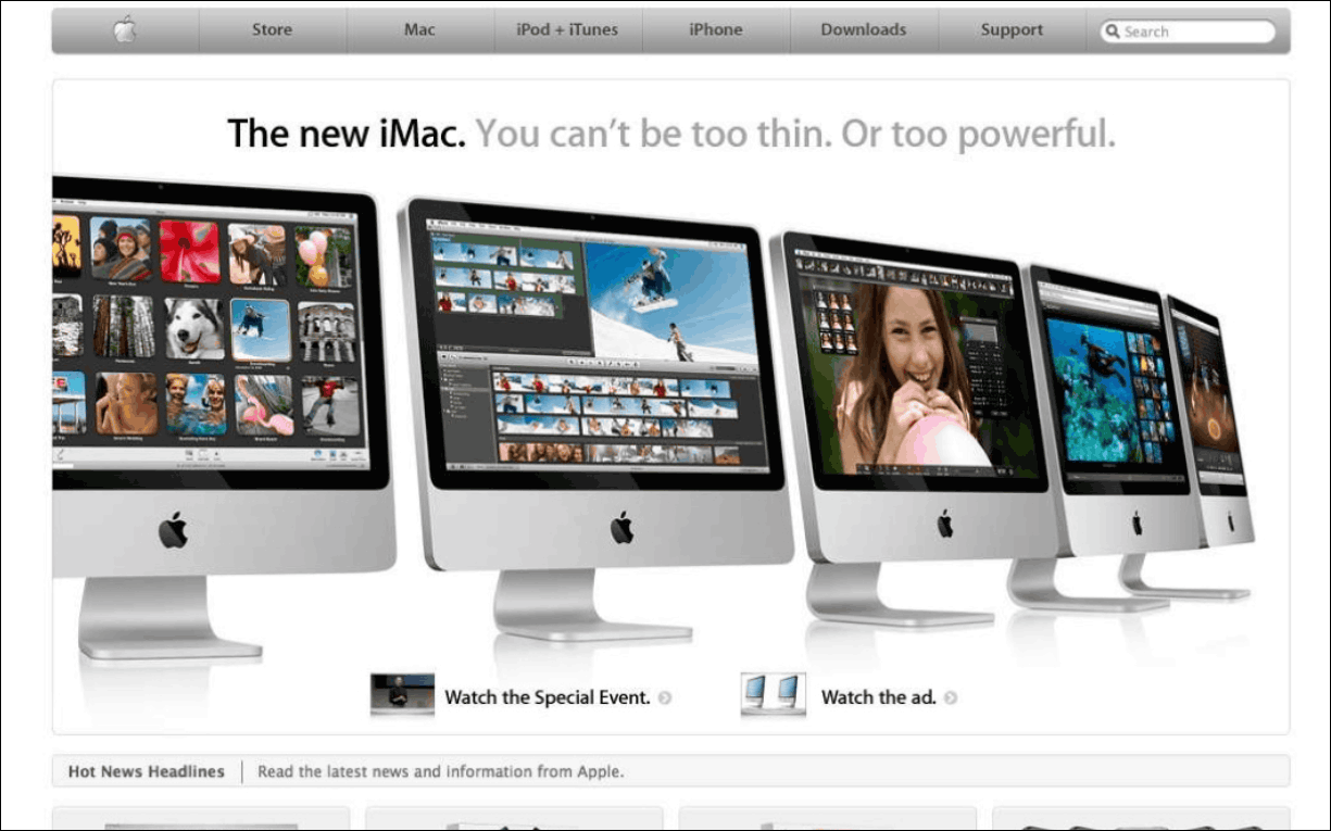
Make the letters a minimum catch phrase, and arrange iMacs in a row.
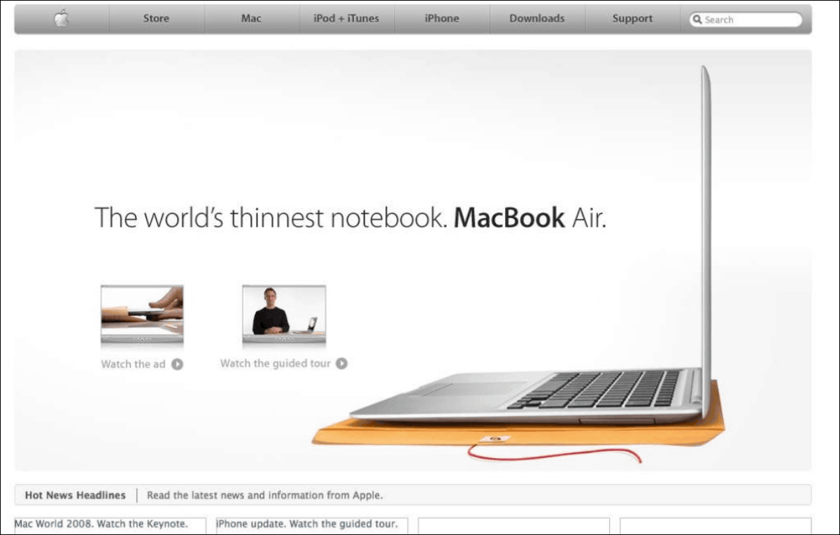
MacBook Air
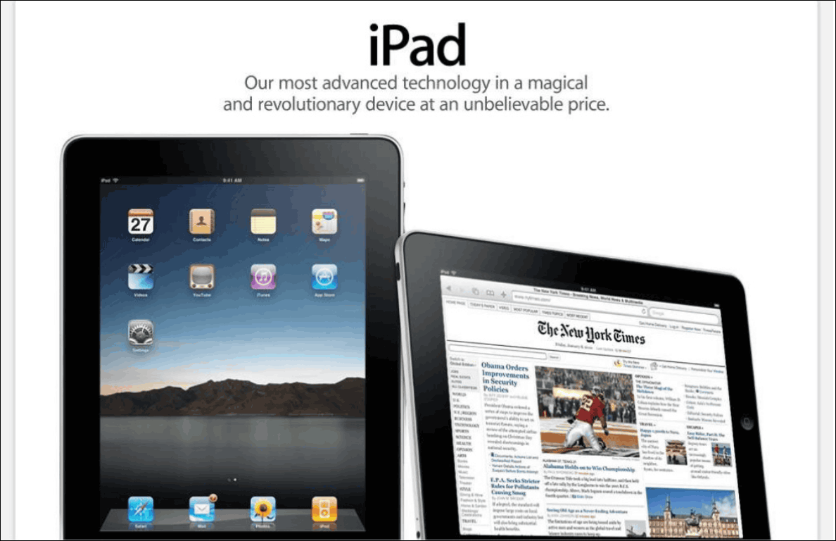
A large image that can not be seen entirely unless scrolling, and the character of "iPad" which is a product name emphasized more than ever.
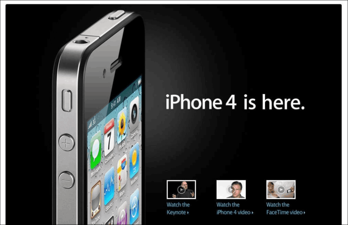
In iPhone 4, three movies are lined next to the picture.
When Steve Jobs died, a picture of Jobs was displayed all over.

And on January 24, 2013website.
Apple website after big changes like product design since Steve Jobs returned in 1997. From that time on, at the top of the page, the main product, the images of products under attention are lined up, the margins are more consistent, but the design has been consistent, but with the passage of time the picture is even bigger, The tendency to design is simple, it is increasing. By arranging a large number of screen shots of about 140 sheets, not only the change on the website but also the slide which can appreciate the pursuit of the Apple design became a slide well.
In addition, it is possible to see all 141 slides from the following.
Related Posts:

in Design, Posted by darkhorse_log