Impressive alphabet fonts that can also be used for free for commercial purposes
How effectively to convey information is to become important when designing something, such as a website, illustrations, posters. Blog collecting information on web designCrazy PixelsThere are more than 50 fonts with impact that seems to be useful at such times. Fonts are free for commercial use as well.
50+ Precious Free Fonts for Commercial Use | Crazy Pixels
http://crazypixels.net/50-precious-free-fonts-for-commercial-use/
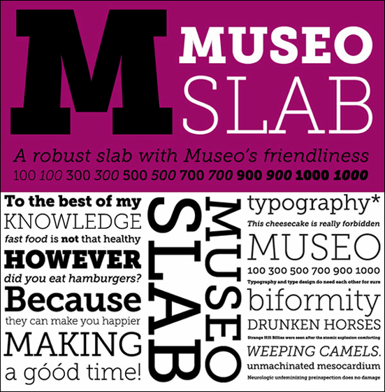
◆Museo Slab: The solid Gothic font. There are 12 different styles in this font, of which "Museo Slab 500" and "Museo Slab 500 Italic" are available for free.
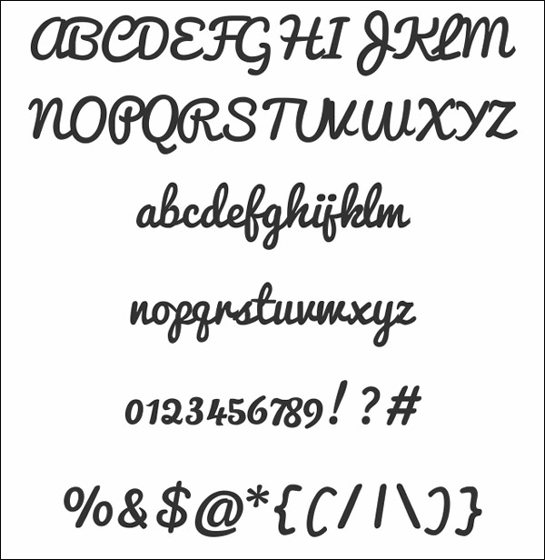
◆Free Font Qarmic Sans: Rounded handwritten style font.
◆Free Font Shardee: A little luxurious atmosphere.
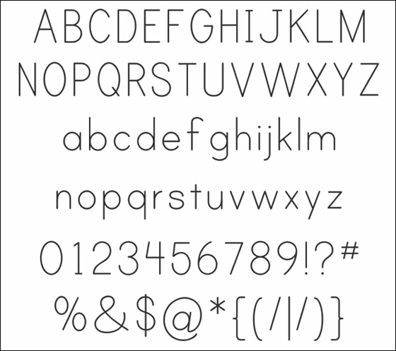
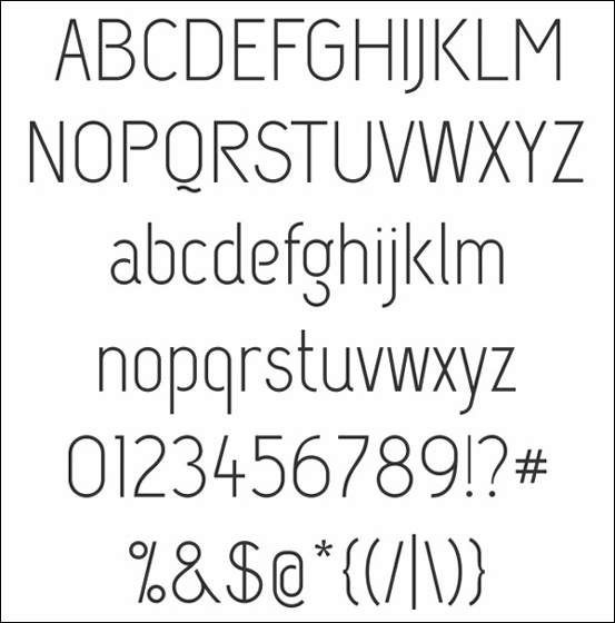
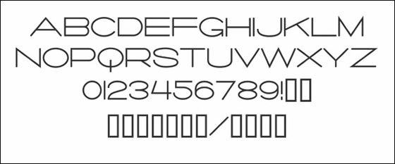
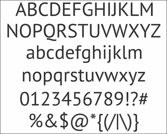
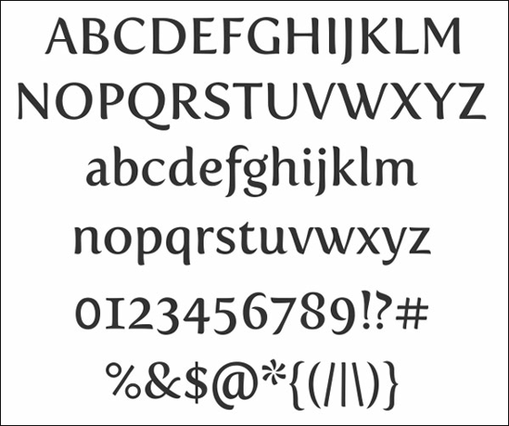
◆Print Clearly: It is simple and easy to understand.
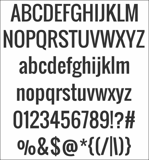
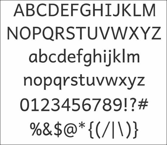
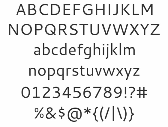
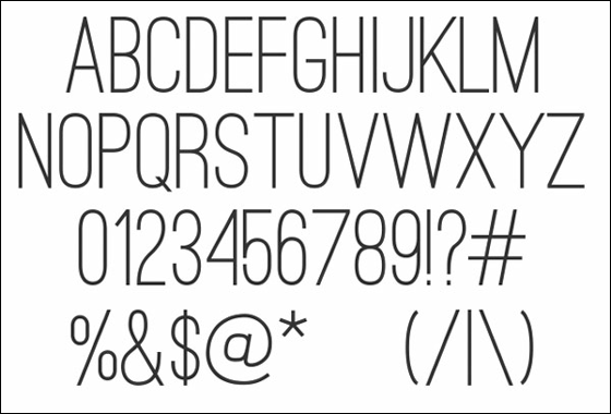
◆Oswald Font: This is also a standard and easy-to-understand font.
◆Kingthings WroteIt is a feeling like punching.
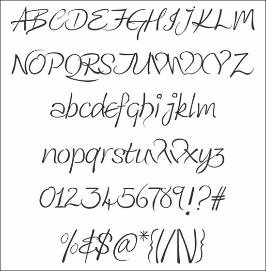
◆Arizonia: This is also a font with momentum like a stroke.
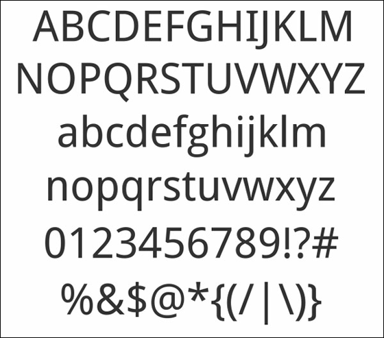
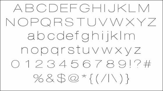
◆Andika: A little thinner line than Oswald, it looks good for ease of use.
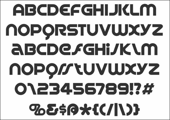
◆Enigmatic: Enigmatic (may be objectionable) font is a slightly square form.
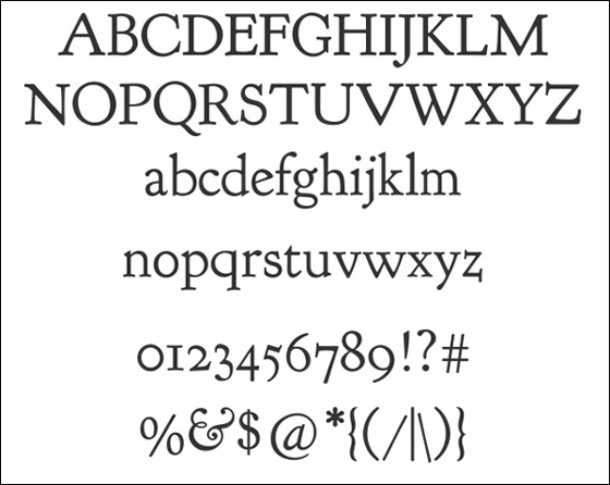
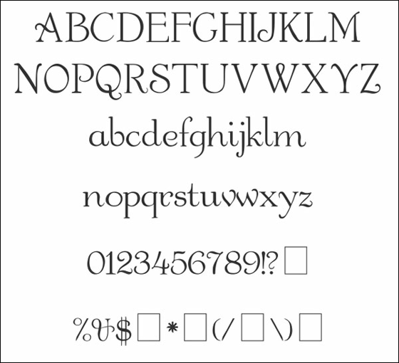
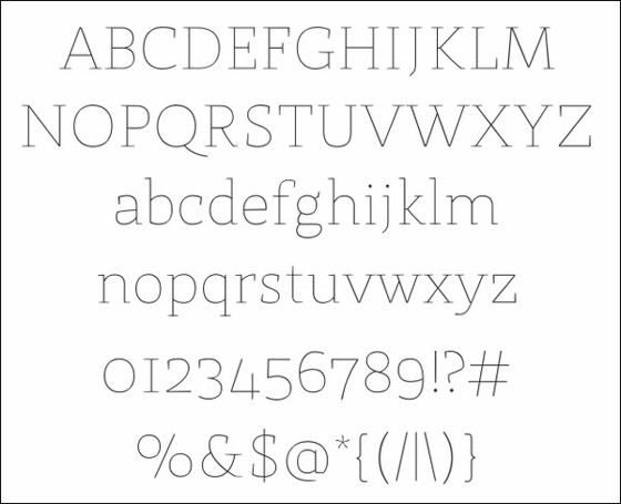
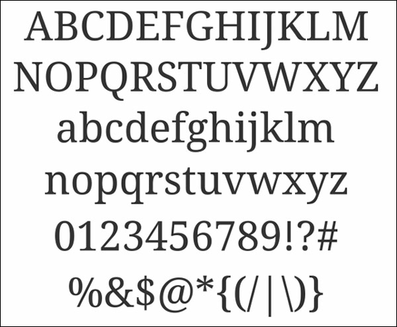
◆Goudy Bookletter: A classic design that looks good on the cover of books.
◆Mountains of Christmas: It seems that it seems to be perfect for picture books and posters for children.
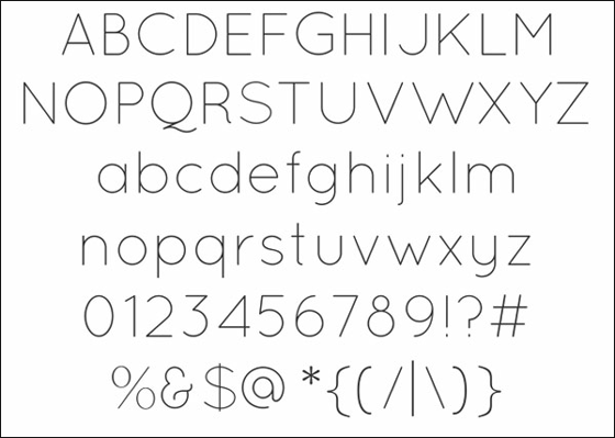
◆Capsuula: In "Q" or "g" etc., the point of intersection of the lines does not cross and the point is a little spaced.
◆Spin Cycle: There is a presence even if it is small.
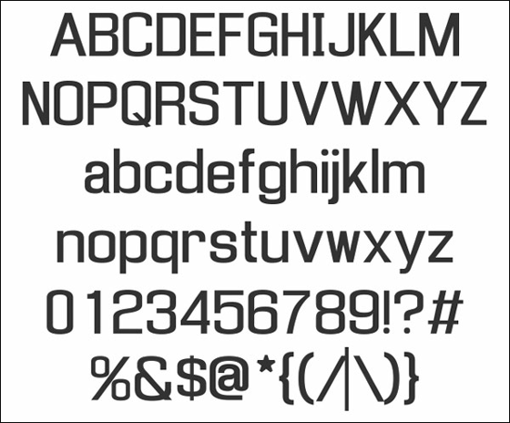
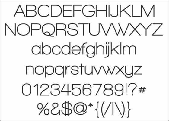
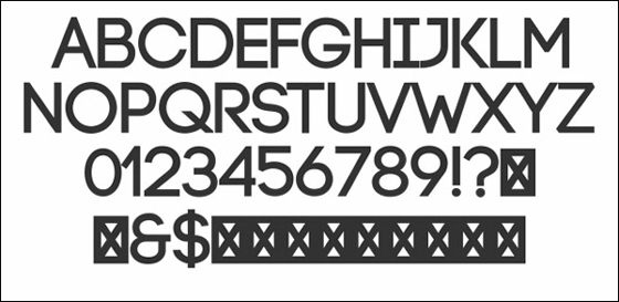
◆Six Caps: Stylish design with elaborate details.
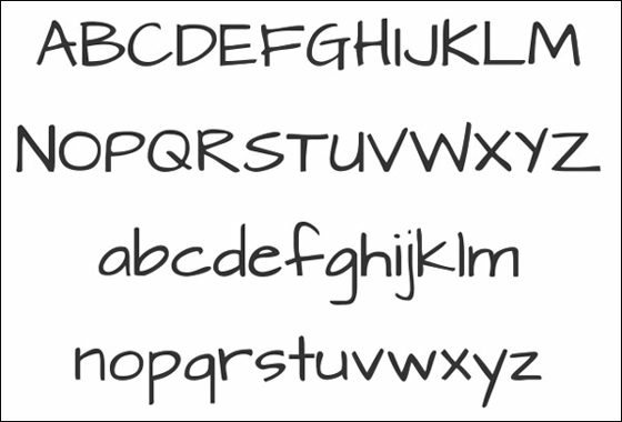
◆Cartoonist Hand: It seems that cartoonists are imagining characters like handwritten letters.
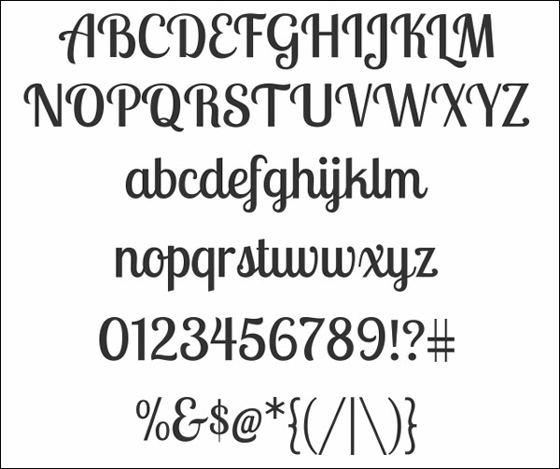
◆Garton: Curves are beautiful fonts.
◆Anivers: Anivers is a name taken from Anniversary (anniversary). OriginallySmashing MagazineIt was designed to celebrate the anniversary of.
◆Crimson: It seems that it was made conscious of classic fonts.
◆Idolwild: Handwritten rustic atmosphere.
◆Salaryman: This is also a simple and stylish design.
◆Kingthings Foundation: It is a unique form like I wrote with a marker.
◆Delicious: This Delicious font is made to admire for letterpress printing. It is simple but warm font design.
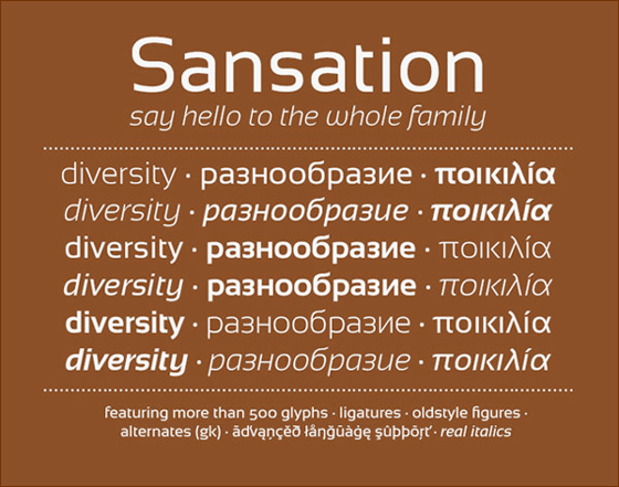
◆Sansation: Sensation is free of 6 types of fonts including bold and italics.
◆Quicksand: QuicksandSediment transport phenomenonMeaning of. It is a delicate design that is likely to flow in the sand.
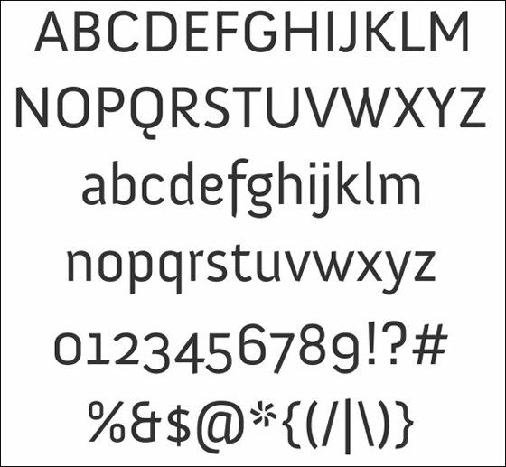
◆PT Sans: This is also a very simple design.
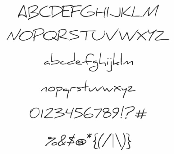
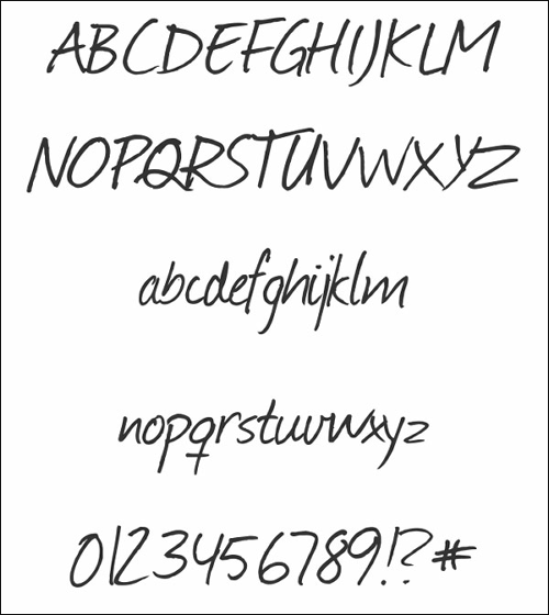
◆Daniel's fonts: It will look like a note written and run with a pen.
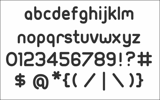
◆Walkway: Although it has roundness, it is a design that I'm catching on.
◆PacificoFont: This is also unique momentum design.
◆Droid Sans: One of the Droid fonts created for use on Android.
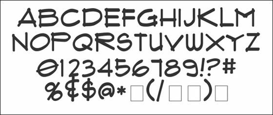
◆Journal: A slightly rough handwritten font.
◆Cantarell: Cantarel is a simple design, but you can change atmosphere at will by italics · bold.
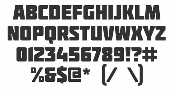
◆Molot: Bold font with impact.
◆Ubuntu-Title: The rounded font of the corner.
◆St Marie: Delicate and feminine atmosphere.
◆CODE: It is elegant font, CODE that made it easy to use for web design and motion graphics.
◆NeoRetroDraw: Three-dimensional font written by handwriting.
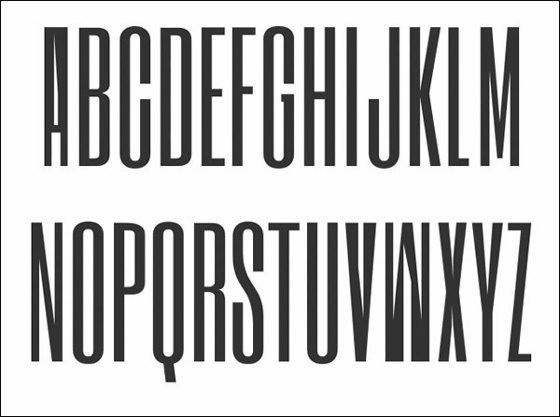
◆Ostrich Sans: As the name of Ostrich (ostrich) the long lengthwise design.
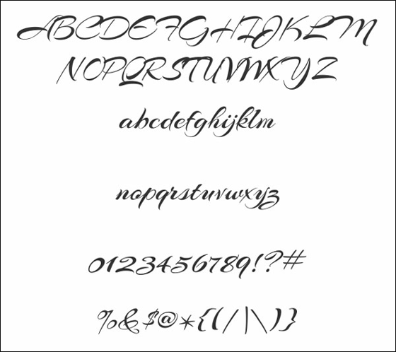
◆Lobster Two: Pop design font,Download LobsterIt looks like font version 2.
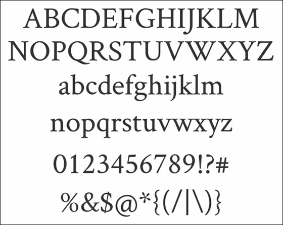
◆Droid Serif: This is also one of the Droid fonts made for use on Android.
◆Riesling: It is a design that emphasizes yen.
◆SeasideResort: This is a distinctive design with shadows.
◆CAC Champagne: It is an elegant design emphasizing streamline.
◆FontleroyBrown: This is also a streamline design, but we are adding thickness.
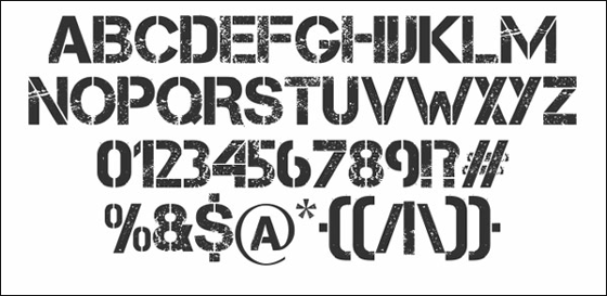
◆Capture: Font design like damaged processing.
◆Mido: It has a soft impression even in Mincho style bearded font.
◆Upper East Side: Upper East Side is adding strength to the line.
◆Lemon Chicken: The line which was haunted is unique.
◆Fertigo Pro: This is also like Mincho, but the form where the hem spreads a little instead of no beard.
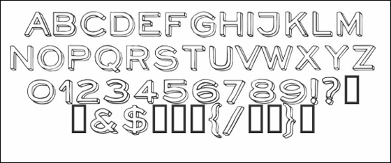
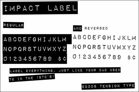
◆Impact Label: Three-dimensional font as if embossed.
◆Hattori Hanzo: The font named Hattori Hanzo is a very simple design.
◆Rabiohead: It seems that the ink is blurred at the edges and contacts of the letters.
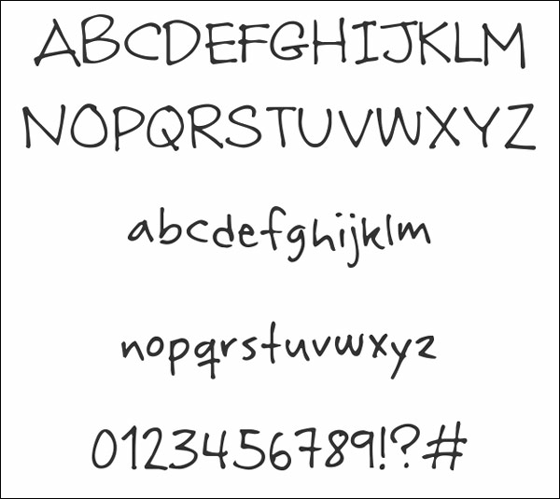
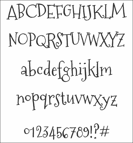
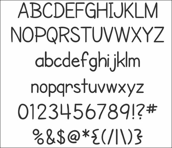
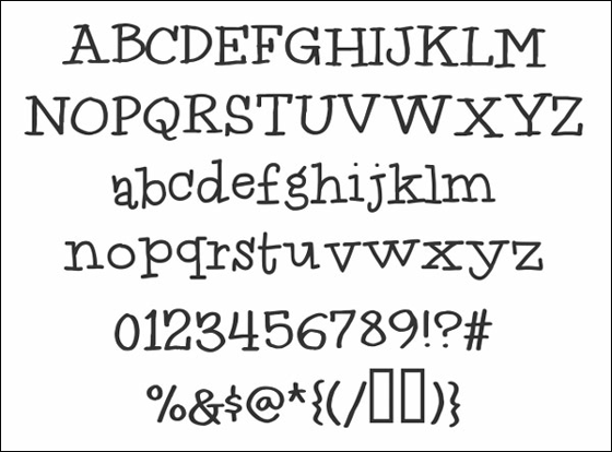
◆Architects Daughter: The unbalanced point Architects Daughter is like a letter written by a child.
◆DISCO: It seems to match web designs and posters in a pop atmosphere.
◆Clutchee: I feel pretty impressive and eye-catching.
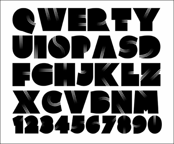
◆Flux Architect: Design like assembling letters assembled lines individually written.
◆Sofia: The edges of letters come and cute curled fonts.
Related Posts:
in Design, Posted by darkhorse_log