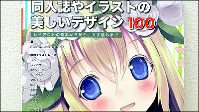
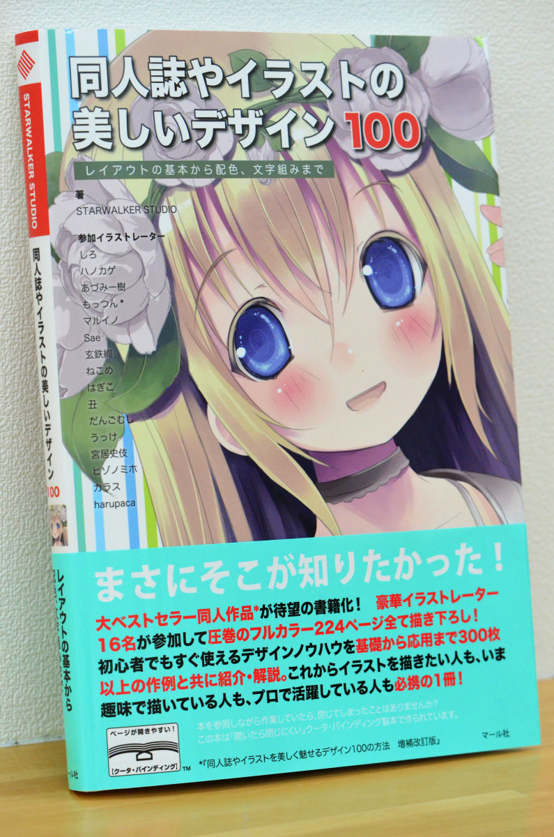
'Beautiful design of fanzines and illustrations 100' that explains concretely, not sense
Don't conveniently cheat the various techniques that are very useful for designing the 'cover' that should be called the most competitive place in doujinshi with the word 'sense,' instead of 'why choose such a layout?' 'What kind of effect can you expect?' 'When can you use it?' 'What is the point to be careful in actually doing?' Also very useful is '
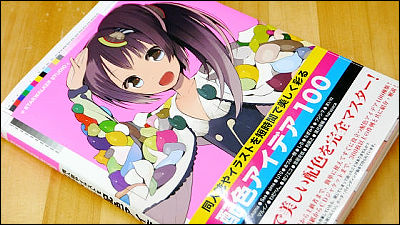
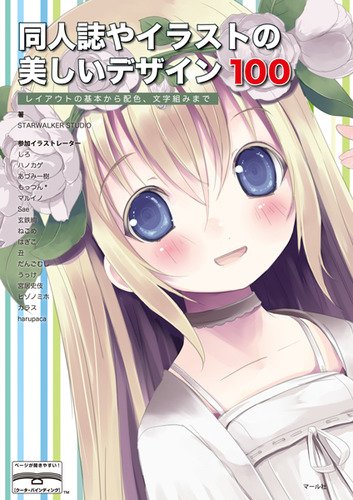
I received a donation from Marl and the real thing that arrived is this
According to the

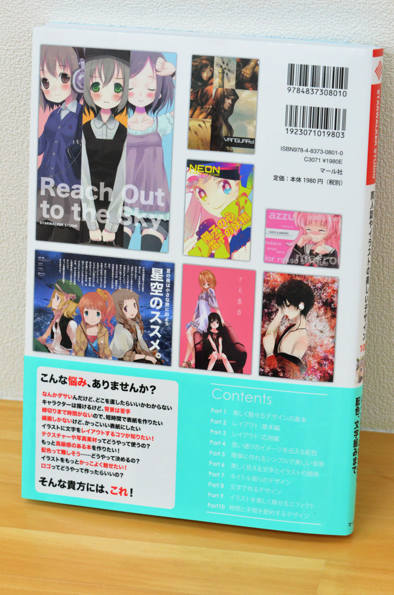
The back is like this
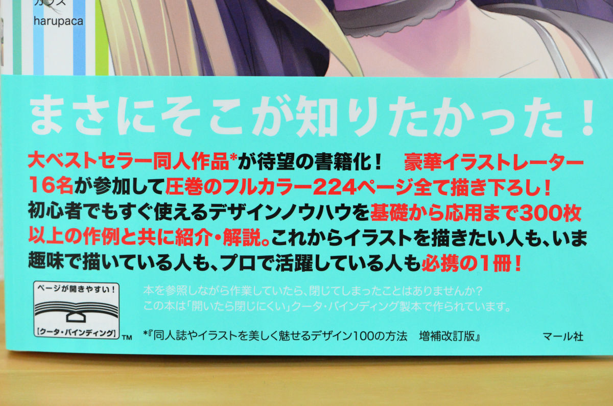
224 pages in full color, the point is that there are more than 300 examples from basic to applied
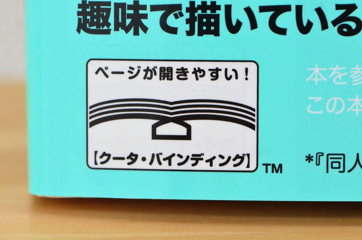
In addition, the latest bookbinding technology with a three-dimensional structure 'Cooter Binding' is adopted, so the pages are easy to open and the book is 'difficult to close when opened'. It is easy to refer to while opening the page, and it feels good.
It's kind of dull, but I don't know where to fix it. 'I want to make a cover in a short time because there is no deadline.' You can see well that you attach importance
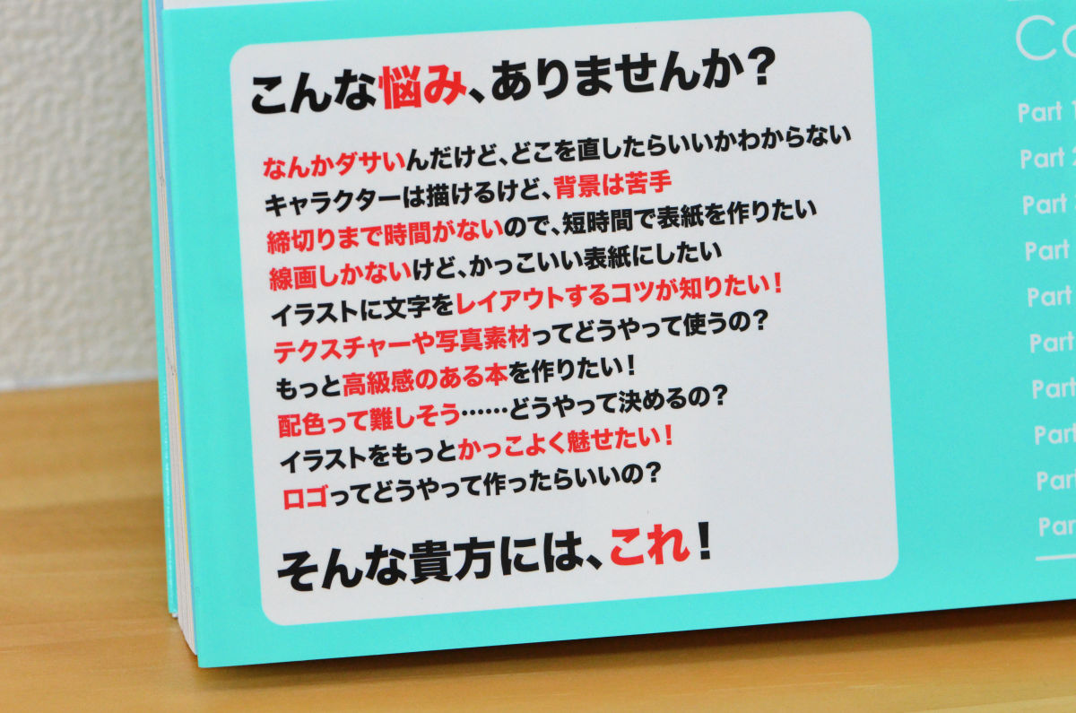
Table of contents headings, all 10 chapters
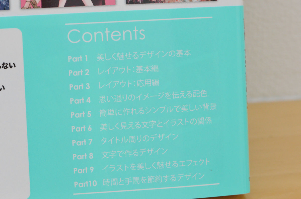
The actual table of contents has become more detailed with this feeling
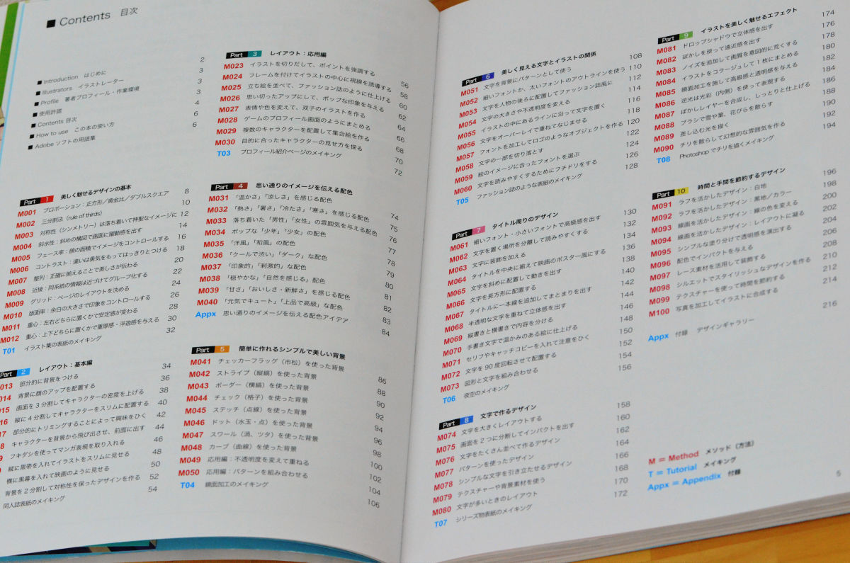
Each page has a difficulty level, purpose, comments, examples and concrete explanations, and since the index is made well, search performance is also high.
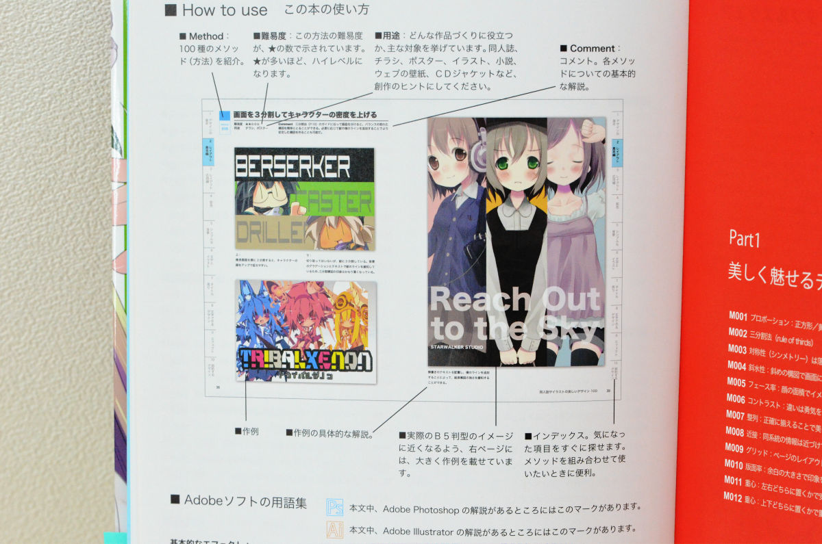
It uses the same B5 version as many of the doujinshis, and examples are posted in Tachikiri or a size close to it, so it is a big strength that you can actually check with a hand size.
It's very easy to grasp the image 'Hmm, hmm, does it look like this?'
There are traces of things that have been carefully devised and devised, and there are plenty of things that only books can do that only books can do.

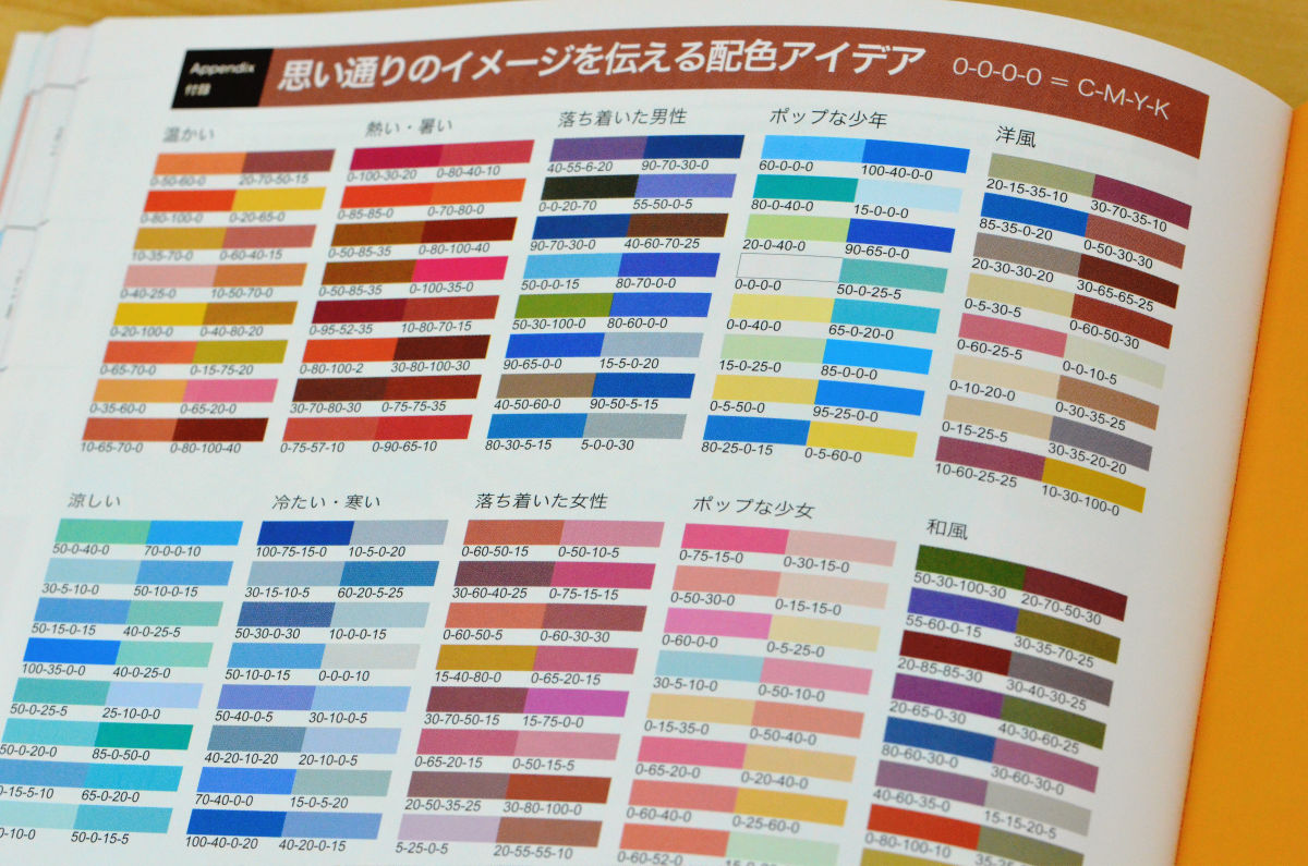
Coloring ideas that can withstand such practical use are also summarized, and because it is a printing premise, it has been written in CMYK
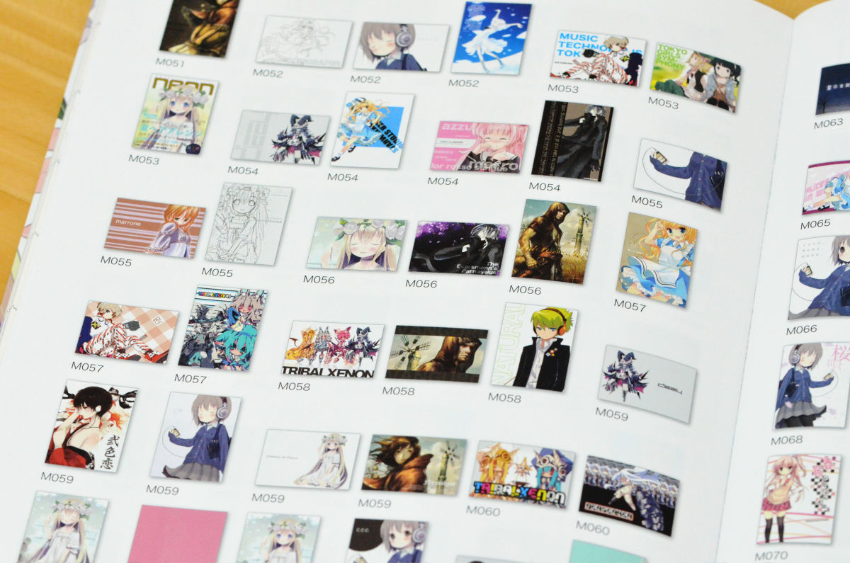
At the end of the book, the creations are arranged in thumbnail format like this, so it's easy to go searching for just that page with the feeling 'I want to create with this atmosphere!'
In the first place, there is a 'designer' as the biggest difference between fanzines and commercial magazines, and in the case of commercial magazines, the designer is the designer of the cover design, the illustration is the illustrator, etc. It is possible to create high quality magazines, but in one doujinshi, the person himself is an illustrator and designer, so it will be done by one person from 1 to 10, and it is inevitable that it is an immature thing in terms of design. Tends to be
Therefore, by using this 'Beautiful design of doujinshi and illustration 100', it is possible to easily realize a design like that, and you can see the high degree of perfection just by looking at the following table of contents. I will.
◆ Part 1: The basics of beautifully attractive designs
・Proportion: Square/Golden ratio/Double Square
・The rule of thirds
・Symmetry becomes calm and sacred image
・Slant water: A diagonal composition gives the screen a dynamic feel.
・Face ratio: Image is controlled by the area of the face
・Contrast: Make the difference clearly with courage
・Alignment: Aligning accurately conveys beauty
-Proximity: Information of the same system is grouped close to each other
・Grid: Determine page layout
・Print ratio: The impression is controlled by the size of the margin.
・Center of gravity: A sense of stability changes depending on whether it is placed on the left or right
◆ Part 2: Layout: Basic
・Partially add background
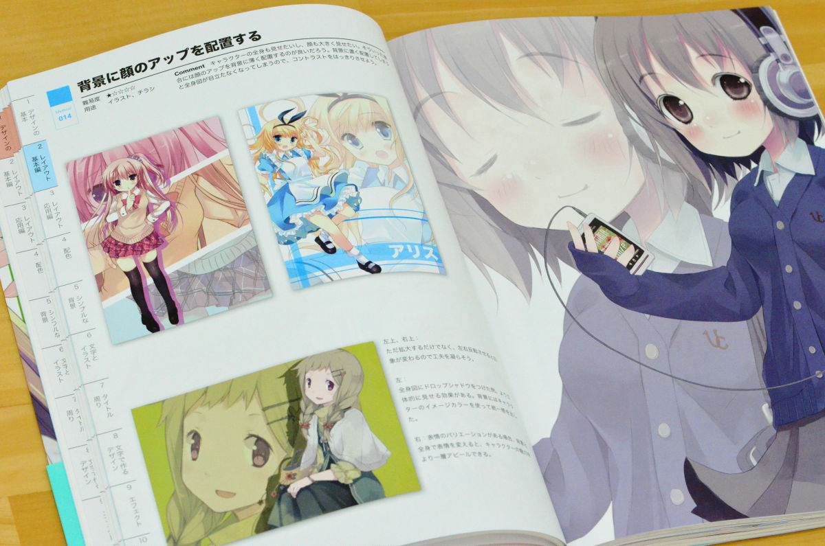
・Place face up on the background
・Increase the character density by dividing the screen into three
・Divided vertically into 4 to arrange characters slim
・Getting interested by partially trimming
・ Make the character pop out of the background and bring it to the front
・Incorporate manga expressions using balloons
・ Put a black belt vertically to make the illustration look slim
・ Put a black curtain next to it to make it look like a movie
・Create a design that maintains symmetry by dividing the background into two
◆ Part 3: Layout: Advanced
・Cut out the illustration and emphasize the points
・Give a line of sight to the center of the illustration with a frame
・Stand by standing pictures and finish like a fashion magazine
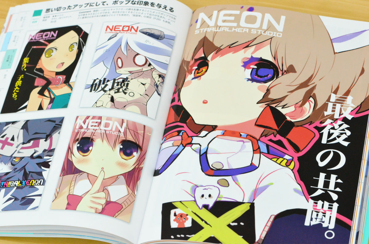
・Make a bold impression and give a pop impression
・Changing facial expressions and colors to create twin illustrations
・Organize like a game profile screen
・Place multiple characters to make a group picture
・Explore how to show the character that suits your purpose
◆ Part4: Color scheme that conveys the desired image
・Color scheme to feel 'warmth' and 'coolness'
・Color scheme to feel 'heat', 'heat', 'coldness', 'coldness'
・Color scheme that gives a calm “male” or “female” atmosphere
・Popular 'boy' and 'girl' color schemes
・Color scheme of 'Western style' and 'Japanese style'
・ 'Cool and astringent' 'Dark' color scheme
・'Impressive' and 'stimulating' color schemes
・Color that is 'gentle' and 'feels nature'
・Color scheme to feel 'sweetness' and 'deliciousness/freshness'
・Color scheme that is “genki and cute” and “elegant and high class”
◆ Part5: Simple and beautiful background that can be easily created
・Background using checkered flags
・Background using stripes (vertical stripes)
・Background using borders (horizontal stripes)
・Background using checks (lattice)
・Background using stitches (dotted lines)
・Background using dots (polka dots/dots)
・Background using swirls (vortex, ivy)
・Background using curves
・Application: Overlay with different opacity
・Advanced: Combine patterns
◆ Part 6: Relationship between beautifully visible characters and illustrations
・Use characters as a pattern in the background
-Use thin or thick font outlines
・Place letters behind people to make them look like fashion magazines
・Change the size and opacity of characters
・Place characters along the line in the illustration
・Overlay letters to blend in
・Process fonts to create logo-like objects
・Cut off a part of the characters
・Choose a font that matches the image of the picture
・Borders to make the text easier to read
◆ Part7: Design around the title
・Thin font ・Small font gives a high-class feeling
・Separate the place to put the letters to make it easier to read
・Add decoration to characters
・Align the title in the center to make it look like a movie poster
・Place characters diagonally to make movement
・Place characters in a rectangle
・Add a single line to the title to create a unity
・Semi-transparent characters are superimposed to give a three-dimensional effect
・Separate content between vertical writing and horizontal writing
・Use handwriting to create a warm picture
・Get attention by adding lines and catchphrases
・Rotate the character 90 degrees and place it
・Combine figures and letters
◆ Part8: Design made with letters
・Lay out the characters large
-Split the screen into two to give an impact
・Design that makes many letters side by side
・Design using patterns
・Design that complements simple characters
・Use textures and background materials
・Layout when there are many characters
◆ Part9: Effects that make the illustration beautiful
・Drop shadow gives a 3D effect
・Use perspective to create a perspective
-Add noise to intentionally reduce the image quality
・Collage the illustrations into one
・A mirror finish is applied to give a sense of luxury and transparency.
・Backlight is expressed using the glow (inside)
・Combines blur layers to create a moist finish
・Splash snow, leaves and petals with a brush
・Draw the light
・Disperse dust to create a fantastic atmosphere
◆ Part10: Design that saves time and effort
・Rough design: White background
・Rough design: black background/color
・Design that makes use of line drawings: Change the line color
・Design utilizing line drawings: elaborate on layout
・Produce transparency with simple coloring
・Impact with color scheme
・Use lace materials to decorate
・Make a stylish design with a silhouette
Save time with textures
・Process photos and combine them into illustrations
It is on sale on Amazon at 2079 yen including tax.
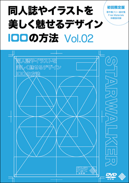
In addition, in addition to this, as a coterie work, a full-color 232-page e-book (includes PDF and JPEG versions), ' 100 ways to design beautiful doujinshi and illustrations Vol.02 ' is Comic Market 3rd day Nishi- It will be distributed at 02a [STARWALKER STUDIO].
Related Posts: