Information learned with "difficult to read font" remains in memory
When choosing textbooks and reference books, not only the contentsfontPerhaps it should be chosen after careful examination.
Princeton UniversityAccording to my research, when I read sentences and learn new information and learn concepts from them, I read it with "difficult to read" font which is a little hard to decipher than a "readable font" which can be readily and painfully readable It seems that contents tend to remain in memory.
Details are as below.Princeton University - Font focus: Making ideas harder to read may make them easier to retain
Dr. Daniel Oppenheimer, Associate Professor of Psychology at Princeton University says, "Difficult to read font makes contents to be learned more difficult than it actually is, so that students will learn more carefully I made a hypothesis and verified it through a series of experiments. Thesis isCognitionIt is published in the magazine.
In the research, we first conducted an experiment in which 28 subjects between the ages of 18 and 48 got information on imaginary extraterrestrial organisms in 90 seconds and tested after 15 minutes. As a result, information on extraterrestrial life is referred to as "easy-to-read font" (size 16 points, font color blackArial) Gave the correct answer rate of 72.8%, whereas the group given with "difficult to read font" (12 points with a lighter text colorComic Sans MSOrBodoni MT), The correct answer rate was 86.5%, and it was said that the examinees who read with font which is difficult to read correctly remembered.
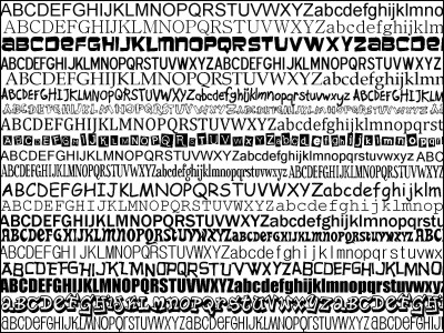
An example of an easy-to-read font (Arial) and a difficult-to-read font (Comic Sans MS).

Next, Dr. Oppenheimer and colleagues examined this theory in a practical environment with the cooperation of a high school in Chesterland, Ohio, one of the author 's students, Connor Diemand - Yauman' s hometown. In various subjects and grade, 222 high school students randomly read "easy-to-read fonts" (same font as the teaching materials used so far, many areTimes New RomanOrArial) And "difficult to read fonts" (Haettenschweiler·Monotype Corsiva·Comic SansIt is said that students who studied with "difficult to read font" got a good result with a quiz that is done on a regular basis.
Examples of "difficult to read" and "readable fonts". (From the top Monotype Corsiva, Comic Sans italic, Times New Roman)

By utilizing this research result, it is expected that educational effect can be improved without changing budget without changing current curriculum and teaching method by manipulating font of teaching materials. However, if it takes more time than necessary to read or read "hard to read", the learning effect decreases, and even with the same "reading difficulty" font, the student's ability and "give up easy Oppenheimer et al. Emphasize that it is necessary to go through more careful investigation to introduce it at the site of education, as it may be counterproductive depending on the situation.
When university teaching materials and lecture notes are distributed online, try to display it in a faint font which is somewhat difficult to read, or try devising font selection when printing materials that you want to put in your mind at work, the learning effect It may rise. Also, it seems likely that "Handwritten notes are the best reference books", but will it be counterproductive if the letters are dirty so that they are "difficult to read" past "difficult to read"?
Related Posts:


in Note, Posted by darkhorse_log